Sony Ericsson W960 review: Walkman extreme
Walkman extreme
Usability breakdown
Using the Sony Ericsson W960 in everyday scenarios like making calls, managing contacts and listening to music was a pleasant task. We do miss the side Back button, which enabled single-handed operation of the interface. There is of course a software Back key, but it's hardly usable in combination with the Jog wheel, especially for left-handed users.


The W960 held in hand • remember the stylus?
The keypad is comfortable to use and keys provide nice tactile feedback. That of course does not hold true for the touch-sensitive keys. All keys have a rather uneven white backlighting (it does seem bluish on the photos, though).


Keypad and touch-sensitive keys: rather uneven backlighting
The TFT display on the W960 is pretty much the same as the displays used in recent Sony Ericsson smartphones. It has a 2.6" diagonal, supports 262K colors and works in QVGA (240 x 320 pixels) resolution. As it is transreflective, it does well under bright sunlight, but colors and contrast look a bit washed out in most situations, compared to regular Sony Ericsson feature phones.


Comparing to Sony Ericsson K850 and T650: the W960 screen looks washed out
As anyone could expect, W960 offers nice signal reception and we found no problems during calls. The vibration is on a medium level, while the ringing volume is more than enough to alert you of incoming calls even in a noisy setting.
Here is how Sony Ericsson W960 ranks along some of the other handsets we've measured in our new speakerphone loudness test. More info on our test here.
| Speakerphone test | Voice, dB | Pink noise/ Music, dB | Ringing phone, dB | Overall score |
| Sony Ericsson W960 | 72.3 | 73.5 | 76.7 | |
| Samsung D900 | 76.8 | 75.9 | 78.0 | Excellent |
| Samsung U600 | 66.7 | 66.2 | 75.3 | Good |
| Sony Ericsson K850 | 71.0 | 75.7 | 75.7 |
Symbian UIQ
The Sony Ericsson W960 interface is UIQ 3.0 - a customizable stylus-based user interface for mobile phones, based on the Symbian 9.1 OS. The interface is the same one used in previous Sony Ericsson smartphones such as the W950, the P990, and the P1. With W960 however, the Walkman functionality is on focus.
Probably the biggest update is the ability to change the well-known Today screen with a Walkman one. When the player is inactive, you have a big Walkman shortcut right in the middle of the screen. Once you get your music playlist rolling, the home screen will visualize every detail about the currently running track plus its album art. The most definite eye-catcher of all is the fullscreen visualizations.
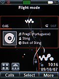
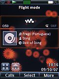
The new Walkman home screen • playing a track on the home screen
Taking our eyes off the player (a bit of a challenge, really) we must duly note that the home screen also offers information on time, date, signal strength and battery meter and, of course, there is the customizable shortcuts bar. It can hold up to 15 different shortcuts to your favorite features. The shortcuts bar is cleverly only a touch away, so that it doesn't consume the precious screen real estate (much like on Sony Ericsson P1). The shortcut items have large graphic icons, aptly sized for finger touching.
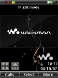
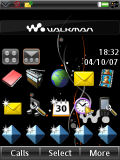
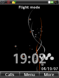
The Walkman home screen with the music player turned off • there are a bunch of shortcuts hidden • the home screen stripped of all applications
| Using the Sony Ericsson W960 in everyday scenarios like making calls, managing contacts and listening to music was a pleasant task. We do miss the side Back button, which enabled single-handed operation of the interface. | <#AdRectangle#> |
The best thing about the new home screen is that the old one is still an option when you use your smartphone to run everyday jobs. In case you opt for it, the Today screen will display the current Calendar events, messages and emails, missed calls, general notes, etc. With the Today screen on, the four top shortcuts of the bar we mentioned earlier appear at the bottom.
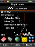
The good old Today home screen
On the standby screen, there are two pop-up menus. The first one can is launched by pressing the More softkey and the second one can be opened by touching the triangle in the upper left corner. While some of their functions overlap, the first one offers the option to turn on a connectivity feature, change the ringtone volume, view the smartphone status, and allows access to a call management option for filtering incoming calls. It's here that you can also access the Task manager. The other pop-up gives you access to the most important items or actions you may need or like to do - for example, you can again turn on connectivity options such as Bluetooth or WLAN, make a new call, add a new contact or put down some appointments and notes. Furthermore, it gives you access to the dual time zone clock and allows you to control the volume level for different events centrally. We are very pleased with this menu, as it allows quick access to the most important functions of any smartphone. The only downside is that it's only accessible with the stylus.
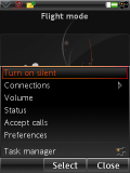
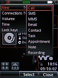
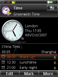
Pop-up menus • Time zone manager with alarms
A nice thing is that the smartphone has a dedicated Flight mode, which can be turned seamlessly on without restarting the phone. Starting the handset directly into Flight mode is another option, which you get prompted about every time you power it on.
The main menu of the Sony Ericsson W960 allows two different views: icon grid and list view. The font throughout the user interface is rather small, except for the file manager, messaging and phonebook, where you can choose between there different font sizes. The smartphone interface is customizable through various graphic themes - unfortunately, ours had only the default Walkman one preinstalled.
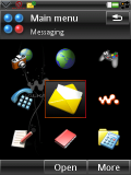
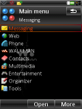
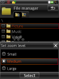
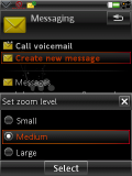
Main menu: grid view and list view • available interface font sizes
Reader comments
- Mike
- 05 Sep 2010
- Iau
anybody can help with my w960 wifi because i really dont know the right setting for the wifi... i enable the wlan connection but no network found, i have pc and i have a wireless router but when i using my laptop and enable the wifi it can access int...
- roxas
- 22 Jun 2010
- uZ9
hey everone im feel as a same thing u knw what i guess iphone is better but how about se w960i? i guess 50 50 in my head,so if i have a money which one im gonna buy?i dont knw what's going on i just smile,
- Andi
- 10 Jun 2010
- PAq
Hey I use this cell phone. after the old nokia, SE G502i, Nokia E63, Nokia E66, SE W980, Aino U10i, LG BL40, Fujitsu F905i, Nokia X3 and before the mobile phone prototype with 3d holographic display. at some time, until that moment arrives, W960i wil...