Sony Ericsson Xperia ray review: Ray of light
Ray of light
Standard sales package
The Xperia ray comes with a compact charger with a USB port in which you plug in the supplied USB cable. The cable is long and the microUSB end is L-shaped, which makes sense given the USB port on the ray is on its left side.
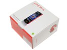
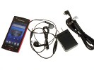
Standard sales package for the Xperia ray
You get a one-piece headset too, which uses ear buds rather than in-ear design. There's a 4GB microSD card in the box too, enough to fit a respectable music collection.
The retail box of the Sony Ericsson Xperia ray is topped off with the usual set of manuals.
Sony Ericsson Xperia ray 360-degree spin
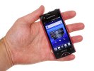
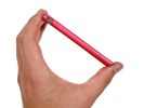
The all-plastic Sony Ericsson Xperia ray stands at 111 x 53 x 9.4 mm and tips the scales at 100 grams sharp.
Design and construction
The Sony Ericsson Xperia ray moves away from the predominant Xperia line styling and gets closer to the minis instead. That design has the advantage of a big home button, but the Back and Menu keys are capacitive.
It's a perfectly usable combination, perhaps more comfortable to use than the thin hardware controls on the recent Xperia phones. It looks good too. The back of the Xperia ray is completely flat - no curve to it, but since the phone is narrow that doesn’t affect ergonomics and makes the phone stable when you put it on a table.
Overall, the design team did a very good job on the phone - the ray is a looker.
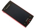
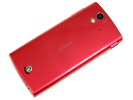
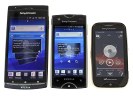
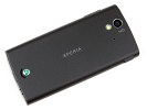
Sony Ericsson Xperia ray in Pink and Black • Xperia Arc vs. Xperia ray vs. Mix Walkman size comparison
Sharp display with BRAVIA engine
The BRAVIA engine Reality display on the Sony Ericsson Xperia arc is hands down one of the best LCD displays we've ever seen. It has FWVGA resolution (480 x 854 pixels), and a 16:9 aspect ratio.
The high resolution on a relatively small diagonal gives it 297ppi pixel density - just shy of the elusive 300ppi density which, according to no other than Steve Jobs, Apple’s CEO, himself, is the picture-perfect ideal for phones.
Being an LCD unit, the Reality display suffers from color shift when viewed at an angle - light blues for example noticeably tend towards light green when you tilt the phone. Contrast is also reduced slightly.
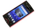
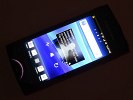
The Reality display has its ups and downs
On the up side, the screen boasts excellent contrast and deep darks. It's helped by the non-reflective surface coating, which leads to excellent sunlight legibility. Colors are very rich - beyond what the Xperia arc or the iPhone 4 can offer.
The Mobile BRAVIA engine further enhances the image quality in software - it borrows tricks from Sony's TVs. It boosts contrast and saturation and performs noise reduction. It also sharpens the image, which would usually lead to jaggies but with the extra-small pixels of the Xperia ray screen, they're not really noticeable.
Unfortunately, we couldn’t run our display test as the auto brightness software could not be turned off and we couldn’t get reliable readings at 50% and 100% brightness.
Controls and feel
Above the screen is the usual lineup of an earpiece, proximity and ambient light sensors and a front-facing camera. Below the screen is the hardware Home key flanked by capacitive Back and Menu keys. Those two don't have clearly defined borders, so keep in mind you have to aim for the back and menu symbols and not to the side or below the key (haptic feedback lets you know your tap has been successful).
The Home key is a bit stiff but it got our attention with the illuminated strip around it. It can glow in different colors - white, red, green and blue. It works as a charge indicator and certain apps and serves as a notification light (e.g. blinks green for missed calls). Third party software couldn't control the light, unfortunately.
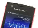
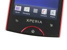

Front-facing camera and companions above the display • The Home key glows in different colors
The left side of the Xperia ray houses the microUSB port, which doubles as a charger plug. With Android 2.3.4 it will also work as a USB On-The-Go port.
The volume rocker is on the right side of the phone - it's small, quite thin and not very comfortable to use.
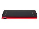
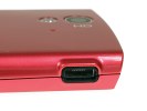
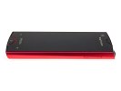
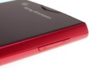
The left houses the microUSB port • The thin volume rocker on the right
On top there's the Power/Lock key in the middle, which is small, rounded and comfortable to press (though not prone to accidental presses), and the 3.5mm audio jack.
At the bottom there's the mic pinhole and the lanyard eyelet, plus a small groove to put a fingernail under and pull the back cover open.
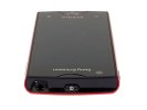
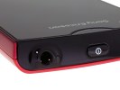
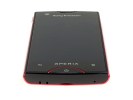
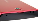
Power/Lock key and 3.5mm audio jack on top of the Xperia ray • not much at the bottom
The Sony Ericsson Xperia ray comes in the usual Black and White color schemes, but if you find those dull, you can also grab it in Gold (as in Golden) or Pink. For the preview, we had the Black version, which had a nice matte black finish on the back and for the review we got the Pink version, which has a bright, eye-catching glossy finish.
Around the back, there's the 8MP auto-focus camera and the LED flash. There's virtually no protection against scratches or smudges for the camera lens, so you'd need to be careful with it.
The loudspeaker is also at the back, right next to the Sony Ericsson logo. The logo protrudes slightly, but the loudspeaker still lies too low and gets muffled. The secondary microphone is near the camera/flash duo.

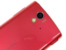
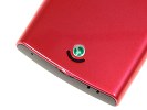
The camera lens, LED flash and loudspeaker grill at the back
Opening the back cover reveals the battery and the SIM and microSD cards nestled next to it. You can't pull either out without removing the battery first, which isn't a big deal for the SIM card, but not having a hot-swappable microSD card can be a drag some times.
At least the battery is all good news - Sony Ericsson has managed to fit a massive 1500mAh battery in the compact Xperia ray. Official numbers promise up to nearly 18 days of standby (in 2G, a bit more in 3G) and almost 7 hours of talk time (in 2G, exactly 7 hours in 3G). The battery should also be good for 36 hours of non-stop music playback if the official numbers are to be believed.
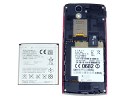
The 1500mAh battery gets in the way of the microSD card slot
Part of the inner body of the Xperia ray is made of metal, which gives the phone excellent rigidity. Still, the outside is all plastic so you don't get the metal unibody feel you get from other phones.
The 16:9 aspect ratio of the screen dictates the overall shape of the Sony Ericsson Xperia ray - it's tall and narrow, which made the ray very comfortable to hold up as a phone. Pocketing the ray is a breeze too.
On the downside, most 3"-3.2" displays use HVGA resolution and by comparison, the wider display of the ray is smaller than you would expect. Actually, a 16:9 3.3" display has about 8% smaller surface area than a 3.2" display of the 3:2 aspect ratio, which most Androids have (think of the standard issue 320 x 480 pixel resolution).
Anyway, the build quality of the Sony Ericsson Xperia ray is solid. It’s all plastic, but the scratch-resistant glass on the front should prevent minor damage to the front of the device.
The phone is a beauty and the small frame reveals little of what it's really capable of. The styling is minimalist but the clean sharp lines instill a sense of confidence and strength.
Reader comments
- Kaushik
- 05 Aug 2020
- XVR
My first Android phone. I bought in 2012. Still working. This is the classiest phone i ever had.
- talha5007
- 24 Feb 2020
- mT@
after using it for few months i sold it,, but since then i'm looking for Xperia Ray to buy it again. it was classiest and one of the best looking Droid i ever had. i'm still looking for one to buy it again.
- Abdullah
- 21 Aug 2019
- f}m
Sony xperia ray is available or no ?
