Sony Ericsson Yendo review: A touch of Walkman
A touch of Walkman
The Four corner touch UI gone dumb
Unlike the other full touch Sony Ericsson devices, the Yendo isn’t running the Android OS. It’s because the thing is not a smartphone.
As a matter of fact, this is the company’s first full touch feature phone. And on top of that, it’s also the first full touch handset with Walkman branding.
Having that said, let’s take a look at the Sony Ericsson Yendo user interface. The phone has borrowed the Four-corner touch UI, which we first saw on the XPERIA X10 mini.
The Yendo uses almost same homescreen and main menu as its smarter bros, the XPERIA X8, X10 mini and X10 mini pro.
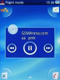
However, this time there are no widgets available on the homescreen, not even a single one. The only thing that is somewhat reminiscent of a widget is the music controls that show up on the homescreen once you minimize the Walkman player.
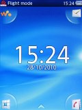
And when the player is switched off, on the homescreen appears a large clock with the date underneath it.
The handy four-corner shortcuts from the X10 mini make an appearance here as well. By default, they take you to the Walkman player, message composer, phonebook and dial pad/call log. You can switch them with any four shortcuts you like though.
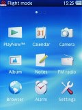
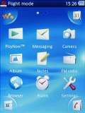
Replacing a four-corner shortcut
At the top of the screen there is a thin strip hosting status info about battery, signal strength and others such as Bluetooth.
Sadly, the Yendo lacks multi-tasking. That’s why there is no task switcher either. What we miss more, however, is the file browser. There is none on board!
The Sony Ericsson Yendo uses a regular feature phone CPU and unfortunately you can feel it throughout the user interface – it’s sluggish all around. We experienced lots of short freeze-ups and we’re generally displeased with how it performs.
Keep in mind that this review is based on a pre-release sample of the Sony Ericsson Yendo so some things (including UI speed) might change until the handset ships to the market in Q1.
Nice phonebook
The Yendo phonebook has space for 1000 contacts and 5000 numbers. It lets you input multiple phone numbers and there are additional fields for email address, address, organisation, ringtone or birthday.
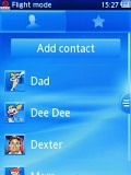


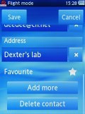
The Yendo phonebook • editing a contact
When viewing a contact, the various details are displayed in sections. Tapping on a given number dials the contact while opting for the envelope icon next to it launches the message editor. Those two buttons fill an entire horizontal row so that they are more thumbable.
Telephony without Smart dialing
The Sony Ericsson Yendo had no issues with reception and the in-call sound was loud and clear.

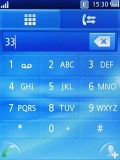
The in-call screen • No Smart dialing
Unfortunately, the device lacks Smart dialing unlike most of the recent Sony Ericson phones. By the way, even the Android-driven Sony Ericsson smartphones haven’t heard of Smart dialing yet.
In the Yendo the call log is a part of the dialer application. You can easily search the entries in it by flick scrolling.
Thanks to the proximity sensor the Sony Ericsson Yendo automatically switches off its touchscreen when you hold it next to your ear for a call. There is no chance of ever hitting an on-screen button with your cheek on this one.
We also ran our traditional loudspeaker test on the Sony Ericsson Yendo. The Yendo scored "Good", meaning you could miss some calls in noisier environments depending on the ringtones you use. More info on the test, as well as other results can be found here.
| Speakerphone test | Voice, dB | Ringing | Overal score | |
| Sony Ericsson XPERIA X10 mini | 65.9 | 66.5 | 67.3 | |
| 66.6 | 66.6 | 69.1 | ||
| Samsung I5700 Galaxy Spica | 66.6 | 62.1 | 75.7 | |
| 66.6 | 66.6 | 75.1 | ||
| 68.7 | 66.6 | 77.5 | ||
| 75.7 | 69.7 | 75.7 | Very good | |
| 75.2 | 75.7 | 85.5 | Excellent |
QWERTY-less messaging
The SMS and MMS messaging section is quite straightforward and simple. When you add multimedia content to the message, it is automatically turned into an MMS.
Moving onto email, the Yendo mail client supports both POP and IMAP inboxes, however, we had to configure it manually. This took us only a few moments, though. The Email app interface is simple and thumbable.
The screen of the Sony Ericsson Yendo as tiny as the device itself so you shouldn’t be surprise hearing that the phone lacks a virtual QWERTY keyboard and since there is no hardware keyboard either, all you get is the on-screen alphanumeric keypad. It certainly won’t please heavy texters but it’s good enough for the occasional use.
Reader comments
- v.m.krish1619@gmail.
- 10 Aug 2012
- X0}
v.v.v...........................bad if u buy this u will good tii up to sony servese center worest but cam clarity is good remaining all are wast
- Honey
- 11 May 2012
- 9Fp
Yendo is the worst of all sony mobile sets. I have 16 sony ericsson sets but among them my yendo is the most worst phone
- Anonymous
- 28 Apr 2012
- tes
Never mind about the pros and cons of the Yendo. The ARTICLE th
