Sony Xperia 10 review
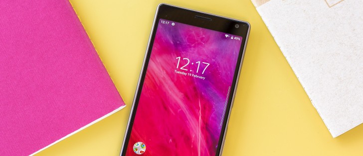
Design and 360-degree view
Having already had the chance to meet the Xperia 10 Plus, the 10's proportions no longer strike us as unusual as much. Dare we say, it's an ordinary looking phone?
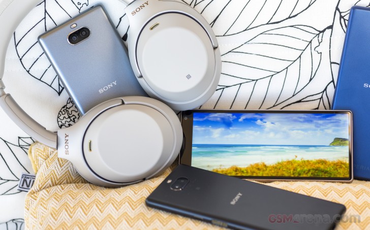
No, that's not really the case. Just because the Xperia 10 is slightly smaller with its 6-inch display versus the Plus's 6.5-inch one doesn't make it any more orthodox. No wonder - it's one of two devices currently on the market with a 21:9 aspect display (the other is obviously the 10 Plus), with the Xperia 1 set to arrive sometime this summer.
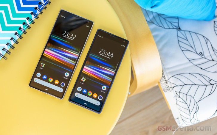
So thanks to the smaller display and the novel aspect, the Xperia 10 is both a really tall phone, and also a compact phone. It's narrower than a Pixel 3 and a Galaxy S10e, so it's easier to reach across to the other side, and it's also easy to slip into a pocket. It will, however, stick out a little from the top of that pocket and likely remind of itself when you're climbing stairs, for example.
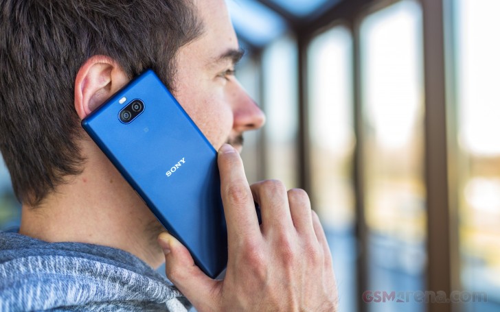
Part of that comes from the fact that in addition to the already elongated display, the Xperia 10 has a sizeable top bezel making the overall proportions even more exaggerated. On a positive note though, because it's that bit smaller, it doesn't have that top-heavy feel of the Plus and you're less likely to feel like it's trying to escape from your hand by diving forward.
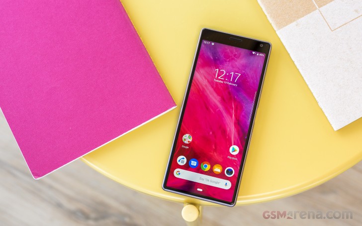
Make no mistake, however - it's just as slippery as the bigger one. The metal finish on the otherwise plastic unibody looks almost like the real deal, but if anything, it's even less grippy than the actual metal-backed alternatives. We had all four colors at the office at one point and, as is often the case, we're leaning towards the blue one as our favorite.
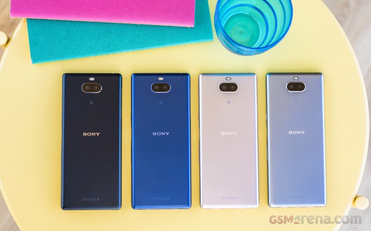
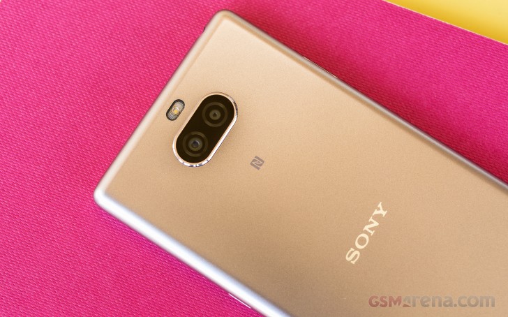
The back is kept clean with the dual camera Wall-E-lookalike assembly sticking out by just a hair - certainly not as much as on the Plus. One can point out that there's both a Sony and an Xperia logo - back in the day it was Sony on the front, Xperia on the back, but there's no longer room on the front.
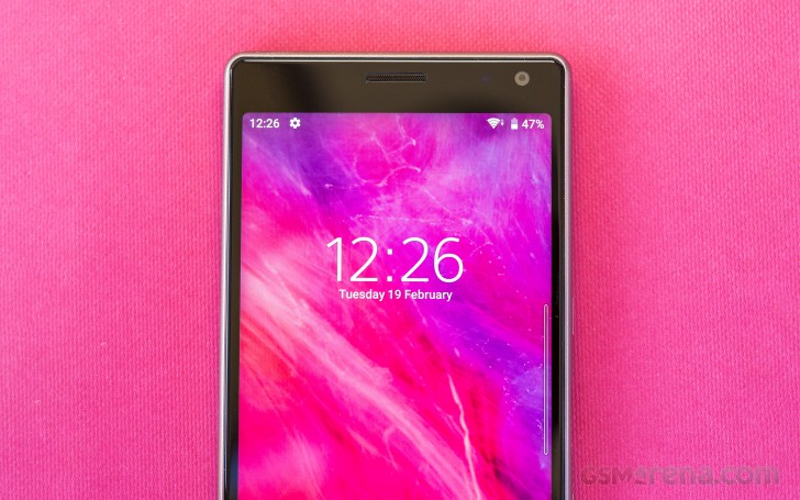
There was no room for the Sony logo on the front as now there's a lot of display there. The 21:9 6-inch panel has minimal bezels on three sides, with more non-display only on top. That means no notches and all of the things we've come to expect to be found in the top bezel - earpiece, selfie camera, ambient light, and proximity sensors, and a notification LED. That could have come off a bit retrograde - we're not against bezelless by any means, and we're not strictly fans of the Xperia's forehead, but let's just call it a reasonable compromise.
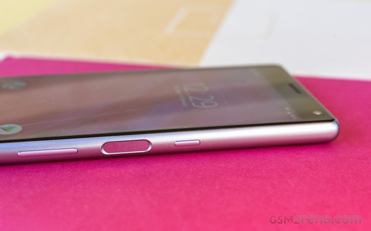
Compromise is what Sony's done with the fingerprint sensor. A legal issue in the US has been leaving US-bound Sonys with no fingerprint recognition on the models where the readers have been on the side within the power button. So the two functions have been decoupled this year, and the Xperia 10 has a separate fingerprint reader a separate power button.
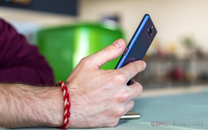
The fingerprint reader works like a charm, it's placed right where it should be and it's not too discriminating about whether you're a right-hand or left-hand user. Perhaps some extra care should be taken when enrolling the left index finger so that you register the right bits of it, but we didn't find it to be an issue.
More unpleasant was our experience with the power button and the volume rocker as both are too small and have little travel and overall mushy click action. And that's in addition to the fact that it's a bit hard to get used to unlocking the phone with the fingerprint reader but locking it by pressing on a different spot which is the power button. Other than that, the placement of the controls makes sense.
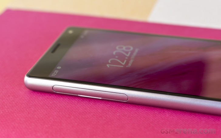
Not quite so with the card slots. We praised the Xperia 10 Plus for its dedicated microSD slot, and we expected to find one on the vanilla 10, but no. You pull out the cover and this would bring out the SIM 1 tray, while the SIM 2/microSD goes into a separate tray. Go figure.
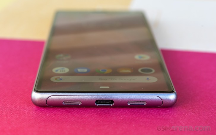
There's not much to figure down on the bottom - the USB-C is in the center with the loudspeaker on the right and the microphone on the left.
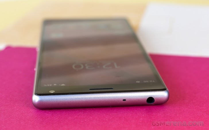
Up top there's a headphone jack and a secondary mic for noise cancellation.
The Xperia 10 measures 155.7 x 68 x 8.4mm, which makes it substantially more compact than potential competitors like the Galaxy A7 (2018), Moto G7, Mi 8 Lite and Huawei P smart 2019, though all of these do indeed have bigger displays. Even so, the Xperia is 5 to 9mm narrower than them, and as tall or shorter, making it an easy choice if pocketability is paramount.
The Xperia 10 is also one of the lighter phones in this group with its 162g, though even the heaviest Moto G7 won't be too big of a burden with its 175g.
Reader comments
- Jyz
- 09 Jan 2024
- N9P
How to unlock Sony xperia 10 if you forget the pin?
- Anonymous
- 11 Mar 2022
- t@g
Because only has 3GB RAM which is too small and Snapdragon 630 which only relies at A53 cores, this is low performance cores, which means snap630 is identical like 4xx not 480 If you want a reliable phone, buy flagship 8xx and UFS, no regret eve...
- Jakeman10
- 13 Jun 2021
- J1W
I have been a Sony fan for many years now, and own/ have owned many Sony products. This phone however does not do the Sony brand justice as it's the worst Sony device I have ever owned (after 2 years of use). Like so many other users, it's ...