Sony Xperia 10 II review
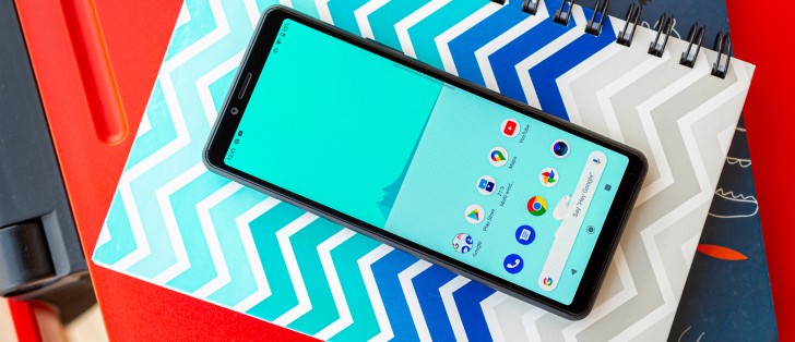
Stock Android 10, with a hint of Xperia customization
Short of one of Google's own Pixel devices, the modern Xperia UI is about as close as you can get to a clean, vanilla Android 10 experience. Sony somehow managed to tone-down the already clean experience from last year's Xperia 1 and Xperia 5 even further.
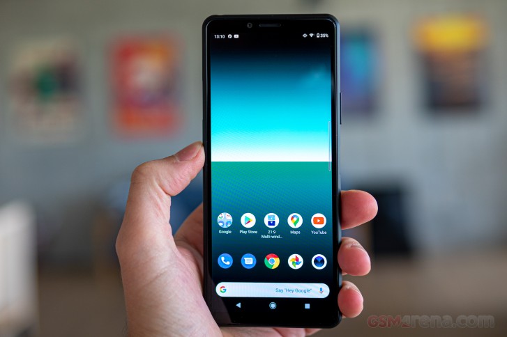
Naturally, the Xperia 10 II comes with all the improvements native to Android 10, like the new two-tier location permission and system-wide Dark theme.


Two-tier location permissions and dark theme
Weirdly enough, the Xperia comes out of the box with the old-school three button nav bar for navigation, though it does offer you the option for gesture navigation. The pill-based method that the previous-gen Xperias used and is still available on Pixels is not an option on the Xperia 10 II, though.
Fingerprint unlock is the only biometric unlock method available and since we found that to work flawlessly we're not lamenting the lack of face unlock. Seeing how there's no dedicated face recognition hardware, a face unlock feature would be less secure than the fingerprint reader anyway.


Gesture navigation • gesture sensitivity • security options
Sony has included more than one thoughtful subtle behavioral tweak in the UI. Especially when it comes to making navigation work properly with various apps. For instance, you can tweak basic gesture navigation sensitivity.
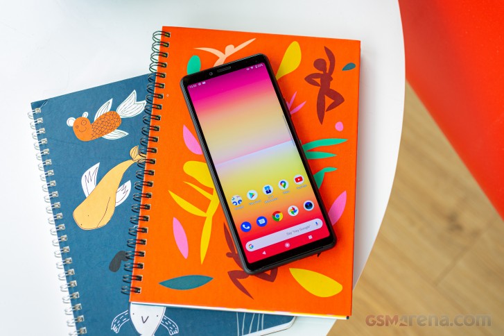
On the flip side, there are very few options in terms of visual customization. You get some static wallpapers and watch styles, and that's about it. In case you were wondering - that Live wallpapers menu from the screenshot has no baked-in options available. It is simply there for convenience once you do install standard Android live wallpapers. Thoughtful!


Very few visual styling options
One small complaint we do have is the overly guided Sony way of presenting things. It takes a good few minutes to initially set up the phone and go through all of the tutorials, settings recommendations, and the additional app wizard. Then, every app or menu you visit for the first time typically has its own little tutorial or "tip" to offer. While we appreciate the novice-friendliness of it all, perhaps the whole system can benefit from an initial "Easy" or "Advanced" mode prompt. Just our two cents.


Setup notifications after the initial setup
The UI basics are identical to what you'd get on Google's own phones.


Lockscreen • Homescreen • Folder view • App drawer • Task switcher • Quick toggles
There are unique Xperia bits on top, however. One-handed mode, for example, lets you shrink the UI to one corner by double-tapping the home button to bring everything within reach. If you go with gesture navigation instead, there is still a convenient-enough toggle in the Side Sense UI.
Sony's Side Sense is present as well. A pair of touch-sensitive areas on either side of the phone enable various actions most of which user-configurable. One particularly powerful and customizable option is the 21:9 pair shortcut feature. Through it, you simply select two apps and the relative location you want to launch them in, and then you can trigger split-screen with the pair instantly.
You can freely drag the Side Sense Ui up and down once open, for optimal convenience. You can even get a smaller version of the app drawer, with all of the apps there. And that's just the tip of the iceberg when it comes to small, thoughtful tweaks and settings for Side Sense.
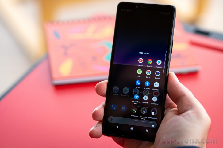
Side sense and Multi-window are technically two separate entities, with separate settings. Their UI's, however, are so intertwined that there is hardly any meaningful distinction. By default, Side Sense has a set of quick toggles and a total of 8 app shortcuts, which are dynamically selected based on behavioral monitoring and patterns. Of course, you can add custom app entries yourself, as well.
The main setting aspect of the multi-window menu is an interface to set up specific app pairs, for quick launching.
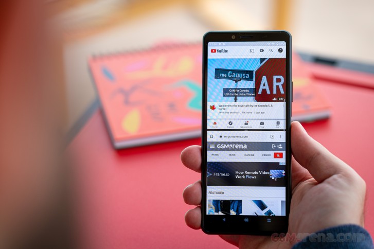
Alternatively, you can evoke Multi-window in several other ways and then just rely on Side Sense suggestions for frequently used app pairs.
We really like how Multi-window actually functions in action. You can quickly swap one of the two apps out for a different one, switch them around and adjust the split. The whole system is responsive, and most modern apps play nicely with it.
Rounding-off Side Sense, we have a very in-depth set of tweaks and settings available. Everything from position, size, look, and sensitivity can be finely-tuned to your liking. You can customize what double-tap, slide up and slide down on the Side Sense bar do freely and even have the entire thing selectively turned-off on a per-app basis. Side Sense is a very versatile feature.
Other than Side Sense, there are a few light Xperia options sprinkled here and there. Most of these housed neatly inside the Xperia Assistant. Battery Care is a particular favorite of ours.


Xperia assistant and various features
And there are a few gestures to customize on a system-wide level as well. Nothing too fancy, but thoughtful-enough to be meaningful on an everyday basis.
Finally, it is worth noting that Sony retired a few of its in-house apps, as well. Gone is the Album app - Sony's in-house gallery, and with it, the image editor. This functionality has been delegated to the Google Photos app now, and that's hardly an issue. The Music app remains, though with ubiquitous streaming apps taking over from offline playback we think its days are probably numbered too.
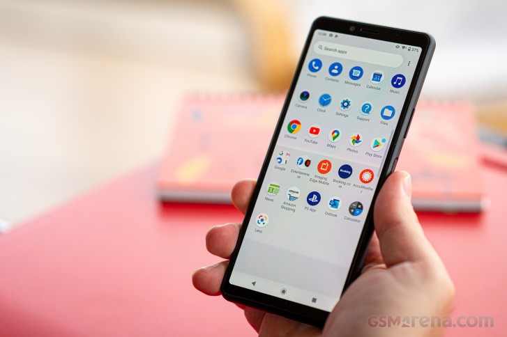
Just in case you were wondering, the feature-rich "Game enhancer", as seen on the Xperia 1 II, is not present on our Xperia 10 II review unit.
Synthetic benchmarks
Raw performance is not the strong suit of the Xperia 10 II. While not necessarily bad in any way, the Snapdragon 665 chipset, powering it, simply had the misfortune to be followed-up, quickly by a lot of development and meaningful competition in the midranger silicon space. It is worth remembering that the Xperia 10 II was announced back in February and is only now coming to the market. That places the RnD cycle for it further in the past, still. Hence, in some sense, we can't really fault Sony for its chipset choice.
Starting with GeekBench and some pure-CPU numbers, we can start to illustrate in number just what we mean when we mention development in the mid-range chipset market, with silicon such as the MediaTek Helio P95 and Snapdragon 765G shifting the bar for performance expectations. Granted, the Snapdragon 730 or 730G, which came out alongside the 665 would have probably stood a better chance in such a crowd.
GeekBench 5.1 (multi-core)
Higher is better
-
OnePlus 7T
2858 -
Samsung Galaxy S10 Lite
2732 -
LG G8 ThinQ
2700 -
Samsung Galaxy Note10 Lite
2027 -
Motorola Edge
1862 -
Xiaomi Redmi K30
1692 -
Oppo Reno3 Pro
1517 -
Sony Xperia 10 II
1413 -
Motorola Moto G8 Power
1394 -
Sony Xperia 10
990
GeekBench 5.1 (single-core)
Higher is better
-
OnePlus 7T
776 -
LG G8 ThinQ
743 -
Samsung Galaxy S10 Lite
738 -
Samsung Galaxy Note10 Lite
688 -
Motorola Edge
586 -
Xiaomi Redmi K30
548 -
Oppo Reno3 Pro
398 -
Sony Xperia 10 II
315 -
Motorola Moto G8 Power
311 -
Sony Xperia 10
179
AnTuTu paints the same overall picture. At least we can see that the Xperia 10 II is outscoring other devices with the same Snapdragon 665 chipset. Seeing how AnTuTu is a more compound benchmark, this is a positive sign about more potent internals inside the Xperia 10 II as a whole, as well as proper optimization on Sony's part to make sure they are getting the most out of the chip.
AnTuTu 8
Higher is better
-
OnePlus 7T
485585 -
Samsung Galaxy S10 Lite
459497 -
LG G8 ThinQ
362730 -
Samsung Galaxy Note10 Lite
341212 -
Motorola Edge
305989 -
Xiaomi Redmi K30
272229 -
Xiaomi Mi Note 10
256717 -
Oppo Reno3 Pro
227810 -
Sony Xperia 10 II
196545 -
Motorola Moto G8 Power
173607 -
Xiaomi Redmi Note 8T
167395 -
Sony Xperia 10
112198
Moving on to GPU figures, we can see the Adreno 610, inside the Snapdragon 665 start to sweat. Even on the lower-intensity OpenGL ES 3.1 test inside GFXBench, we do not see frame rates above the 30 mark. Let alone 60.
Granted, on top of these charts, we have Snapdragon 855+ and 855 ex-flagship devices, skewing the scale, mainly because some of these are now attainable at roughly the Xperia 10 II's price point. If you are after the best possible graphics experience and are willing to live with slightly older hardware, we see no reason not to look in that direction.
GFX 3.0 Manhattan (1080p offscreen)
Higher is better
-
OnePlus 7T
112 -
Samsung Galaxy S10 Lite
100 -
LG G8 ThinQ
90 -
Samsung Galaxy Note10 Lite
79 -
Motorola Edge
50 -
Xiaomi Mi Note 10
41 -
Xiaomi Redmi K30
41 -
Xiaomi Redmi Note 8T
20 -
Sony Xperia 10 II
19 -
Motorola Moto G8 Power
19 -
Sony Xperia 10
13
GFX 3.0 Manhattan (onscreen)
Higher is better
-
Samsung Galaxy S10 Lite
60 -
OnePlus 7T
59 -
Samsung Galaxy Note10 Lite
57 -
LG G8 ThinQ
51 -
Motorola Edge
48 -
Xiaomi Mi Note 10
38 -
Xiaomi Redmi K30
37 -
Motorola Moto G8 Power
18 -
Sony Xperia 10 II
16 -
Xiaomi Redmi Note 8T
16 -
Sony Xperia 10
11
On-screen numbers are particularly interesting here, mainly to illustrate that the extra tall, or rather extra-wide, depending on how you look at it, resolution on the Xperia 10 II is not doing it any favors.
GFX 3.1 Manhattan (1080p offscreen)
Higher is better
-
OnePlus 7T
79 -
Samsung Galaxy S10 Lite
69 -
LG G8 ThinQ
65 -
Samsung Galaxy Note10 Lite
47 -
Motorola Edge
34 -
Xiaomi Mi Note 10
30 -
Xiaomi Redmi K30
30 -
Oppo Reno3 Pro
20 -
Sony Xperia 10 II
13 -
Xiaomi Redmi Note 8T
13 -
Motorola Moto G8 Power
13 -
Sony Xperia 10
9.6
GFX 3.1 Manhattan (onscreen)
Higher is better
-
OnePlus 7T
59 -
Samsung Galaxy S10 Lite
56 -
Samsung Galaxy Note10 Lite
41 -
LG G8 ThinQ
33 -
Motorola Edge
32 -
Xiaomi Mi Note 10
27 -
Xiaomi Redmi K30
27 -
Oppo Reno3 Pro
17 -
Motorola Moto G8 Power
12 -
Xiaomi Redmi Note 8T
11 -
Sony Xperia 10 II
10 -
Sony Xperia 10
7.8
GFX 3.1 Car scene (1080p offscreen)
Higher is better
-
OnePlus 7T
48 -
Samsung Galaxy S10 Lite
43 -
LG G8 ThinQ
40 -
Samsung Galaxy Note10 Lite
29 -
Motorola Edge
19 -
Xiaomi Mi Note 10
17 -
Xiaomi Redmi K30
17 -
Oppo Reno3 Pro
7.3 -
Sony Xperia 10 II
7.1 -
Motorola Moto G8 Power
7.1 -
Xiaomi Redmi Note 8T
7 -
Sony Xperia 10
5.4
Finally, we have some 3D mark numbers for you, as well. It should be noted that these weren't particularly easy to record since the Xperia 10 II ran out of graphical memory and either errored-out or froze on most runs. In much the same fashion, the higher-difficulty Aztec runs within GFXBench never properly finished on the phone either.
3DMark SSE OpenGL ES 3.1 1440p
Higher is better
-
OnePlus 7T
6296 -
Samsung Galaxy S10 Lite
5641 -
LG G8 ThinQ
5254 -
Samsung Galaxy Note10 Lite
4015 -
Motorola Edge
3004 -
Xiaomi Redmi K30
2467 -
Oppo Reno3 Pro
1243 -
Sony Xperia 10 II
1125 -
Sony Xperia 10
820
3DMark SSE Vulkan 1440p
Higher is better
-
OnePlus 7T
5540 -
Samsung Galaxy S10 Lite
4892 -
LG G8 ThinQ
4514 -
Samsung Galaxy Note10 Lite
3706 -
Motorola Edge
2801 -
Xiaomi Redmi K30
2244 -
Oppo Reno3 Pro
1551 -
Sony Xperia 10 II
1121 -
Sony Xperia 10
831
The Xperia 10 II is definitely no record-setter and its Snapdragon 665 chipset is hardly a powerhouse by 2020 standards. If you are after raw performance, you can likely get more for the same money elsewhere. Going for one of the newer mid-ranger chips, or, alternatively, one of the price-depreciated flagships from last year.
However, if gaming is not a major priority for you, we can assure you that the Snapdragon 665, as implemented in the Xperia 10 II does a swell job of running everything perfectly smoothly - whether it is web browsing, popular apps or simply general UI interactions.
Reader comments
- Ram
- 28 Dec 2021
- XQ9
Sony's one of the Best affordable mobile. but amazon website is out of stock in india. im waiting for sony 10 II mobile in india.
- Edda
- 18 Oct 2021
- p}h
Great phone at this price range, but the processor could have been a tad better. But other wise a superb midranger from Sony. The camera is pretty good too.
- Anonymous
- 16 Oct 2021
- gIc
Big fun of Sony! So I have this model the last 6 months and I can say it's pretty good. Today I put it accidentally in the washing machine.. 15 minutes later I realized it was in there.. I didn't want to test if it's water resistant bu...


