Sony Xperia 10 III review
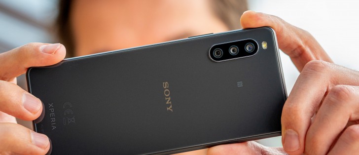
Design
The overall approach of 'if it ain't broke, don't try to fix it' is nowhere more evident than in the Xperia 10 III's physical appearance - it's what your eyes see and what your fingers touch, and both can be fooled it's the same phone, unless you pay attention. That's just as bad as it is good.
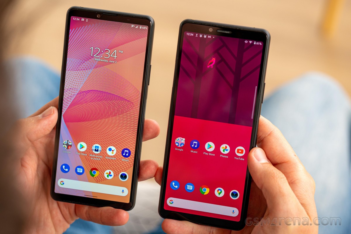 Sony Xperia 10 III (left) next to the Mark 2
We get the principle of continuity and evolution, and brand identity, and all that - the 10 III is clearly an Xperia, and you can spot that from just a passing glance. Flashy designs from other midrangers we've seen recently don't bother much with trying to adhere to a common design language, instead opting to stand out at this very moment, with another, very different-looking handset replacing them in a few months. That's not Sony, and we have a certain respect for Sony for it.
But the thing is, the Mk 3 is barely different from the Mk2, and it's more than 12 months that split the two - some slightly bolder strokes could have livened up the looks a bit.
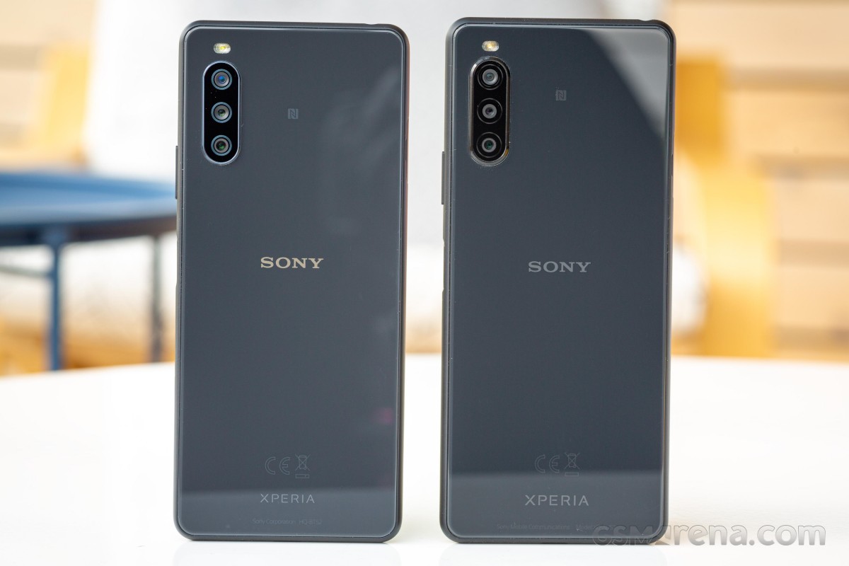 Sony Xperia 10 III (left) next to the Mark 2
That's not to say there aren't changes, even if it may take a while to spot them. The Xperia 10 III has actually shrunk in footprint compared to the last generation - it's a millimeter narrower and three mils shorter and it's one of few handsets in the midrange that can pass for 'compact'.
That's with the display maintaining its size at 6 inches, effectively meaning that it's the bezels that have been trimmed - one area where Xperias have been prone to attracting criticism.
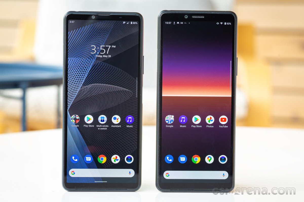 Sony Xperia 10 III (left) next to the Mark 2
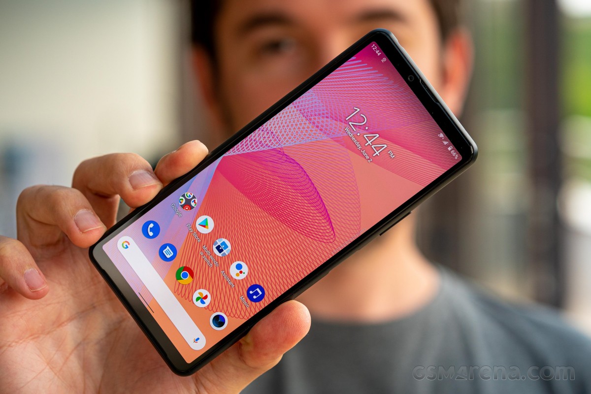
The top bezel is visibly slimmer while maintaining all the functionality of the predecessor. It still houses the selfie camera (so no display cutouts), there are proximity and ambient light sensors, and even an RGB notification LED is still present. The earpiece cutout has been moved off to the edge of the Gorilla Glass 6 panel, but it's still an earpiece only - there's no stereo action going on on the 10 III.
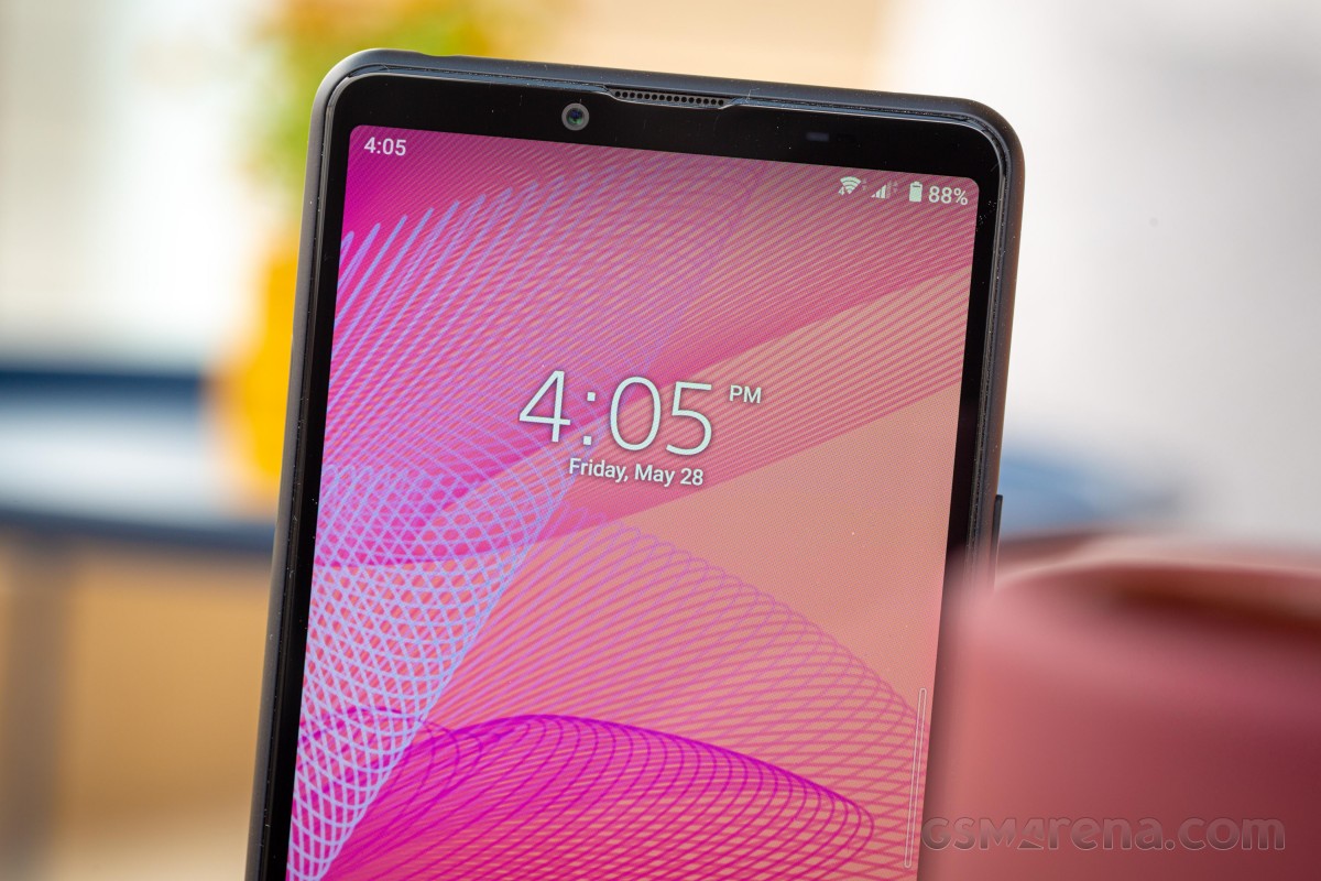
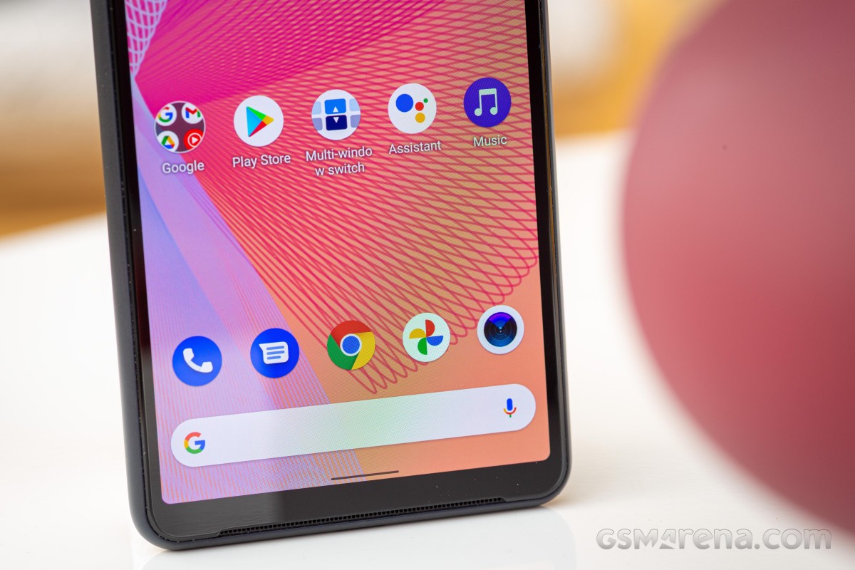
Down below the display, the bezel is again thinner than before, though slightly less so than up top. The single front-firing speaker gets a wide slit where the glass meets the frame, now protected by what is apparently a metal mesh in place of the finer textile one of the old phone.
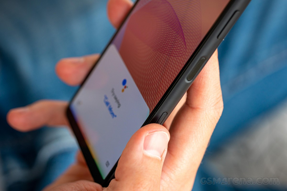
Another minor change can be spotted along the matte polycarbonate frame, though this one has actual functional implications. It's the inclusion of an extra key on the right. Placed about a third of the way up, flush with the frame's outer edge, it gives you direct access to Google Assistant.
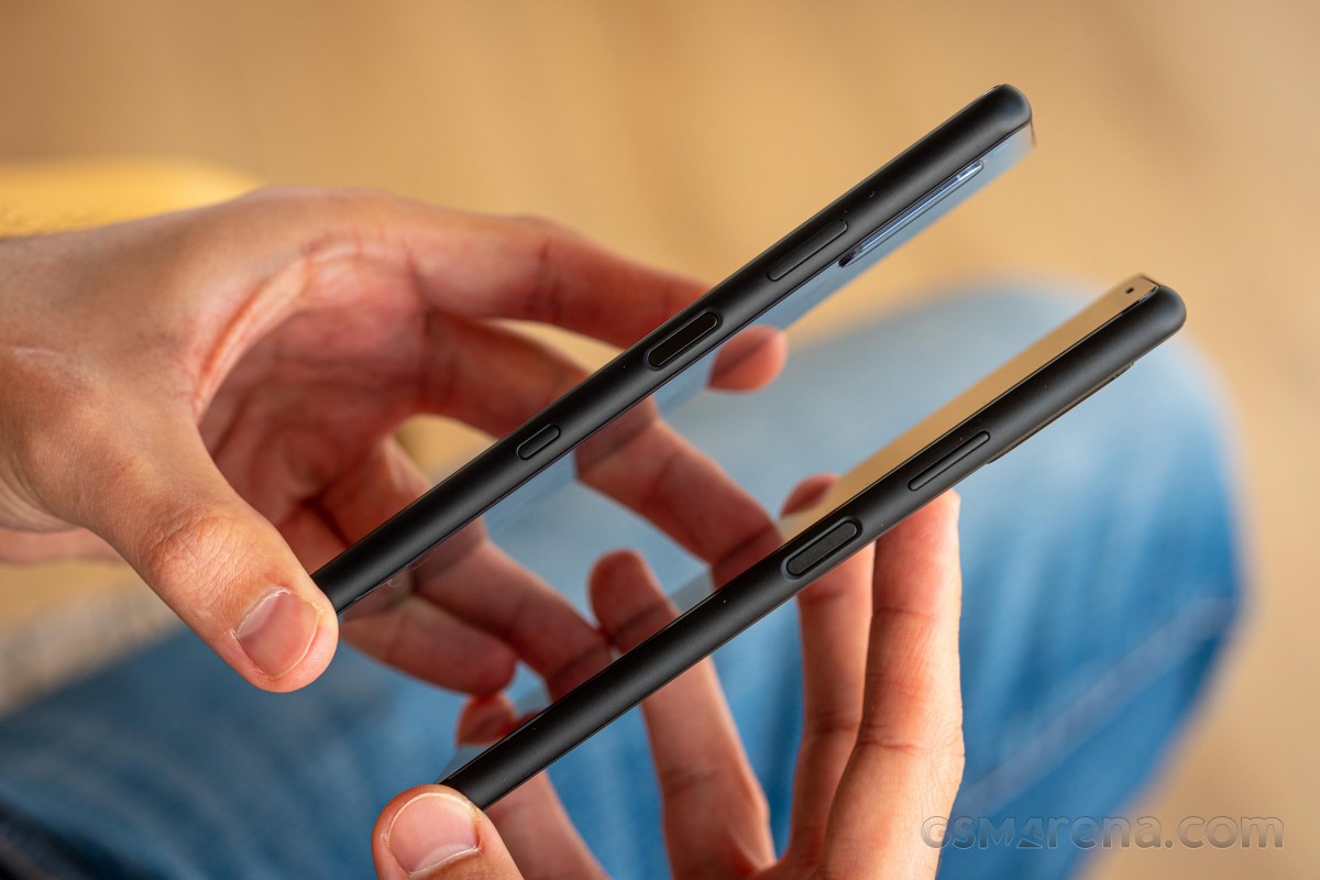 Sony Xperia 10 III (top) next to the Mark 2
The rest of the controls remain unchanged. You get a power button just around the midpoint on the right side with a capacitive fingerprint sensor embedded in it. In contrast to the Google Assistant button, this one is slightly recessed into the frame to help you locate it more easily.
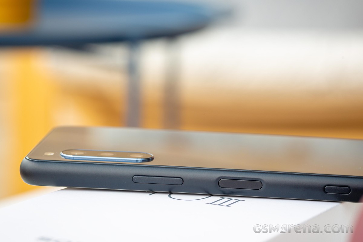
That's not necessarily enough to avoid accidental touches, and you may find yourself locked out of fingerprint recognition if you happen to graze the sensor accidentally in the handling of the phone. Other phones with side-mounted sensors let you set them up so that a press is required to engage the unlocking procedure, but we couldn't find such a setting on the Xperia 10 III - this one is always on and will directly unlock the phone if you touch it with a registered fingertip.
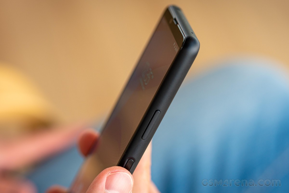
The unlocking procedure is straightforward, and we generally didn't have issues with the Xperia 10 III with either right thumb or left index finger unlocking, though the lefties might score a lower success percentage.
The sensor is also a bit temperamental outside of a plain and simple single unlock. Say you just pressed the power button to lock the phone but a split second later you decide you want to unlock it again - well, it may or may not work and you may need to deliberately move your finger away for that extra bit more time and tap on the sensor again. It's not a huge deal and you probably don't do 10 repeat unlocks just to feel the speed of the process like we happen to.
Above the power button/fingerprint reader combo is the volume rocker, itself unremarkable in its operation - it clicks, volume goes one way or the other. There's no dedicated shutter release button on the Xperia 10 III, but wasn't on either of the previous generation phones, so it's not a surprise. And, before you ask, there's no way to set the Google Assistant key to act as shutter release, but the volume rocker can do that.
On the opposite side of the phone is the card slot. In typical Sony fashion, you can pry out the tray using just your fingernail - no pins needed. The tray can take two cards back to back and those can be two nano SIMs or a nano SIM and a microSD - there's the option for storage expansion, but not if you need two SIMs in at the same time. The tray has a high-vis green gasket to ensure the slot is good for the IP65/68 rating - not that's both water jets and submersion covered (dust too, if flour is your kryptonite).
Down below, there's just the USB-C port and a mic pinhole. Up top, you can find another mic pinhole, and another port - the 3.5mm headphone jack.
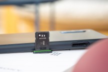
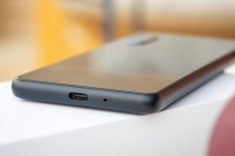
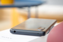
Hybrid microSD slot • USB-C port on the bottom • Headphone jack up top
We left the back for last because, well, it's essentially the same as on the Mk 2. It takes some hair-splitting to come up with the point that with the fractional increase in overall thickness, the camera cluster now sticks out by fractionally less.
This minimalist camera island is, in fact, sort of a feature in 2021, when all sorts of oversized assemblies have been devised to make otherwise mundane setups look more intimidating, particularly on less expensive phones. Could the Xperia 10 III be a trendsetter by sticking with the old?
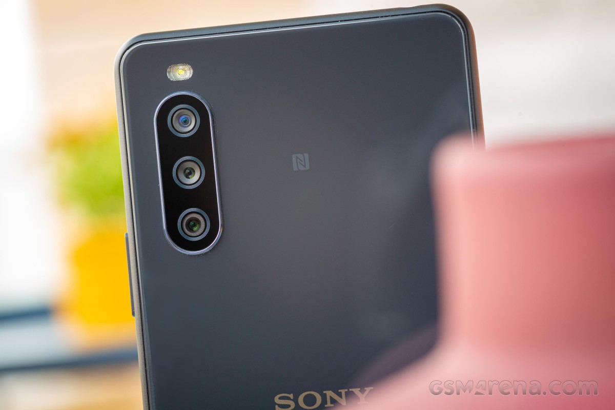
The rear panel is made of Gorilla Glass 6 too, that's no small feat given that, say, the Galaxy S21's back cover is plastic, and the Galaxy S21 is more than twice as expensive as the 10 III. Our black Mk 3 review unit is a different shade than the black of last year's one, a grayer black, if you will. The Sony logo is in a more contrasting color this time, making it pop more, while the Xperia branding has been shrunk a bit. That's about it.
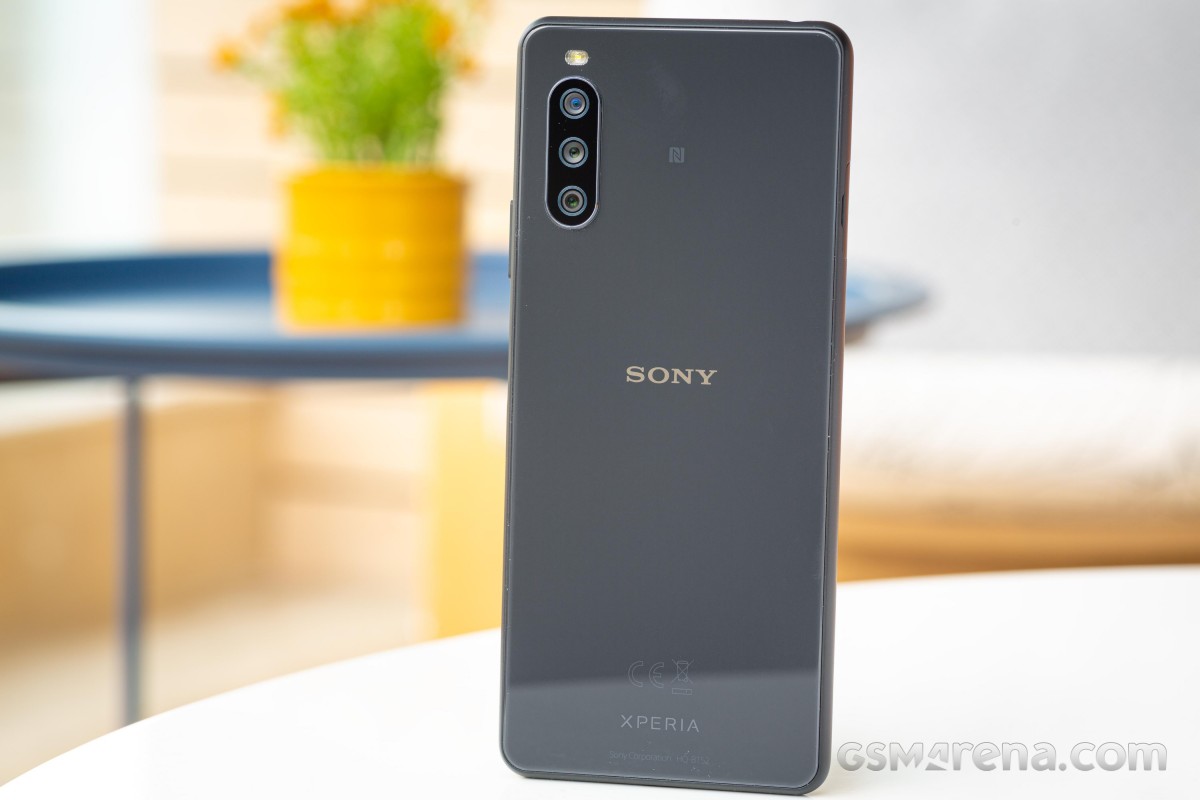
The new phone is indeed slightly heavier - 169g vs. 151g. We'd say that while the difference can be felt when someone points it out to you, the Xperia 10 III weight isn't enough to push it into what you'd call heavy, and in our minds, it remains a lightweight phone.
We'd also dare call it a compact phone, particularly for its market context. That's not all that difficult given that the Xperia's diagonal stands at 6 inches and competitors are in the 6.4-6.7 inch ballpark. The perception is further aided by Sony's push for elongated 21:9 displays that ate slimmer and taller for the same diagonal than competing offers that are typically 20:9. Anyway, this is about as close as you can get to a reasonably sized midranger in 2021.
Reader comments
- Anonymous
- 15 Nov 2024
- bxd
how to enable 5G network in Malaysia??? any workarounds???
- Anonymous
- 05 Oct 2024
- 9h5
Mine is very good and I wish to continue by another one good and bigger than this Experia 10 v1 I want to test this one hop it will be good like Experia 10 111
- Stefan Kazakov
- 14 Nov 2022
- nq6
Disappointed! 1. The phone turns off when overheated by applications, like navigation, especially in the summer. It is unpredictable when it will shut down or turn on. I have bee waiting from minutes to hours to turn on. 2. The battery do not ch...