Sony Xperia 1, 10 Plus, 10, L3 hands-on review
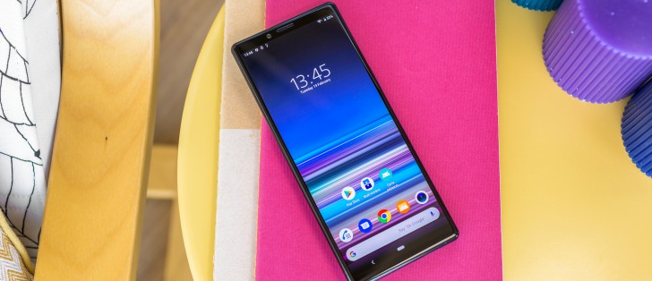
Sony Xperia 1 design
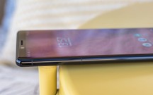
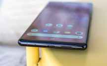
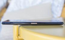
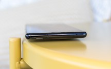
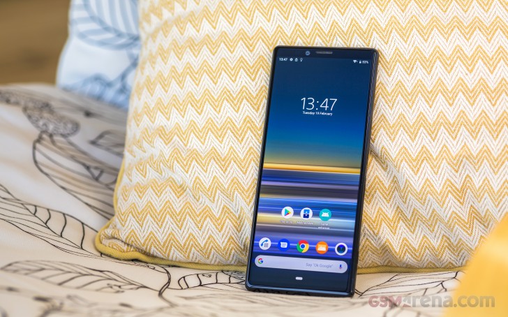
Let us just start by saying the Xperia 1 is a really gorgeous device. Of course, we mean that in pretty typical smartphone terms - a standard metal frame construction, complete with a glass sandwich on both sides. Having said that, Sony really spared to expense in terms of materials and build quality. The metal frame feels really sturdy, despite the fact that it extends 167mm. We felt zero flex in the extra-tall Xperia 1. Still, it is not exactly the most pocketable device out there.
On the other hand, at 72mm wide, it is fairly skinny and thus easy to get a good grip on. Probably a good thing, since the Xperia 1's curved back, as pretty as it is, is amazingly slippery. If you do, unfortunately, end up dropping the Xperia 1, Sony has done everything it can to give you that little extra bit of edge in the fight against gravity.
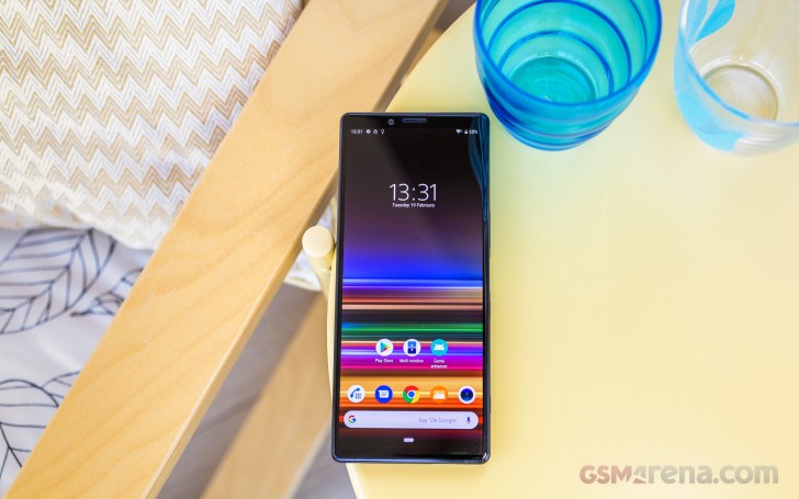
Both faces of the phone are covered by Gorilla Glass 6. Compared to the previous 5th iteration, you can count on increased drop resistance in particular, whereas the scratch protection remains pretty much unchanged.
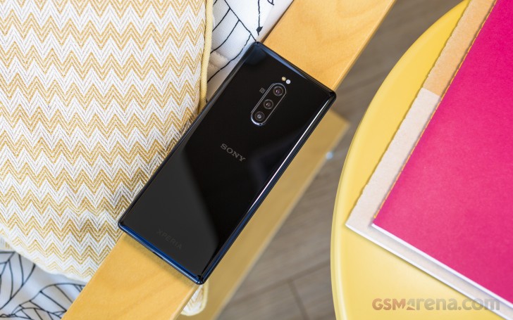
Speaking of protection, the Xperia 1 is certified for IP65/IP68 water and dust resistance. Still carrying a certain memory of IP rating scandals from long long ago, Sony is now pretty descriptive when it comes to this stuff and says that you can confidently splash water on the Xperia 1 or even clean it under the tap. Just make sure not to purposefully submerge it fully in water. Also, be especially mindful when closing the SIM card tray. And salt water, as always, is a real bad idea. Pretty standard ruler to follow with modern IP rated devices.
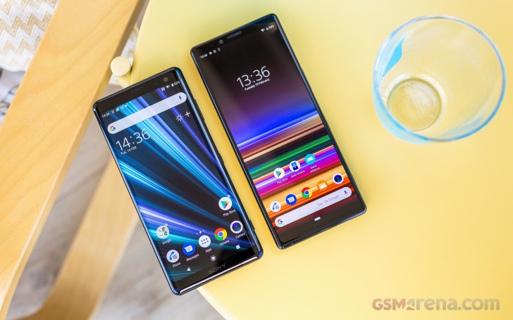
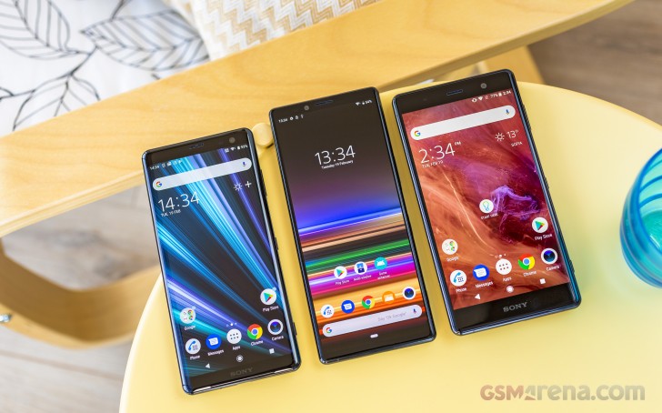 Xperia XZ3 * Xperia 1 * Xperia XZ2 Premium (left to right)
Speaking of ingress protection, the Xperia 10 and 10 Plus, which we had the pleasure of handling as well will have an optional official Style Cover Solid case which Sony has rated for MIL-STD-810G-516.7 durability. We aren't sure whether such an accessory will be available for the Xperia 1 as well, but we would just hate to see its gorgeous chassis be covered up. Sony's new design really is a thing of beauty and you even get a fair selection of color options to choose from: Black, Purple, Grey and White.
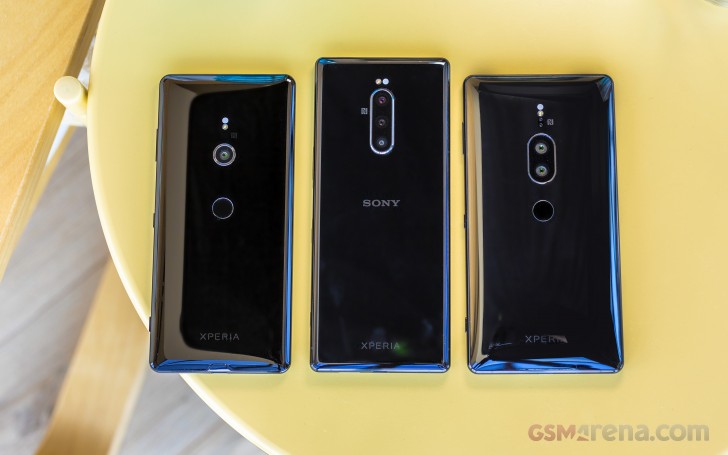 Xperia XZ3 * Xperia 1 * Xperia XZ2 Premium (left to right)
Overall, we have a noticeable tall and skinny device, but one with a very good feel in the hand. Again, we can probably describe it best as different and quite a bit experimental. This is clearly no the "Ambient Flow" language we have grown accustomed to in one form or another. A fact probably most apparent from the front of the phone.
Although not entirely edge-to-edge, the side bezels around the 6.5" panel are really thin. The same goes for the bottom chin. Sony is clearly using some wrap-around control board technique to accommodate the electronics for the display. If you ask us, this is probably as small as we would like to see a chin on a device, especially one this big. Having it smaller or even completely gone would traditionally place the Android navigation way too far for a comfortable reach. Nothing that clever UI design can't fix. But only up to the point when you encounter a misbehaving legacy app of some sorts.
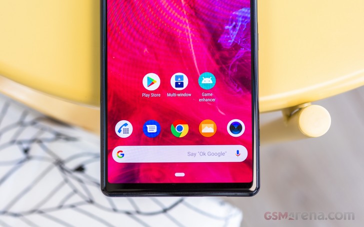
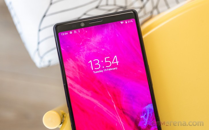
The "forehead", if you will, above the panel is also fairly slim. Unlike the chin, however, this feels like a slightly bitter-sweet thing to celebrate, since it goes hand in hand with a lack of any kind of advanced biometric or facial scanning hardware. Furthermore, compared with the likes of the Xperia XZ2 Premium or XZ3, the selfie camera has clearly taken a hit in raw specs. It is now an 8MP unit, compared to 13MP on the aforementioned devices, with a fairly small 1.4+ sensor, behind an f/2.0 lens. Not exactly in line to win any selfie contests. What we are getting at here is that lack of room could have attributed to the selfie downgrade.
To finish off the hardware tour and our initial impressions of it, we should mention the controls. We admit that the huge 21:9 panel diverted our attention away from this for some time, but the side-mounted fingerprint reader is no small revelation in itself.
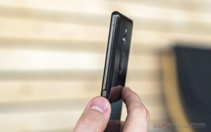
A throwback to older Sony design if we ever saw one. This sensor in particular is really accurate and very snappy. Plus, we really enjoy its location. Without going too deep into legal particulars, some of you might remember that Sony had certain patent issues regarding its side-mounted fingerprint reader/power button combo. Apparently getting around that was at least part of the motivation to separate the power button. On the Xperia 1 you can find a dedicated power clicker underneath the fingerprint reader.
However, since the latter is always-on and definitely better positioned on the tall side bezel, you can simply use it on a daily basis to wake up and unlock the phone.
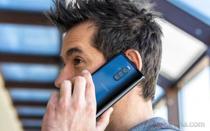
The rest of the control scheme is pretty self-explanatory. The only thing we will note is that despite its appearance, there is more than one speaker on the Xperia 1. The bottom one is clearly visible. The other channel is handled by the earpiece, so it is technically a hybrid setup. Even so, it left us with pretty good initial impressions. Dolby Atmos, along with a slew of other Sony audio technologies is clearly doing a good job here.
Display
The 6.5", 4K OLED, HDR panel on the Xperia 1 is nothing short of stunning. Like we already, Sony has managed to claim a "world first" here by combining 4K resolution and OLED. All the other tech sprinkled on top beyond that only sweetens the deal further and makes for an even more one-of-a-kind offer. Sony has even coined a marketing brand for this high-end panel, referring to it as CinemaWide.
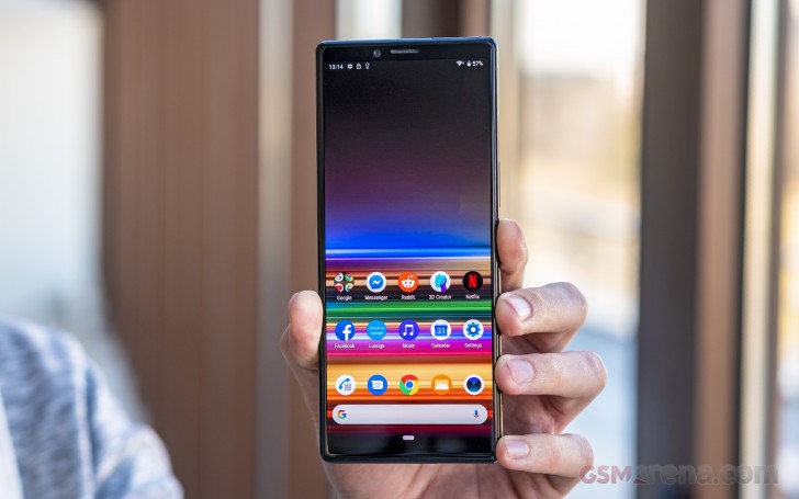
Going into more particulars, the resolution you are actually getting on the Xperia 1 is 1644 x 3840 pixels. On the 6.5" diagonal this makes for a crispy 420ppi density rating. All pretty great stuff. To be perfectly fair, though, just like an ultra-wide PC monitor or a cinema screen, for that matter, this aspect tends to come off as way too "short" for productivity in landscape mode. To be frank, there is some truth to this on the Xperia 1. Keep in mind that for good practical and especially battery endurance reasons, you are not going to get the full native panel resolution in most regular use cases throughout the UI. That only triggers automatically when compatible content is displayed on screen. That does limit the number of pixels you get in one dimension rather disproportionally.
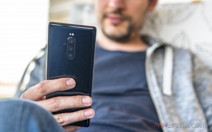
Luckily, though, the benefits of 21:9 seem to outweigh its shortcomings. Like we mentioned earlier, most of what we tend to do on a smartphone is scroll through long vertical content - lists or otherwise. On such a tall display that's a truly great experience.
Sony made sure to sprinkle some visual extras on top of the already impressive OLED panel as well. One being HDR certification. In keeping with the company's track record, the certification in question here is BT.2020, which is arguably a bit more versatile than HDR10. And while the panel is not truly 10-bit, but rather the more typical 8+2 bit variety, contrast, local dimming, gradients all looks spectacular, given the right content.
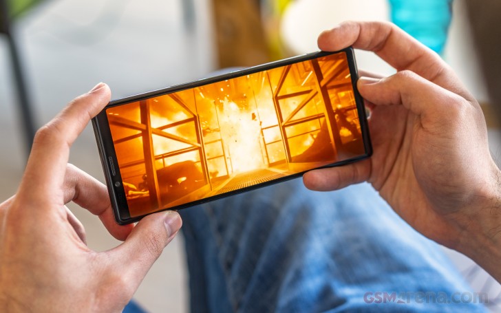
Speaking of which, there is already plenty of 21:9 content out there. YouTube has a bunch and so do streaming services like Amazon's video offerings and Netflix. The latter, especially, has a vast library of movies and Sony is currently busy working closely to make sure Netflix works great on the Xperia 1.
In case you are wondering, there are a few parts necessary for an ultimate experience. These mostly have to do with communication between the app and the Netflix platform so that you get the right stream. In this case a 21:9, HDR version (when available).
And speaking of right content and properly viewing and enjoying it, there is yet another interesting "sprinkle" on top of the Xperia 1's gorgeous panel, which Sony calls "Creator mode". What it is is a new system-wide color setting, which currently co-exists with "Standard" and "Super-vivid" mode. While in it, the Xperia X1 tries its best to display accurate colors, as close to the ones intended by the content creator as possible. The display itself supports wide color space ITU-R BT.2020m as well as DCI P3 and Illuminant D65. Of course, the source you are watching has to be encoded with the proper color info to take advantage of the feature. This is where Netflix comes into play once again.
Another way to leverage and experience "Creator mode" is by capturing cinematic video on the Xperia 1 itself. We'll get further in-depth in the camera section, but Sony has been working hard together with its acclaimed "Alpha" professional camera division to craft a powerful "Cinema Pro" video recording app, complete with support for a wide selection of pro color spaces to record in.
The Xperia 1 also has the proprietary X1 for mobile engine running in the background, optimising content that is not natively created for the high contrast and color pallete of the panel. It is tech borrowed from the company's BRAVIA TV line and even works dynamically on streamed content.
Last, but not least, we feel like a few words are necessary on the topic of gaming. Ultra-wide gaming is definitely a thing in the PC realm. A glorious experience, we may add. The same goes for the gaming on the Xperia 1. When it works right, the extra field of view you get to enjoy makes a huge difference in immersion and can even potentially provide a competitive edge in some cases.
However, just like its PC counterpart, ultra-wide screen gaming on Android is littered with challenges, mostly having to do with compatibility. If a game is made correctly and scales properly it's a glorious experience. Sony is currently working with creators to optimise a few titles in particular, including Fortnite, Asphalt 9, Arena of Valor. Hopefully the list will expand in the future. Beyond that, it's going to be a hit or miss affair with pre-existing games. Some refuse to scale beyond 16:9, others do it poorly. Certain ones already behave correctly.
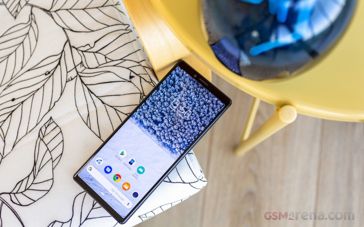
Taking the observation one step further, you are likely to run into similar issues with other applications as well. Sure, Android can force an up-scale on older, non-optimised apps, but that can sometimes look funky or even break certain apps. But, none of this is intrinsically Sony's fault. Rather, it's an ongoing Android-wide ecosystem struggle. The Xperia X1 simply gets to experience some extreme cases of bad compatibility with its 21:9 aspect.
Reader comments
- Grimlen
- 03 Jun 2019
- rRU
Wow what a phone hands down
- DantE O2
- 31 May 2019
- a3p
you can't delete my comment cause i mentioned your mistake guys, for a device to be labeled as 4k/QHD/FHD/HD we should look at "vertical" pixels not horizontal pixels , this is an elementary term in resolution topics. so if a device doesn't ha...
- DantE O2
- 30 May 2019
- a32
6.5 in 21:9 is equal to having a 5.2 display in 16:9 and having it's up and down stretched
