Sony Xperia 1 II review
Design
Sony being Sony, the Xperia lineup has been pretty consistent in their designs. The Xperia 1 II continues on Sony's path of defying prevailing trends but still manages to look modern.
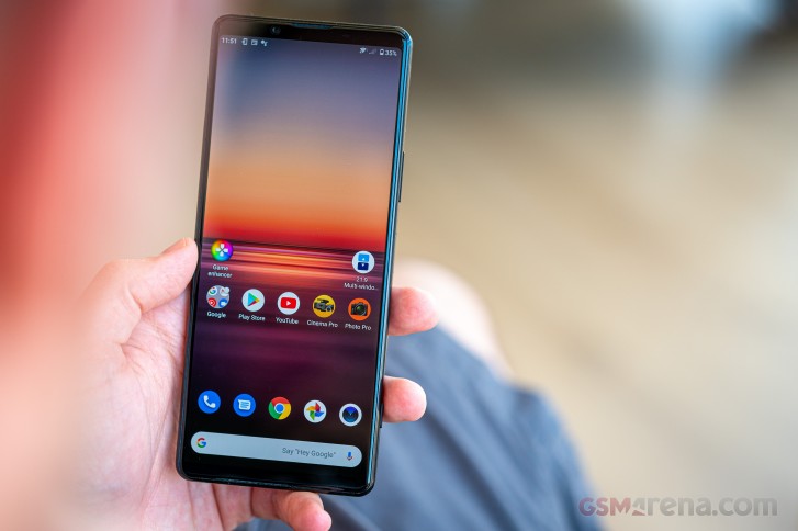
It's a boxy rectangle - the corners are barely rounded and there are no sweeping curves. The completely flat front and back proceed along the technical no-nonsense course.
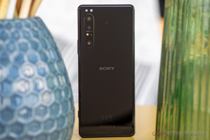
However, the defining design element has to be the exposed flat aluminum frame. In a world of ever shrinking bezels and waterfall displays eating into the frame, the Xperia 1 II offers an alternative. The frame grips nicely despite the glossy finish and lets you easily pick up the handset off a table while also feeling very secure in hand.
One slight con to this shape is that the frame does tend to show fingerprints more than what your average Galaxy would - there's simply a lot more area to welcome and display finger grease. It's hardly an issue all in itself, particularly since the glass back itself is inevitably going to get smudged up too.
It's made of Gorilla Glass 6, that back panel, and the display too is protected with Corning's latest. The phone is IP68 rated for dust and water resistance as most other current flagships. As is the norm with Sonys, it also covers the IPx5 portion of the standard. So not only should it survive immersion, but also stands a chance against water jets - something rivals don't typically test for (or at least advertise).
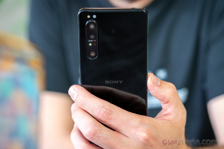
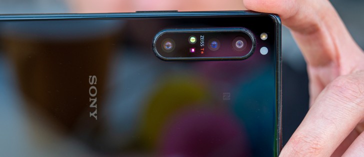
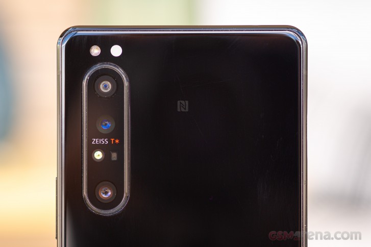
It's a busy camera cluster in the top left corner. Three actual cameras and a 3D ToF emitter-receiver pair are grouped together behind a shared glass that sticks out by a good 1.4mm. Yes, it does make the phone wobble on a table. It still couldn't fit all the camera related bits and the single LED flash and the IR light temperature sensor ended up above the camera bump.
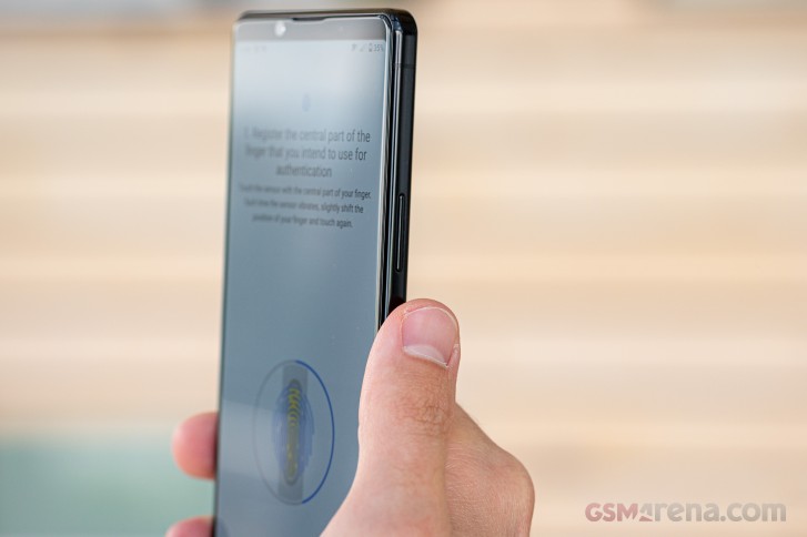
For all the areas you want to keep free of fingerprints, the Xperia 1 II does have a portion of its right side dedicated specifically to fingerprint collection - the capacitive fingerprint reader. In a decisive step in the right direction, it's now housed in the power button, where it should be and where it was on a number of older Xperias. Sony decoupled the two functions in the Xperia 1 and Xperia 5 in order to be able to offer fingerprint recognition in the States, as a patent clash reportedly prevented them from doing so with previous two-in-one designs. All is well now, apparently.
The fingerprint reader/power button is located almost precisely at the midpoint and is easily accessible with either the right thumb or the left index finger. We experienced no appreciable difference in unlock speed or reliability with either hand despite the slightly more awkward left hand action - left hand users shouldn't worry that their fingerprint unlock experience will be compromised.
The volume rocker is above the power button on the same side of the phone and it too clicks nicely.
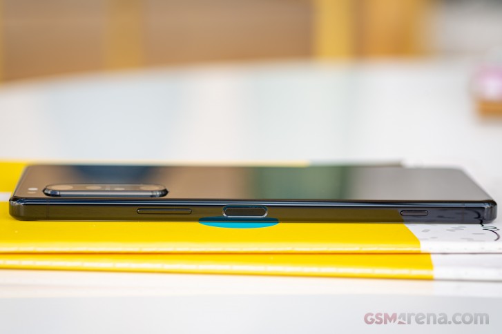
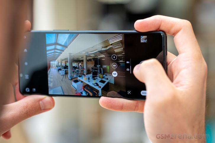
A staple of Sony smartphone design and a key element in the whole 'this smartphone is a camera' concept that the Xperia 1 II adheres to is the two-stage shutter release button towards the bottom end of the Xperia's right side. It has a well-defined half-press position and can also be used to directly launch the camera from standby. Perhaps making it bigger would have added to its usability, though we're also not entirely convinced it's at all needed in the first place.
The opposite side of the phone is home to the card tray only. Sony is one of few holdouts left that allow you to open the tray with a fingernail as opposed to forcing you to use a pin to eject it and we can't say we don't appreciate it. Perhaps an even bigger deal is the fact that the Xperia 1 II doesn't restart when you take out the tray or put it back in as most other Sonys notoriously used to. The tray on our review unit accepts two nano SIMs or a nano SIM and a microSD. Single SIM variants will keep the microSD slot, it just won't be able to accept a second SIM.
In a truly remarkable turn of events, the Xperia 1 II arrives geared with the good old 3.5mm headphone jack. Sony's the first maker to reintroduce the feature on a top-shelf device after removing it on the XZ2 in 2018 as part of one of the dumber industry trends in recent years. It's on the top plate of the phone and we can imagine some people complaining it's not on the bottom, but hey - let's just be happy we have it at all. A mic pinhole keeps the jack company up top.
The USB-C port is on the bottom joined by another mic.
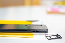
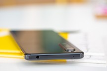
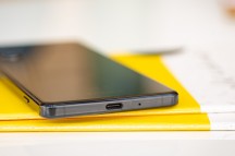
Card tray • Headphone jack up top • USB-C port on the bottom
Where are the speakers then? Well, on the front, of course, where they make the most sense. There's a thin slit on each end of the display glass and a speaker fires from both of them. The top one obviously doubles as an earpiece for voice calls. Sony is keen to point out the superiority of such an arrangement to the other approach of a bottom firing main speaker and a front-facing earpiece/second speaker. It's kind of self-evident though, isn't it? The speakers themselves are also supposedly bigger so we can't wait to check them out in our new speaker test.
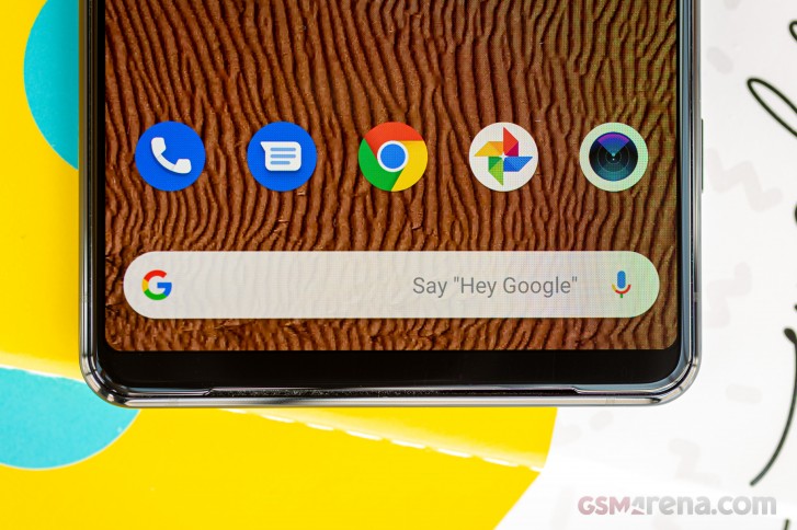
Another thing that will please a certain audience is the presence of an RGB status LED in the top right corner of the phone. A universally available feature back in the day, this little notification light has gone missing on pretty much all high-end phones. Well, the Xperia 1 II has it.
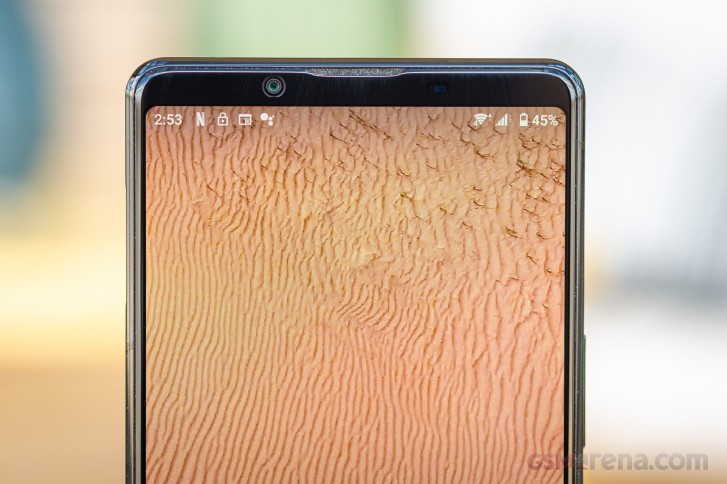
We're circling back to the traditional yet contemporary theme to mention that the Xperia 1 II still has no notch, instead keeping the selfie camera in the top bezel. While that means the Xperia's got more meat above the display than its rivals, it also allows for an uninterrupted viewing area, which is hardly a bad thing. And the 1 II has shaved off a couple of millimeters of height compared to the 1 I, so Sony has indeed made some effort in improving the otherwise mostly unchanged design.
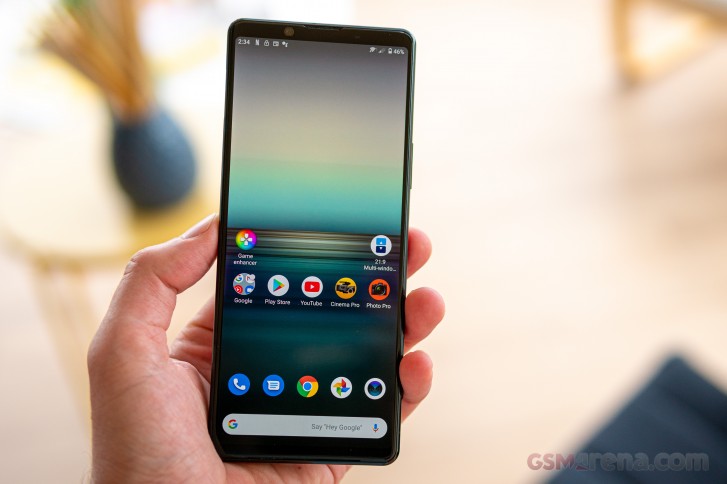
The Xperia 1 II measures 165.1x71.1x7.6mm and it's unquestionably a tall phone - it's 3mm taller than the Galaxy S20+ and less than 2mm shorter than the Ultra. Thanks to a combination of a more elongated aspect ratio, the flat sides, the thinness and relatively low weight, the latest Sony manages to remain feeling compact for a 6.5-inch full-fledged flagship.
Reader comments
- Gops
- 21 Dec 2024
- 7kj
Hey u can see difference clearly With any satsung flagship or chappal flagship phones Download a 4k movie and play simultaneously which looks clear And without any Motion blur Then u can see the difference dont go on colous the movie looks very Nice ...
- Anonymous
- 15 Oct 2024
- Dkr
sony xperia 1 ii have x reality engine & Triluminos display ?
- Anonymous
- 16 Mar 2024
- tDS
yeah just copy and save the 4K video on your phone, easy as a piece of cake, any newer phone can play 4K even in FHD, Technically Normal Eyes could not see difference 4K video in FHD or 4K Phone display but only very Keen Eyes can see the difference,...