Sony Xperia 1 IV review
Design, build, handling
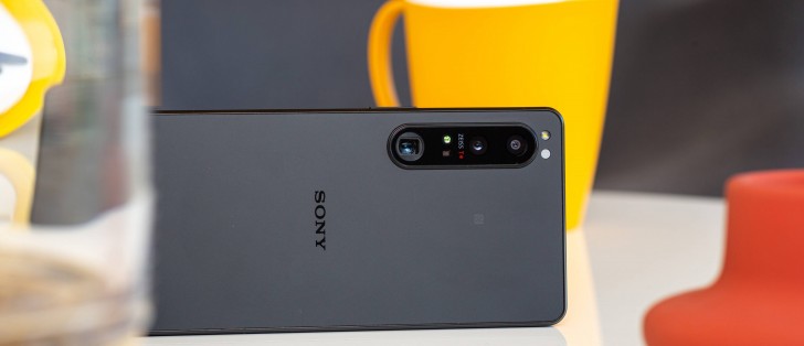
The Sony Xperia 1 IV improves the timeless design established a few generations ago. The new flagship now features two flat Gorilla Glass Victus panels sandwiching an aluminum frame. One notable change over the Xperia III is the matte finish on the rear panel for all color versions.
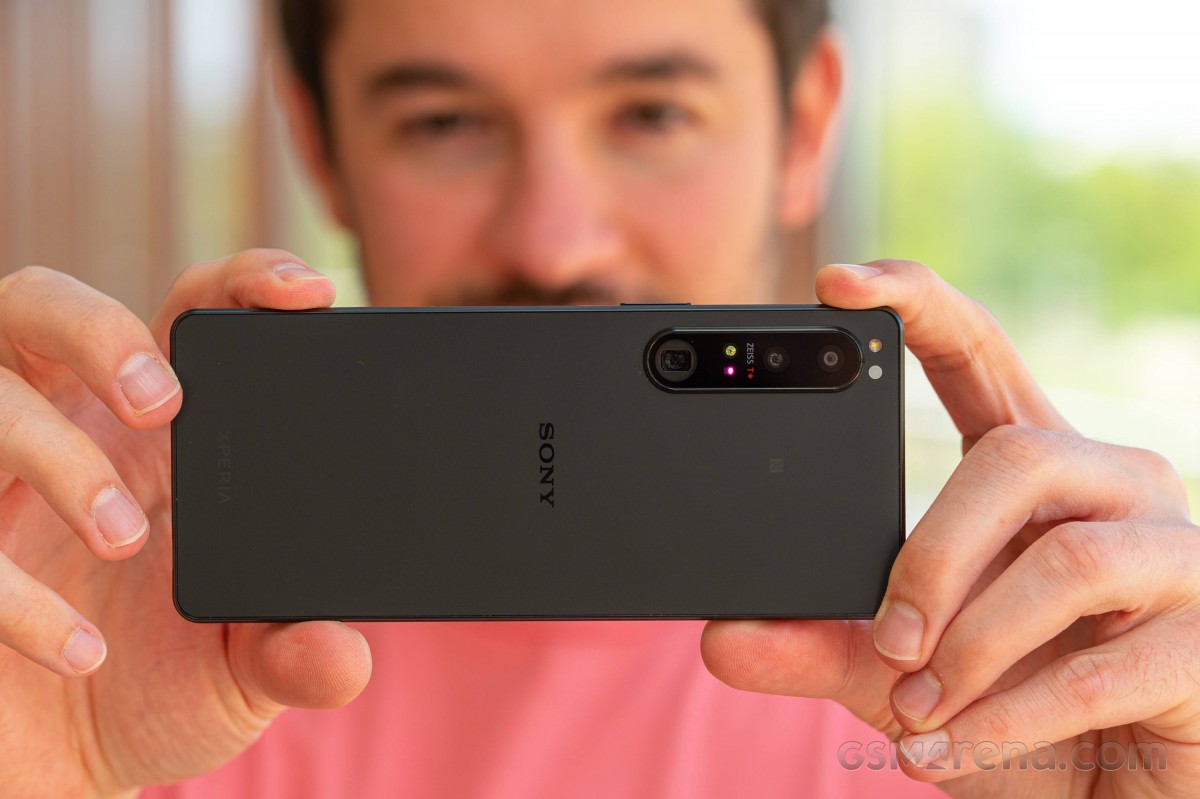
While some people might be frustrated by the lack of visual change for the Xperia headliner, we cannot but appreciate that Sony has found its footing and is improving each year instead of redesigning elements for the sake of recognition and standout.
But design has never been all about novelties, and Sony knows that best. The iconic tall and slim shape is back, with an all-matte back panel and frame. The camera island, while containing some new and innovative lenses with moving parts, is still the same as before and packs the usual Zeiss T* insignia.
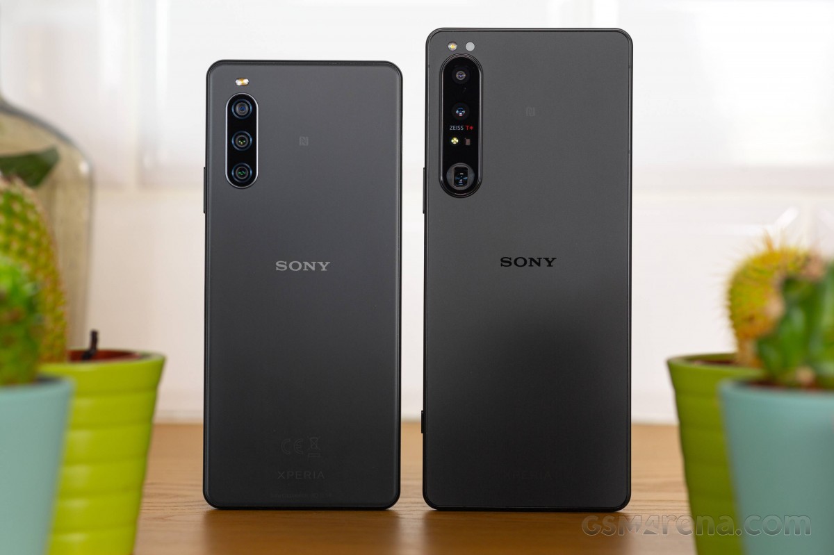 Xperia 10 IV and Xperia 1 IV
We appreciate the dual-glass Victus protection - currently the most shatter-proofed smartphone glass. And, of course, the Xperia 1 IV has the same ingress protection as its ancestors - IP65/IP68 for both water jets (the IPx5) and clean water submersion (IPx8).
The Xperia I IV is as compact and lightweight as the Xperia 1 III, and it looks the same. But there are differences like SIM tray placement and power key size. We'll get to those in a bit.
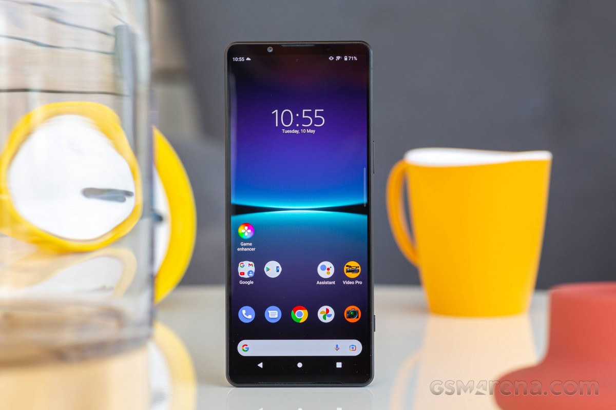
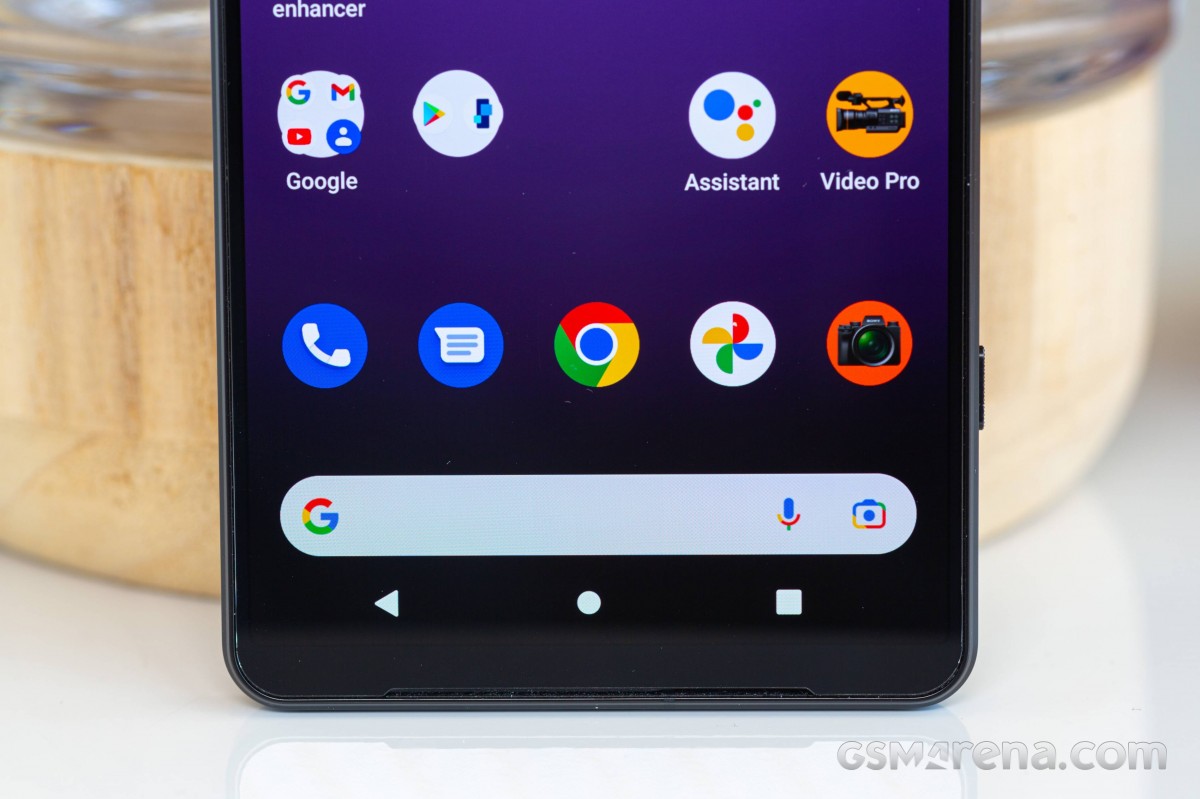
Let's start our tour with the front side - here, you can see the 6.5" 4K OLED screen free of any cutouts. The display has impressively thin side bezels and reasonable top and bottom ones. The panel has been updated with higher brightness, though it remains virtually the same 4K HDR 120Hz screen we saw on the Xperia 1 III.
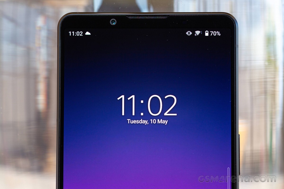
Above the 4K display is the improved 12MP selfie camera, a notable update over the old 8MP selfie that has long overstayed its welcome. There is a bunch of sensors hidden in this bezel, including a proper proximity one. Oh, and there is a small notification LED, something that you'd probably find only on Sony phones these days.
The top speaker is also here, and it doubles as an earpiece. The bottom speaker is symmetrically placed below the screen, and both are front-facing as usual - a guarantee for proper balance and immersive experience. This front-firing setup is also quite rare among smartphones, and Sony is one of the few makers consistently offering it. And it has allegedly been updated compared to the Xperia 1 III with a 10% loudness increase and up to 50% deeper bass.
The matte black rear panel is not prone to smudges, and it looks as no-nonsense as possible in spite of the pro camera setup it contains. Its flat anti-glare surface is lovely, and this stylish Xperia can easily fit in every official meeting or event; no dress-up needed.
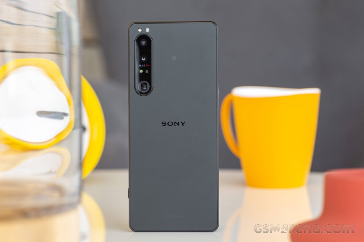
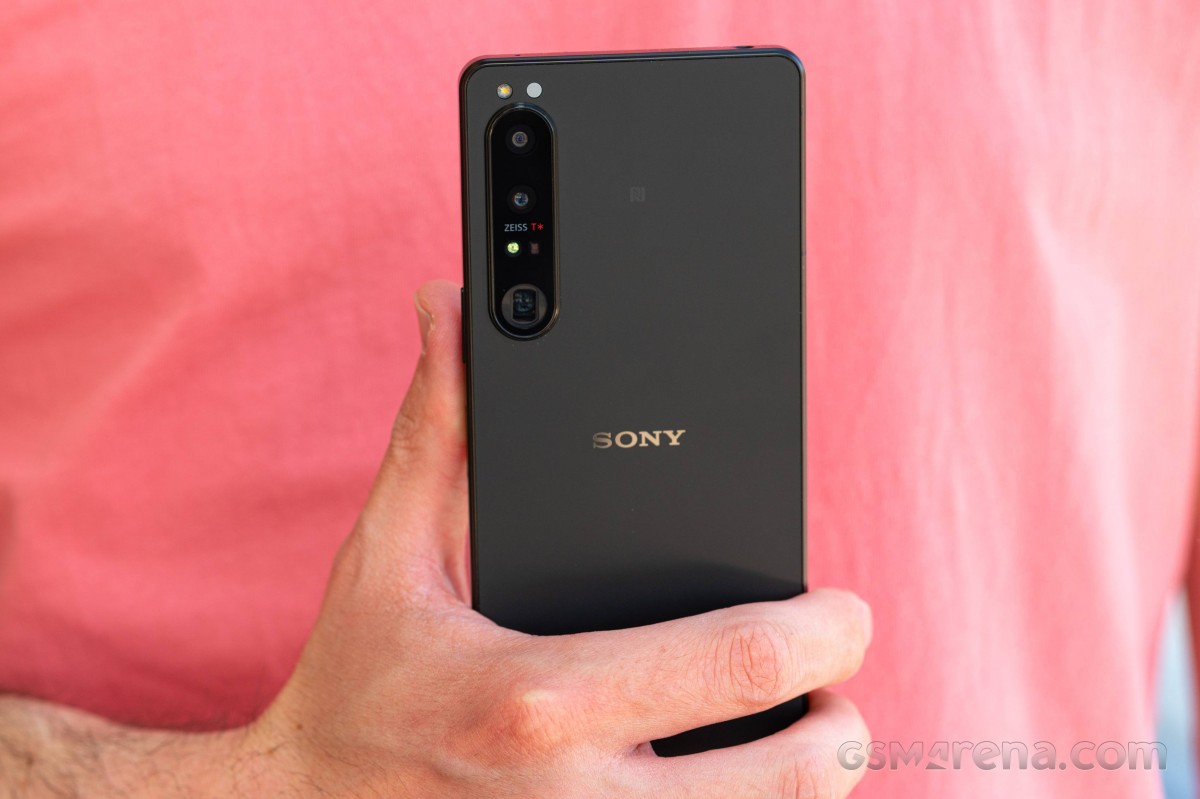
The glass camera holder is jutting out of the back and has a surrounding metal frame. It contains (top to bottom) the 12MP ultrawide, the 12MP primary, the ToF, and the 12MP zoom cameras. The last one is not actually visible; we can only see the end of the periscopic zoom lens here.
Above the camera island and flush with the back are the LED flash and the RGB color sensor for improved white balance and color accuracy across all cameras.
And now, let's look around the sides of the Xperia 1 IV. The phone has a flat metal frame with barely visible chamfers. The frame is also with a matte finish, though not as fingerprint resistant as the back. The good news, though, is that it provides for a secure grip and an overall excellent handling experience.
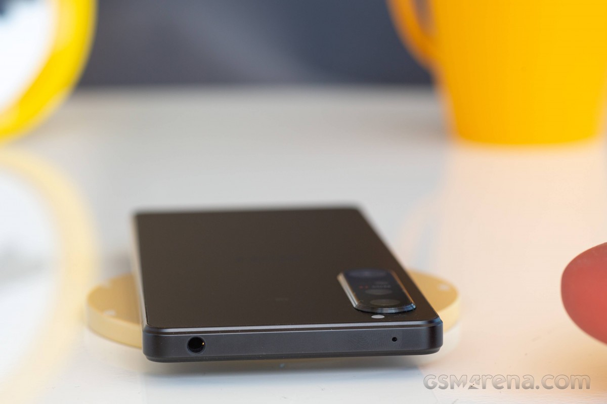
The top of the Xperia 1 IV has a 3.5mm jack and one of the microphones.
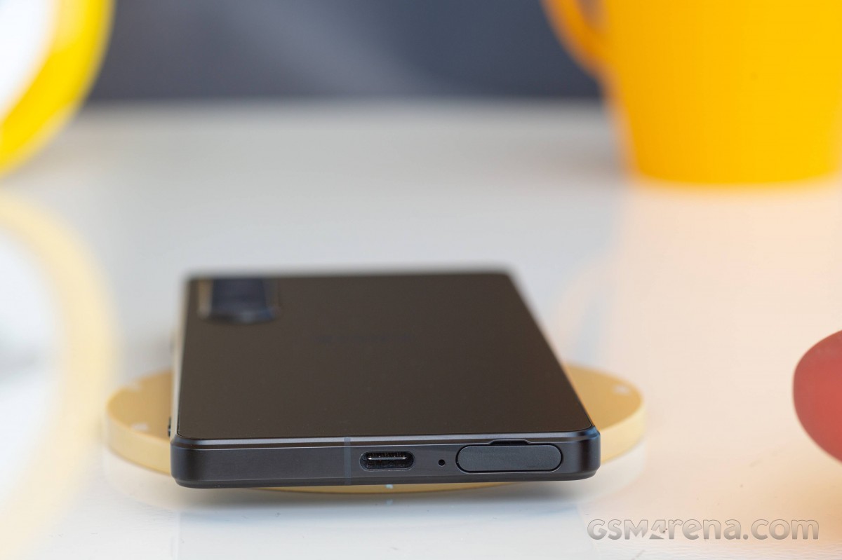
The bottom has the primary mic, the USB-C port, and the hybrid-SIM tray. You don't need a pin to eject the tray, unlike most modern phones - the tip of your nail has always been enough to open it on Xperia phones.
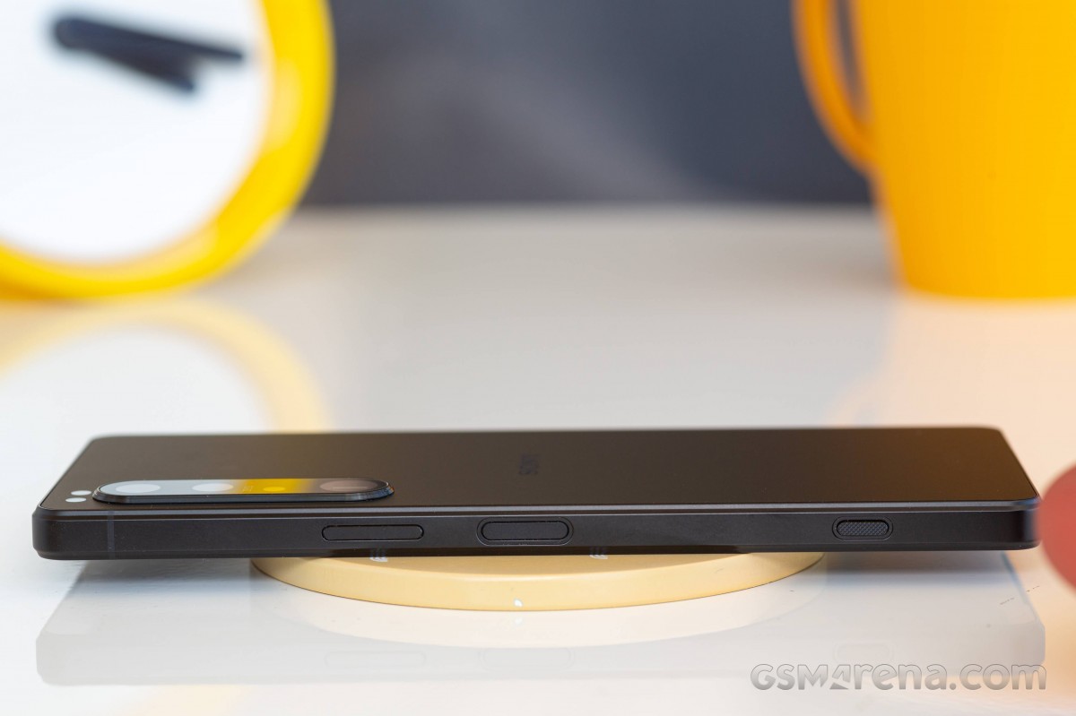
The left side of the Xperia 1 IV is completely bare.
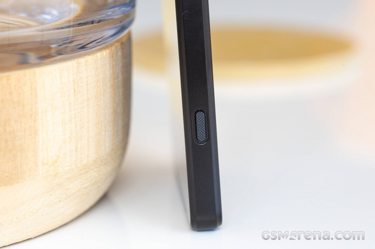
The volume rocker, the power/lock key, and the two-step shutter button are all on the right. The power key is now larger, which means a larger surface for the integrated fingerprint scanner. It's always-on and amazingly fast. Being flush with the frame and always-on makes for a lot of misreads, so you may need to input your PIN occasionally.
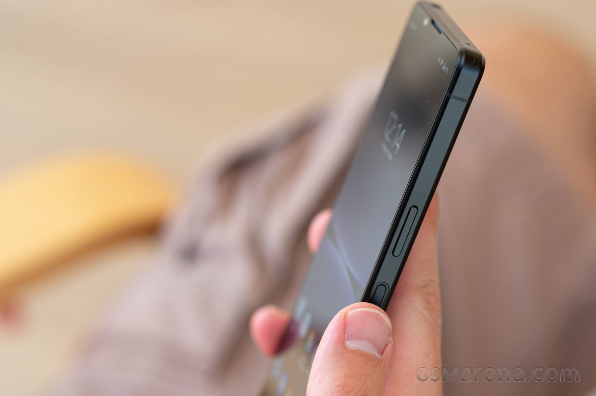
The shutter key is smaller than on the Xperia Pro-I and about the same size as on the Xperia 1 III. It has the usual knurled texture, which makes it instantly recognizable by touch. The button has well-defined two positions and works well for both quick access to the camera and focus/shutter when using any rear camera. And it doesn't get in the way when handling the phone and using it for day-to-day operations.
The Xperia 1 IV is a compact smartphone, lightweight at that. Its shape, metal frame and its champers, along with the all-around matte finish, make for one of the best handlings experience we've had in a while with a secure enough grip. The smudge-resistant back is also a nice touch. Overall, we'd give an excellent mark to Xperia 1 IV for its design and ergonomics.
Reader comments
- Anonymous
- 06 Nov 2024
- IVM
Any user know how to use 2 WhatsApp in this Xperia 1 iv, since it is dual sims
- Anonymous
- 18 Jun 2024
- 0uJ
The worst phone, I've ever had. It overheats while I was watching a YouTube video. It can't handle Bluetooth
- Kriegsherr
- 08 Nov 2023
- 6tD
The tall aspect ratio won't bother you longer. You would eventually find it cool. Specially for app usage it's very good. Only slight issue is typing which might take some time to be adjusted. Overall top phone. The best display in the bu...