Sony Xperia P review: Ironclad
Ironclad
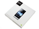
Retail box is pretty standard
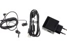
The Sony Xperia P comes in a big flat box, with some of the essentials. You get a not-so-compact GreenHeart charger with a USB port, a microUSB cable for data and charging and a one-piece headset with in-ear plugs.
The charger warrants a closer look - it's the E850 model that supports boost charging. It tops off the battery very quickly (e.g. 10 minutes of charging for 60 minutes of talk time) up to a point (80%) and then slows down (this is done for the benefit of the battery). Note that this only works with the supplied USB cable and might not work with third party accessories.
The Xperia P supports NFC, but you won't get NFC tags (like the one that came with the Xperia S) in the box. You can grab four official Xperia Smart Tags for about $20 (€15, £13), or go with unofficial tags, which can be less than $2 a piece.
Sony Xperia P 360-degree spin
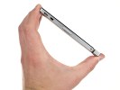
The Sony Xperia P measures 122 x 59.5 x 10.5 mm and is quite light at 120g considering the metal unibody (it weighs as much as the HTC One S).
Design and build quality
The Sony Xperia P design is nearly identical to that of the Xperia S - a mostly angular look with a smooth curve on the back to make the phone fit better in human hands. The transparent strip typical of the NXT phones is part of the design too.
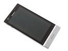
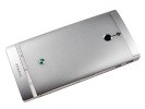
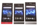
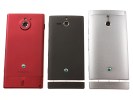
The Sony Xperia P combines NXT style with an aluminum build
The Xperia P does differ from its bigger sibling though - it has an aluminum unibody and some things on the exterior were moved around, but more importantly you get that premium metal feel.
The flip side is you get no access whatsoever to the phone's internals - the phone is practically wrapped in its unibody, not a single bit can be opened or removed. The microSIM slot is on the side of the handset, no memory cards are supported and the battery isn't user-accessible. By comparison, the only advantage of having a removable rear cover (Xperia S) is being able to replace it if scratched or otherwise damaged.
The design of the face of the phone has barely changed. The earpiece is right above the SONY logo, along with other bits of gadgetry - a VGA front-facing camera, proximity and ambient light sensors.
A charge/event indicator is hidden in the earpiece and it glows in red or green depending on charge status and blinks whenever there's something that requires your attention.

The earpiece and its companions
Below the screen, right on the transparent strip, are the three capacitive keys (Back, Home and Menu). This setup is more intuitive than what the Xperia S has (where the icons were on the strip, but the buttons themselves were on the black bezel around the screen).
The transparent strip has a cool white backlight, which makes it an attractive design accent in the dark. The bottom part of the phone, below the strip, is made of plastic. That's where the antenna is so you don't have to worry about the aluminum case blocking the signal. We found no evidence of signal loss even when cupping the bottom of the phone.
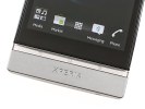
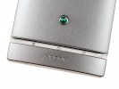
The transparent strip holds the capacitive Android keys
The two wired ports - microUSB and microHDMI - are on the left side of the phone and both are left open. They appear pretty crammed together, but not too close so you should be able to plug both a USB cable for power and an HDMI cable to connect to a TV.
A bit further down is a plastic flap that covers the microSIM card slot. The slot is a bit too deeply set into the body, so putting the SIM card in and taking it out is quite a challenge.
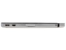
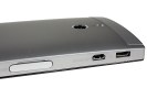
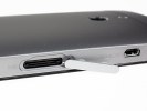
microUSB port, microHDMI port and microSIM slot on the left
The right side of the Sony Xperia P holds the Power/Lock button, a volume rocker and a shutter key. The shutter key is thin and has a low profile but isn't as stiff as on the Xperia S and the sola.
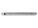
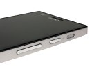
Volume rocker and shutter key on the right
The other thing on the right is the single loudspeaker. We wish Sony found the room for a matching loudspeaker on the right, but at least this positioning prevents it from getting muffled when you place the phone on a table.
The 3.5mm audio jack is alone on the top. There's nothing of interest at the bottom besides the lanyard eyelet.
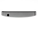
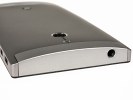
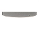
The 3.5mm audio jack on top • Lanyard eyelet on the bottom
The back of the Sony Xperia P is almost entirely made of aluminum painted in Silver, Black or Red. It houses the 8MP camera and its LED flash. The camera is thoughtfully further down from the top edge than the one on the Xperia S, so you can hold the phone without worrying about covering the lens with a finger.


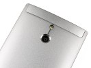
The aluminum back houses the 8MP camera and LED flash
The battery is not user accessible and has a smallish 1305 mAh capacity, though according to official numbers the phone is good for 470 hours of 2G stand-by (475 hours in 3G) or up to 6 hours of talk time in 2G (5 hours in 3G).
Our battery test came to a different conclusion though, finding the Xperia P endurance to be less than stellar. The smartphone scored an overall endurance rating of 28h, which is a ways off the best in class.
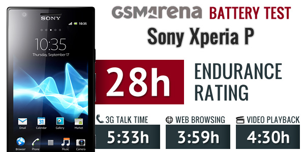
You can find the complete test here and more information of the testing procedures over here.
The back has a matte aluminum finish, which is nice to the touch and fingerprint-proof. The metal outer shell also gives the phone a solid, premium feel. Aluminum unibodies are quite rare in the modern smartphone market (especially outside the HTC lineup), so that's a big point in favor of the Sony Xperia P.
The curved back makes the phone fit comfortable in the hand and while it's not exactly slim, it slips comfortably into pockets. The relatively low weight helps quite a bit here as well.
WhiteMagic Reality display has its ups and downs
The Sony Xperia P has a TFT LCD "Reality display" of qHD (540 x 960) resolution, backed by Mobile BRAVIA Engine for improved image rendering.
Unlike other Reality displays we've seen so far, this one has WhiteMagic - basically, each pixel consists of the usual Red, Green and Blue subpixels plus a pure White subpixel.
This increases the maximum brightness - up to 935 nits Sony claims. Regular RGB LCDs have a tougher time (and use more energy to do it) because light coming from the backlight is filtered to make the three primary colors in the subpixels.
Special software is part of WhiteMagic, which works in two modes - indoor and outdoor. Outdoors the backlight works at 100% allowing for maximum brightness. But when the software detects your surrounding aren't that bright (or you manually set the brightness lower), it goes into indoor mode, turning off half of the LEDs used for the backlight. Indoor mode is officially rated at 530 nits, which is still pretty bright.
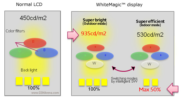
The WhiteMagic software analyzes the screen content to make sure the color rendering isn't adversely affected. Sony claims 50% reduction in power usage compared to "most other displays" when showing mostly white content (e.g. web pages).
Time to check how the Reality display performs in reality. First off, the qHD resolution on a 4" screen makes for 275ppi. It's very sharp and you won't notice too much difference between it and the Xperia S display.
And it's certainly bright - our measurements peg the maximum brightness at over 1000 nits. That comes at a price, though - the black pixels glow noticeably even in a bright room, which spoils the experience somewhat and reduces the contrast quite notably.
| Display test | 50% brightness | 100% brightness | ||||
| Black, cd/m2 | White, cd/m2 | Black, cd/m2 | White, cd/m2 | |||
| HTC Sensation XE | 0.23 | 172 | 761 | 0.64 | 484 | 752 |
| Nokia 701 | 0.64 | 619 | 964 | 1.12 | 1022 | 905 |
| LG Prada 3.0 | 0.19 | 184 | 993 | 0.81 | 835 | 1031 |
| Sony Xperia P | 0.37 | 340 | 919 | 1.36 | 1050 | 775 |
| Sony Xperia S | - | - | - | 0.48 | 495 | 1038 |
| Sony Xperia sola | 0.28 | 295 | 1033 | 0.5 | 500 | 1002 |
| Sony Ericsson XPERIA Arc | 0.03 | 34 | 1078 | 0.33 | 394 | 1207 |
| Apple iPhone 4S | 0.14 | 205 | 1463 | 0.52 | 654 | 1261 |
| Samsung Galaxy Nexus | 0 | 112 | ∞ | 0 | 247 | ∞ |
| Motorola RAZR XT910 | 0 | 215 | ∞ | 0 | 361 | ∞ |
| Samsung I9100 Galaxy S II | 0 | 231 | ∞ | 0 | 362 | ∞ |
| Samsung Galaxy Note | 0 | 287 | ∞ | 0 | 429 | ∞ |
Second, despite Sony's claims that outdoor visibility doesn't affect color rendering, we saw heavy posterization when the screen is set to over 75% brightness or so. That effect is especially visible in gradients and can make images look pretty bad.

Heavy posterization occurs at high brightness settings
On the up side, Sony has done some great work in improving viewing angles - there is some noticeable contrast loss and very slight color shift, but overall the display remains highly readable even at extreme angles.
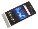

The Reality display with WhiteMagic is a mixed bag
We did notice moire patterns that shift around when you tilt the phone. They are most visible in the neutral color patches - white and gray and while not detrimental to image quality, they're unusual for LCD screens and are something to be aware of.
Reader comments
- Anantha sarker joy
- 02 May 2015
- uNV
Can i use battery for xperia p with2000+mah???? Plz plz plz help me
- GK
- 16 Jun 2014
- ub6
I bought it just when it was lauched in India. The phone could be a excellent one unless thie sony guys had put atleast a 2000mAh battery. This is not a good one for even normal use. The battery sucks!!! The battery drains even after you dont use i...
- AnonD-217498
- 06 May 2014
- tuf
Good day everyone. I need some opinion and recommendation. Currently I'm in a very deep dilemma on whether to buy Xperia P or Xperia S. I really love the NXT design of both phone. I'm more to Xperia P as the 3 capacitive keys are built on ...
