Sony Xperia sola review: Light 'em up
Light 'em up
NFC goodies highlight the retail box
The Sony Xperia sola is delivered in a rather unconventional shallow square box, like the kind used to hold a small mirror or picture frame. Inside, you'll find your run-of-the-mill USB cable, charger and headset, as well as the included NFC Smart Tags.
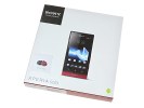
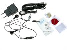
The Xperia sola box and contents
The Smart Tags are small, round and made of glossy plastic. We got one red and one black, which makes them easy to tell apart. The Smart Tags have lanyard eyelets if you need to put them on a keychain, but there's also two double-sided adhesive tape patches if you want to secure the tags more permanently. The Smart Tags can trigger different actions and the pone has preset Home, Office, Car and Bedroom profiles, each with a set of relevant apps and settings.
Sony Xperia sola 360-degree spin
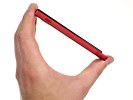
The Sony Xperia sola measures 116 x 59 x 9.39 mm and weighs 107 g. The soft finish of the back literally sticks to the palm and the hand-fit is surprisingly comfortable for such a boxy handset. The Xperia sola is compact and lightweight, and a breeze to control single-handedly.
Design and build quality
The Xperia sola has the square front but not the curvature back of the NXT line. The trademark transparent, glowing strip of the new Xperia phones is also gone, and is instead replaced by an elongated LED under the display, where it stylistically juts out from the body. More of a standby breathing light rather than an event notifier, it emits occasional short glows and pulsates upon an incoming call.
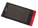
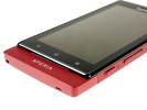
The Sony Xperia sola's characteristic design
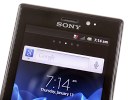
The screen on the Sony Xperia sola is impressively sharp, with punchy colors and very good contrast. Like the members of the Xperia NXT family, it's backed by the mobile BRAVIA display engine, a variant of what Sony use on their HDTVs. It's the kind of processed sharpness, which some might find overdone, but we did like the crisp, vibrant screen of the Xperia sola.
While the viewing angles are better than in previous Xperia phones, there's significant color shift and contrast compression when looking at the display from the side.
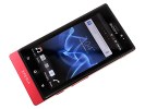
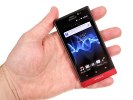
The Reality display boasts excellent picture quality
Anyway, the Xperia sola screen has average blacks, but its good brightness secured an overall contrast ratio of just over 1000:1. Sunlight legibility on the Xperia sola screen is pretty decent too, but some way off the best in class.
| Display test | 50% brightness | 100% brightness | ||||
| Black, cd/m2 | White, cd/m2 | Black, cd/m2 | White, cd/m2 | |||
| HTC Sensation XE | 0.23 | 172 | 761 | 0.64 | 484 | 752 |
| Nokia 701 | 0.64 | 619 | 964 | 1.12 | 1022 | 905 |
| LG Prada 3.0 | 0.19 | 184 | 993 | 0.81 | 835 | 1031 |
| Sony Xperia S | - | - | - | 0.48 | 495 | 1038 |
| Sony Xperia sola | 0.28 | 295 | 1033 | 0.5 | 500 | 1002 |
| Sony Ericsson XPERIA Arc | 0.03 | 34 | 1078 | 0.33 | 394 | 1207 |
| Apple iPhone 4S | 0.14 | 205 | 1463 | 0.52 | 654 | 1261 |
| Samsung Galaxy Nexus | 0 | 112 | ∞ | 0 | 247 | ∞ |
| Motorola RAZR XT910 | 0 | 215 | ∞ | 0 | 361 | ∞ |
| Samsung I9100 Galaxy S II | 0 | 231 | ∞ | 0 | 362 | ∞ |
| Samsung Galaxy Note | 0 | 287 | ∞ | 0 | 429 | ∞ |
Above the screen is the SONY logo styled with their instantly recognizable font (unlike the "Sony" in "Sony Ericsson"). The earpiece is below, along with other bits of gadgetry, which, unfortunately, do not include a front-facing camera.
A charge/event indicator glows in red or green depending on charge status and blinks whenever there's something that requires your attention.
Below the screen, there are three capacitive keys (Back, Home and Menu), which become backlit based upon what the ambient sensor detects. There is a slight vibration whenever one of the keys is pressed, so you know whether you're pressing something or not. The screen glass is projecting over the phone's body, providing a tactile reference point. The resulting chin is a strong design accent too.
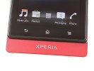
The standard Android keys below the display
The left side is bare, save for the power/lock key located near the top.
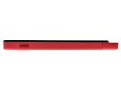
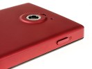
The power/lock button on the left side
By comparison, the right is crowded. From top to bottom, you have the USB port for charging and transferring files, followed by the volume rocker and camera shutter key right next to one another. The volume rocker can also be used for zooming in camera mode, which is probably why it's placed so close to the camera button. The shutter key could've been better though. The tiny knob has rather shallow stroke and is hard to press all the way down.
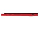
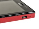
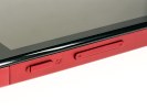
The uncovered microUSB port on the right, along with volume rocker and shutter key
The 3.5mm audio jack is the only thing on the top, while on the bottom you'll find just the primary mic pinhole and a lanyard eyelet.
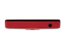
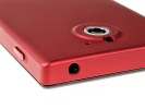
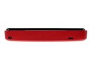
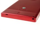
The 3.5mm audio jack on top • Lanyard eyelet and primary microphone on the bottom
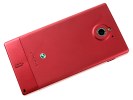
On the back of the Xperia sola the 5MP camera is set within a slight protrusion. There's also an LED flash and a secondary mic for stereo recording. The speaker grille is located towards the bottom.
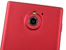
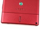
The camera, LED flash, secondary mic and speaker grille are on the back
The back cover is made of soft matte plastic, which feels good and hides fingerprints well. The back panel covers the top and most of the sides of the phone as well, and while it is slightly bendable, it fits firmly in place and feels sturdy enough when attached to the device.
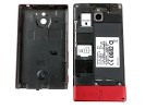
Removing the back cover reveals the microSD and SIM card slots. Here is where you can admire (but not touch!) your phones battery, as it is the non-removable kind. The NFC antenna is also located on the device and not on the back panel like some other phones.
The microSD card is hot-swappable, but the SIM card is not - attempting to add or remove a SIM while the phone is on will result in an automatic restart.
The battery is a 1320 mAh unit, which is said to provide about 470 hours of 2G stand-by (475 hours in 3G) or up to 6 hours of talk time (5 hours in 3G).
The overall design of the Xperia sola reflects that of its parent lineup - square construction with tightly etched corners, and a characteristic extension of the body below the display.
If you aren't a fan of the curved shape of the NXT lineup, the Xperia sola is a fresh new face. The display has the illusion of being placed on its own elevated pedestal above the body, although for some people that might beg the question of why not have the display cover the whole body, or eliminate the excess body entirely. We do like the design and the solid, industrial feel of the handset, which still remains lightweight and compact. The hand fit is very comfortable.
Coming up is our tour of the software found on the Sony Xperia sola.
Reader comments
- Liza
- 28 Jan 2021
- sxr
Best phone ever since 2012 till now 2021 still in my hand and still working. For many times it fall down ( from top of refregirator.tables.chairs.my child make it play i never worried)the screen never broke...how many times fall in the water still wo...
- Anonymous
- 26 Dec 2016
- vGP
worst mobile always hangs
- SDUFFF
- 03 Feb 2014
- t}D
icecream sandwich
