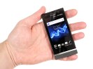
Sony Xperia U review: Fun united
Fun united
Well stocked retail package
The Sony Xperia U is shipped in a plain rectangular box, but we were nicely surprised by what was hiding inside. Normally, manufacturers try not to run up the bill on €200 smartphones by sometimes omitting even essential peripherals.
This is hardly the case here - the basics are comfortably covered with a two-piece fast charger and a single-piece wired headset, with some nice extras on top. As you may know, the new Sony chargers have increased power output to get your Xperia smartphone fully charged in just about an hour. You do need to use the supplied USB cable for the boost charging to work - otherwise the charger falls back to regular speed.
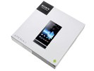
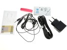
The box has more than we expected
The next item inside the box is a spare cap for the bottom of your phone. The plastic bit underneath the transparent strip can be replaced and every phone comes with a spare. We got ours in pink, but those things usually vary. There's also a microSIM to regular SIM adapter and a screen protector inside the package. There's a tiny plastic spatula and a piece of cloth to help apply the screen protector.
Sony Xperia U 360-degree spin
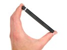
The Sony Xperia U is a pretty compact set at 112 x 54 x 12 mm. We've certainly seen slimmer, but at this size the extra few millimeters around the waist are hardly a big issue, not in this price range anyway.
Design and build quality
Design is one of the Xperia U's strongest advantages against the competition. The Sony smartphone is a cut above its peers in both looks and build quality. The angular body accented with subtle curves wouldn't feel out of place in a smartphone that costs twice as much. The Xperia U is in fact a near exact replica of the flagship Xperia S - on a smaller scale of course, and not as slim.
They didn't compromise the quality of the finish: the matte plastic feels pretty nice to the touch and is decently grippy, precluding accidental drops.
The 3.5" FWVGA Bravia LCD is another major asset. Not only is it tack sharp at 280ppi, but it also offers great image quality, with very good contrast and nicely saturated colors.
The viewing angles aren't perfect, but they are still notably better than most competitors in the same price range. Even at extreme angles the Xperia U display remains legible, although contrast loss is inevitable.
Naturally, with a 3.5" diagonal the screen isn't best suited for enjoying multimedia, but a small high-quality screen has its advantages over massive displays in everyday use.
Here's how the Sony Xperia U did in our dedicated display tests. You can learn more about the testing process over here.
| Display test | 50% brightness | 100% brightness | ||||
| Black, cd/m2 | White, cd/m2 | Black, cd/m2 | White, cd/m2 | |||
| Sony Xperia U | 0.35 | 287 | 831 | 0.55 | 515 | 930 |
| HTC Sensation XE | 0.23 | 172 | 761 | 0.64 | 484 | 752 |
| Nokia 701 | 0.64 | 619 | 964 | 1.12 | 1022 | 905 |
| Sony Xperia P | 0.37 | 340 | 919 | 1.36 | 1050 | 775 |
| Sony Xperia S | - | - | - | 0.48 | 495 | 1038 |
| Sony Xperia sola | 0.28 | 295 | 1033 | 0.5 | 500 | 1002 |
| Sony Ericsson XPERIA Arc | 0.03 | 34 | 1078 | 0.33 | 394 | 1207 |
| Apple iPhone 4S | 0.14 | 205 | 1463 | 0.52 | 654 | 1261 |
Contrast ratio
-
Sony Xperia U
1.758 -
Samsung Galaxy Pocket
1.180 -
LG Optimus L7
1.269 -
Samsung I9300 Galaxy S III
3.419 -
Nokia Asha 302
1.537 -
Apple iPhone 4
2.016 -
Apple iPhone 4S
2.269 -
Gigabyte GSmart G1355
1.361 -
HTC One S
2.901 -
HTC One X
2.158 -
HTC One V
1.685 -
LG Optimus 3D
1.542 -
Meizu MX
1.221 -
Nokia N8
2.144 -
Nokia N9
3.069 -
Samsung Galaxy Note
2.970 -
Samsung Galaxy S
3.155 -
Samsung Galaxy S II
2.832 -
Samsung Omnia W
3.301 -
Sony Ericsson Xperia ray
1.955
We zoomed into the display using our digital microscope so you can get a better idea of how the pixels are arranged, and how big they are. Check it out.
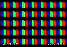
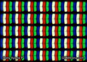
The Xperia U display matrix compared to the Xperia P WhiteMagic screen
Below the screen we find the three capacitive touch buttons that help navigate the UI. From left to right the buttons are Back, Home and Menu and, even though their icons are on the transparent strip, the buttons themselves are marked by the three white dots just under the display. The dots are good enough clues to avoid pressing the actual icons instead.
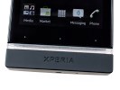
The three capacitive keys below the display
The transparent strip itself is one of the Xperia U coolest, if practically useless, features. The color of the backlighting changes to match your currently selected theme (when you are on the homescreen), or the dominant color of the image you're viewing in the gallery. That also works for album art in the music player and, while it hardly adds anything in terms of usability, it's the ultimate show off feature.
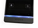

The transparent stripe changes its color to match the selected theme
The exchangeable bottom cap is another way to customize the phone. There's one extra cap in the retail package and more can be purchased separately.
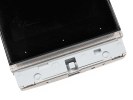
The bottom cap can easily be removed and replaced with one of different color
The left side of the Sony Xperia U features the microUSB port, which supports USB on the go. There's no protective cover to get in the way, which improves usability, but leaves the port exposed to dust. The SIM card slot is on this side as well, but you need to remove the back panel to access it.
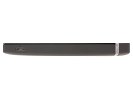
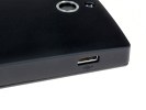
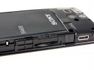
The microUSB port and the SIM slot are on the left
The right side of the phone hosts three keys. From top to bottom, they are power/lock button, volume rocker and shutter key. None of these causes any usability troubles, but ideally the camera button should have been slightly bigger.
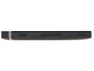
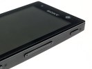
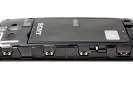
There are three buttons on the right
On top we find the 3.5mm audio jack and the secondary microphone.
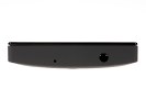
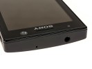
The 3.5mm audio jack and a microphone sit on top
The bottom is bereft of controls and ports, save for the primary microphone pinhole.
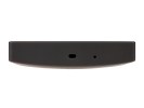
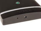
The primary microphone is at the bottom
Our trip round the Sony Xperia U concludes at the back, where we come upon the 5 megapixel camera lens, which has the loudspeaker grille and the single LED flash on its sides.
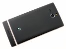
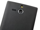
The camera lens, the loudspeaker grille and the LED flash are at the back
Unlike the Xperia P, the Xperia U allows you to pry its back cover open and access the battery. That will come in handy, letting you carry a spare when away from charger for a long time.
And it can be even more useful than some of you might think as the original battery only has a capacity of 1320 mAh, which hardly lasts ages. Sony says that you can count on up to 5 hours and 36 mins of telephony and 472 hours of standby on a single charge in 3G networks. Our experience shows that you'd normally need to charge the Xperua U every other day if you use it for a couple of hours daily. With heavy usage the runtime falls to a day.
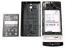
The battery is user replaceable this time
We'd like to wrap up the hardware overview by pointing once again to the Xperia U superior build quality and handling. Now let's see if the dual-core CPU lives up to the expectations and provides a smooth ride along the UI.
Reader comments
- Anonymous
- 26 Apr 2022
- Nue
I don't Know how to find Sony Ericsson ST25i battery is it in the market
- Mineshkumar
- 13 Apr 2017
- XRS
I have, not good aps, not worldwide use and warranty seaport
- KKK
- 05 Mar 2015
- KAw
How to use viedo call? so very bad.
