Sony Xperia XZ2 and XZ2 Compact hands-on review
Design
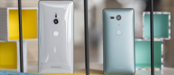
An Xperia phone which can't stand upright on its own? We never thought we'd live to see the day and frankly, we kind of already miss the little distinctive detail already. To be fair, devices like the Xperia XA2 and XA2 Ultra kind of hinted that Sony is looking into a curvier aesthetic, but nothing quite as extreme as the XZ2 and XZ2 Compact.
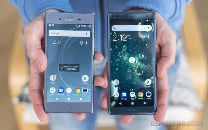
Even with the drastic changes in form, however, we can't really go as far as to say the new flagships lack a certain distinctive Sony aesthetic. It is still very much there, so credit is clearly due to the design team on this one.
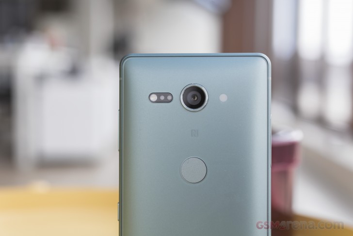
The Japanese giant has always put great emphasis on its design language and philosophy. This new evolutionary stem is titled "Ambient Flow" and despite all its differences, still keeps some strong ties with the "Loop Surface" and the "Omni Balance" concepts before it. For one, symmetry is still at the core of the design. In fact, probably now more than ever, with the camera module and the rear-mounted fingerprint reader aligned neatly along the central axis of the curved back.
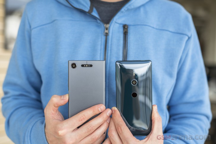
Yes, the fingerprint reader is back-mounted - we are still getting to grips with this fact after we first saw this on the Xperia XA2 and the XA2 Ultra.
The reader here is still just as snappy as we remember from previous generations and, naturally, always-on. That's another neat little distinctive detail lost in the absence of the signature in power button module. On the plus side though, Sony reps feel pretty confident that this will put an end to all the State-side legal fingerprint issues.
As for the rest of the controls on the XZ2 and XZ2 Compact, those are thankfully, mostly unchanged. You still get a volume rocker, power button and dedicated shutter key from top to bottom on the right-hand side. The hybrid SIM and SD tray is either on the left side or the top, on the Compact and regular version, respectively.
While on the subject of controls, it is worth mentioning that the hybrid SIM and SD card trays on the XZ2 and XZ2 Compact are not separated, which has typically been Sony's answer for their long-standing reboot on tray eject situation. Hence, expect a restart every time you pull it out. Just like good old times.
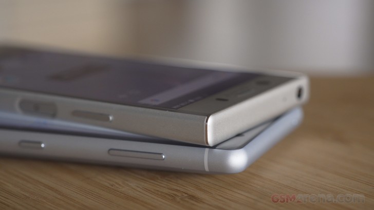
Of course, there is the elephant in the room - Sony has officially joined the "courageous" ranks of manufacturers to ditch the 3.5mm audio jack. At least, as some form of mitigation, every XZ2 and XZ2 Compact will ship bundled with an Y-style Type-C dongle, that allows for simultaneous charging and audio out.
Anyway, back to design and particularly the back of the XZ2 and XZ2 Compact. Both phones have a very distinct curve to them, but it's especially pronounced on the Compact. Sony claims its main goal was to make the pair as comfortable as possible to fit in the hand. That's a pretty subjective goal to pursue. Sharp corners are definitely better for a good grip. Still, the silky smooth surfaces on the XZ2 and XZ2 Compact both fit snug and feel nice in the hand. The only real complaint we have here and it's a nitpicky one, is the way the back taper into the frame of the phones, leaving a distinct edge, noticeable to the touch.
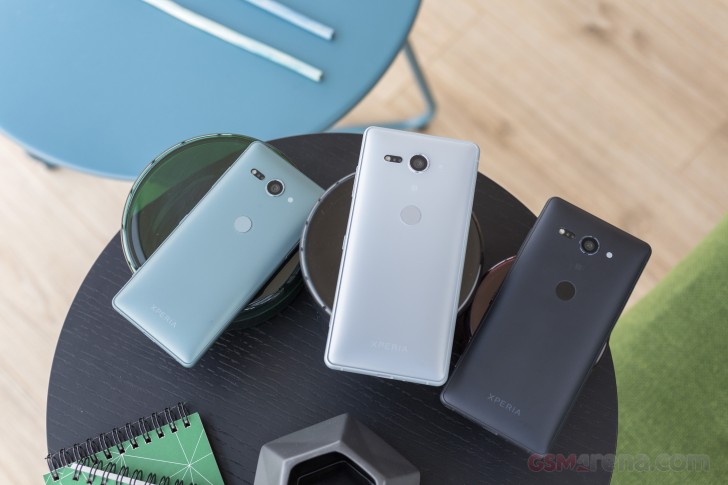
Though, all that being said, there is no point beating about the bush, the XZ2 Compact feels and looks chunky. While not necessarily a bad thing and perfectly understandable for what is essentially a compressed, full-featured flagship, it might be a visual deterrent to some. If nothing else, it goes against most design conventions of the day.
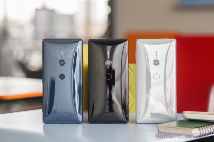
Besides the overall footprint, girth and curvature, the other major distinction between the XZ2 and XZ2 Compact is the bill of materials that went into the respective back panels and the corresponding look and feel. The bigger Xperia XZ2 has Gorilla Glass 5 on both sides. Around the back, the material is carefully heated and moulded, a process reminiscent of what HTC did for the U11 and its subsequent models. The end result is something Sony refers to as "Flow of Light". In practical terms, it lacks some of the depth and layered appearance HTC managed to pull of but is still nicely translucent and a real fingerprint magnet.
The smaller XZ2 Compact has a polycarbonate backside, with a much glossier finish. Significantly easier to maintain smudge-free. Sony refers to the resulting visual effects as "Diffusion of Light". Pretty fancy titles for "reflective" and "non-reflective", if you ask us. Frankly, you'll probably want to put a case on both the XZ2 variants. The smaller one could have some endurance issues around back, while its bigger sibling has a tendency to slide around a lot even on level surfaces.
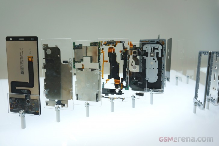
The regular Xperia XZ2 will be available in Liquid Black, Liquid Silver, Deep Green (Petroleum Blue) and Ash Pink. The XZ2 Compact adds its own little twist to things, to signify the difference in finish and calls its dyes Black, White Silver, Moss Green and Coral Pink.
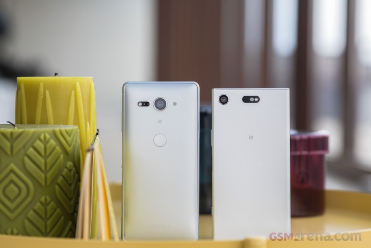
From the front, the XZ2 and XZ2 Compact look airily identical. Only some minor spacing differences here and there. Both get a Gorilla Glass 5 finish, slightly tapered around the edges, the same camera, hybrid stereo speaker setup, with the earpiece handling one of the channels and an RGB notification LED.


Xperia XZ2 • Xperia XZ2 Compact
Of course, we can't miss yet another elephant in the Sony room - the 16:9, extra-tall panels. These are a first for the company and a pretty necessary step to stay relevant on the 2018 scene. More on that on the next page.
Reader comments
- Anonymous
- 28 Mar 2018
- PA7
Want do you to see from apple copypaste phone? Quick charge 2, where xiaomi and friends at least 3? Thas why galaxy fan boy come here try copy sony IP certificate
- Anonymous
- 26 Mar 2018
- I8m
And there you go deflecting again as usual
- 3D Memorys
- 25 Mar 2018
- vV5
Try to turn the OLED display always on until next day morning then you can know the quality, do at your own risk or maybe do not try this at home.
