Sony Xperia Z5 review: Finely tuned
Finely tuned

Unboxing
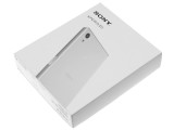
The Sony Xperia Z5 comes with rather minimalistic packaging. It is housed inside a white, two piece cardboard box, without any fancy finish, embossing or other accents to suggest a premium product. That, however, is in no way a complaint as a lavish box, like the one on the Huawei P8, for example, only ramps up the overall price with little to no other purpose, as in today's world a smartphone is almost never an off-the-shelf supermarket purchase.
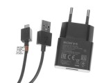
However, it is worth noting that the Z5 comes bundled with all the essentials - a wall charger (1.5 A), USB cable, both of nice quality as well as a pair of in-ear headphones. They are far from superb in terms of sound quality, but are still well above average. They sound nice, feel sturdy enough to last at least a few months and also come with two extra padding sizes and a clip.
It is worth noting that bundled accessories vary from market to market. Alto the photo above is of the Sony MDR-NC750 High-Resolution Audio Headset, which, when used with the Z5 provides active noise cancelling.
Sony Xperia Z5 360-degree spin
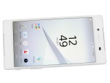
The Sony Xperia Z5 boasts a slick and clean exterior. It is styled entirely following Sony's new minimalistic design language.
Design and build quality
One thing is definitely changed on the Z5 and that is the design and the same goes for its sibling - the Premium and Compact, as well. With the Z5 series Sony is making a significant revision of its signature design language. It is the biggest such undertaking since the Xperia Z1 and all members of the Z5 family, share this common new exterior.
It seems that Sony's vision was to go a step beyond the symmetry of its previous devices. The new design language takes the concept of uniformity to a whole new level. The Z5 is not only symmetrical, it looks almost identical from every angle - no more accents on curves or groves, no more obvious grills, everything is tucked away to create a minimalistic exterior as if the phone has been machined out of a single uniform block.
Some people are sure to find the new understated looks boring, but it is quite charming in its simplicity. But, you shouldn't let the clean looks deceive you, the Z5 packs a lot of power.
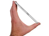
The Z5 measures 146 x 72 x 7.3 mm, which is almost identical to the Z3+, except it is a tad thicker, but we could hardly tell the difference. In terms of weight, however, the Z5 tips the scale at 154 grams, which is exactly 10 grams more than the Z3+.
As already mentioned, the whole Z5 lineup shares a common design and the bunch can definitely be mistaken from a distance, especially if you don't watch out for the model-specific color options. One such detail are the four bumper edges of the Z5, which, unlike the smooth finish on the Z5 Compact, are quite visibly made from a different material than the rest of the frame.
This is due to the fact that the higher-end Z5 and Z5 Premium use a metal frame that Sony has decided to reinforce by replacing the edges with a polycarbonate plastic. This might not look as smooth as the one piece solution on the Compact, but it is arguably a better overall design that allows you to have both the premium feeling of a metal frame and protection against easy denting of said metal on the most-likely contact points in a drop.
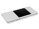
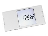
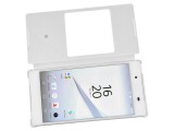
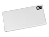
The Xperia Z5 with a Sony flip cover
The back on the Z5 Compact is made of frosted glass (another way of saying matte glass) and Sony has really got the most out of the available materials. The body feels nice to the touch and the finish does not look cheap in any way. The handset comes in two classic colors - white and black, as well as two additional more vibrant options - yellow and green.
Controls
Just like the Z5 Compact, Sony has decided to leave the display of the Z5 mostly unchanged compared to its predecessor. Hence, the phone is equipped with a 5.2 inch 1080 x 1920 pixels display, just like the Z3+. As far as we are concerned FullHD is a perfect choice, but valid arguments could also be made for the need of higher resolution, like QHD, mostly to keep up with other flagship phones out there. Thankfully, however, this time around Sony can't be accused of lacking behind on the new fad thanks to the Z5 Premium, which, if anything, takes high res to the extreme with the first 4K display on a mobile phone.
That being said, the 1080p panel of the Z5 seems like the most reasonable choice Sony could have made.
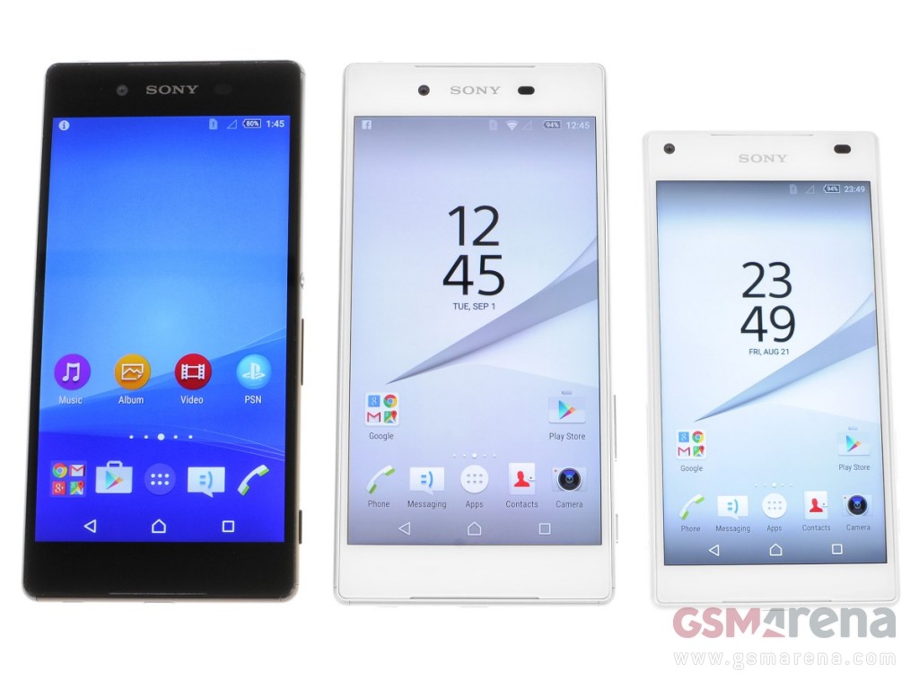
Surprisingly enough, bezels have also gotten bigger and the Z5 now has a screen to body ratio of 69.6%, instead of the 70.9% of the Z3+. This is also the case with the Z5 Compact and the Z3 Compact. But, once again, the difference is barely noticeable, especially in black.
Overall, the front of the Z5 is clean and decluttered. The 5.1MP front camera is placed just to the left of the Sony logo, above the display and is void of any rings or color accents, so it can blend in.
You can really tell that Sony is making an extra effort to bring a new minimalistic feel to the Z5. This design language also extends to the earpiece grill, which is now almost invisible. So is the symmetrical bottom speaker grill and it is actually the only thing found beneath the screen. It also houses the main microphone.
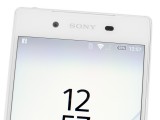

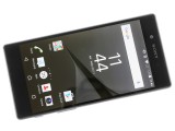
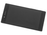
The front of the device is very clean and minimalistic
Going around the device, we find the left side almost empty. The SIM card and MicroSD slot are hidden under a tightly sealed flap. It does a splendid job of water-sealing the sensitive components, but does have a grove near the bottom that stands out on the otherwise flush side. It does, however, aid greatly in opening the cover, which is at least some conciliation.
There is only one other details on the left frame of the Z5 - a machined premium looking Xperia insignia - definitely a nice accent. It is actually one of the few little additions that is exclusive to the Z5 family, so you can look for it if you have trouble telling the Z3 Compact and Z5 Compact apart and even more so, the almost identical twins - Z3+ and Z5.
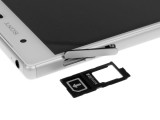
The left side of the Z5 is mostly empty
The right-hand side is a little bit more crowded. It houses the silver power button, which also tends to stand out, especially on our dark grey review unit.
It is, however, just as instantly recognizable as the old round signature Sony one and it does actually make a lot of sense to leave at least one such distinguishing detail on a device that can otherwise be instinctively grabbed in any orientation. The embedded fingerprint reader might also have something to do with the color.
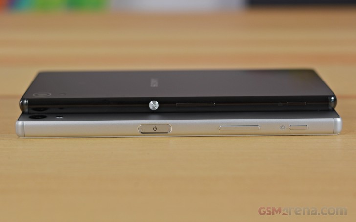
However, it is quite a lot harder to justify the volume rocker position. Instead of being above the power button, Sony has decided to place the control underneath it. This is a common trait for the entire Z5 family and is arguably quite inconvenient. And before you flame us in the comment section, we are aware that the older Z3 series has a similar layout, but the rocker was positioned a bit higher, making it easier to press with your thumb.
Near the bottom, there is a very thin and almost unnoticeable shutter button. It makes taking photos all that more convenient, especially underwater where the capacitive touchscreen might play tricks on you.
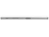
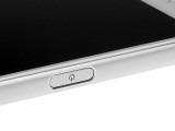
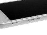
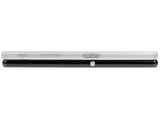
The right hand side has a lot going on
The 3.5mm headphone jack is placed on the top of the device, in the left corner. Next to it is the secondary noise-canceling microphone.
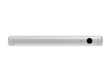
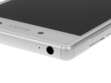
The top features the 3.5mm headphone jack and noise-canceling mic
The bottom side of the Z5 is relatively bare as well. It houses the microUSB port, which thanks to Sony's additional waterproof coating no longer needs a cover flap.
The only other thing on the bottom is the lanyard eyelet. While still convenient for a lot of people it is somewhat of an eye-sore, s for some reason Sony has decided to make it a deep cavern that extends well inside the device. However, it is arguably a lot less noticeable than the one on the Z5 Compact, which is on the side of the unit.
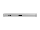
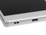
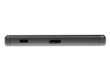
The bottom side holds a microUSB port and a lanyard eyelet
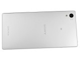
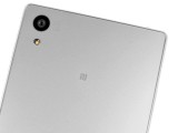
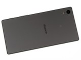
Around the back of the Z5, we find a matte glass panel, complete with an exquisite frosted finish and thankfully not the type that would be easily covered in fingerprints. The only controls found here are the new 23MP camera, just like the one on the Z5 Premium and Compact, along with a single LED flash.
Other than that, on the back there is both Sony and Xperia branding, as well as the traditional tiny NFC logo as this is where the NFC contact area is located. The logo itself has a rubbery finish to it - yet another pleasant example of attention to detail on Sony's part.
Reader comments
- Mickey
- 03 Feb 2023
- mFd
The phone heat too much why
- N41
- 04 Jan 2020
- n41
Correction: but when the DXOMARK shows xperias got worst scores in the test results, vV5 doesn't believe it. LMAO
- Amen King
- 03 Dec 2019
- CGH
Okay
