Sony Xperia Z5 Compact review: The overachiever
The overachiever

Sony Xperia Z5 Compact 360-degree spin
The Sony Xperia Z5 Compact boasts a slick and clean exterior. It is styled entirely following Sony's new minimalistic design language.
Design and build quality
One thing is definitely changed on the Z5 Compact and that is the design. With the Z5 series Sony is making a significant revision of its signature design language. It is the biggest such undertaking since the Xperia Z1 and all members of the Z5 family, including the Compact, share a common new exterior.
It seems that Sony's vision was to go a step beyond the symmetry of its previous devices. The new design language takes the concept of uniformity to a whole new level. The Z5 Compact is not only symmetrical, it looks almost identical from every angle - no more accents on curves or groves, no more obvious grills, everything is tucked away to create a minimalistic exterior as if the phone has been machined out of a single uniform block.
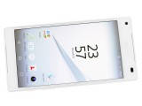
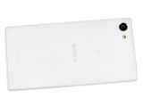
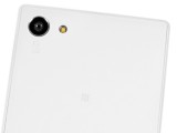
Sony Xperia Z5 Compact overview
Some people are sure to find the new understated looks boring, but it is quite charming in its simplicity. Perhaps even more so when looking at the small, by today's standards, Z5 Compact - packing a lot of power in a quaint and simple shell.
The Z5 Compact measures 127 x 65 x 8.9 mm, which is just a tad thicker than the Z3 Compact, but we could hardly tell the difference, which was perhaps the desired effect. In terms of weight, however, the new Compact tips the scale at 138 grams, which is a good 10 grams more than the Z3 Compact, bringing it closer to the ranks of its full-sized sibling - the Z5.
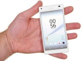
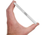
The Xperia Z5 Compact in the hand
This difference might be noticeable, but it is far from problematic. The Z3 Compact handles great and its small size allows for a tight grip and excellent one hand control. As already mentioned, the Z5 Compact is more or less a scaled-down version of the Z5 in every sense of the word - design and hardware. However, despite being part of the premium lineup, the Z5 Compact doesn't use metal for the frame, but rather a polycarbonate plastic. This could be the reason for one of the subtle differences in appearance, namely that the Z5 looks to has differently coated corners, while its little sibling offers a seamless finish across the edges. The former might have some durability advantages, but the latter is arguably far better looking.
Other than that, the back on the Z5 Compact is also made of frosted glass (another way of saying matte glass) and Sony has really got the most out of the available materials. The body feels nice to the touch and the finish does not look cheap in any way. The handset comes in two classic colors - white and black, as well as two additional more vibrant options - yellow and red.
Controls
The Z5 Compact is undoubtedly based on the bigger Z5, but perhaps the most notable change in hardware it brings is the smaller 4.6-inch display. The slightly disappointing part, however, is that Sony has retained the same 720p resolution from the Z3 Compact. A 1080p panel would have definitely provided a bigger upgrade incentive over its predecessor, but there still seem to be at least some changes to the panel, as it now has slightly higher pixel density of 323 ppi (even higher than the iPhone 6 and 6s for all that matters).
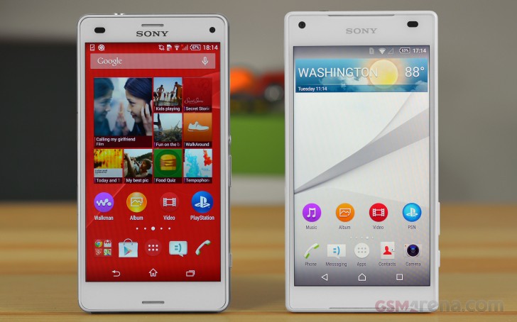
Surprisingly enough, bezels have also gotten bigger and the Z5 Compact now has a screen to body ratio of 68.9%, instead of the 70.6% of the Z3 Compact. But, once again, the difference is barely noticeable, especially in black.
Overall, the front of the Z5 Compact has gotten a lot cleaner and decluttered. The 5.1MP front camera is off to the far left and is void of any rings or color accents, so it can blend in.
You can really tell that Sony is making an extra effort to bring a new minimalistic feel to the Z5 Compact. This design language also extends to the earpiece grill, which is now almost invisible. So is the symmetrical bottom speaker grill and it is actually the only thing found beneath the screen.

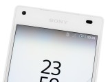
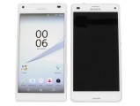
The front of the device is very clean and minimalistic
Going around the device, we find the left side almost empty. The SIM card and MicroSD slot are hidden under a tightly sealed flap. It does a splendid job of water-sealing the sensitive components, but does have a grove near the bottom that stands out on the otherwise flush side. It does, however, aid greatly in opening the cover, which is at least some conciliation.
There are only two other details on the left frame of the Z5 Compact. First, there is a machined premium looking Xperia insignia near the top - definitely a nice accent. The second, however is a quite obvious lanyard eyelet. It is a major eye-sore, as for some reason Sony has decided to make it a deep cavern that extends well inside the device.
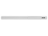
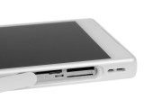
The left side of the Z5 Compact is mostly empty
The right-hand side is a little bit more crowded. It houses the silver power button, which also tends to stick out, especially on dark grey review unit we received a bit later (not pictured).
Unlike the lanyard eyelet on the opposite side, however, this looks to be intentional and it does make quite a lot of sense to leave at least one instantly-recognizable detail on a device that can otherwise be instinctively grabbed in any orientation. The embedded fingerprint reader might also have something to do with the color.
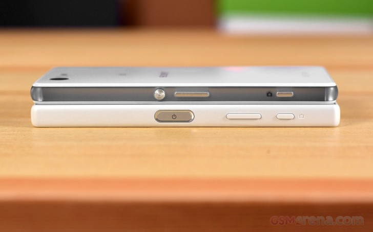
However, it is quite a lot harder to justify the volume rocker position. Instead of being above the power button, Sony has decided to place the control underneath it. This is a common trait for the entire Z5 family and is arguably quite inconvenient. And before you flame us in the comment section, we are aware that the Z3 Compact has a similar layout, but the rocker was positioned a bit higher, making it easier to press with your thumb.
Near the bottom, there is a very thin and almost unnoticeable shutter button. It makes taking photos all that more convenient, especially underwater where the capacitive touchscreen might play tricks on you.
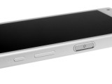
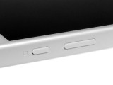
The right hand side has a lot going on
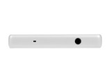
The 3.5mm headphone jack is placed on the top of the device, in the right corner. Next to it is the secondary noise-canceling microphone.

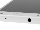
The top features the 3.5mm headphone jack and noise-canceling mic.
The bottom side of the Z5 Compact is relatively bare as well. It houses the microUSB port, which thanks to Sony's additional waterproof coating no longer needs a cover flap. The only other thing on the bottom is the main microphone.
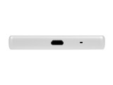
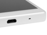
The bottom side holds a microphone and the microUSB port
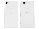
Around the back of the Z5 Compact, we find a matte glass panel, complete with an exquisite frosted finish and thankfully not the type that would be easily covered in fingerprints. The only controls found here are the new 23MP camera, just like the one on the Z5 and a single LED flash.
Other than that, on the back there is both Sony and Xperia branding, as well as the traditional tiny NFC logo as this is where the NFC contact area is located.
Reader comments
- Zzz
- 10 Dec 2022
- 8ut
Gotta love this line "Amidst an industry increasingly pushing toward more and more screen real estate, sometimes to absurd levels, as much as 6.0-inches in a handheld device,"
- oldies goldies
- 08 Jan 2022
- pqV
Bought it in 2016 on sale for 200€ and still works. It got slower but still perfectly useable besides demanding games and it has all practical features of new phones. I consider this phone to be one of mine best buys of all time. And considering...
- Arte8800
- 27 Apr 2020
- nEY
I have 3 Z5c, white, black, yellow. All on 7.0. 7.1 is a big battery drain, but fast no lags. On 6.1 was good, but 7.0 is the best. Had too Root to revert back to 7.0. Just love the boxy oblong sharp edges Monolithic design omnibalance flat back...
