Sony Xperia Z5 Compact review: The overachiever
The overachiever
Android Lollipop with a pinch of Xperia
After a slightly hesitant transition into Android Lollipop, Sony is now fairly comfortable with the new platform and is spreading it across as many devices possible. We are happy to report that the Z5 Compact comes with Android Lollipop right out-of-the-box and, even better, it is running the up to date 5.1.1 version. It is mostly identical to its predecessor in terms of user interface, but there are a few notable changes.
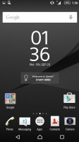
As far as the launcher goes, Sony has gone to great lengths to preserve its signature look and feel. If you are transitioning from a KitKat Xperia, you will instantly feel that almost everything is right where you remember, just with a fresher material-design look.
This even extends to the bundled applications. Most of them are also practically untouched as far as navigation and UX goes, but now employ all the extra visual eye-candy of Android Lollipop. This kind of transition really takes effort and is definitely worth noting.
The lockscreen has undergone some changes with Android 5.0. There are no more lockscreen widgets available, apart, of course, from a selection of clocks.
The multiple panes have been removed as well. There are still quick shortcuts to launch the dialer and camera, which are now at the bottom left and right corners, respectively.
Naturally, you can protect your lockscreen by Face, Pattern, PIN or Password unlock and in the Z5 Compact even finger print, in ascending order of security.
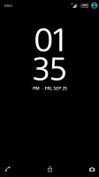
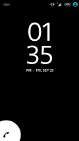
Xperia lockscreen, lacking widgets
There are five homescreen panels by default and you can set any of them as your primary one. You can't have more than seven panes at any given time though, nor can you change the order they're in.
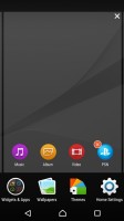
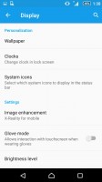
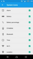
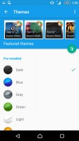
You can set various live and static wallpapers, add widgets and shortcut, or change the UI theme. You can also choose which icons will be visible on the status bar, and which should remain hidden.
The notification area uses the standard Lollipop-style pull-down effect with multiple levels. Quick settings are on the top and notifications on the bottom. The aforementioned can be accessed by swiping from the top twice, but Sony has also preserved its two-finger swipe gesture, which extends the full shade in one stroke.
The toggles are customizable and you can choose between a total of 13 and have up to 9 of them visible. Their order can be adjusted manually, or you can leave that to Lollipop, which will automatically rearrange them according to frequency of use.

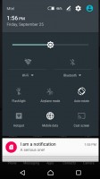
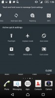
Notification area • Quick settings
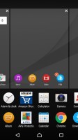
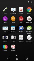
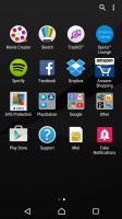
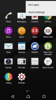
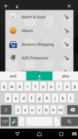
The app drawer is laid out across multiple pages and you can sort the apps in various ways. However, in this new version of the launcher the signature left swipe-out menu is gone. Instead it is replaced by a small drop-down menu on the right and the search bar is at the top.
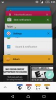
The Xperia Z5 Compact uses the stock Android task manager that lets you switch between the recently opened apps, as well as terminate any of them with a side-swipe.
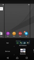
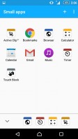
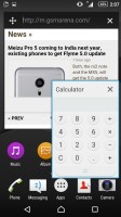
The so-called "small apps" are also available in the Xperia Z5 Compact and are accessible via the task manager. They are similar to Samsung's Mini Apps, and pop up tiny widget-like applications on your homescreen, which you can move around and use without having to open the full-fledged app.
The list of small apps really tends to differ from one Sony to another for some reason and on our unit we found a default set of eight of those available: Active Clip, Browser, Calculator, Calendar, Timer, Touch Block, Music, Bookmarks, Gmail. The latter two seem to come courtesy of the Chrome and Gmail apps presumably through implementing some special interface, but oddly enough they don't appear on all Xperia's with the corresponding apps installed.
You can launch only one instance of a Small App, but you can open multiple Small Apps simultaneously.
Sadly, you can't disable the small apps entirely and will always have them cramming your recent apps whether you use them or not.
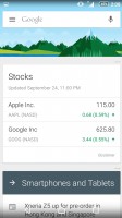
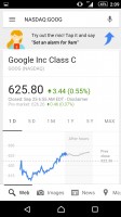
Finally, Google Now integrates with your Google account and can access your daily routine, internet searches, email, etc. and give you information relevant to your interests and daily needs.
Reader comments
- Zzz
- 10 Dec 2022
- 8ut
Gotta love this line "Amidst an industry increasingly pushing toward more and more screen real estate, sometimes to absurd levels, as much as 6.0-inches in a handheld device,"
- oldies goldies
- 08 Jan 2022
- pqV
Bought it in 2016 on sale for 200€ and still works. It got slower but still perfectly useable besides demanding games and it has all practical features of new phones. I consider this phone to be one of mine best buys of all time. And considering...
- Arte8800
- 27 Apr 2020
- nEY
I have 3 Z5c, white, black, yellow. All on 7.0. 7.1 is a big battery drain, but fast no lags. On 6.1 was good, but 7.0 is the best. Had too Root to revert back to 7.0. Just love the boxy oblong sharp edges Monolithic design omnibalance flat back...
