Sony Xperia Z5 Premium review: Premium Definition
Premium Definition
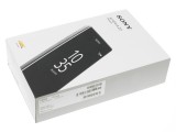
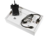
It looks like the phone itself got all the premium treatment and there was nothing left for the accessories. There's nothing Premium about the retail box contents of the Sony Xperia Z5 Premium, which we got - just a regular 1.5A charger and a USB cable. A headset was missing, but one will be included in the retail package, region dependent, of course.
Honestly, we expected at least a bundled quick charger, but we guess that's not covered by the premium tag.
Sony Xperia Z5 Premium 360-degree spin
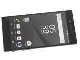
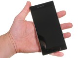
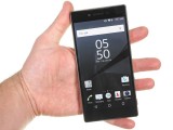
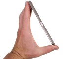
The Sony Xperia Z5 Premium features a bigger display than the regular Xperia Z5, which means it is the first of the Z series with a noticeably bigger footprint. The Z5 Premium measures 154.4 x 75.8 x 7.8mm, which is some 9mm taller, 4mm wider and half a mil thicker than the regular Z5 flagship.
The Premium has gained some weight too - at about 180g it's almost 30g heavier than the Z5.
Coincidentally, that's the exact same footprint (weight not considered) as the Samsung Galaxy S6 edge+. True, Samsung has squeezed in a 5.7-inch display, but the dual-edge design makes direct comparison impossible.
You would need an Adobe Flash-capable web browser to visualize the interactive 360-degree view above.
Design and build quality
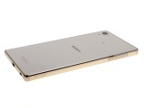
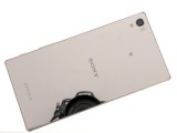
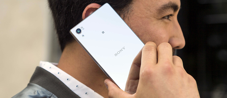
The history behind the Sony Xperia Z5 Premium might be quite an interesting one, but we'll probably never know for sure. The Z5 Premium, unlike the Z5 and the Z5 Compact, comes with a reflective glass on the back (no matter the color flavor) and a stainless steel frame similar to the Xperia Z3+. It's almost like the Z5 Premium was supposed to come out with the Z3, but got pushed back a couple of seasons.
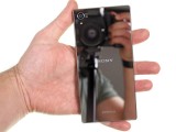
Anyway, we don't mind the design decision at all, especially the gorgeous chrome version we got. It reflects about as much light as your everyday household mirror, if we're to trust our entirely non-scientific bare-eye tests. Flashy as it is, it all means it's near impossible to keep clean unless you lock it up in a glass display box, which you definitely wouldn't like to do.
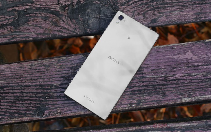
The black and gold paintjobs are also reflective, but not even close to the chrome version. It seems to be the signature of the Premium lineup, and it indeed looks captivating, but to keep it this cool, you have to clean it hourly. Maybe it's worth it, who are we to judge?
The color aside, the Xperia Z5 Premium looks like any other Z model, especially the black-clad version. Once you look up close you realize it's an odd blend between the materials of the Xperia Z3+ and the detailing of the Z5. Then, of course, scaled up to accommodate the larger screen.
The phone feels very pleasant in hand, but it also demands to be handled with care - the polished metal frame and glass panels are super slippery. A secure grip is nearly impossible, god forbid you leave it on any sloping surface. You've got a premium phone and you have to give it the proper care and attention, that's the deal.
The Sony Xperia Z5 Premium doesn't look like an experiment or an outsider, but more like the highlight of a generation of Z phones. You can tell it sums up the traditions of the series and keeps the signature elements while putting a little twist that lets it stand out.
Sony has produced a stunning piece of smartphone indeed. It's just one that needs the extra care and attention.
Controls
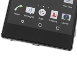
In practice, the Z5 Premium has reasonably thin side bezels with some more meat top and bottom - but overall - the typical Xperia proportions. The front has the stereo speakers, the selfie camera, a couple of sensors and the primary mic hidden below the bottom grille.
You get a capless microUSB port on the bottom, a capped card slot on the left and the same corner inserts on the metal frame as the Xperia Z5. We have to warn you both SD and SIM cards reside on a very flimsy plastic trasy, which is very easy to break and even easier to get stuck inside when some of the cards dislodges.
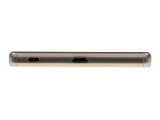
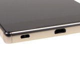
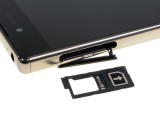
Cap-less USB port at the bottom • The microSD/nanoSIM tray
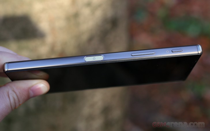
The fingerprint sensor is midway on the right, but did we mention the low position of the volume rocker before? It's between the camera key and the lock key and we found its placement to be very odd and uncomfortable.
The fingerprint scanner is positioned thoughtfully on the surface of the side Power/Lock key and is very comfy to use. Sony's decision to put it there is an equivalent of LG's rear control deck - an innovative take on a popular feature, which boosts the usability a lot.
The scanner is very fast and responsive and we had no problems with the unlocking procedure. It doesn't work when the screen is asleep though, you'll have to push it once with, say your thumb, and if recognized it will open your homescreen in about a second.
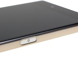
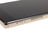
The controls of the Z5 Premium are all on the right
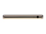
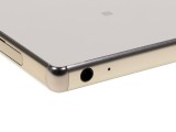
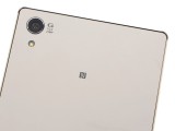
The audio jack and the second mic are on top of the frame. The entire rear is one big travel mirror with only the 23MP camera lens and the tiny LED flash standing in the way.
Reader comments
- Banele
- 29 Jan 2022
- XLA
Haven't tried
- Domestoboto
- 31 May 2018
- PSv
Have you tried "SoundAbout"? (that's the name on the GP Store.) Personally, though, I just resorted to using good Bluetooth earphones and headphones - I got an Aukey Latitude (EP-B40) for super cheap and a Sony MDR-ZX770BN (noise canceling headp...
