Sony Xperia Z Ultra review: Thinking big
Thinking big
Android 4.2.2 is in charge of the Xperia Z Ultra
Sony Xperia Z Ultra comes with Android 4.2.2 out of the box and Sony's proprietary Xperia launcher on top of it. The most recent Xperia are already running or will soon join the Android 4.2.2 Jelly Bean train.
Here is a demo video of the Sony Xperia Z Ultra to get you started.
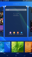
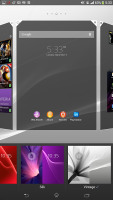
The Xperia Z Ultra gives you the option to add or remove homescreen panes (you start with five) and assign any of them as the default. You can't have more than seven panes at any given time though, nor can you change the order they're in.
The background for the virtual on-screen buttons is black when you are running an app and completely transparent of you are browsing throughout the Android OS homescreens and menus.
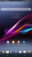
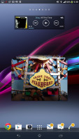
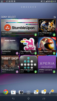
Sony Xperia Z Ultra user interface
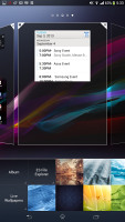
Adding stuff to the homescreen is done with a tap-and-hold on a blank area or using the pinch-to-zoom gesture. A context menu appears, allowing you to perform various customizations on your phone - add widgets or shortcuts, change the wallpaper and the theme. You can also add shortcuts from the app drawer by holding your finger over an icon and dragging it across to the homescreen area.
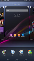
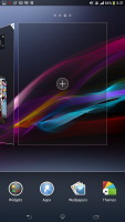
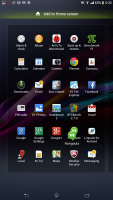
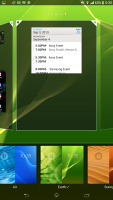
Adding widgets and app shortcuts to the homescreen
The Xperia Z Ultra has a few custom-made Sony widgets for various social services, connectivity toggles, the Walkman player, etc. The Timescape and Mediascape widgets are gone for good. Thankfully, the widgets in the Xperia Z Ultra do resize and re-arrange automatically when you're trying to place them.
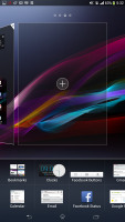
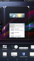
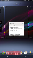
Adding and removing widgets is easy
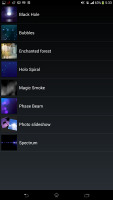
The wallpaper menu offers both static and live wallpapers. As usual you can preview the live wallpapers before applying them.
Selecting a new theme changes the lock and homescreen wallpapers and the color of the system icons (toggles, menu icons, etc.).
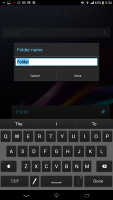
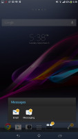
Along the bottom, there are six docked shortcuts (three each side of the app drawer shortcut). These are visible across all homescreen panes and are user configurable: they can be either single icons or folders with multiple items in them. You can also place whole folders there in which case you get smaller icons of the first four items in them.
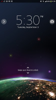
The lockscreen has multiple panes, each containing one widget. The page to the right is special and fires up the camera.
The pages to the left contain different widgets - Email, Gmail, Google Now, Calendar, Google+ posts, TrackID and Digital clock you can download apps from the Play Store that add new widgets.
When the music player is active, the lockscreen will display the music controls by default, but you swipe them out of the way. You can also enable Face, Pattern, PIN or Password unlock, in ascending order of security.

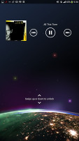
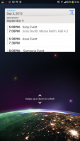
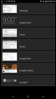
The lockscreen and its options
The notification area features a few toggles (Sound, Bluetooth, Wi-Fi and Brightness by default). There's also a quick shortcut to the settings menu. This time around the toggles are customizable. You can choose between 16 different quick toggles and have up to 10 accessible from the notification area within two rows of shortcuts. You can even opt out of having the Settings key.
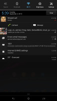
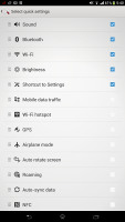
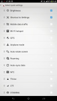
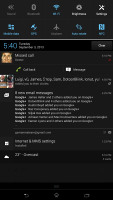
The notification area offers two customizable rows of quick toggles
The notifications themselves have not changed - they can be expanded to reveal more info and collapsed to save space or dismissed with a sideways swipe. Sometimes they also have helpful buttons on them, such as "Call back" or "Send SMS" on a missed call notification.

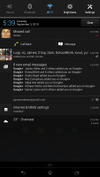
Notifications are still expandable
The app drawer is laid out across multiple pages and you can sort the apps manually, alphabetically, by the most used or most recently installed. The menu with those settings is accessible via a swipe from the left edge of the screen and you can also search and even uninstall apps from there. If you tap and hold on an app, a green Add to Homescreen area will appear on top of the app drawer. Just drag the icon there and you will go back to your homescreens where you can put a shortcut.
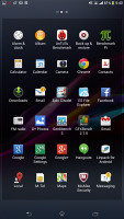
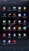
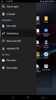
The app drawer and its swipe-able settings
The pure Android task manager is onboard. It lets you go to the recently opened apps as well as remove them with a side-swipe. The so-called "small apps" introduced with the Xperia T are here too.
They are similar to Mini Apps from Samsung, and pop up tiny widget-like applications on your homescreen, which you can move around and use without having to fully open a dedicated app.
So far, there's a default set of nine: Active Clip, Chrome Bookmarks, Browser, Calculator, Calendar, Gmail, Timer, Notes, and Voice Recorder.
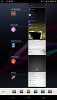
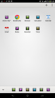
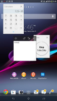
The task manager • the default Small Apps • Small Apps in action
You can download more Small Apps from the Play Store or you have the option to turn your favorite widgets into Small Apps. Just hit the Plus key at the top of the list and choose a widget.
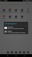
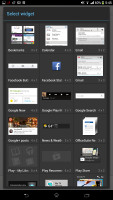
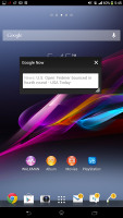
Turning a widget into a Small App
You can launch only one instance of a Small App, but you can open every Small App that is available hassle-free.
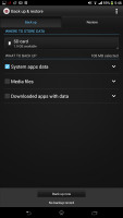
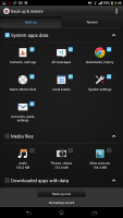
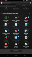
Sony has added its own Backup & Reset feature for Android OS. It works for apps you've uninstalled and then reinstalled again, all of your multimedia content is saved too, and all system apps such as messaging, call logs, etc. get their data stored safely. Restoring is easy and if you lost something, you can easily bring it back.
Reader comments
- ibro
- 02 Jul 2022
- dP$
have fun with your toy
- Anonymous
- 19 Dec 2016
- r3H
Why would the display turn off during calls? This singular fact rubbished whatever advantage the Z Ultra possesses. secondly the screen cracked at the slightest provocation. For me, durability is zero. No one want to buy and expensive item and...
- AnonD-615282
- 29 Nov 2016
- GXm
How I use jio 4g sim in my sony xperia z c6802
