T-Mobile G1 review: The whole cagoogle
The whole cagoogle
Crash course in Android
Android is a brand new OS, which means it doesn't carry the same kind of baggage as other smartphone platforms. Sure, it uses the Linux kernel but you'll never know it's there - even Google say the OS is not Linux. This means that you'll have to learn a few new things but the interface is very intuitive and consistent so it doesn't take long.
Things work in a similar way to other OSes but there are differences as well. For example, the "menu" key under the screen doesn't bring up what most people would think of as THE menu. It would be more appropriate to call it a "context menu" as it brings up relevant options to whatever is currently happening on the screen.
In the case of the homescreen, it brings up a bar with options for modifying its contents - add new shortcuts or widgets, change the wallpaper, launch Search or access Settings. In applications, it brings up buttons that are like soft keys with a "more" tab when the list of available options is too long.
To get to the actual Main menu you tap the virtual button at the bottom of the screen. This launches a panel with shortcuts to all the applications on the handset. Alternatively, you can drag the panel up with your finger.
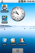
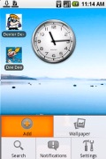
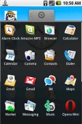
The Android homescreen • context menu • adding stuff to the homescreen • main menu
Tapping is faster and simpler but, trust us, you'll be dragging it. It has an inherent "cool factor" - pulling it up is almost physical. The interface elements stick to your finger much like on the iPhone - very smooth and very slick.
There are a couple of basic gestures you won't need to learn if you've used a touchscreen phone. The first and most obvious is the simple tap. This is one of the most commonly used gestures - it activates whatever you tapped on, whether a shortcut, a button or a list item.
Next is the long press, which serves two different purposes. On the homescreen it is used for dragging shortcuts and in lists it is used to bring up a submenu for a specific list item (e.g. if you want to delete a contact).
To remove a shortcut from the homescreen, just drag it to the main menu icon, which will temporarily turn into a trashcan (it works the same way for widgets too).
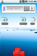
When an item is being removed it gets colored in red
The third gesture you need to know to get you going is the sweep. Quite predictably, it scrolls lists up and down or the available homescreens side to side. Multiple desktops have become quite popular, first on computers and now on mobile phones as well.
The Android homescreen has three separate desktops that actually seem like three parts of one single panoramic desktop. Eye candy is of course not forgotten - the default background is a stunning landscape (there are several wallpapers preinstalled) and the icons move a little faster than the background adding a feeling of depth and added dimension that's not to be seen on any other OS - somehow the icons look closer to you that way.
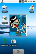

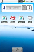
The three parts of the homescreen
Sliding the keyboard out switches the screen to landscape but despite the change in aspect ratio, the arrangement of the icons doesn't change. That is, an icon's relative position remains the same.
Things to look out for
Android has some peculiarities. It doesn't recognize the concept of "running" and "closed" applications. Instead it gives the impression that all apps are running all the time. The system may close an app that runs in the background to preserve resources but as soon as the user selects it again Android will restore it to its previous state so that the user never knows the app had actually been closed.
A pleasant surprise is that all this background activity doesn't lead to any hang-ups or slowdowns. Holding down the Home key brings up a kind of "task switcher". It's not really a task switcher, though, as some of the applications you've already started may no longer appear running for the reasons described above. Still, the task switcher is useful as it gives you access to the six most recently used apps.
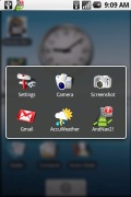
The Android "task switcher": notice the really nice bokeh in the background
Android doesn't have the typical concept of a "file system" either. You can put folders on the homescreen to help keep things organized but you can't put folders within folders. Browsing through your memory card is out of the question too. Instead, your only chance of checking what's on it is by using the respective file viewers - to check photos on the memory card open up the gallery.
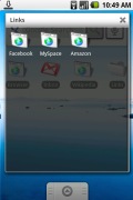
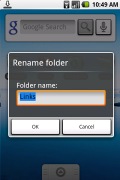
A folder with some links • you can rename folders too
It makes sense - a music player would do a much better job of navigating your music collection than a generic file browser. This however has its drawback as, say, copying a file from the memory card to the internal memory is not possible.
Here the app store - the Android Market - comes into play offering a wide range of applications (most of them free) to do what you need. But more on that later in this review.
There are some "bad" habits you need to break when using Android. For example the red receiver key doesn't bring you to the homescreen as it does on every other phone out there, instead it locks the keyboard (and screen). Another one is that typing just about anything short of a phone number requires you to open the keyboard, at least until the expected Cupcake goodness spills over the G1. The only virtual onscreen keyboard the G1 has out of the box is a basic dialer to quickly punch in a phone number.
However it's interesting to know that some of the applications that come fresh out of the Android Market have their own onscreen QWERTY keyboards.
The only thing that we found missing in this new Android line of work, is a nice and easily accessible Wireless manager - having some type of a shortcut pad for managing Wi-Fi, Bluetooth and the likes directly from the homescreen would have been a nice asset.
Secret handshake - the gesture unlock
A quite intriguing feature is the Gesture lock. Yes, the Apple iPhone came up with the whole "slide to unlock" thing but with Samsung I7500 the unlock slide can take a very complex shape. The phone can be set to require a preset pattern of onscreen sweeps each time you're unlocking it.
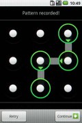
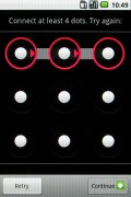
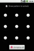
First you record a pattern of at least 4 dots • then you must enter it to unlock the phone
The way it works is you're presented with a 3 x 3 grid of dots and you have to connect at least four dots in whatever order you choose. Now, we'd advise against too complex shapes, as you have to draw the shape again if you want to cancel or change it, so forgetting it would be quite unfortunate. You can choose to have haptics enabled so with a little training you can unlock the phone without looking at the grid. There's even an option that disables the trail that connects the dots completing the pattern.
Buttons and dials
There are quite a few things you can add to the homescreen. Shortcuts, folders and bookmarks are the most basic ones but you can also add shortcuts to contacts, Gmail labels and even playlists. There is also widget support but you get just three widgets at this point: clock, search and picture frame. You can't download new ones from the Market just yet.
The search button on the hardware keypad (the one with the magnifying glass on) activates context relevant search - in the homescreen it's Google search, in the Gmail app it searches the mail, when browsing contacts it quite naturally searches for contacts.
The only place where it doesn't do what you'd expect it to is in the browser - it doesn't search on the page but instead brings up Google search again. The other gripe we have is that it doesn't search for items on the device.
The search button also moonlights as a quick launch button. For example, Search + B launches the browser, Search + C brings up the contacts and so on. You can also assign your own shortcuts in the Settings menu.
Additionally, there are shortcuts using other keyboard combinations. A number of Menu key + letter button combinations work as shortcuts for apps, while Menu + W in the browser closes a tab just like in computer browsers.
One big advantage of Android is the notification area. As usual, there's a thin bar at the top of the screen with status info about battery, signal strength and others such as Bluetooth or missed events.
But if you slide it down you get a list of all recent notifications - that's the so called notifications area. Tapping one of the listed notifications takes a context relevant action - for instance, a tap on a notification of a successful installation would launch that application; a finished download notification will open the file and so on.
Since you can open the notification area from wherever the top bar is visible, new events won't interrupt your work. You can slide the tray down like a window blind just enough to see more details about what has happened and if it's not important you can let it slide back up and continue where you left off.
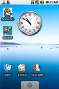
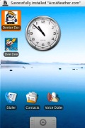

Notification area • a new event has occurred • the whole notification area
Reader comments
- SrVD
- 05 Feb 2022
- gMK
This is a piece of tech history.
- ftgtg
- 20 Oct 2015
- pY6
I like the feely thing
