TCL futuristic foldables hands-on
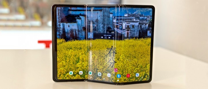
TCL single fold, booklet concept
Kicking things off with what was the most functional out of the three TCL foldable prototypes on display, we have a device very reminiscent of the Samsung Galaxy Fold. That is to say that its "booklet," two-piece, folding-in design is just as straight-forward. The idea behind it is also clear - fit a tablet's worth of screen real estate in a pocket-friendly stack.
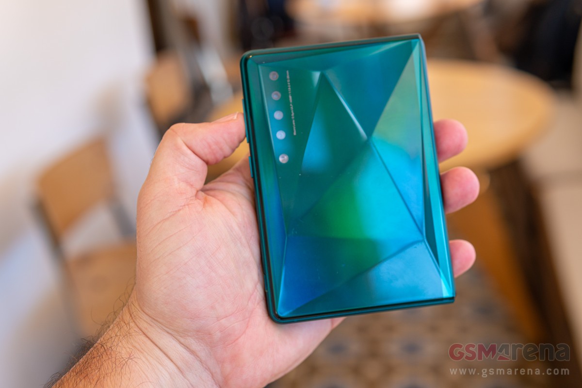
TCL is not sharing any specifics on the prototype, not even basic bits, like the display diagonal. TCL's design looks a bit more "square" than Samsung's. Each of the two halves is wider and shorter. That essentially makes for landscape orientation on the unfolded display without the need to rotate the phone. Arguably better for video consumption and gaming, but probably worse for scrolling long UI lists and mobile web pages.
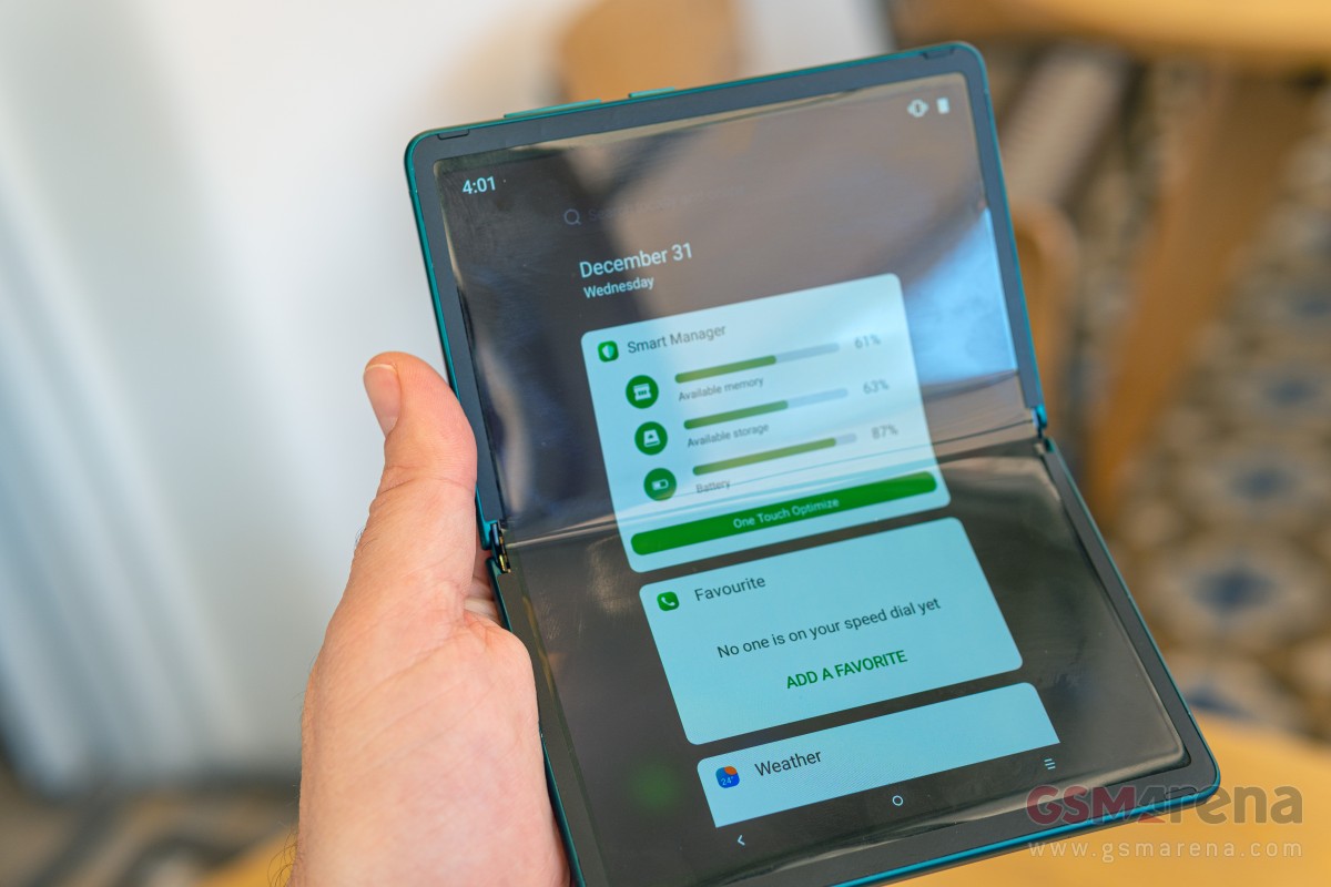
Since we are already on the topic of display and its potential multimedia prowess, it is worth noting that the unit we got to check out has an uninterrupted panel on the front. There is no cutout, punch hole or notch in sight. That's unquestionably better for watching videos, but not really a compromise-free solution on this particular device since there seems to be no earpiece or internal/selfie camera in sight. The lack of a secondary display on the outside also means that there is no easy way to simply take selfies with the main camera. All things that can easily be forgiven on what is essentially an early design mockup.
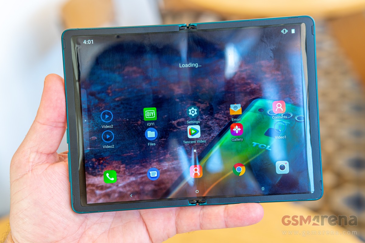
Since this was the only unit out of the three with an actual working display, we do feel obliged to talk about its properties. This is a very early implementation and a work in progress and is probably not indicative of the final panel, nor its mounting, which looks kind of crude and features a very thick overlapping bezel. With that warning out of the way, we will say that the display surface both looked and felt very soft, uneven and plastic. All those reflections that the camera picked-up - you can see most of them in person as well, due to the very poor uniformity of the surface. Again - this is an early prototype, so make of that what you will.
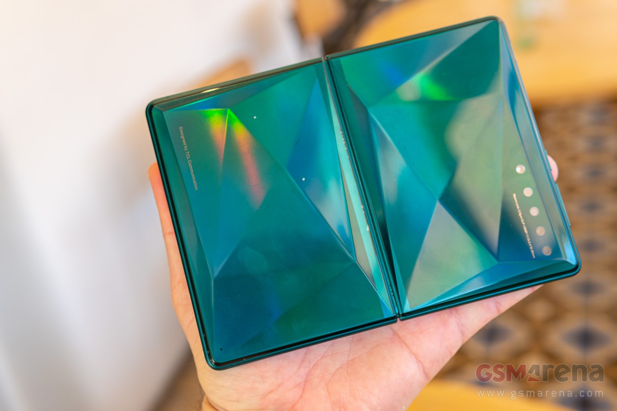
Moving on from the display to the other bits and pieces of the unit, frankly made those feel very premium and well-made in comparison. The large surfaces on the back of the two folding halves feature a nifty pattern design. On this particular unit, these panels felt a bit on the plastic side but considering they are meant to be separate from the main actual frame of the phone, we can only imagine some toughened glass will be in the final design.
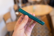
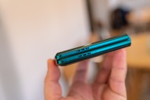

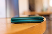
TCL flip phone concept from all angles
Looking at the phone in its fully folded-down state, we can't help but notice the impressive tightness of the fit and the lack of an air gap. An issue that plagues the original Samsung Galaxy Fold and is also present, in a lesser degree on the new Samsung Galaxy Z Flip. However, we don't think TCL managed to develop a revolutionary new generation of a foldable display with a tighter curve. Instead, the thickness of the two folding halves manages to work pretty well together with the hinge to achieve the effect. It is impressive non the less.
Speaking of the hinge, its spine looks and feels sturdy enough. The folding action was relatively smooth on the prototype unit as well. Still, without any knowledge of its internal structure and things like added protection from dust, we can't really be certain of its actual qualities.
In terms of controls and layout, the design seems to have all the essentials sensibly laid-out. In a closed state, you end up with a mostly empty top side, housing just a secondary microphone, and a bottom with two speaker-looking grills and a hole for the main microphone. Hopefully, both of these house speakers, since these would end up in a very convenient far left and right location when the unit is unfolded, potentially providing stereo output.
Most other bits end up on the right-hand side, where the two folding halves meet. These include a volume rocker, power button (no sign of a fingerprint reader), a SIM card tray, and a rather oddly positioned Type-C port. The latter does start to make sense when you think about it, though.
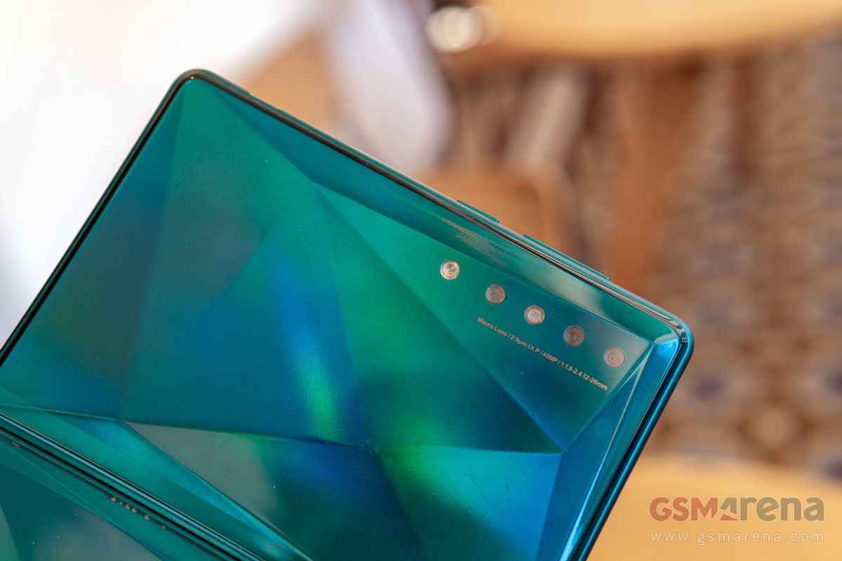
Finally, since we are sure it is going to come up in the comments, we have little info on the camera setup of this prototype. Frankly, upon closer inspection, most of it appears to be an array of fake lenses and cutouts. If we had to guess, as far as this particular prototype goes, we would say one or perhaps two of the holes actually have working cameras in them. Again, that is not really important on a nameless early prototype. The text alongside the five-module camera array reads: "Macro Lens/2.9µm ULP/48MP/1:1.8-2.4 12-26mm". There is a lot to potentially unpack here. But, again, there is no point in doing so since this text is probably just a placeholder.
TCL's other two prototype designs are even more "out there" and intriguing, so be sure to check the next page as well.
Reader comments
- Anonymous
- 08 Sep 2021
- P$I
The design is unnecessarily flashy
- ignorance
- 10 Dec 2020
- 0p$
Glass can't bend? Ever heard of optical fiber?
- L2ga
- 31 Oct 2020
- r39
TCL keep it up