vivo NEX Dual Display review
Design
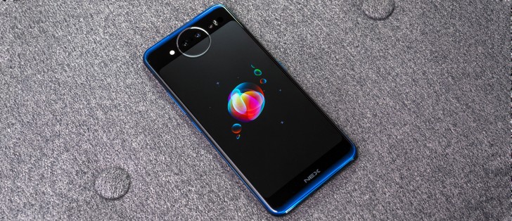
The vivo NEX Dual Display is definitely a looker. Not really in the conventional stylish sense, but not really in any particularly flamboyant way either. It is unapologetically different, though and designed in a way to highlight that fact.
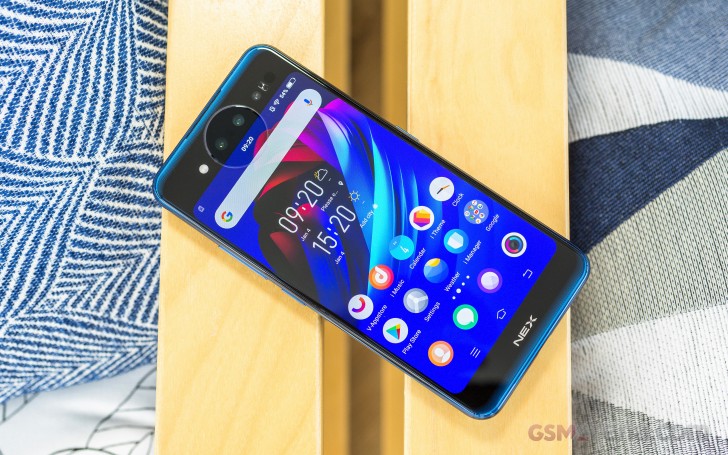
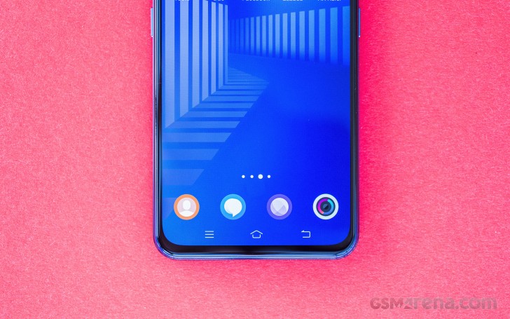
On the front, the design team clearly only had one goal - extend the display as far as possible and slim the bezels down aggressively. After all, that's the whole reason for the second display endeavor in the first place. And to vivo's credit, the end result is remarkably close to that proverbial "all display" look. That being said, we've seen side bezels thinner than the ones on the NEX Dual Display. The same goes for the forehead and chin. Putting all of these together, however, is a veritable achievement in itself.
We particularly appreciate seeing a thinner chin compared to the original NEX S. This time around it is roughly the size of Apple's chin for the iPhone XS. So, whatever display controller wrapping magic Cupertino was doing, it is apparently no longer exclusive. There are plenty more neat little details above the display. The forehead only has a single control/cut-out, of sorts, for the earpiece, tucked away underneath. It is also mirrored around back since you can hold the NEX Dual Display the other way around and still have a conversation. Our best guess is that vivo simply positioned a single speaker in the middle to serve both sides.
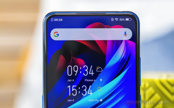
As for sensors, like proximity and the ambient light meter - these are actually positioned underneath the AMOLED panel near the earpiece. Not a new technology, but still very cool to see in practice.
Unfortunately, there is no notification LED on the front. The RGB LED strip around the camera on the back side handles that. So, vivo clearly envisions the NEX Dual Display spending most of the time face down.
The only other potential issue we find with the front side of the phone is the unspecified protective glass used for the panel. Perhaps it is hard enough, but we would have preferred a Gorilla Glass number of some sorts.
Speaking of materials, in contrast, the back side of the NEX Dual Display is clearly labeled as having Gorilla Glass 5 as its final layer. Last, but not least - the frame is solid aluminum. With so much going on on both sides of the phone, one could imagine that structural integrity would be a concern. Well, It's definitely not, likely thanks to the solid frame design. There is practically no flex in the unit. Still, it doesn't exactly feel too encouraging in the hand, mainly due to its extremely slippery surface. Both sides are fingerprint magnets and offer little traction. Using the bumper case really is a must.
Around the back, the overall design approach becomes a lot less subdued and clearly more flamboyant. Let's agree to call it "showmanship", since the NEX Dual Display clearly wants to stand out and be recognized. The sizeable "vivo" logo is probably the first clue here. Then there are the color gradient accents on the top and bottom bezels. There is clearly not enough room to lay out a properly impressive visual surface, but vivo wasted no opportunity to slap on some recognizable "war paint" non the less.
And if we think we are exaggerating the "showmanship" aspect here, look no further than the circular camera bump that actually spread into a portion of the rear display for no other apparent reason but symmetry. The piece covering the display is translucent but since it's thicker than the rest of the surface, it distorts the display image and making for a sort of "shattered and displaced" appearance.
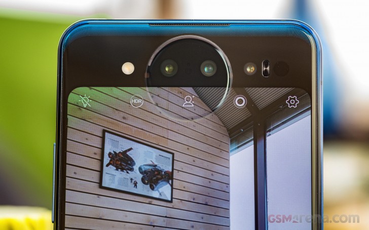
The camera bump doesn't really need to be round. The only practical use vivo is getting out of it and we are using "practical" in the loosest sense here - are the pair of RGB LED strips positioned on the top segments of the camera ring are symmetrically matched by a colorful visualization on screen.
Only the top part of the light ring is an RGB LED array, while the bottom portion of the animated area is simply lit up by the display. Even so, since we can't get Jovi working outside China, we can't really experience half of the intriguing animations and their clever implementation anyway.
For us, the ring around the camera bump lit up for taking selfies, for notifications and for when the phone was charging. Rather mundane tasks for the otherwise flashy appearance of this LED light show.
Controls
Speaking of kind of unnecessary or at least unorthodox design choices, this is a perfect segue to a controlled tour of the NEX Dual Display. Starting, of course, with the pair of power buttons. Yes, just like many recent Samsung phones, the NEX Dual Display has a pair of single buttons on either side of the frame. In this case, the left one is labeled "vivo" in tiny font, so one could assume it triggers the Jovi assistant and it does. Its more important function, however, is to wake up the secondary display on the back. The idea is that you simply need to build up muscle memory to always press the button on the right side to wake the phone, no matter which display you are looking at. It's neat, actually and very easy to get used to indeed.
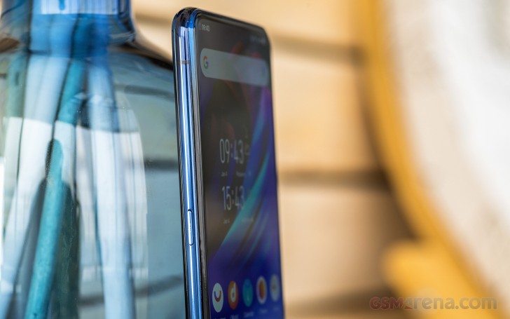
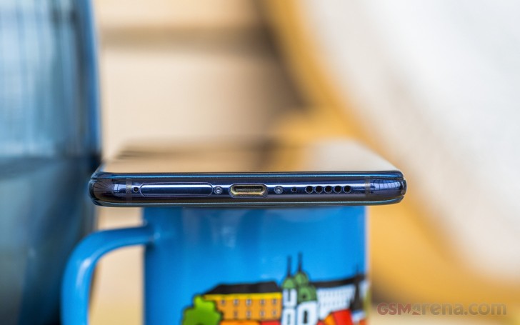
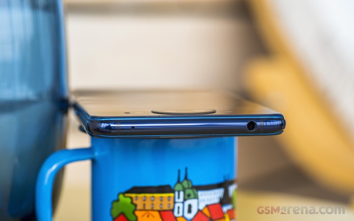
Other than the pair of power buttons, the rest of the controls scattered around the frame are pretty standard. A volume rocker on the right - nice and tactile, just like the other two buttons. On the top - a 3.5mm audio jack and secondary microphone. And on the bottom - a single speaker, USB 3.0 Type-C port and a dual Nano-SIM tray. Sadly, there is no memory card expansion slot.
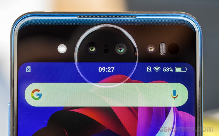
Things get a lot more exciting around back. We already mentioned the RGB LED strip on the top edge of the circular camera bump. There is a bit more interesting hardware here as well. Besides the two cameras, LED flash and TOF sensor, which consists of a few parts, there is also a pair of "fill lights" on either side of the round camera module. These do just what it says on the tin - they provide softer fill light for selfies than the regular LED flash.
Reader comments
- Bronxy
- 28 Oct 2019
- ftM
I bought this in Ghana and i cant even change the country and region on this phone , Can anyone assist me with this please .
- Nice
- 13 Oct 2019
- 6sE
Nice
- .
- 17 Sep 2019
- HXa
Should I purchase this or the Xiaomi mi 9t pro?