vivo NEX S review
Design and 360-degree spin
The vivo NEX S is a looker. Like we already said, the end-goal is well defined - an all-display experience. Having a window into the digital world, without any obvious hardware getting in the way. We're not quite there yet. Plus, that sounds like a really boring reality to live, since mobile hardware has come so far and worked so hard, for the best possible hand-feel.
In this respect, the vivo NEX S subscribes to the current trends. Hence - a glass sandwich design and a strong metal frame in between. Nothing really out of the ordinary. The back surface is gently sloped, so the handset sits better in your palm. But, how well that works in reality is a pretty fair question to ask, given the NEX S' huge proportions - 162 x 77 x 8 mm and a hefty weight of 200 grams.
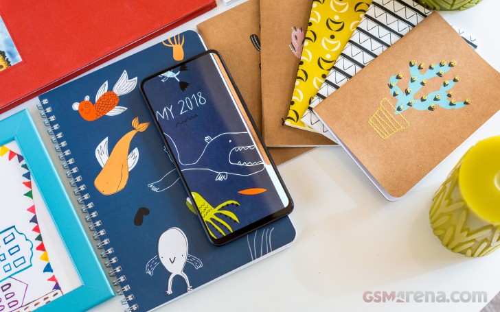
Well, it will come down to personal preference, but subjectively, the NEX S manages to remain pretty comfortable to handle. It is not unwieldy, despite outdoing the Samsung Galaxy Note8 in most dimensions. Sure, some thumb-stretching is required, but we would even go as far as to claim it is usable with one hand. Especially if you get accustomed to the trendy new gesture navigation scheme, that vivo included in their OS.
Hardware overview
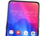
The almost all-display front side of the NEX S is its calling card. Vivo would have you believe the gorgeous 19.3:9 display is surrounded by so little bezel, that the screen to body ratio is over 91%. In reality, that's just the PR department getting a bit ahead of themselves, since the real number is somewhere around 86%. That sure sounds a lot less impressive, but, in person, the NEX S offers a strikingly different experience from pretty much every other phone around.

When the Super AMOLED panel is off, you really can't appreciate just how impressively massive it is. Light it up, however, and you are sure to get some amazed gazes. In fact, unlocking the phone straight to selfie cam mode in front of an unsuspecting friend's face almost always produces an instant reaction of pure amazement. Combining the two in one go is almost like a sensory overload. We can't tell you just how happy it makes us to see such a reaction from what could have easily been yet another boring "slab" smartphone.
There are actually quite a few impressive things going on behind the scenes, to achieve this stunning nearly bezel-free look. Starting at the top of what is an uninterrupted sheet of Gorilla Glass, we can see there is no earpiece on the slim top bezel. It was ditched in favor of a piezoelectric speaker under the display.
Another thing that has been moved beneath the screen is the under display fingerprint reader. The whole module seems to be tucked away nicely behind the panel, although, it should be noted that the iPhone X still has a slimmer bottom chin. Apparently, Apple's circuit folding chops are still a few steps ahead.

Under-display fingerprint reader
Vivo didn't necessarily have to that to slim down the bottom chin. A back-mounted traditional reader solution, as found on the lower-end NEX A, would have also worked. But that would have meant skipping some of the impressive technological innovations the APEX concept presented. To be fair, the APEX featured a larger reader, encompassing the entire bottom half of the display.
The fingerprint reader on the NEX S is small and round, pretty similar, if not identical to the vivo X21 UD module. Some integration improvements have apparently been made, though, since we can't really spot the reader, no matter how hard we try to illuminate the NEX S' under different angles. The one on the vivo X21 UD was relatively easy to spot.
But those are minor details, and we're tiptoeing around the real issues. And the reader has plenty of those. Sure, this technology is still in its infancy and will surely get better. But in its current implementation, it is not really ready for the end-user market.
Speed is one of its weak points. We do get the complexity of the optical readout through an entire display assembly and won't really hold that against vivo. However, most average consumers likely will, seeing how even entry-level traditional fingerprint readers have gotten so speedy and accurate lately. Registering more than one fingerprint in the UI makes things worse. So, expect longer waiting times when unlocking this phone with the reader.
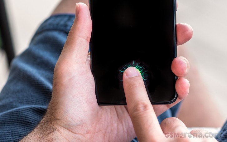
Frankly, we can live with a slow reader, as long as it is reliable. Sadly, the one on the vivo NEX S isn't. Different people around the office seem to have different unlock success rates, ranging from around 70% in the best of cases, all the way down to 0%. That means registering the fingerprint, verifying that it actually works and then having it fail every time once the phone has spent some time in a pocket and the screen is no longer perfectly clean.
At this point, the under-display reader remains a tech showcase more than anything else. Seeing how it is one of the major differentiating points between the NEX S and the cheaper NEX A if you can live with the slightly slower internals, don't go for the more expensive model just for the reader alone. You will be sorely disappointed.
In contrast to the fingerprint and selfie camera setup, the rest of the NEX S' control scheme and placement is somewhat standard. Despite offering a double-tap to wake feature to accompany the fancy under display fingerprint reader, vivo has still left a physical power button on the right side of the handset. Probably a good choice. Right above that, a volume rocker.
On the opposite side, vivo now has a dedicated Assistant button. The assistant itself is called "Jovi" and currently deals with searches and OS-level tasks and automation. Much like Samsung's own Bixby. In fact, even its interface looks quite similar. Currently, it is strictly targeted to the Chinese users, but vivo has confirmed that more third-party functionality and integration is coming in the future.
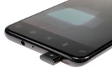
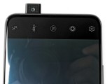
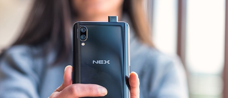
Most of the top bezel is occupied by the motorized selfie camera assembly. Still, vivo found enough space there to include the trusty old 3.5mm jack and a secondary, noise-canceling microphone.
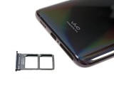
The SIM card tray fit best on the bottom bezel. It seems a bit crammed there, but we won't complain. We will, however, take a few points off the NEX S' overall rating due to the lack of a microSD slot. Then again, even the base variant comes with 128GB of built-in storage, so most users should be covered.
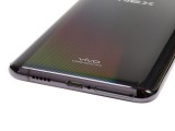
Next to the SIM tray, we find the main microphone and the Type-C port. It offers OTG support, which is nice but is oddly only backed up by a USB 2.0 interface.
Next to that, the only speaker the NEX S has at its disposal. Unfortunately, Vivo didn't figure out a way to make a hybrid stereo setup in the absence of a traditional earpiece.

vivo NEX S nicely textured glass back
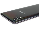
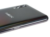
Last, but definitely not least, there is the back of the phone. Like we already mentioned, just like the front, it's one solid piece of Gorilla Glass. The underlying pattern does make for a great visual effect, though. Plus, the relative heft and bulk of the device make up for the slippery surface by providing a good, solid grip.
The back is quick to smudge with fingerprints as some other past vivo models. A case can patch that up nicely. The one vivo bundles in the box is actually very nice to the touch. Plus, it also protects the slightly protruding camera assembly from accidental scratching.
One thing we can't simply glance over is the text near the bottom, which reads "vivo Designed by vivo". Quite informative there vivo, indeed...
Reader comments
- RishiGuru
- 20 Apr 2020
- gM{
Correct me if I am wrong, but Vivo Nex S is the first device in the world to sport pop up selfie shooter. I own a NEX and the selfie camera takes average photos. However good first try by Vivo. Nothing great to talk about the image quality though. Ho...
- Anonymous
- 01 Feb 2019
- PEh
I never had this problem. I can hear everything clearly
- Rakesh
- 31 Jan 2019
- f{4
I am also facing same problem. Voice is not clear to hear and I sent back for replacement after using 1 day. This deficiency covers all good things of the phone. Because basic function must be perfect.
