vivo U20 hands-on review
Design
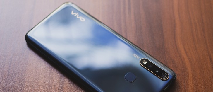
The U20 looks far too much like other phones from vivo's product lineup. It has the same teardrop notch design on the front and a stacked triple camera lens at the back. That's not to say it looks bad but the company is basically recycling the same design at this point and it's starting to get boring.
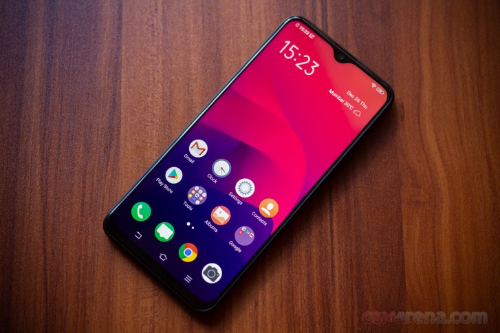
Lazy copy pasting aside, the phone still looks reasonably good. The back on our 'Racing Black' model has etchings to create the now familiar curved patterns every time light hits it. It's not exactly black as the name would suggest but a light bluish gray, which contrasts nicely against the golden accents on the back.
The front looks anemic in comparison, with the now somewhat dated teardrop notch design. The notch is fairly small, however, as is the chin at the bottom, so it's not too distracting.
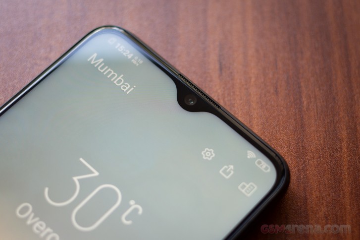
What the real problem with the front is that the display lacks any oleophobic coating whatsoever, or at least that was the case with our review unit. The phone comes with a pre-applied screen protector, which we promptly removed as we usually do. Unfortunately, we quickly found out that perhaps that wasn't the best idea, as the display doesn't seem to have any oleophobic coating and instantly turns into a disturbing fingerprint nightmare.
This also means it's rather difficult to clean quickly and easily and needs a special cloth to wipe. This does prove to be a futile exercise, of course, as you can only clean it so often during a day and then watch it get greasy all over again. We'd like to believe there was just some issue with our unit and that a manufacturer wouldn't just ship a device without an oleophobic coating in late 2019 but you never know.
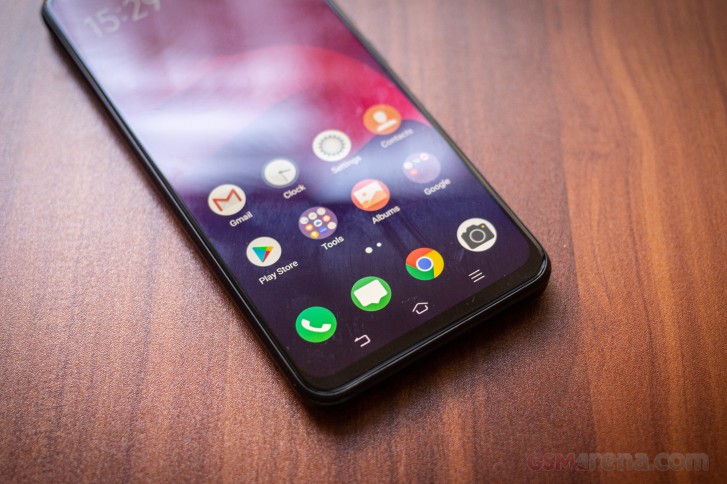
The rest of the phone feels very sturdily built, despite the plastic construction. It's also fairly heavy due to the large battery inside but not too heavy to be cumbersome. The phone has a reassuring heft and feel in hand and the frame feels robust. Overall, decent build quality save for the mishap with the display.
Display
Speaking of display, it's a shame that the glass on top is such a smudgy mess because the actual panel underneath is very good.
The vivo U20 has a 6.53-inch, 2340x1080 resolution IPS LCD. The panel has good image quality with saturated colors that aren't entirely accurate but pleasant to look at, good contrast and viewing angles. Text is sharp while images and videos look vibrant and pop off the screen.
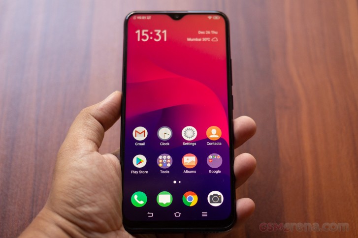
The only minor issue with the display is that it doesn't get nearly bright enough. Even the maximum brightness isn't enough so you end up spending most time at the highest brightness setting.
Aside from that, the vivo U20 has a really good display.
Reader comments
- Anonymous
- 07 Jun 2021
- 6iP
Wow
- Anonymous
- 17 Apr 2020
- gMx
Superb
- Anonymous
- 14 Feb 2020
- DkJ
Redmi note 8 pro is IPS screen and v17 pro has super amoled display... V17 pro,v17 and s1 pro much better display quality compare to redmi note 8 pro