vivo V23 review
Design
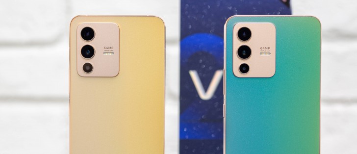
Both the vivo V23 and V23 Pro are unquestionably stylish devices, both with a shared overarching design language, yet like we mentioned, also distinctly different in a few notable ways. While the V23 Pro bets big on the razor-thin aesthetic, the vanilla V23 kind of goes the polar opposite route with a flat front and back panel and a wide middle frame.
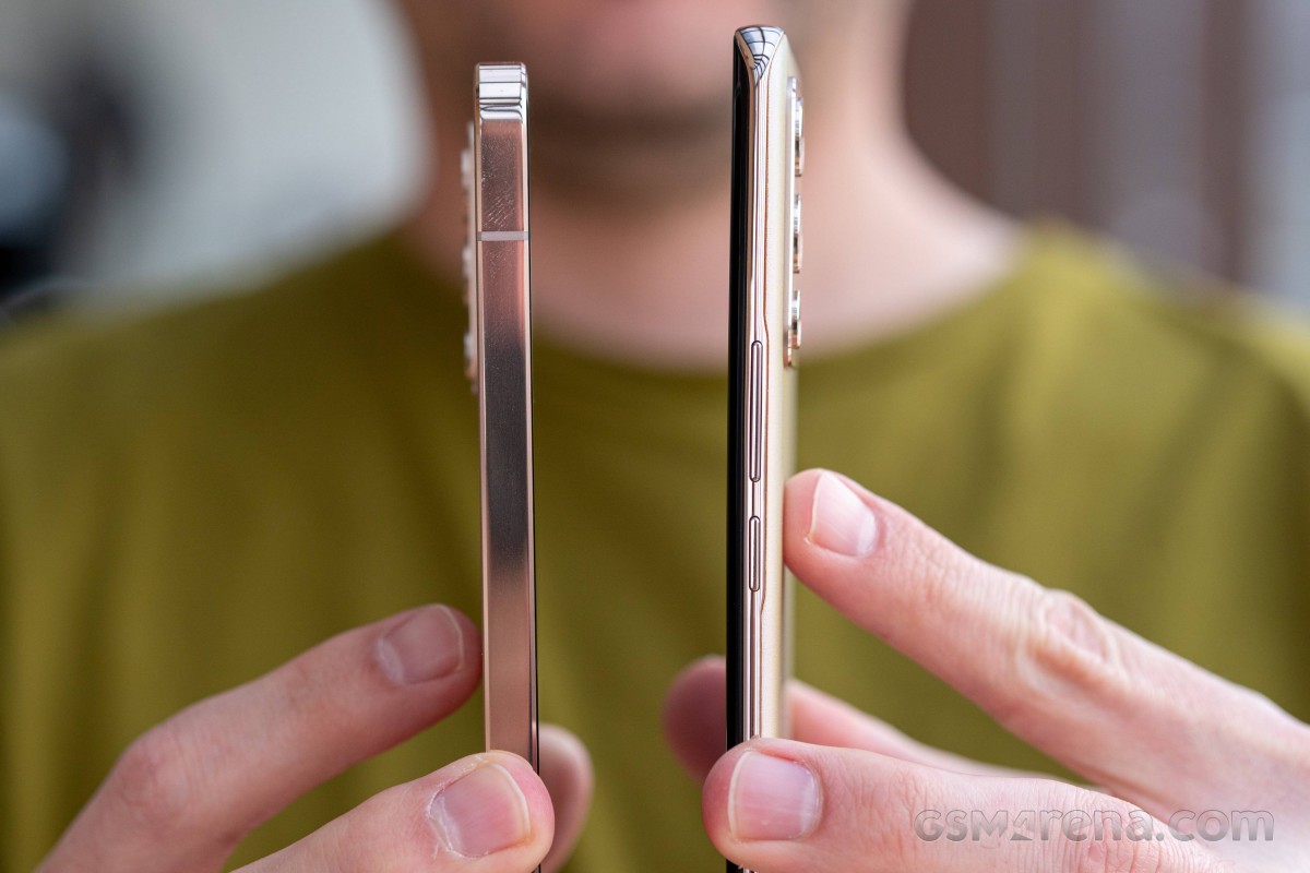 Left: vivo V23 * Right: vivo V23 Pro
While the actual thickness of the two phones isn't all that different, the aesthetic sure is, with the V23 going for a pretty obvious iPhone look. Even the angles of the display and edges look pretty Apple-esque to us, which we don't see as a negative. While this might be a relatively unpopular opinion, we kind of prefer the overall silhouette of the vanilla V23 over the V23 Pro.
A lot of that favoritism has to do with handling. Due to its particular shapes and aggressive curvature on both sides, the V23 Pro just doesn't handle well. It can slip from the hand easily. That is not at all the case with the V23. Its shape offers plenty of comfortable grip. If you still want some additional grip, the included TPU case provides plenty, but you do have to give up on the particular feel of the back panel.
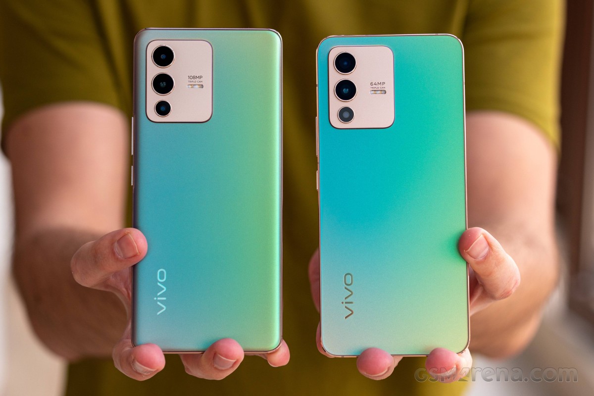 Left: vivo V23 Pro * Right: vivo V23
The back panel on both V23 models is actually covered with Fluorite AG Glass. It has a sort of soft yet sandy feel, achieved through a special crystal finish, reminiscent of the Oppo Reno6 Pro 5G Dimensity model's rear panel. The vivo logo is also kind of embossed, which is a nifty little detail.
While the finish on the back side is likely to be polarizing in terms of feel, the fact that it doesn't get greasy or otherwise dirty easily should be universally appreciated.
Of course, we can't discuss the back of the vivo V23 Pro without talking about its "party trick" - the UV reactive paint job. It should be noted that just the signature Sunshine Gold color is UV reactive. That's the unit we got for review too. The other Stardust Black variant still has the sandy feel but does not change colors, making it a bit more understated overall.
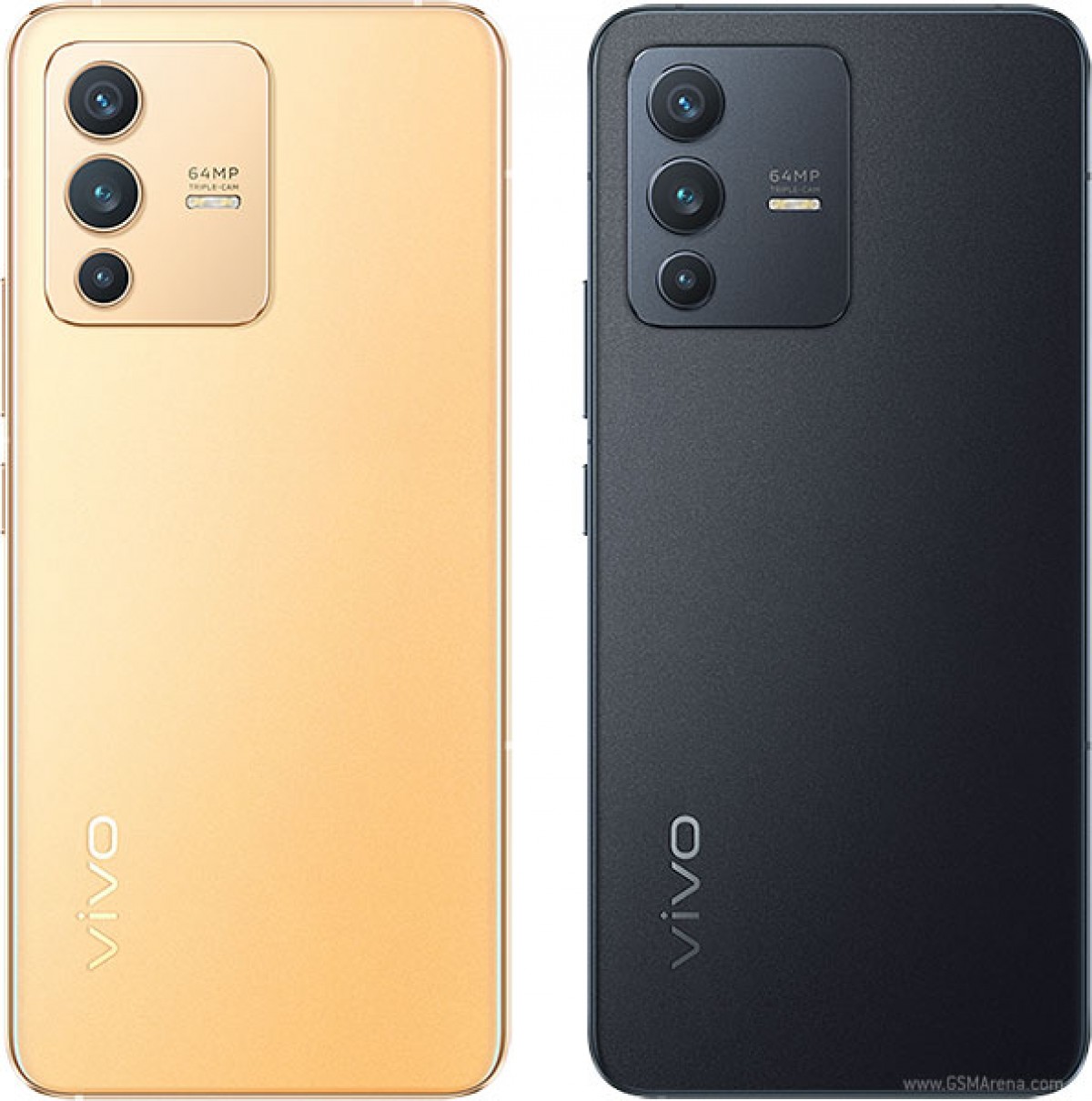
Plus, there is a small detail to potentially consider - the camera island on the Stardust Black is, for some reason, not treated with the same UV-reactive paint as the rest of the back and does not change color, which can look a bit weird at times.
Speaking of weird, the color change itself can fall under that category. The "native" Sunshine Gold color is only really gold under more intense UV-free lighting. In a dim room with just natural light coming in from a window (which does filter out UV), the color is a lot "duller" and not as vibrant, like a pale grey or silver, with some greenish and blueish tones coming through, depending on how the light hits it. It's a pretty odd mix of hues, and that is also the case in UV light after the color has changed to what is mostly blue, but with some green and yellow showing through on occasion and depending on the angle. It is kind of meant to play with your mind and does that well.
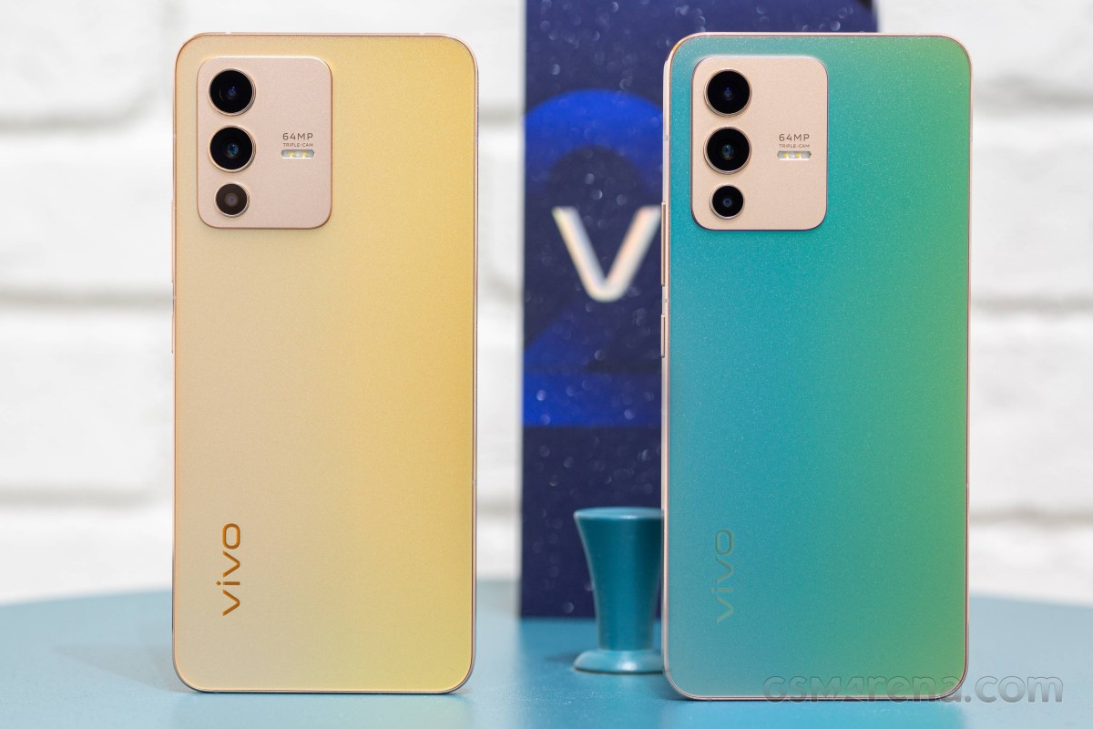
Depending on how much UV light is present, the color change itself can take anywhere from under a minute to a few minutes, both boing to and from the UV blue state. You can often end up with a mid-way change in some environments, like on a cloudy day and never get the proper "blue" color.
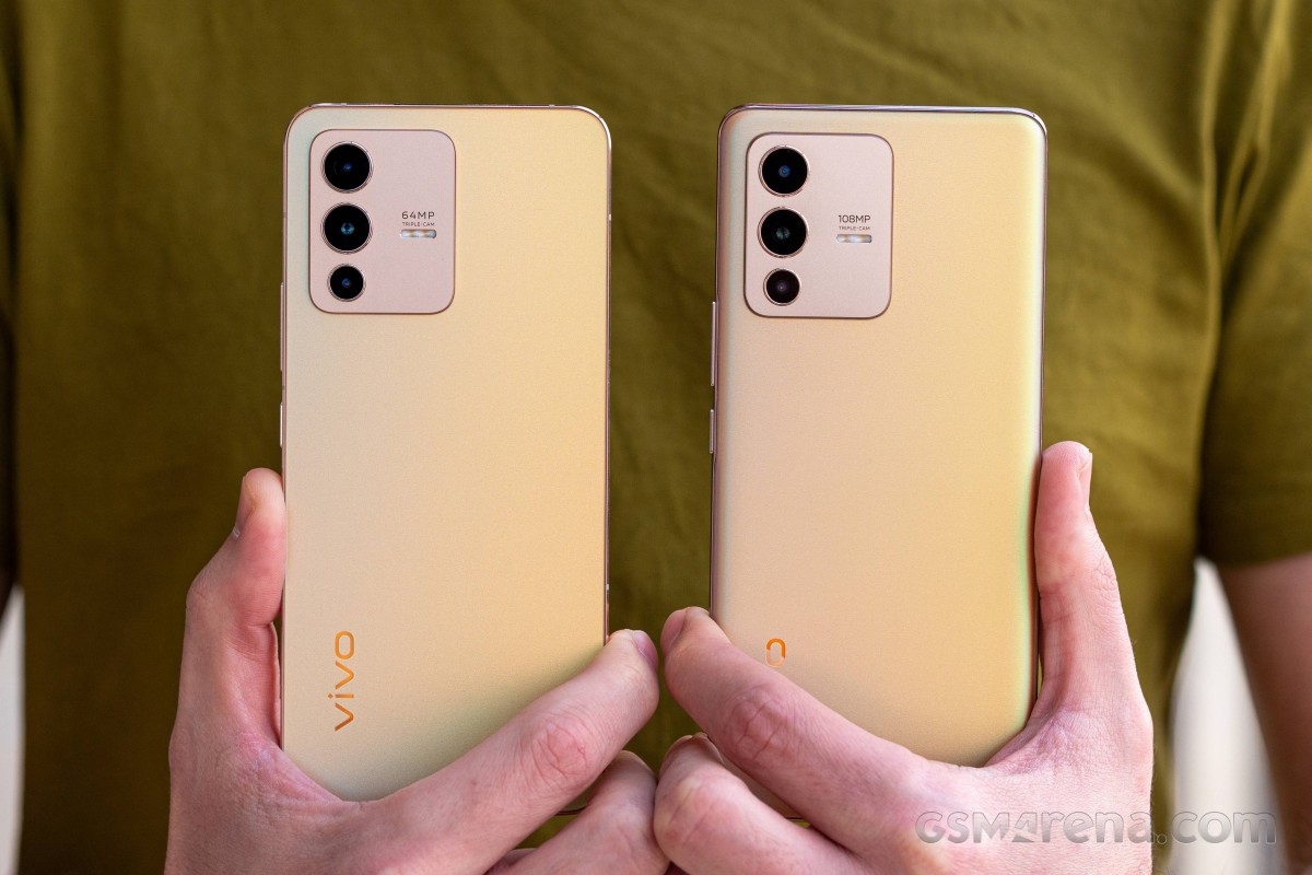 Left: vivo V23 * Right: vivo V23 Pro
Naturally, you can play around with the process quite a bit simply by covering parts of the back panel as it changes. Unless you are in a controlled environment, though, don't bet on any temporary "customization" sticking around consistently, like a stencil of a logo or something. And also, be prepared to look at a not-so-pleasing random "artsy" design for a while after holding your phone as you walk into or away from the sun.
All things considered, though, it is a really cool party trick that even works fairly well through the included TPU case, which is neat. And if you are not into it at all, you can always just slap a solid case on the V23 Pro and forget it was ever a thing.
Enough about the back side of the V23, though. Circling to the front, we find some more iPhone-like design, though only if you don't immediately have an iPhone 13 phone to compare with. Vivo clearly did the best it could to color in "as close inside the lines" as possible without infringing on some Apple copyright.
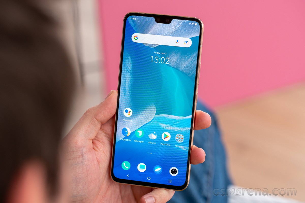
The glass front is mostly flat, though it does sort of taper-off at the sides. Unlike Apple's pretty-much symmetrical display bezels, vivo went for slightly thicker ones on the top and bottom and extremely slim bezels on the left and right.
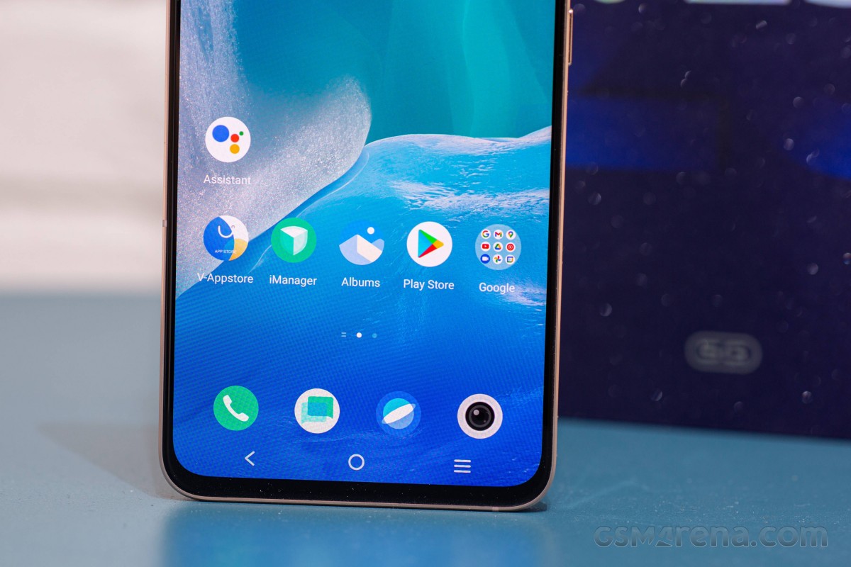
That looks pretty modern but could potentially be an issue for making a proper edge-to-edge glass screen protector for the V23. Perhaps there is just enough room to get some adhesive on there, but we can't say for sure.
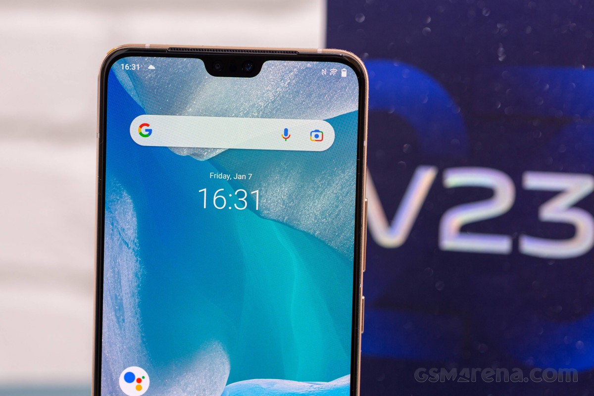
The selfie notch on the V23 is neither quite as big nor exactly the same shape as that on the iPhone 13. One could argue that with two impressive selfie cameras in there and some light and proximity sensors, vivo is making much better use of space. Though, it should be noted that Apple's extra-wide notch is pretty much filled up with hardware as well. It's just more specialized in nature, rather than a second camera.
We'll circle back to the area above the display in a bit for the overview of the control.
Materials and build quality
Both vivo V23 models have a rather interesting bill of materials. While the V23 Pro's overall assembly can be described as a bit of a "glass sandwich" with a plastic frame in between, the V23 has a much more prominent middle frame, with the display and back panel kind of "sitting" recessed inside it and mounted that way. It feels very sturdy, even more so than the Pro and has absolutely no flex.
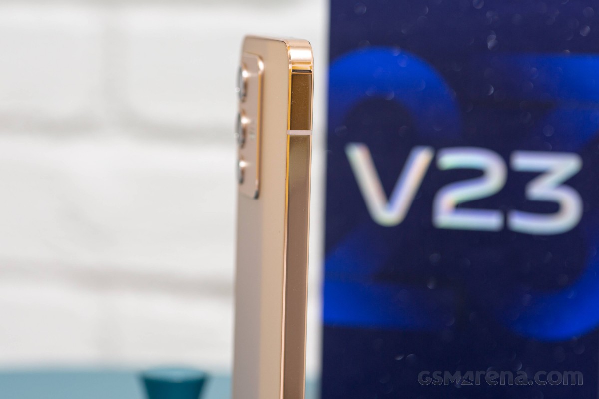
One particularly-interesting detail that vivo isn't focusing too much on in its promotional materials has to do with the materials for both of these frames. The thin middle frame on the V23 Pro, as good and sound as it feels, is made of plastic. This has its drawbacks but does also arguably hold up better when scratched and scuffed and makes for a lighter construction material. So much so, in fact, that you might notice that despite its smaller size and battery, the vanilla V23 is actually a bit heavier than its sibling - 179 to 181 grams (the Stardust Black one is lighter and thinner at 7.39mm, while the Sunshine Gold is 181 grams and 7.55mm thick), compared to 171 grams for the Pro.
That's because the wide middle frame on the V23 is made of aluminum. Vivo calls it "aerospace aluminum", which doesn't really say much about its sturdiness. Still, it feels solid in practice, and it's one obvious benefit over the plastic finish on the V23 Pro is the more premium look and feel. It's honestly not even a competition when holding and looking at the two side by side. The vanilla V23 is just so much more impressive all-around. That being said, beyond the extra weight added by the aluminum, it is a lot more susceptible to scuffs and scratches. In fact, despite our pretty good care, our review unit already has a few small scratches near one of the edges. It will surely become increasingly off-putting as scratches, and perhaps even dents accumulate further.
As for the two flat glass panels - we already noted the Fluorite AG Glass on the back - the same as on the V23 Pro. For the front, vivo stuck with Scott. They might not be nearly as well-known as Corning in the space but is a quite reputable source for protective glass finish nonetheless. The regular V23 uses a Xensation Up glass, which is actually last year's model. The V23 Pro, in comparison, has the current flagship Xensation α, which claims to rival Corning's Gorilla Glass Victus. In that sense, it can be considered a bit of a downgrade. However, Xensation Up is still an excellent product and one also used on the vivo X60 Pro and X70 Pro.
One unfortunate omission on the V23 is any formal ingress protection rating. Not even the basic IP53. This is also unfortunately true for the V23 Pro as well. There is an obvious rubber gasket on the SIM tray, for what that's worth.
Controls
The vivo V23 has a straightforward control scheme. You get a power button and a volume rocker on the right side in terms of physical buttons. These are well positioned and easy to feel out. While they do feel a bit better than the buttons on the V23 Pro, which we had some complaints about, their tactile feedback is still not perfect. Still very much usable and better than what you get on the Pro, but not perfect.
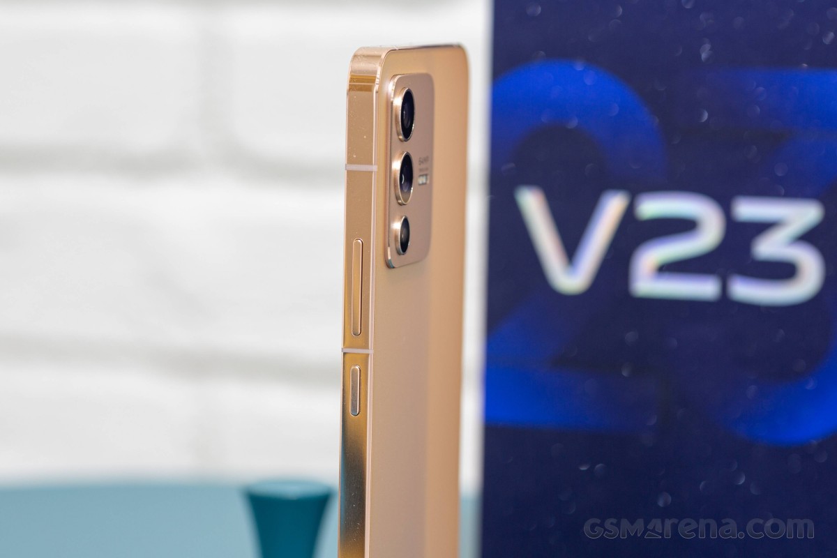
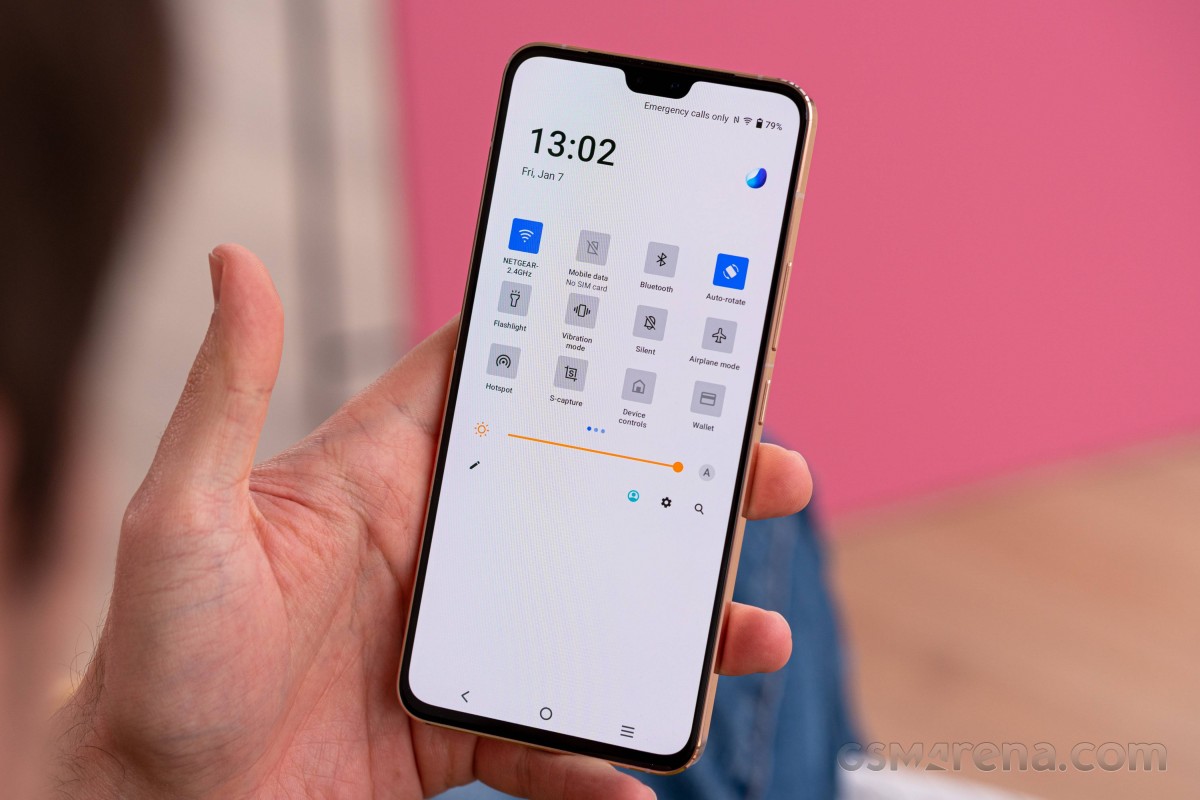
The V23 has an optical under-display fingerprint reader. It is quite snappy and reliable. We have no complaints about it.
The left frame on the V23 Pro is completely empty, and the top frame just houses a single hole for the secondary microphone. This "barren" nature makes the rather thick plastic antenna lines stick out a bit more. We should probably point out that said lines are particularly bad if you have an OCD about symmetry since the two ones on the left and right sides are differently spaced and positioned, and the same goes for the top and bottom. In fact, there is just a single line on the bottom.
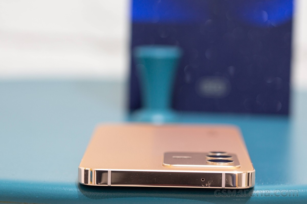
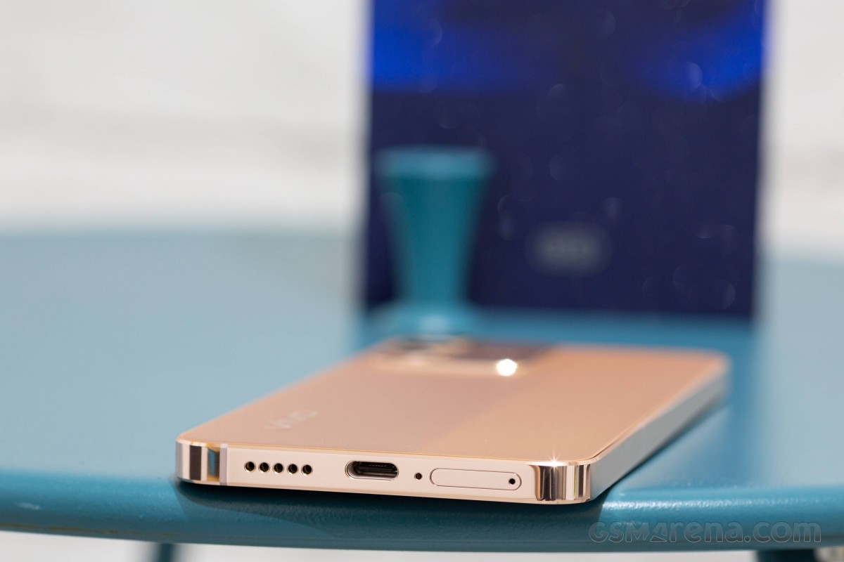
The bottom of the V23 houses its dual Nano-SIM card slot. It lacks a microSD card slot, which is a bit of a bummer.
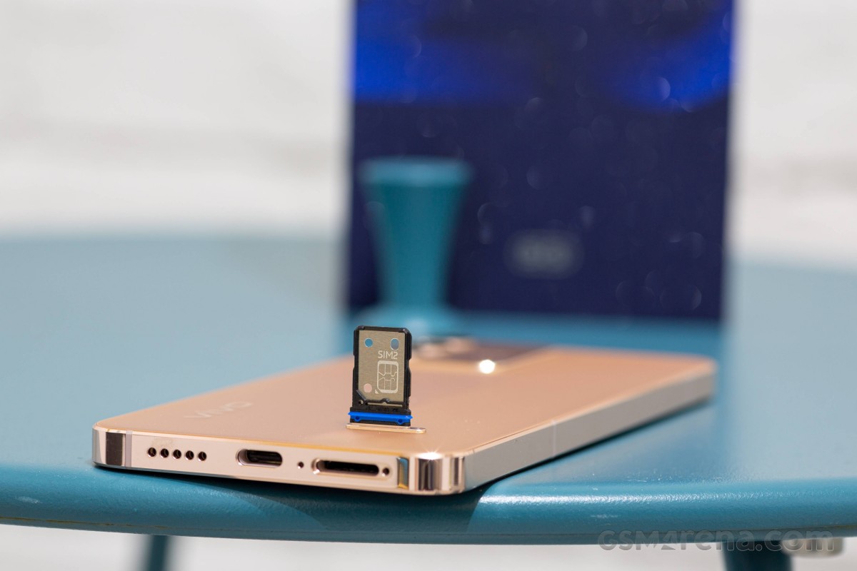
Speaking of bummers, there is just a single bottom-firing speaker on the V23. Just like on the Pro. No stereo setup, not even a hybrid one. There is no 3.5mm audio jack either. And since we are on the topic - no FM radio. The Type-C port is wired for USB 2.0 data speeds but does support OTG. At least, in a rather odd development, the vanilla V23 does offer NFC on some markets, which is not a thing on the V23 Pro.
There is no notification LED hidden away somewhere, just like on the Pro, but that's pretty much expected. At least we are happy to say that vivo hid away a proper proximity sensor and a light sensor somewhere in the selfie notch or top bezel, both of which are appreciated over virtual alternatives.
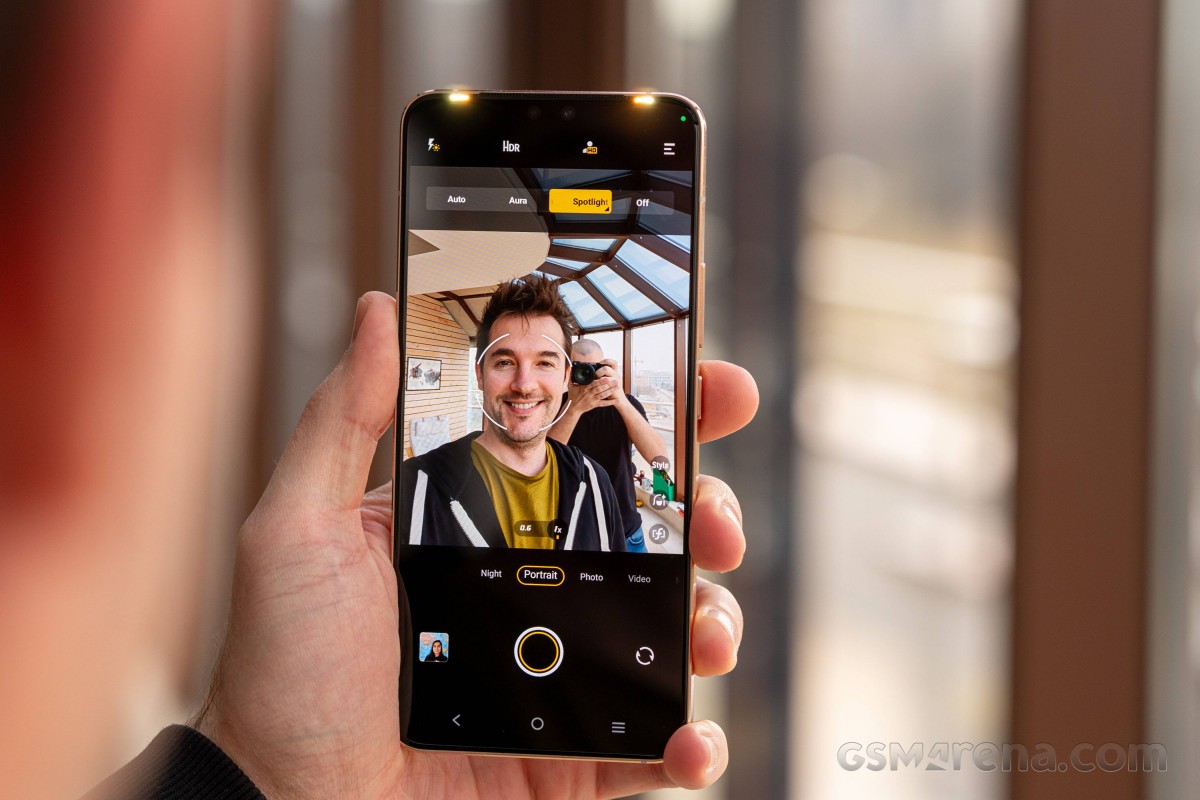
We still like how the earpiece is neatly hidden away above the selfie cameras and just has a tiny little slit for sound to come through. Of course, we shouldn't forget to mention the two dual-tone LED "torches" for selfies, also hidden away near the top left and right edges. These are invisible while turned off as well.
Reader comments
- Anonymous
- 14 Mar 2023
- X}J
Is the phone has the NFC future?
- T4techdroid
- 02 Sep 2022
- DkP
S20 Fe 5g is a bit outdated regarding os . So its only gonna get updates till Android 13 , It was released on 2020 with Android 10 out of box . Eventually samsung relaunched s20 fe 5g 2022 version its really pricier than old s20 fe 5g