vivo V5 review: The Oddball
The Oddball

Software overview
The vivo V5 runs on Android 6.0.1 Marshmallow OS with vivo's custom Funtouch v2.6 overlay on top, which is an older version of vivo's overlay compared to what we saw on the V5 Plus. As with other Chinese manufacturers, that means a single-tiered interface with no app drawer. Vivo steps it up a notch and bakes a lot of Apple-esque user interface touches to Android, making for an interesting mashup.
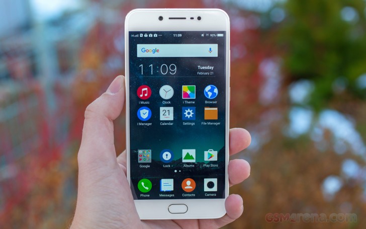
The result is a slick user interface with a slew of features, making for an interesting Android skin. That being said, there's also a lot vivo can further polish. Many menus and some features are hidden under layers of shortcuts and obscure menus. The company has taken care of some of these issues with the Funtouch v3.0 launcher, which we saw on the vivo V5 Plus. We are hoping vivo brings v3.0 to the V5, too.
The lockscreen can be heavily customized and features notifications - a feature Google introduced with Lollipop. The other modifications come in the form of two shortcuts in the bottom corners - dialer and camera by default. However, you do get to assign any other app of your choice to either one. Lockscreen themes are also an option for further customization.

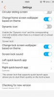

Default lockscreen • Lockscreen settings • Lockscreen themes
Past the lockscreen you get the same single-tier interface with no app drawer. The number of homescreen panes doesn't appear to be limited to a single page of thumbs (which holds 9), and we quickly concluded you wouldn't be left needing any spare room for new app icons.
You can rearrange the homescreens in any way you like and the pane you place first is the default one that appears when you tap the Home button. The panes cannot be cycled, which can prove to be a problem if you have a large number set up.


The homescreen • It doubles as an app drawer • Managing the homescreen panes isn't easy
The homescreen is where all your apps reside after installation. You can group the app icons in folders and tapping on a folder shows its contents in a nicely animated popup on a blurred background (quite iOS like).
There's a dock on the bottom of the homescreen, which takes up to 5 icons, folders included, and redistributes them evenly, depending on the number.
Meanwhile, swiping up from the bottom edge brings out a combined toggles/brightness/tasks drawer, reminiscent of the iOS Control center. Closing apps works with a cheerful "Speed up" button.
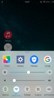
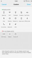
The Quick settings toggles and the task manager • You can customize the Quick settings toggles
The brightness slider won't accept tapping for changing its position if you want to jump straight to a specific place along the axis. Instead, you need to grab it by the handle and drag it where you want it to be each time. There's an Auto switch too.
The toggles offer the expected functionality and aside from the simple on/off action, work as shortcuts to the respective setting upon a long press. All of them are listed in a singled side-scrollable row, and you can rearrange them or hide the unused ones.


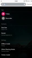
Custom notification shade • Searching a-la Apple's Spotlight
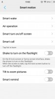
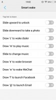
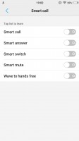
The vivo V5 comes with extensive gesture and motion functionality, found in settings under Smart motion. Smart wake works with the display off and lets you draw letters to launch specific apps, unlock with an upward swipe without lighting the screen beforehand or launch the camera with a downward swipe.
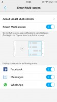
There's Smart Multi-Screen, which allows you to split the display and launch two apps side-by-side. This is only limited to just a few supported messaging apps - Messages, Facebook, Whatsapp. It works only when you are within one of these messengers, say Facebook, and receive a notification from some of the others, say Whatsapp. Then you can expand the Whatsapp floating icon into the full-blown app, which will share the screen with Facebook.
Vivo has kept things pretty clean regarding preloaded applications and, besides the nowadays obligatory Google suite, there are few pre-installed apps. Also, the things that are included in the mix are well executed, nicely styled and even, quite convenient. We won't mention the mandatory calendar, calculator, clock, and voice recording apps, but they are onboard.
Funtouch OS has an amazing central management hub, called iManager. It is designed to keep your phone in top shape and does a pretty good job of it. It can clean your RAM and storage on request and naturally manage applications.
The phone also comes with a very intuitive file manager. It automatically groups things according to type but also allows traditional folder browsing, as well as searching. Multiple file operations are now possible too.

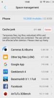
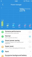
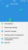
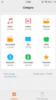
iManager app is pretty powerful • iManager • iManager • iManager • Intuitive file manager
Reader comments
- Vivo
- 30 Oct 2023
- j46
Battery
- chocomintae
- 28 Oct 2021
- PGE
Been using it since April 2017 and its still doing good for me. I like the mini design which makes it look like iphone lol, still superior to most bulky phones nowadays. Best to watch dramas online. When my mom's first bought it at retail price ...
- Anonymous
- 08 Jul 2021
- I@a
I'm using Vivo v5 and it's easy to get lowbat especially when I'm doing a video call..just got charged but gets lowbat already
