vivo V5 Plus review: iPhone impersonator, bokeh king
iPhone impersonator, bokeh king

Unboxing
The vivo V5 Plus comes in a flat squarish box. There is a headset bundled - budget-minded phones typically skip those, but for a $400 midranger you'd expect to at least get a pair of earbuds. A clear silicone bumper case is also included.
There's also a charger rated at 5V/2A or 9V/2A, and a USB cable, naturally. Marketing department insists on calling it a Dual Charging Engine but for all we know, it must be Quick Charge 2.0.
vivo V5 Plus 360-degree spin
The V5 Plus measures 152.6 x 74 x 7.3 mm - all very much standard numbers for a 5.5-inch smartphone, and nearly identical to the OnePlus 3T's dimensions. That said, the Xiaomi Redmi Note 4 is 2mm wider (and 2mm in this direction do make a difference), and also 1.2mm thicker (even more tangible). Mind you, the Asus Zenfone 3 (ZE552KL, because you absolutely need that with Asus phones) is 3.4mm wider - talk about bezels.
At 158.6g the V5 Plus also weighs as much as the net 5.5-incher. The same Redmi tips the scales at 165, but does have a larger 4,100mAh battery to show for that (and it probably accounts for the extra thickness too).
Hardware overview
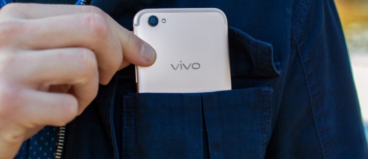
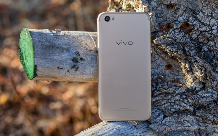
As far as iPhone 7 impersonations go, the vivo V5 Plus is in the running for top spot. Just look at its back - the antenna bands, the camera placement, there's even a 'Designed by vivo' inscription where it should say 'Designed by Apple in Cupertino'.

It's in some of the details that the vivo handset differs, inevitably. Controls placement, Home button shape, and all those black spots around the earpiece eventually reveal that's no iPhone. But the immediate first reaction is 'Copycat!'.
That's not to say that the V5 Plus doesn't look good or isn't well built - quite the opposite. It's a solid device with confidence-inspiring look and feel. The metal back with a satin finish says 'premium' (and is crazy slippery like all such designs, iPhone included), the display has the compulsory 2.5D curved edges - there's hardly anything to put you off the V5 Plus, physically.
The screen enjoys the latest Gorilla Glass 5 protection, which makes us wonder why the handset comes with a pre-applied screen protector. Better safe than sorry can always be cited as a reason, but it does make us deduct some points for posh. Peel it off though - posh points instantly restored.
Vivo used to rely on capacitive keys below the display, Home included, with the fingerprint reader around the back. However, the Apple influence has seen the adoption of a physical Home button with a reader in it and now just the back and task switcher keys are capacitve. They also light up when you wake the phone.


A bit more personality on the front
The Home button isn't TouchID-circular, but does serve the same touchID-ing purpose - there's a fingerprint sensor embedded in it. It's also one of the fastest we've seen, and works virtually every time.

There's a lot going on above the display. The earpiece is here, there's no escaping that (okay, the Mi Mix would beg to differ). There are two cameras to be found next to it - the closer one is the primary 20MP shooter, while the auxiliary 8MP unit is further to the left. In the corner there's an LED notification light too.
That's not all though. A proximity/ambient light sensor combo lurks behind the tiniest of the cutouts. The one next to it is the LED fill light - not a flash, strictly speaking, as it lights up and stays on instead of only firing when you're taking a shot.
On the right side of the device you'll find the power button, a little bit above the midpoint, with the volume rocker further up. They are quite well placed, no complaints here.
Just the SIM card slot is on the left side of the phone. The tray will only take nanoSIMs, one or two of them, but no microSD - 64GB of built-in storage is all you get.


Right side • Power button and volume rocker • Left side • Dual nano SIM tray
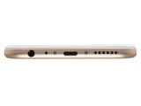
The bottom is also brimming with cutouts. There's the microUSB port in the center, flanked by a screw on each side. On the right is the loudspeaker, while on the left you'll find the microphone and the 3.5mm jack - we can copy Apple all we want for looks, but the headphone jack stays, is what vivo is saying.
By contrast, there's nothing to be seen on the top plate.


Bottom handles wired connectivity • microUSB 2.0 • Nothing on top
It's a 5.5-inch phone so you won't be able to reach it all with one hand (though there is a software feature that shrinks the interface to manageable dimensions), but the bezels are thin, the controls are well-placed, and it's overall a joy to handle. Again, it's slippery, be careful.
Reader comments
- RishiGuru
- 11 May 2022
- utg
Realme GT Master is a great phone and much better than the recent Realme 9 series launched. I thought to have one but just then Realme threw the bomb. At $300 we were having Realme X7 Max with the Mediatek Dimensity 1200 SoC, 12GB LPDDR4X RAM, 256GB ...
- NikiDroid
- 08 May 2022
- tDP
Sorry for late reply, I seldom open old phone page anymore. Today just check Vivo V5 Plus opinions and review comments. I bought realme GT Master for $351 on August 2021. So far the phone is good, I love it.
- RishiGuru
- 23 Sep 2021
- utg
I understand. Recently I ordered a brand new Realme X2 Pro from Amazon India. It of 12/256 GB memory configuration. Paid INR 22.85K ($313, 264 euros) after discounts without exchange. Oppo created the Reno Ace back in 2019, and the same phone w...


