vivo V5 Plus review: iPhone impersonator, bokeh king
iPhone impersonator, bokeh king
Marshmallow with a ton of added features
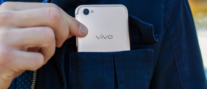
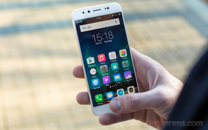
It's good ol' Marshmallow running on the vivo V5 Plus, but you won't be able to tell, really. The interface is so iOS-like, you'll need a double-take to make sure you're not actually holding an iPhone. That includes icon designs, too - vivo's been going down the path of emulating Apple's mobile OS, but it's now gotten to a point where it's more of a full-on copy&paste affair.
The lockscreen is nothing out of the ordinary, offering two shortcuts in the bottom corners - just the dialer and camera, but you can't customize those.


Default lockscreen • Password entry • Camera shortcut in action
The lockscreen is likely to go unnoticed most of the time - in fact you won't be seeing any of it if you enable fingerprint unlock. As was the case in previous interactions with vivo fingerprint recognition, it's instantaneous, there are no animations and you're at the homescreen before you know it. Even big-name flagships can't beat that, in our experience, at least.
Past the lockscreen it's the same single-tier interface like you get on iOS. The homescreens hold all your apps, and there's no app drawer, but it doesn't look like you're limited in the number of homescreens you can have. You can group the app icons in folders and tapping on a folder shows its contents in a nicely animated popup on a blurred background. There's a dock on the bottom of the homescreen, which takes up to 5 icons, folders included, and redistributes them evenly, depending on the number.
You can rearrange the homescreens any way you like and the pane you place first is the default one that appears when you tap the Home button. The panes cannot be cycled, which can prove a problem if you have a large number set up.

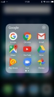


The homescreen doubles as an app drawer • Folder view • Managing the homescreen panes
Notifications are evoked with a downward swipe from the top. The phone will group the notifications by apps, so things are nice and tidy, and there's a 'dismiss all' button conveniently located on the bottom for when things go out of hand on all your social networks.
You can enable a banner-style preview that will pop up on top of the entire interface when a new notification comes in, and you also get granular control over which app can push notifications when and where.
Now, you might be startled to see no quick toggles here, but fret not - they are tucked away elsewhere.


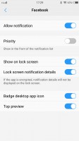
Notifications shade • Status bar and notification settings • Head-up • Per-app settings
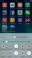
On previous vivo models, swiping up from the bottom edge would bring out a combined toggles/brightness/tasks drawer, reminiscent of the iOS Control center, called, um, Control center. The tasks portion of it has been assigned to the left capacitive key now, so it's just sliders and toggles.
The quick toggles offer the expected functionality and aside from the simple on/off action, work as shortcuts to the respective setting upon a long press. The removal of the task switcher from this UI element has allowed for two rows of toggles now, instead of just one, and you can rearrange them or hide the unused ones. The brightness slider doesn't take taps if you want to jump straight to a specific position, instead you need to grab it by the handle each time - so Apple-y. There's an Auto switch, at least.
The task switcher is a horizontally scrollable deck of cards which you tap to select, swipe up to kill, or swipe down to lock, so the 'kill all' button spares them.
Screen pinning lets you lock the view on this one app that you choose - say you want to show someone a few photos, but don't want them poking through your messages. The feature needs to be enabled in settings first, and then when you open the task switcher you tap on the pin icon to pin the respective app. To get out of the pinned app you long-press the back key and at this point the phone will go into a locked state prompting you for a password or fingerprint. That last bit is optional, but to us it only makes sense that way.
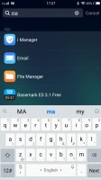
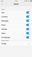
There's a system wide search feature, not unlike a certain Spotlight. It can look into your contacts, messages, apps, and settings - provided, of course, you tick the appropriate boxes in its own settings.
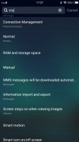
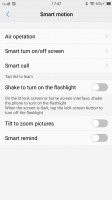
The vivo V5 Plus comes with extensive gesture and motion functionality, found in settings under Smart motion. Air operation can show you a quick glance screen with clock and notifications upon a wave above the proximity sensor, while a second wave will wake the device (you still need to unlock it).
Smart turn on/off screen can prevent in-pocket mishaps, keep the phone awake by looking through the front cam to make sure you're still staring back and also send the phone to standby with a double tap on an empty area. Smart call is a host of features that rely on the accelerometer and proximity sensor to make calls, switch between earpiece and speaker and mute a call. You could also launch the flashlight with a (slightly violent) shake, but a second shake won't turn it off. Odd.
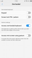
There's also a one-handed mode for easier operation, which shrinks the UI to one of the lower corners. It's activated in the original Samsung way - swiping in from one of the edges and back out. You're also given the option to resize the window, depending on how long your digits are.
We've praised vivo before for their useful screen-grabbing utility called S-capture, and it's here as well. Chief among its features is the ability to capture long screenshots, for example, an entire webpage or a conversation in a messaging app. Alternatively, you could record a video of what's going on the screen, like gameplay or instructional videos. The Funny screenshot option lets you crop a part of the screen with a freeform or preset shape, of which there are a few.
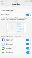
There's also a rather limited multi-window implementation. Basically, if you're watching a video, and a message comes in, a notification pops up on the side and you can expand it to view the message without switching back and forth between the apps.
Reader comments
- RishiGuru
- 11 May 2022
- utg
Realme GT Master is a great phone and much better than the recent Realme 9 series launched. I thought to have one but just then Realme threw the bomb. At $300 we were having Realme X7 Max with the Mediatek Dimensity 1200 SoC, 12GB LPDDR4X RAM, 256GB ...
- NikiDroid
- 08 May 2022
- tDP
Sorry for late reply, I seldom open old phone page anymore. Today just check Vivo V5 Plus opinions and review comments. I bought realme GT Master for $351 on August 2021. So far the phone is good, I love it.
- RishiGuru
- 23 Sep 2021
- utg
I understand. Recently I ordered a brand new Realme X2 Pro from Amazon India. It of 12/256 GB memory configuration. Paid INR 22.85K ($313, 264 euros) after discounts without exchange. Oppo created the Reno Ace back in 2019, and the same phone w...


