vivo X60 Pro review
Design
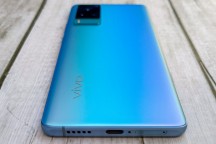
If the presentation wasn't enough of an indication that it's a high-end smartphone we're dealing with, the smartphone itself dispels any doubts. A svelte glass-aluminum handset with curved display edges, a frosted back with a very serious looking and to-the-point camera island, and the bare minimum of text to draw unnecessary attention, plus the tiniest of Zeiss logos - it's a design language vivo already got right with the X50 series, and it hasn't changed much for this generation.
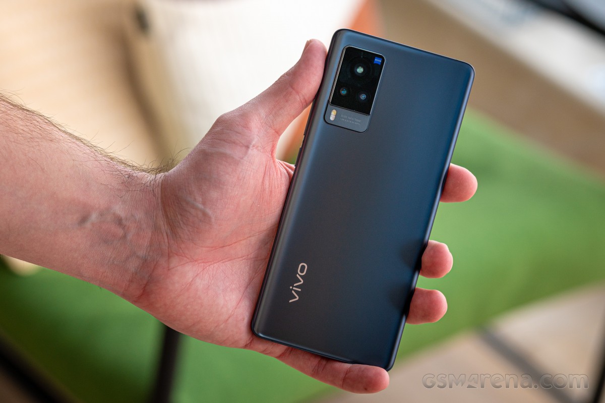
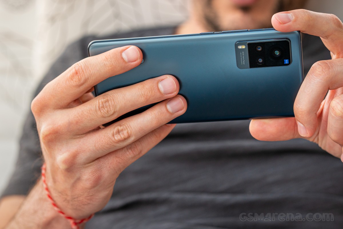
Let's stay on the back for a second. Vivo calls the material AG glass, which we gather stands for 'anti-glare' and glare, indeed, it does not. It's good at keeping fingerprints out of sight, which is nice, but it's also among the most slippery finishes around, particularly for people with drier palms.
For a grippier and even less prone to smudges finish, you can look at the vivo X60 Pro+ which comes with a vegan leather rear. Here is our X60 Pro in Midnight Black next to the X60 Pro+ in Emperor Blue.
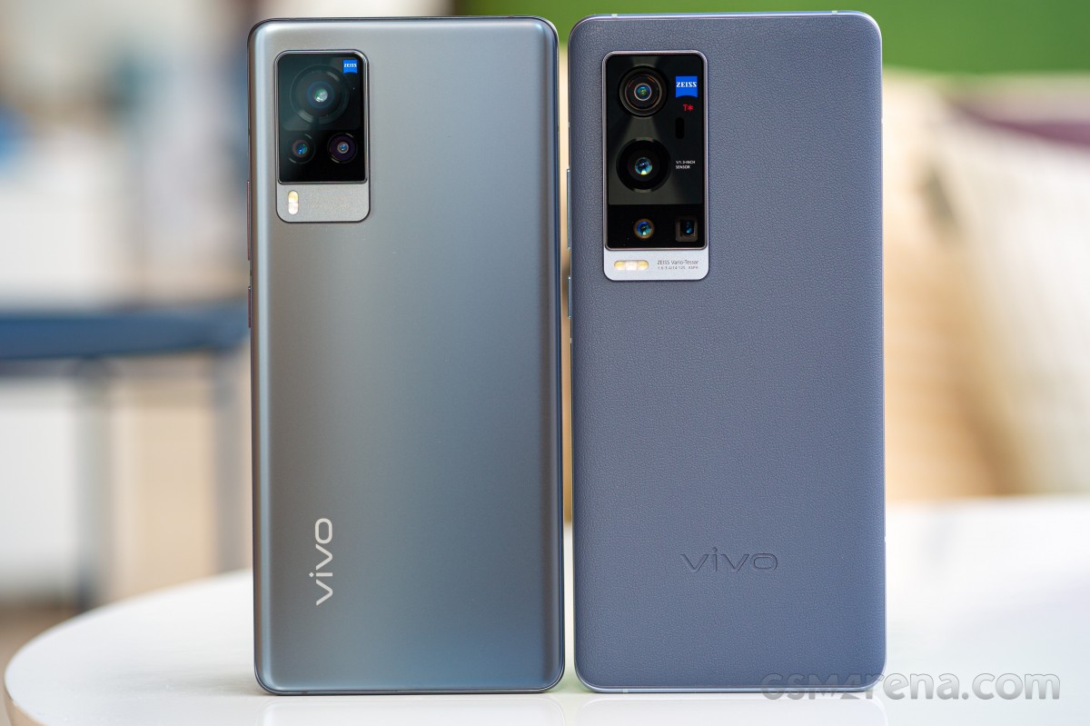 vivo X60 Pro (left) next to vivo X60 Pro+
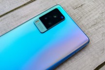
The alternative colorway for the X60 Pro is called Shimmer Blue and is one of those paint jobs that you can't really call one single color. It changes hues depending on the angle you look at it and can be anything from cyan to magenta to copper. It's otherwise the same frosted glass.
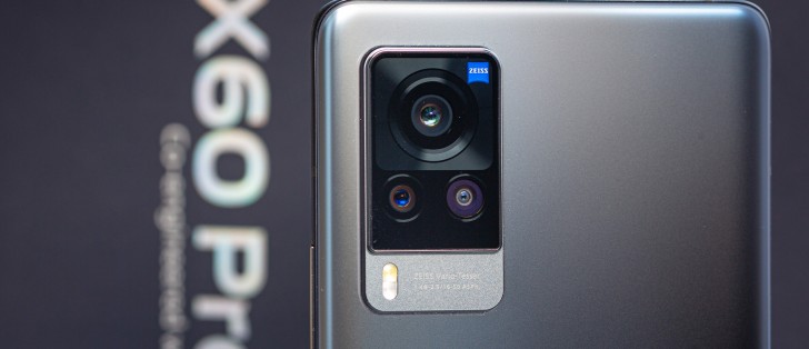
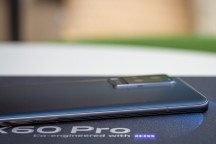
The camera island is the focal point (is that a pun we stumbled upon?) of the rear's styling. Looking very 'professional' without explicitly saying so here, the cluster features a prominent gimbal-mounted primary cam up top, the 2x tele and the ultrawide side by side under it, all three under a shared black glass window. A Zeiss badge in the top right corner is about as mini as they get, yet impossible to miss.
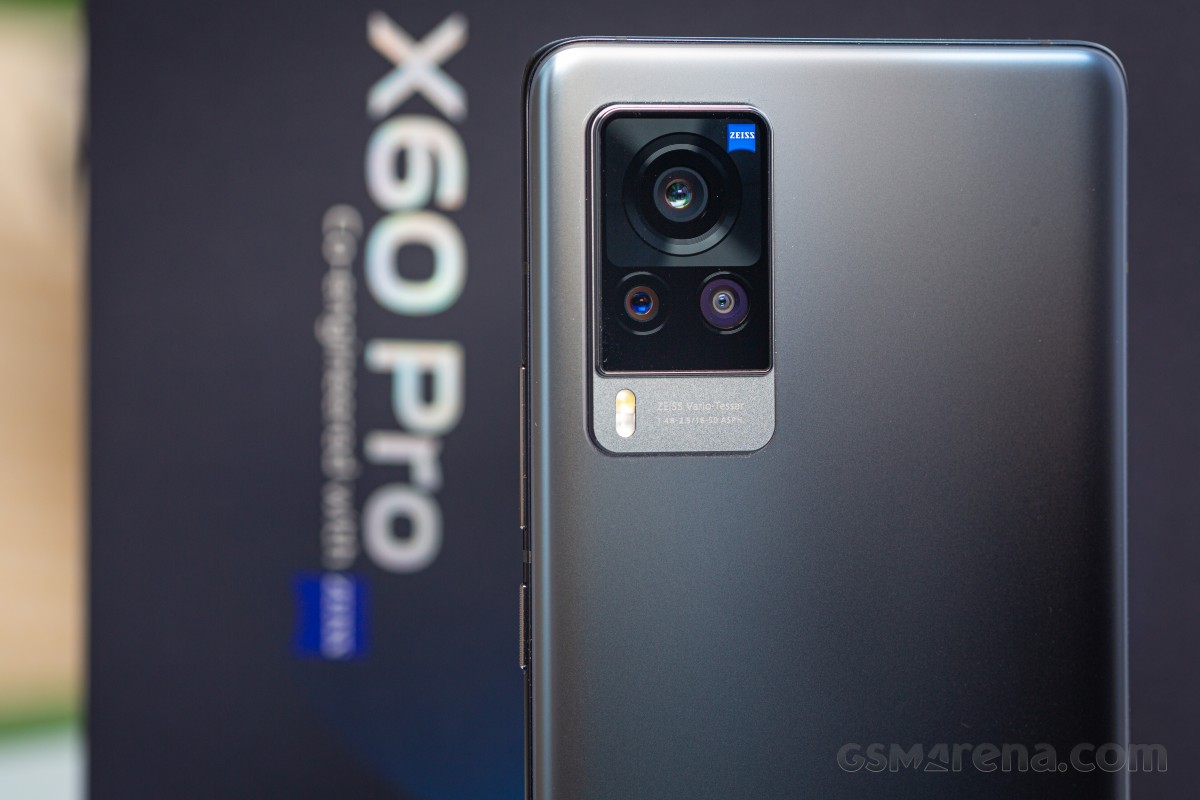
This imaging assembly sticks out by 2.3mm - it's quite the bump that's needed to house the gimbal's moving bits and provide it room for... gimbaling.
A step below is where you'll find another Zeiss reference alongside some camera specs in a somewhat hard to read (minuscule and also not very contrasting) typeface. You'd find another camera here on the previous generation, be it a periscope or a macro, depending on the model. On this year's X60s, that space is reserved for the flash and the numbers, and it's a tidier arrangement, we reckon.
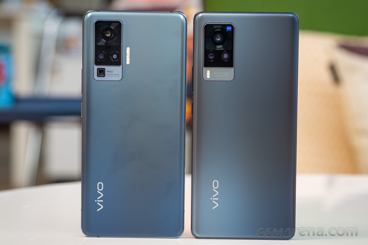 vivo X50 Pro (left) next to vivo X60 Pro
Ah, since we're on the topic of the text and it's in vaguely the same whereabouts, the 'Professional photography' insignia on the top plate is the one bit that we're not overly fond of - you slap the professional label on something that's clearly not meant to be a tool for making money in a particular field, and it's suddenly robbed of most of its credibility.
The plate itself is, as best as we can tell, plastic, and it's placed in a cutout in the aluminum frame - a set of choices that we read as a clue for the existence of antennas underneath. The pinhole, on the other hand, we interpret as an opening for a microphone, and these usually don't lie.
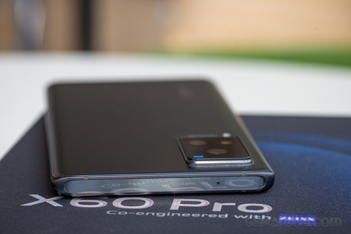
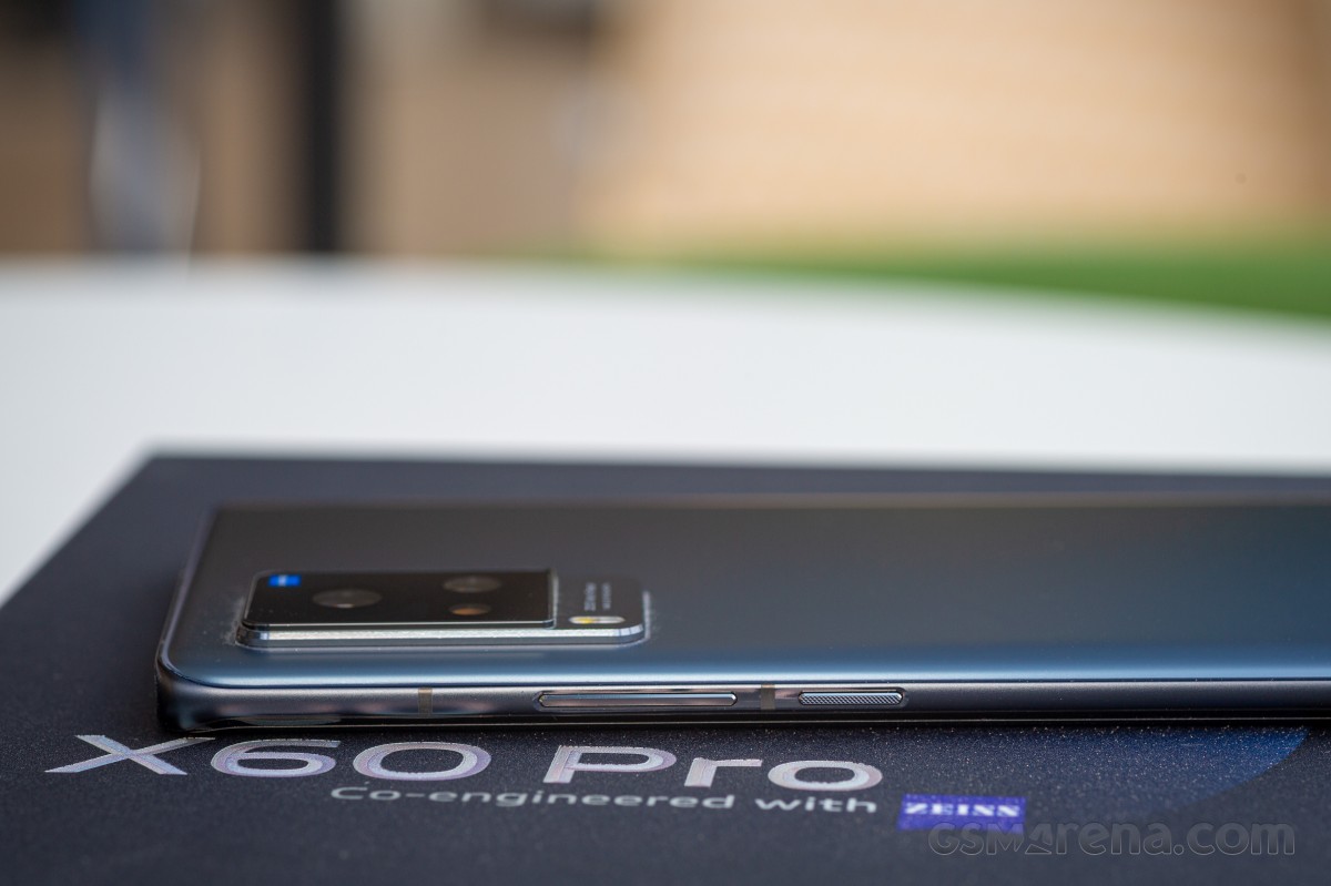
The exposed frame is very thin on the sides, a result of the curving edges of both front and back glass panels. The knurled power button is right above the midpoint on the right, the volume rocker over it, with the two physical controls placed in a chiseled, slightly recessed section of the frame. Both buttons are metal as well, and they also click positively.
We'd say they could have been a bit wider to improve usability, but they really couldn't have been - the frame thickness, or rather thinness, wouldn't allow it.
The bottom of the phone has multiple small cutouts as opposed to the single big one up top. The USB-C port is in the middle, nothing unusual, then there's the speaker to one side and the primary mic to the other. The card slot is here as well, and the tray is the dual nano SIM type, with cards going in back to back - there's no option for memory expansion on the vivo X60 Pro. As we already mentioned, but now also proven with the tour of the periphery, there's no 3.5mm headphone jack either.
Bottom plate • Dual nano SIM slot • nothing on the left
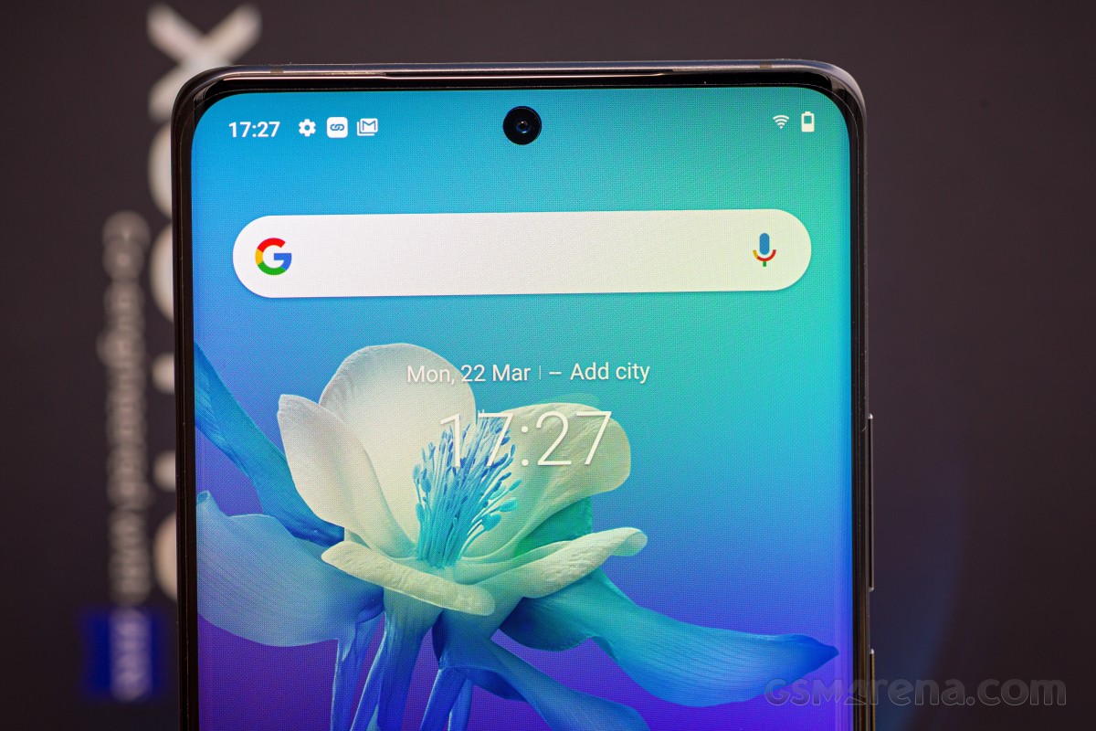
The 6.56-inch AMOLED display dominates the front of the X60 Pro. Bezels are minimal all around, with the bottom one ever so slightly thicker than the rest. The side edges of the screen curve gently into the frame, so gently that there's barely any color shift along the extremes.
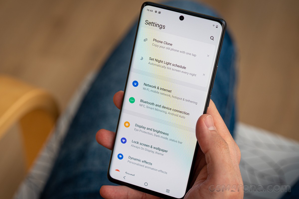
We know curved displays tend to spark fiery debates, but we experienced no issues with misinterpreted touch input causing weird behavior of the phone.
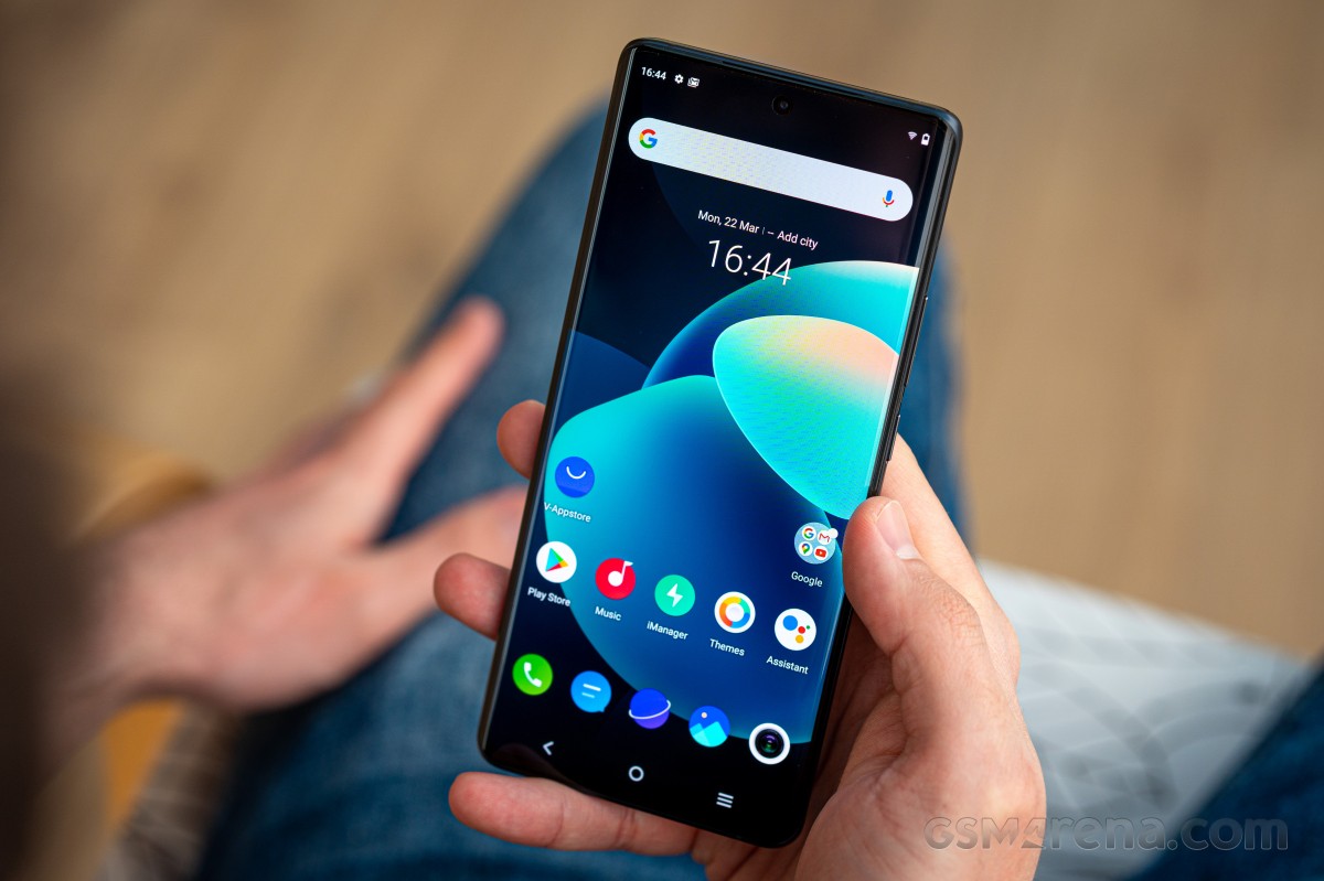
The AMOLED display allows the X60 Pro to have a fingerprint reader embedded under the panel. It's the optical variety, and predictably, it is fast and reliable. Perhaps the one gripe we have is that it's placed relatively low (particularly so if you're coming from a Galaxy). It's a quick adjustment though.
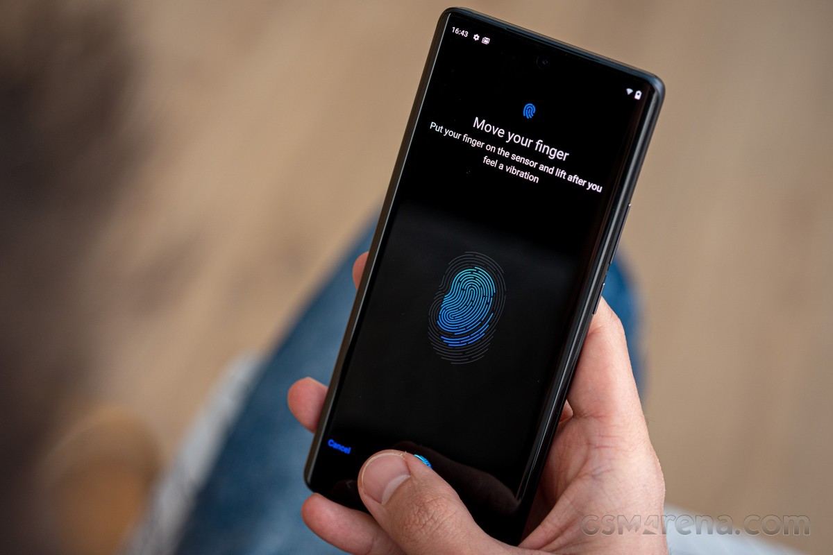
Vivo says the X60 Pro's selfie camera cutout is 3.9mm in diameter, and that sounds about right. It's not the absolute tiniest - say, a Galaxy S21 has a smaller punch hole. However, there's a reasonably big 1/2.8" sensor under there (bigger than the Galaxy's), and we like big sensors.
We also like stereo speakers, but we're not getting those on the X60 Pro. The thin slit where the display glass meets the top section of the frame serves as the earpiece's outlet. But it's just an earpiece for voice calls, nothing more.
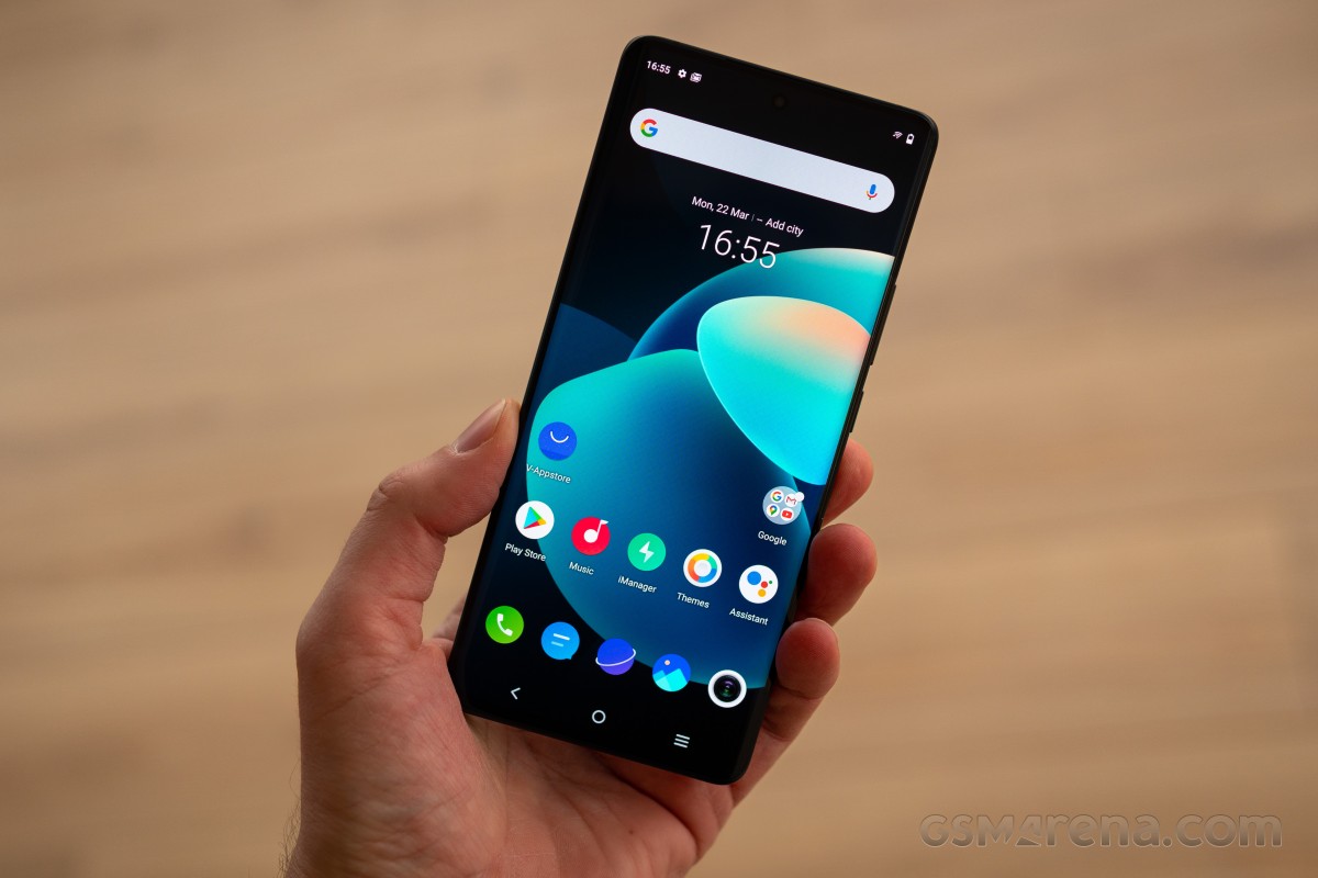
The vivo X60 Pro measures 158.6x73.2x7.6mm and weighs 179g. It's thin, that much we established, and that helps make it feel lighter than what the numbers will have you believe. It's a millimeter smaller in every direction than the OnePlus 9 (well, at least an OP9 made for Europe or North America, like the one we have at the office), and it's also smaller than a Mi 11, though the Mi does make great use of the extra space with a larger display. As potential competitors go, however, the vivo X60 Pro is among the more pocketable options.
Reader comments
- Anonymous
- 21 Mar 2022
- D6e
Vivo does have bugs, but xiaomi has sooooooooo many mroe. And they didn't use to have them like 5 years ago. But now xiaomi miui is total trash. Poco ui is better but not that much. Funtouch is nice very feature rich but there's one navigat...
- ex-vivo
- 27 Oct 2021
- bxd
i bought my vivo v3max in 2016 and in 2018 i really wanted to throw it so badly. there is a very major bug, no update for android version some very bank app no longer work with it. and yes my mi 9 is cheap with many bugs, but i still can bear wi...
