vivo X80 Pro review
Design, build quality, handling
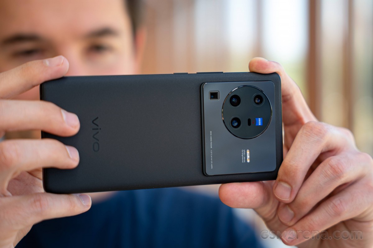
They haven't exactly been inconspicuous, the high-end vivos of late, but the X80 Pro somehow manages to outdo even the X70 Pro+ in camera island 'presence'. All the while, the vivo still maintains a level of restraint in its styling that the iQOOs from across the street prefer to abandon.
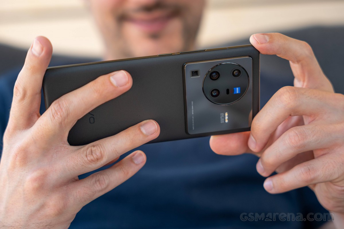
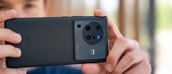
Most of the personality in a modern phone is in its camera island and boy, does the X80 Pro have a lot of personality. Almost indiscriminately scattered, the four modules abandon the tidy arrangement found on the X70 Pro+ and three of them are now in a circular formation, together with the mandatory Zeiss badge and the laser AF window.
The periscope is underneath that circle, the LED flash is to the right - not a whole lot of order here, no. There better be some internal component considerations that led to this arrangement, as opposed to the engineers having to figure out an internal layout to accommodate a design of this sort.
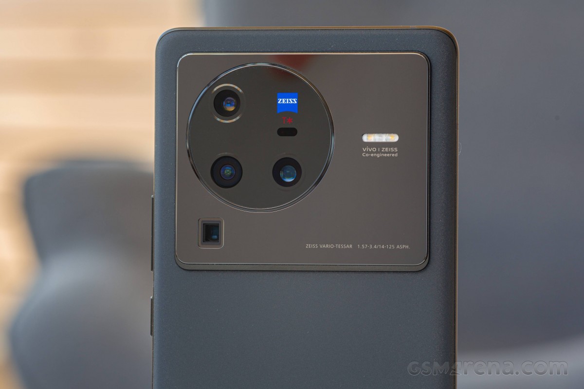
Okay, that may have sounded a little harsh. Looking from a different perspective, one could appreciate the sparing use of text on the camera island, with a tiny font too. And the fact that the island now spans most of the width of the phone makes the handset very stable when placed on a table, not one of the X70 Pro+'s virtues.
Still, we maintain that the older phone is more to-the-point in its camera styling - the X80 Pro isn't quite as focused.
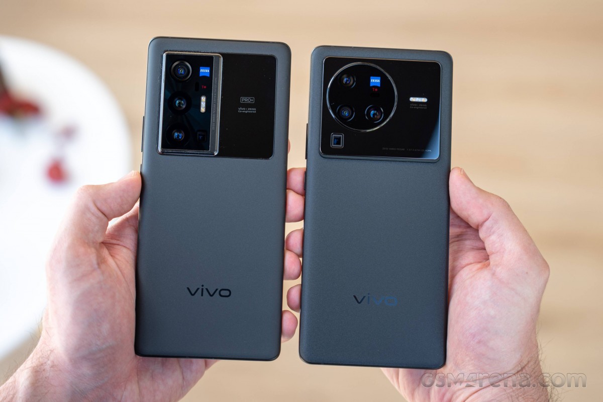
You can still use the camera assembly as a mirror, whether it's for rough framing of rear-camera selfies, or, you know, as a mirror. If anything, it's now even better suited to those task, being larger and all.
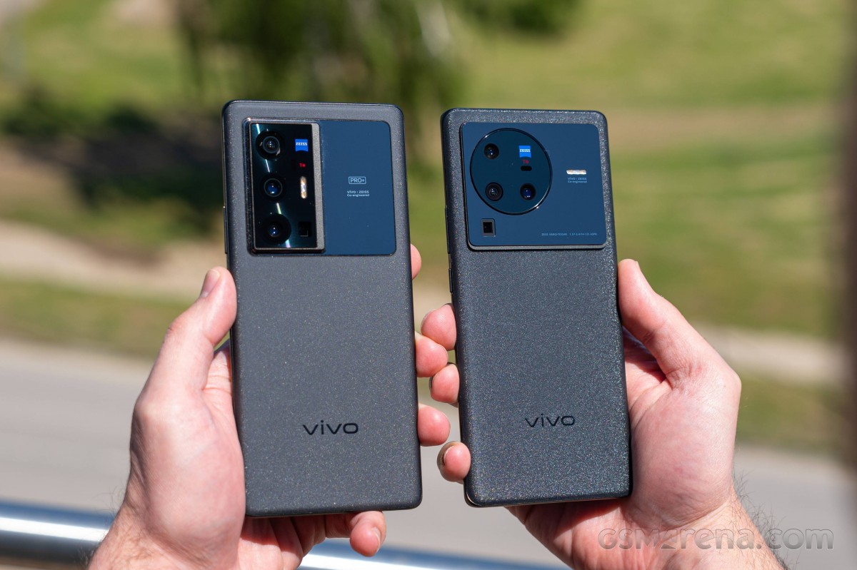
Another design element that's been kept is the shimmery finish on what might at first glance pass for a matte black rear panel. It may appear matte indoors or genreally in dimmer conditions, but when the sun catches it, the glitter shines through.
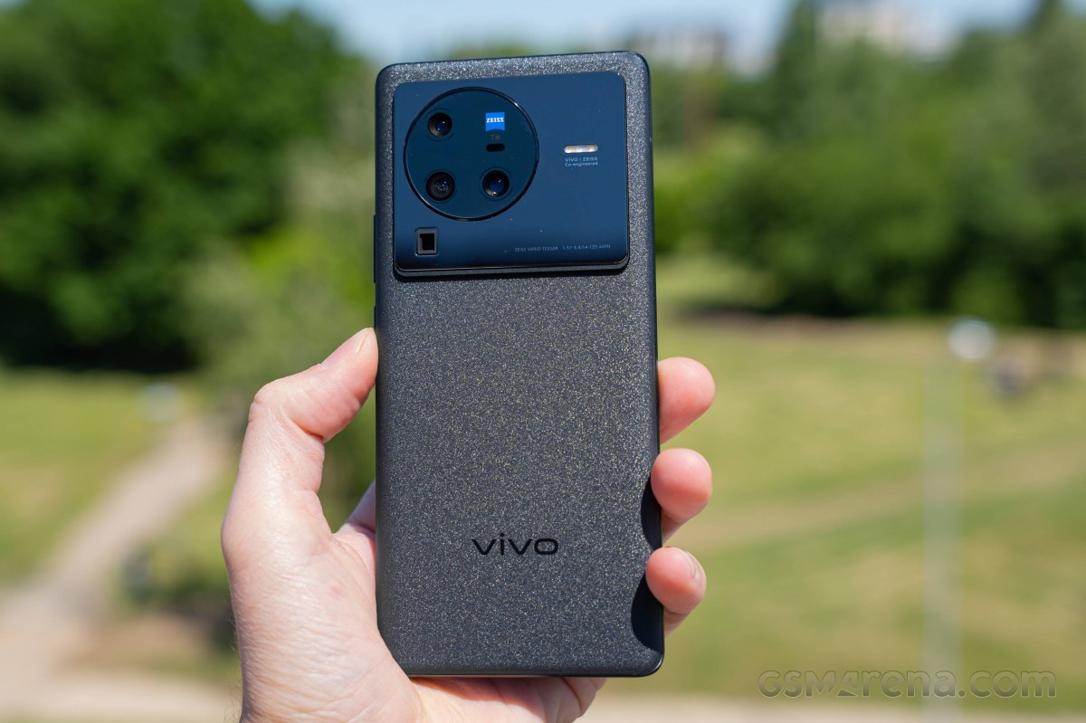
In more practical terms, the rear panel (unnamed type of glass) is about as slippery as they get, but the included case helps with that. It will hide that sparkly finish though, and that's not a trade-off we can just dismiss. You'd be happy to know that the panel isn't remotely prone to accumulating fingerprints, so the lack of grip remains its sole downside.
We've only been talking about this Cosmic Black colorway, because that's what's going to be the only option on the global X80 Pro. The Chinese model is also offered in orange vegan leather or cyan ceramic (don't quote us on that). The thing is, the black colorway does offer a pretty appealing aesthetic so we're not too bummed about the lack of choice.
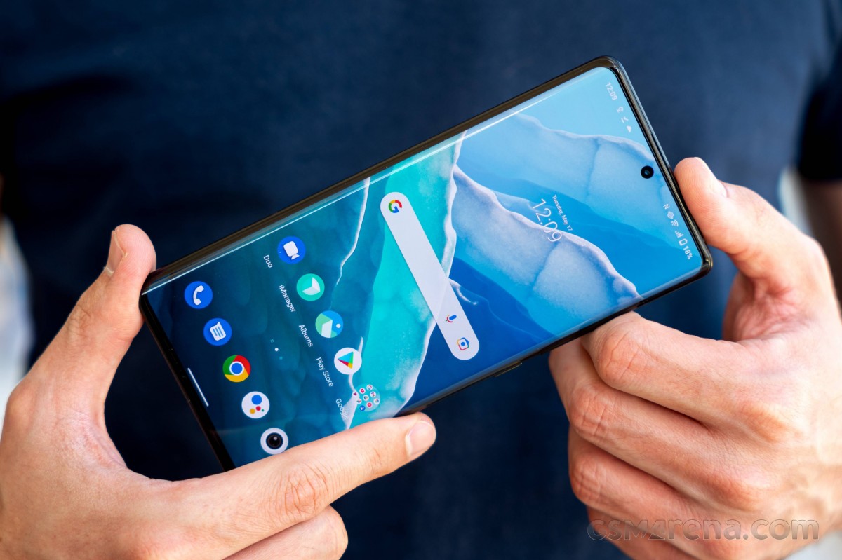
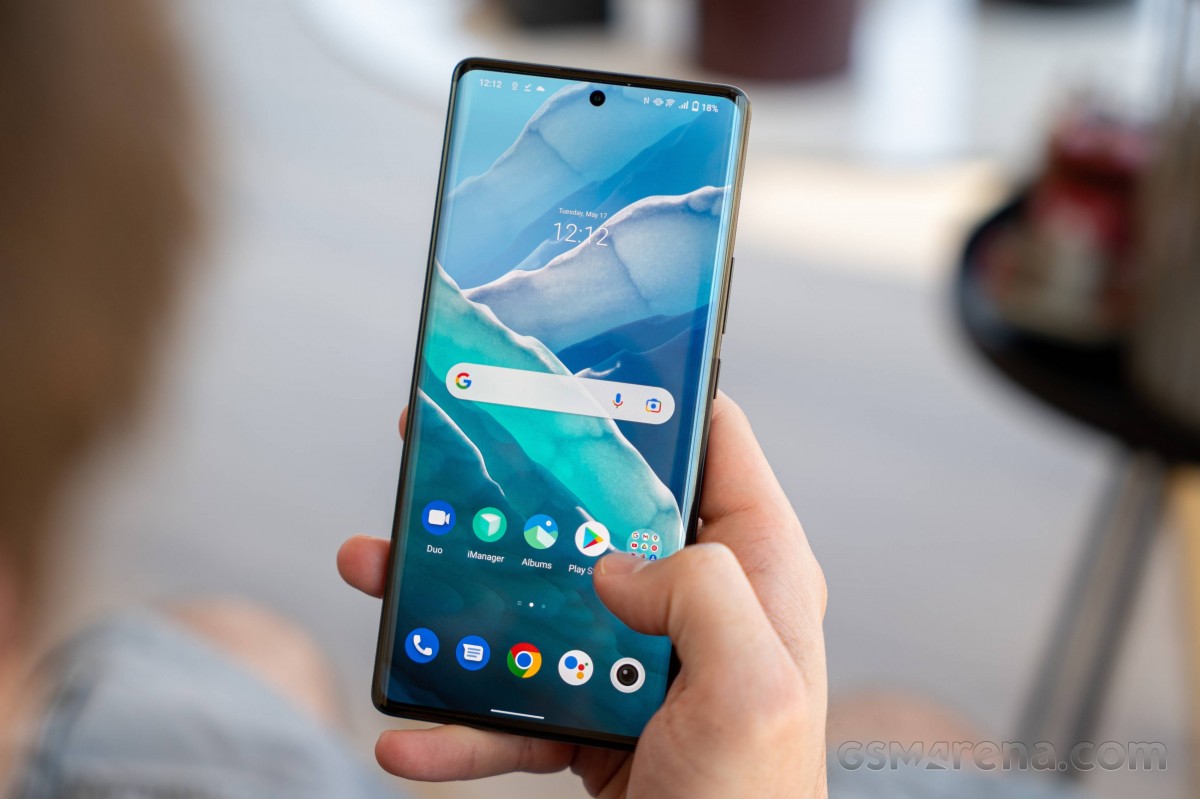
Over on the front you get that large 6.78" OLED display with the classic physical markings of a true flagship - curved sides, minimal bezels, tiny selfie camera cutout. It's a properly high-end panel too, but more on that later. The protection comes from Schott's Xensation Up glass - a Corning Gorilla Glass competitor.
While on the topic of physical properties, it has to be said that the large display naturally comes in a large handset overall. Measuring 164.6x75.3x9.1mm, the X80 Pro is a full-size unit with no aspirations for compactness. It's even a mil taller than a Galaxy S22 Ultra, though the non-Note is admittedly a full 2.6mm wider and that's a lot. But even against the S22+, the vivo is more than 7mm taller. The Xiaomi 12 Pro, meanwhile, comes in essentially the same footprint as the vivo.
The X80 Pro is also among the heaviest in the class, though its 215g will probably feel just the same in your pocket as the S22+'s 195g. The 1.5mm difference in thickness between the 9.1mm vivo and the svelte 7.6mm Galaxy is somewhat mitigated by the X80 Pro's curved sides, though it can't entirely fool you.
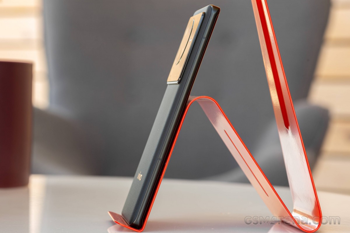
Those thin aluminum rails on the sides remind us of the times when Samsung was all about curved screens. Admittedly, vivo has adopted that design for a couple of years now and made it work for their own phones too.
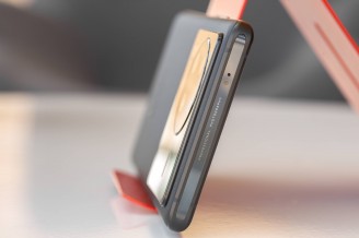
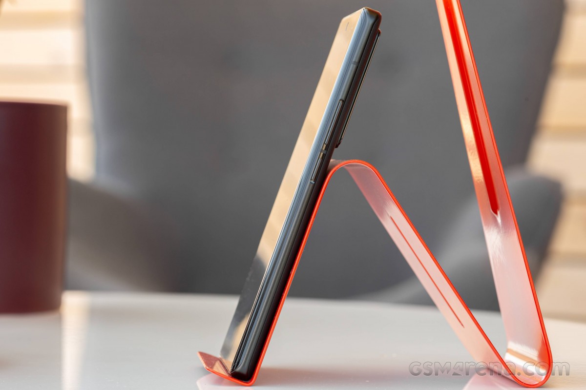
A shallow chiseled groove on the right is home to the power button and volume rocker and both operate remarkably quietly, yet with satisfying click action.
The top is home to a cheap-looking glossy plastic insert which must have been mandated by the antenna placement, but we're not liking it one bit. The cheesy 'Professional photography' inscription doesn't help and neither does the fact that it's all scuffed up after a little over a week of gentle reviewing. The infrared emitter does steer our minds away from that negativity.
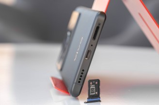
On the bottom of the phone is where the USB-C port is. The primary mic and primary loudspeaker are in this vicinity as well. Also here is the card slot which will accept two nano-SIMs back to back, but no microSD. Note the blue gasket - the X80 Pro is IP68-rated for dust and water protection.
Reader comments
- Amitk
- 03 May 2025
- X%S
You can use Google Files app safe folder option to lock files
- dpak4u
- 10 Jul 2024
- Fnp
it is sad , you are not aware of 3.5 advantage , no battery no charging , plug and play works with most of all devices
- Arijit Jhampri
- 28 Jul 2023
- P@L
The only concerning thing in funtouch is that it lacks a password protected app lock or a private safe.
