Windows Phone 7 OS review: From scratch
From scratch
User interface like you haven’t seen before
The Windows Mobile Today screen is gone – and gone is the Start menu. We told you, Windows Phone 7 is unrecognizable as a descendant of Windows Mobile. But don’t worry – there’s actually only a couple of things you need to learn before you feel right at home with the new UI.
The interface has a cool cover-of-a-magazine feel to it. At first glance, the similarity is obvious – font size ranges from large titles to small labels to direct your attention as needed. Some of the hubs even have a dynamic visual background that makes them look like a page in a magazine.
But that’s not all, the homescreen (called simply “start”) is sort of the cover page. It’s home to the live tiles. They are part widget, part shortcut and reside on a square grid.
This homescreen is what you make of it though – you can “pin” items from the menu to the homescreen (Windows 7 users should be comfortable with that concept). So, in a way the homescreen features the most important apps and hubs from the phone up front. A single tap is the equivalent of “Read more on page 5!”.

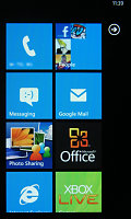
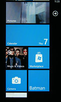
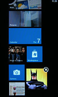
The lock screen • the homescreen • reorganizing the homescreen
Let’s look closer at the live tiles. They fit the broad concept of “widget”, but unlike most widgets out there, they are very uniform with clear labels that indicate what each one of them does. That’s what we like that about them. It’s clear what a tile does even if it’s the first time you see it.
There’s more to them though – they are live tiles after all. For example, the People tile is a 3 x 3 grid with contact photos fading in and out. It’s one of the tiles that rarely sit still.
But eye candy aside, they can display info from the hub they belong to.– say, the number of new messages. They can easily be reordered and removed, new ones can be added from the main menu.
The main menu is where all the hubs and apps are listed. Getting there is easy – an animated arrow in the top right corner will egg you on to tap it and it brings up the menu.
Alternatively, you can scroll the homescreen panes sideways to move between the homescreen and the menu. There’s no way to organize things here, so if you have many apps installed, the list will soon grow to unmanageable proportions.
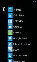
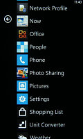
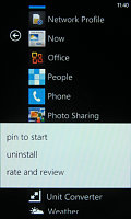
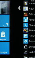
The main menu • pinning something to the homescreen • swiping halfway through
We told you there are only a couple of things that you need to know about the Windows Phone 7 logic to be ready to use it and they are very easy to learn.
The interface is neat and tidy – there’s nothing on it that doesn’t need to be there, so the rule of thumb is that if something looks like it can be pressed, then it can be pressed. No need to fumble about menus and submenus – just tap the thing that looks most likely to do what you’re interested in and most of the time it will work.
Besides tapping, there’s also a lot of swiping. Swiping up and down scrolls whatever you’re looking at and reveals more content. Swiping sideways reveals another section that shows related content – e.g. in the calendar a swipe lets you toggle day and agenda views, in the email app it goes over the folders (all emails, unread, flagged and so on).
That’s the logic behind the homescreen/main menu all set up. Scroll up and down for more tiles/apps, swipe sideways for another related section. Other OSes use tabs, submenus, pop ups and so on to organize content – in Windows Phone 7 you just swipe your wipe through.
The UI also offers tips, which pop out at the right time to teach you a new trick.
Before we jump into specifics about hubs, apps and others, we should mention one more change that we really liked. Soft keys have been a part of phone interfaces pretty much since phones had screens.
Windows Phone 7 has them too – context-dependent icons at the bottom of the screen. Whenever you see the “...” symbol, there are more options available for the current screen.
Usually the more advanced settings are placed there, so you won’t use the three dots often. All in all it’s akin to the Android contextual menu but it needs one key less. Alternatively, there’s a tap-and-hold menu available too for handling individual items in a list.
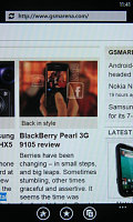
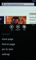
The on-screen soft keys • the extended “...” menu
We already mentioned there’s no multitasking, but now it’s time to get into some more detail. No, Windows Phone 7 can’t multitask – instead it takes the iOS (pre-version 4) approach and lets applications keep their state when you switch away from them.
That is, you can be using the browser and hit the Windows key to go to the homescreen and launch another app. The Back key will always take you to the previous screen – in this example you will pass the homescreen and go back to the browser again.
It will keep all the tabs you’ve open at the exact location you’ve been reading. The back button may be a little confusing, since it doesn’t go up the menu hierarchy but to the previous screen – even through apps you don’t want to use again.
Anyway, this isn’t quite as good as real multitasking – you don’t even get a switcher that lists the recently used apps so that you can skip going back to apps you don’t want. Overall, it’s a usable system.
However, lack of multitasking means you can’t, say, run third party music players (e.g. last.fm) in the background. A curiosity is that apps (in general, not just music players) can continue to work even after you lock the screen – but you have to allow it. The phone will ask permission the first time you start the app and later you can change that setting from the app’s menu.
Microsoft will lift that restriction, but only for the apps that prove battery-efficient – the phone must be able to work at least 6 hours with the app running if it’s a music player and 120 hours otherwise. They didn’t specify what their test phone is though (not even battery capacity).
Still, all the other apps get suspended when you lock the phone – unlocking the phone will cause the app or game to reload, which can be slow and you usually lose your progress. This can be very annoying even to casual gamers.
Another OS-specific limitation is the memory card support - yes, cards are supported (though not all phones will have a card slot) but the way Windows Phone 7 uses memory cards introduces some difficulties.
The memory card gets merged with the internal memory, but that only happens when the phone is initialized - that is if you want to swap memory cards, you'll have to do a hard reset. Also, the merge happens in a non-standard way and those cards become unreadable by a computer.
Here's a video of Windows Phone 7 in action:
Reader comments
- AnonD-246723
- 10 Jul 2014
- PTG
sry but memory card is depend on the os . And it doesnt suport it at all .
- Navi
- 07 Mar 2012
- 7tx
WP 7.5 is too bad..... It have too many problems. I resetted my phone more than 2 times with in a month of purchase coz of software problems... No soft reset is there for solving small problems...
- steven
- 22 Jul 2011
- t7R
The windows mobile operating system is a mobile operating system that was designed by Microsoft for use in mobile devices, particularly smart phones.Nevertheless it is still a great mobile OS which is enjoyed by many persons and advancements in the t...