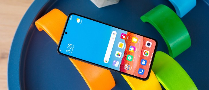
Xiaomi 12T Pro long-term review

Updates
It's 2023, and the Xiaomi 12T Pro launched in October 2022 is still running MIUI 13 based on Android 12, at least our review unit intended for the European market is. Not just that, but there's been no concise communication from the company telling us, and more generally its customers in the EU, what to expect when it comes to updates. Both MIUI 14 and Android 13 have been out for a while now, the former for less time than the latter, but still - we're in the dark as to when the 12T Pro will get a big update.
For all we know, it could happen tomorrow, or within a few hours of this review going live. And that's fine, but the fact remains - Xiaomi is really, really slow with updates. And this isn't even confined to big ones. Our review unit is currently on the November 2022 security patch level, and that's just unacceptable.
At half the 12T Pro's asking price, less so, but from this price point upwards - Xiaomi just needs to do better. We've ranted about this before so we'll try to keep it simple this time around: software updates are few and (very) far between, and you need to factor that into your purchase decision with any Xiaomi / Redmi / Poco device. This applies to the 12T Pro too, of course. Only you know how important timely updates truly are to you, so we can't make a qualitative judgment on your behalf about how bad this is. But good, it definitely isn't.
MIUI 13, bugs
Another thing we've been ranting about a lot in our recent long-term reviews is the fact that Xiaomi's MIUI has gotten pretty stale in the past few years, with updates only bringing with them minute changes in looks. It's still a joyful, playful UI, and if you've never used it before, you'll definitely enjoy its whimsicality, but if you have a Xiaomi / Redmi / Poco handset from the last 2-3 years and are switching to the 12T Pro, we have to inform you that you need to expect almost zero changes in the UI.

So maybe it's time for a new coat of paint? Some might rightfully point out that Apple's iOS has similarly looked the same for a very long time, and we'd respond that it, too is most likely in dire need of a refresh. So here's the gist of this argument: if you like the way it looks, that's fine. But the fact that no big changes have been launched in the past few years, combined with the obvious lack of focus on timely updates, makes us wonder how much emphasis software still gets nowadays over at Xiaomi HQ and what that might say for the future.
The current implementation of MIUI 13 on the Xiaomi 12T Pro also has an egregious bug that we've noticed recently on some Poco phones too - namely, the Do Not Disturb mode simply doesn't work as it should. You can turn it on, either manually or through the scheduling function, and the notifications that should be silenced aren't. There's not much more we can say about this, since it's not a random occurrence, or a hard to track bug. It literally never worked for us.
And this circles back into software emphasis, or de-emphasis - it's definitely not hard to catch such an obvious bug, is it? So then why is it still here? Maybe the next update, whenever that arrives, fixes it. Or maybe it doesn't. And then it's many more months of waiting for the next update, hoping it will finally make a base feature work again. Not a great experience, is it?
The System apps updater section in Settings still exists, in case you were wondering, but it now seems to handle a much lower number of apps than it used to. For years, we've been baffled by the fact that some system apps used this for updates, while others went the Play Store route. Now, it seems like most are being updated through the Play Store, which makes us hopeful that the System apps updater might finally be on the way out. Then again, it's been there for so long that we're wary of setting our expectations too high.
Launcher, Recents, Control Center
Going back to the topic of bugs for a bit, this one has been in the launcher for years - you can't have a home screen shortcut pointing towards something inside an app, although this works on every other Android skin, as it should. The easiest example to think of is the My Apps section in the Play Store. On any other skin, you long press the Play Store icon and the My Apps section is presented as an option. You then drag that to wherever you want it, and voila, it's on your home screen directly. The dragging bit doesn't work in MIUI, and hasn't for ages. Why? Who knows.
Another, perhaps smaller, issue with the launcher is that dragging apps across one or more home screens feels weird, and way too easily results in other apps that are already on said screens 'moving out of your way', even though you never intended for that to happen. This wastes time since you then need to manually move those back to where they were initially.
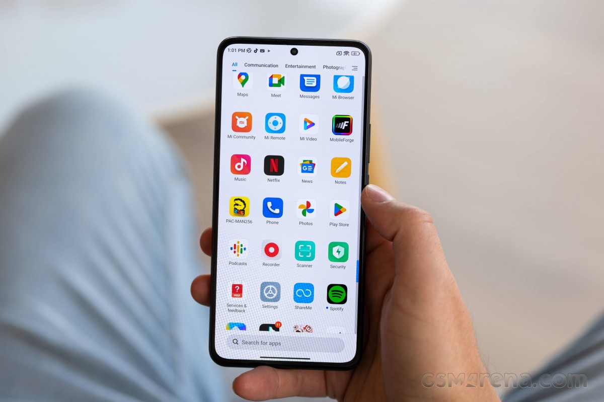
These problems aside, the launcher is potent enough for 99% of people's needs, we'd say. You have a bunch of useful features, but not so many that it gets out of hand, and newbies would feel overwhelmed. It has an app drawer by default (with categorization and two different scroll bar modes), and the Google Discover feed to the left of your leftmost home screen.
In the Recent apps screen, the default is a vertically-scrolling two-column setup, but you can thankfully switch from that to a horizontally scrolling layout, which is what Xiaomi's competitors all use.
If you've used MIUI in the past year or so, you're well aware of the 'new style' Control Center, basically Xiaomi's wholesale reproduction of Apple's similarly named feature. Not only is this baked into the software now, but it's the default option. Thankfully though, you can switch back to the 'old style' of doing things, aka the Android way, with Quick Settings icons right above notifications.
While initially we tried out the 'new' Control Center, we eventually went back to the Android way of doing things since it just makes more sense to us, but obviously you may disagree. We don't find it a particularly amazing user experience for righties like us to have to swipe down from the left side of the screen to see notifications, since we look at those much more in a day than we do at the Control Center toggles. And there's also the fact that in the 'old style' the Quick Settings at the top push the first notification down a bit, making it more easily reachable with the thumb without the need for any gymnastics.
Gesture navigation, Dark mode
Gesture navigation exists and works very well, and thankfully allows you to get rid of the pill-shaped eyesore monstrosity at the bottom of the screen too if you so wish. And why wouldn't you? The functionality associated with it doesn't go away - you're still able to quickly jump from one app to another by swiping across the bottom of the screen where the white bar would be.


Gesture navigation and Dark mode settings
Dark mode is also in, unsurprisingly, and can be scheduled to come on and off on its own (sunset to sunrise), or using a specific set of hours. For less eye searing at night, we suggest you leave on "Adjust wallpaper to Dark mode" and "Adjust text and backgrounds" too. We were happy to see that forcing Dark mode onto third party apps works on this phone, and so we used that for the few that still don't have a darker theme of their own for whatever reason.
Reader comments
- Aziz khan
- 26 Feb 2025
- u1v
I have mi 12t pro and 120w original charger but it's not working superfast charging what can I do please help me
- Diyako
- 16 Jan 2025
- dSV
Absolutely joke, it is my second years using Xiaomi 12at pro. First camera not doing well it doesn't like before Also the battery needs more than 2 times charging a day, The last one hate that it is up coming issue about volume it is work...
- Jim
- 23 Feb 2024
- smT
there is something definitely wrong with your phone......


