Xiaomi 14 Ultra review
Design, build quality, handling
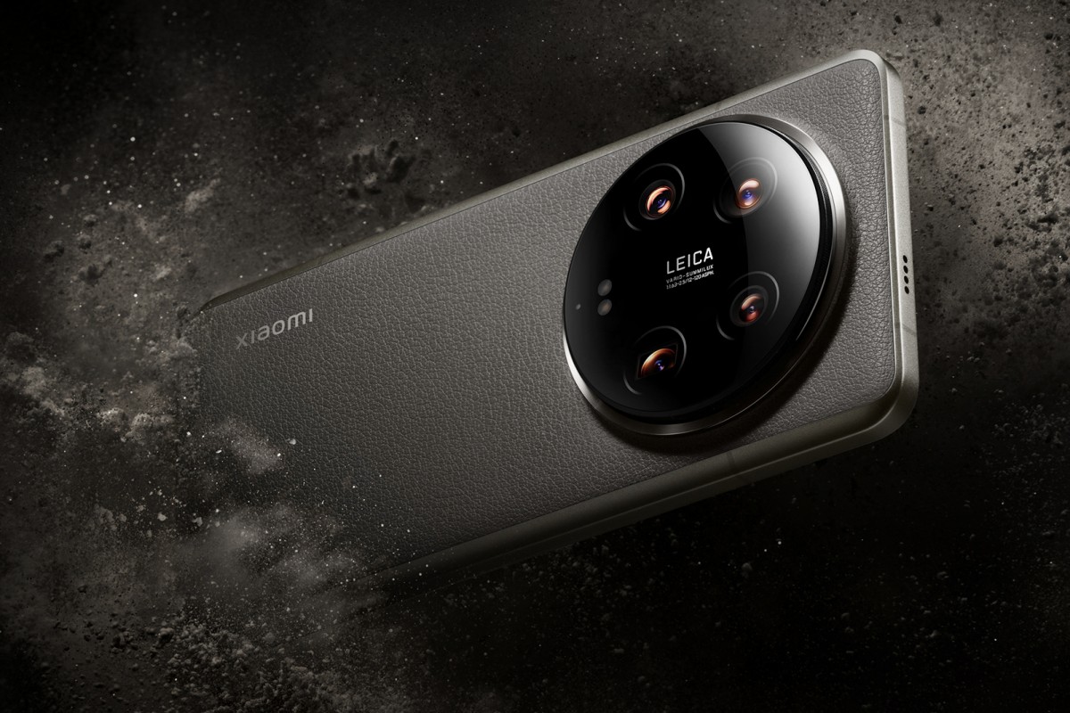
The Xiaomi 14 Ultra embraces continuity in its looks, and, in many ways, it resembles the previous model, maintaining a distinct character that sets it apart from the competition. That's not to say there aren't some stylistic changes, and Xiaomi's also done a few things differently when it comes to materials, but the broad strokes are familiar.
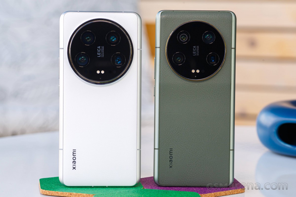 Xiaomi 14 Ultra (left) next to Xiaomi 13 Ultra
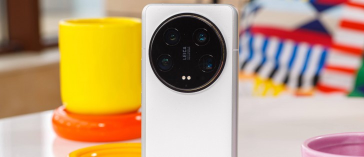
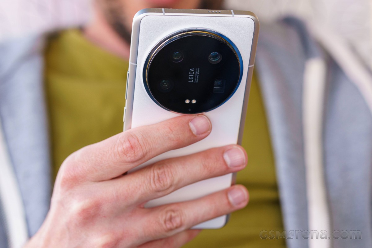
Most visible is, of course, the camera bump on the back, the ever-growing circle now even larger than before. It houses more or less the same hardware, so the increase in diameter may very well be a cosmetic development, though the new lenses on the telephotos and the main camera may have had their say.
Gone is the hump that made a more gentle transition towards the camera circle and now the camera assembly sticks out more prominently.
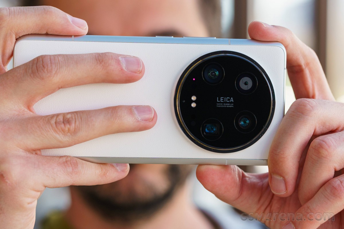
The back is once again made of synthetic leather-like material, but Xiaomi says this new 'nano-tech' formulation is six times as wear-resistant as the one used on the old model. It certainly feels very soft and grippy - more pleasant than the 13 Ultra, though a year of use may have had its toll on that one, making the comparison a little flawed.
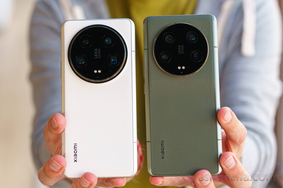 Xiaomi 14 Ultra (left) next to Xiaomi 13 Ultra
Just like on the 2023 model, and unlike any other phone from other makers, the 14 Ultra's frame flows from the sides into the back - it's not just a unique look, but it must also help with durability, we reckon. Xiaomi says it's using a new aluminum alloy that they call 6M42, which we can't find any reliable third-party info on. They claim a 1.38x improvement in strength and twice the rigidity; only that's compared to the 13 Pro and not the 13 Ultra.
Speaking of materials, it has to be pointed out that the Chinese market gets a few more options other than the white (our review unit) and black aluminum/leatherette versions that the international model comes in. We have to say that the glass-backed blue color is a very appealing hue, and we'd have been properly annoyed that we couldn't have it if it were ceramic - now we're just moderately annoyed.
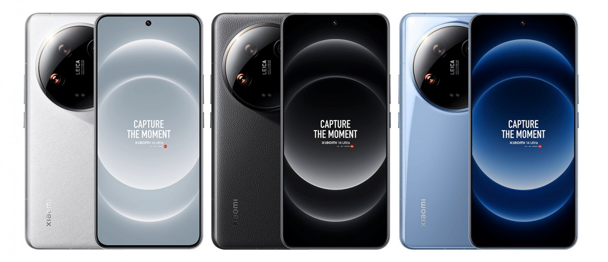
Additionally, there's another black option with a titanium frame (as opposed to aluminum) where the otherwise golden ring around the camera is also in the same gunmetal gray color. As a result, this one is a bit more incognito, but it also potentially offers even better durability. In China, that version is 13% more expensive than the plain 16GB/1TB option, which is, in turn, pricier than the 16GB/512GB option that the world is getting. So, if the titanium version were to be sold globally, it would be something like €1900. Ouch.
Over on the front, there are material changes too. Xiaomi has replaced the Corning Gorilla Glass Victus of the predecessor with an in-house Xiaomi Shield Glass, which their lab tests show to offer 10 times better drop resistance than the 13 Ultra. The real-world implications of this are hard to quantify, but if they say it's 10 times better in the lab, it has to be at least somewhat better in real life.
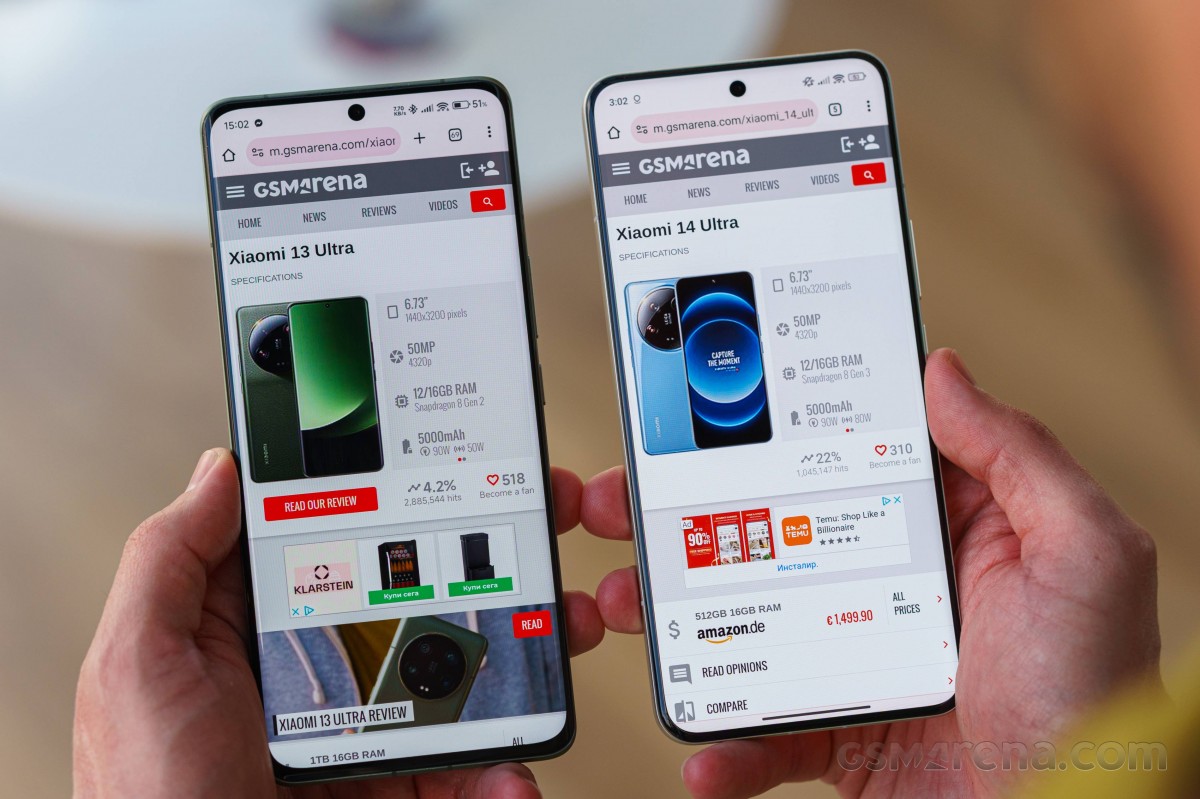 Victus on the 13 Ultra, Xiaomi Shield Glass on the 14 Ultra
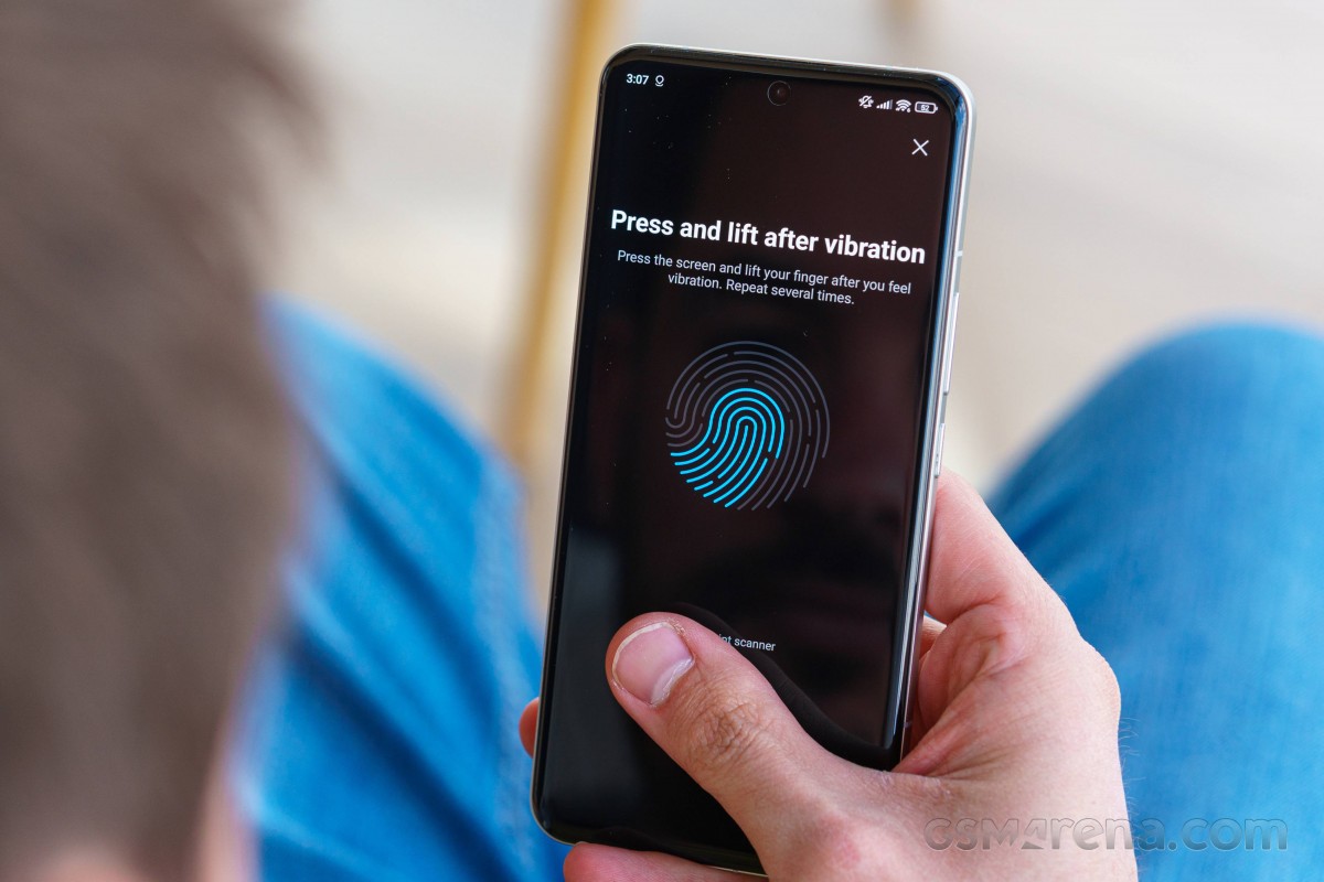
Underneath that glass is the 6.73-inch OLED display, and below that is the optical fingerprint reader. It's placed conveniently high up on the screen, so you don't have to think twice where it is - your thumb should just hit it naturally.
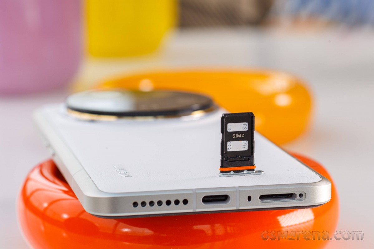
Unchanged is the IP68 rating on the Ultra, so there's extra peace of mind in adverse weather. Of course, that goes with the usual fine print that the ingress protection deteriorates over time, and you'd better not deliberately test its limits in the first place.
Photography kit unboxing and hands-on
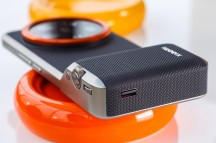
As with the 2023 model, there's a dedicated optional set of accessories for the 14 Ultra that make what was already a camera with a phone attached to it into even more of a camera. The Photography kit comes in at €200, and while it does sound like a lot when taken in isolation, the number is a mere 13% on top of the phone's asking price, so it's probably not that big of a stretch if you appreciate the aesthetic and extra functionality.
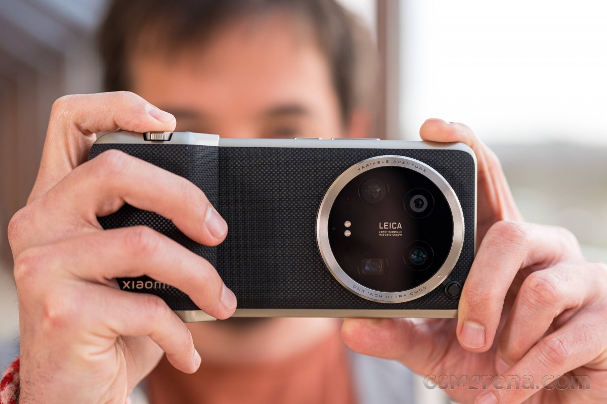
The kit includes a nice case in black (the one we got) or white (the one we wish we'd gotten), with a matching color detachable right hand grip. Mind you, just because China has both, doesn't mean the world does.
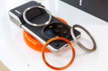
Next come two different-colored decorative rings for the camera bump, and another ring that's threaded for standard 67mm lens filters. The rings are now locked into place and there's a dedicated button to release them, as opposed to the lock-less bayonet design on the previous version that left the possibility for more easily losing the rings. Also included is a lanyard that attaches to the grip, for extra peace of mind.
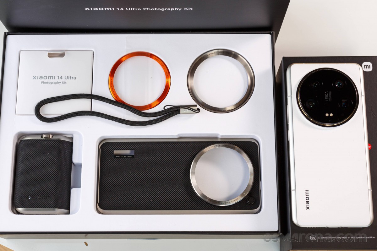
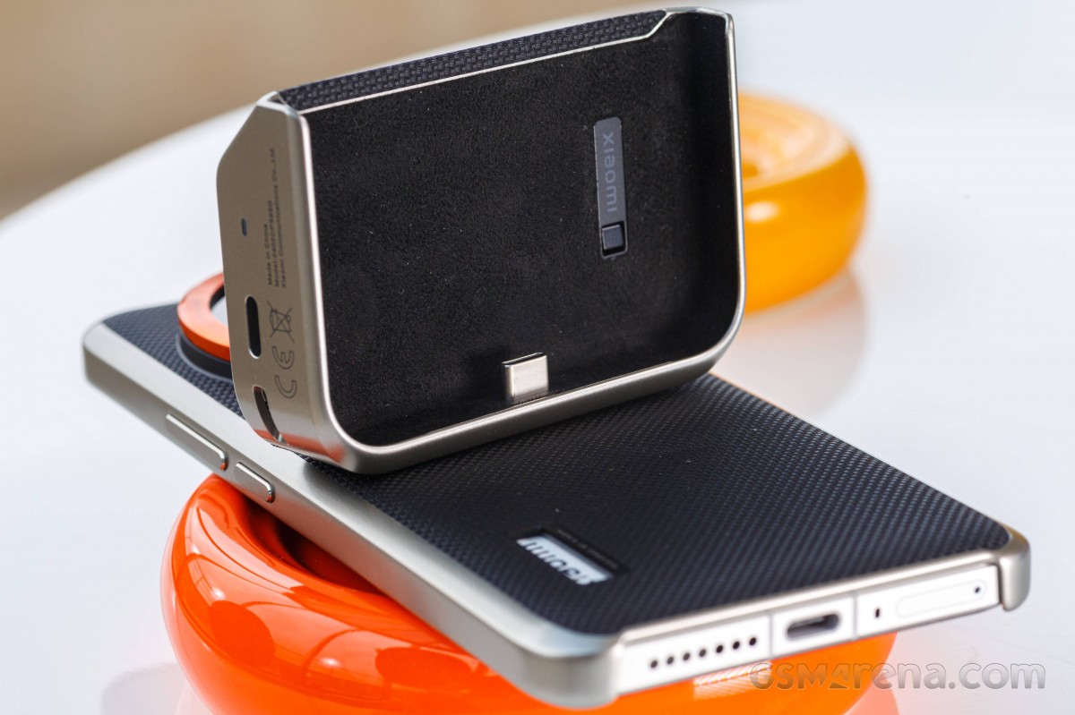
The case can be used without the grip, which exposes the phone's Xiaomi logo through a slot in back. The slot is there for a functional reason though - it's used to latch the grip to the case. The grip has a built-in 1,500mAh battery and a USB-C port, so it adds some longevity to the phone/camera ensemble, while also allowing it to be charged without disassembling.
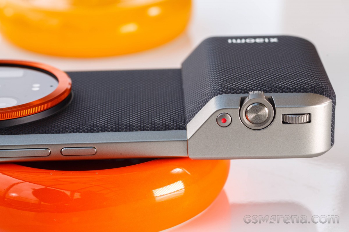
Xiaomi hasn't just re-released the old accessory in a fit for the new phone though - they've added some extra functionality. In addition to the two-stage shutter release button (with a very nice feel, we might add) and the zoom rocker around it, there's also now a dial and an extra button. The dial operates exposure compensation by default, but can be alternatively set to control aperture on the main camera, among other things. By default, the red dot button is used to start video recording.
We'll reiterate that the extra €200 may sound like a hefty sum to pay for 'a case', but the kit is more than that and adds further utility in more ways than one - there's the obvious photography aspect, but let's not forget that it's also a power bank of sorts (if rather small). Weighing the value proposition in it is going to be a personal choice, of course, but if a simple 'FineWoven' (not even leather) iPhone case can command a €70 price tag, the Xiaomi photo kit is almost a bargain.
Reader comments
- Murphiel34
- 05 Feb 2025
- xjH
Those the Xiaomi 14 ultra turn off camera when the phone is hot when taking photos under the sun
- Vilsilav
- 02 Feb 2025
- nbr
Important! The sound you're all hearing from the backside of the phone is the OIS - Opticall image stabilization, or why your camera is not shkaing like crazy when your hands naturally are not stable. It's good that you're hearing it...
- Saif
- 06 Jan 2025
- KI{
Wtf, USB 2.0 was good..?
