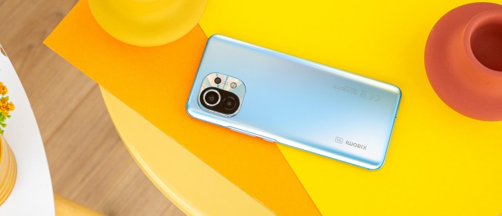
Xiaomi Mi 11 long-term review

Updates, current software build
The Mi 11 launched running MIUI 12 based on Android 11, and since then it's been updated to MIUI 12.5. Our review unit, intended for the EU market, received the update in mid-May, as build 12.5.1.0.RKBEUXM. This is still the current software at the moment, and it includes the April 1, 2021 security patch level.
Before going into the experience of using MIUI 12.5, we'll quickly reiterate some of our past pain points about the experience of receiving security updates on Xiaomi devices, no matter how high-end they may be. In short, it's not great. The security update level is never ever current, it's always out of date, and updates, in general, are few and far between. It's usually a two or three-month wait for the next one, and even when that comes, it still won't be up to date with the latest security patches.
So if up to date security patch levels are important to you, unfortunately, you may have to look elsewhere. Android version updates do take a long time to arrive on Xiaomi handsets, but that's less of an issue because most of the stuff you're actually interacting with in day to day use is coming from MIUI, since it's one of the heaviest skins around. And the company is pretty good at issuing updates to the latest version of MIUI to even some very old phones.
Android version updates, when they do arrive, generally don't change much, if anything, of the UI. But another thing to note is that one or two Android version updates is pretty much the best you can expect from Xiaomi, even if you're purchasing its most expensive devices. The lower you go in price, the more likely it is you'll only ever get one - if that.
We would really like for the company to step up its updates game, perhaps take a look at Samsung and the amazing strides it's made in this regard in the past year or two, while launching a similar number of phones as Xiaomi.
MIUI 12.5 general impressions
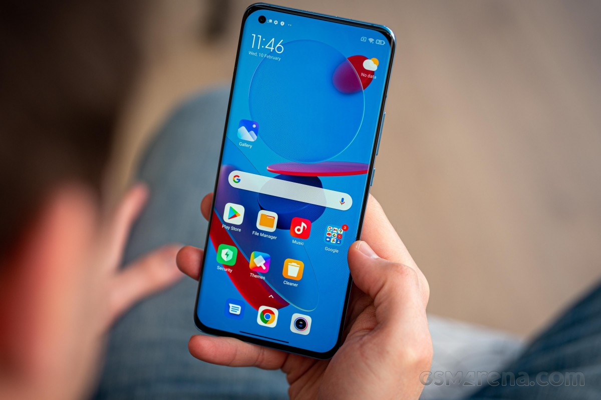
All of this aside, MIUI 12.5 is by far the best looking and smoothest feeling iteration of the skin yet. It's a joy to use, even if some idiosyncrasies still remain here and there (for example, the System apps updater is still a part of Settings, and it still only updates a limited subset of system apps, with the rest getting their new versions through the Play Store).

System apps updater still exists
MIUI 12.5 is also the most polished MIUI release ever, from the first build - at least this is true on the Mi 11, unfortunately your mileage may vary on other phones (especially the cheaper ones seem to not really get a lot of quality testing before software releases). But, on the Mi 11, we haven't encountered any bugs, big or small, after installing MIUI 12.5. And the overall experience of using the phone has been greatly improved by the lower resource use of MIUI 12.5 in general. The animations seem better timed too (but this is just our subjective assessment), and everything is simply smoother than before, more buttery - better and faster, to be concise.

One of our major niggles with Xiaomi's skin has finally been fixed, namely the incredibly confusing way the DND mode was laid out in Settings. Sanity has finally been restored here, and now the settings relating to the DND mode finally make sense and are easy to understand. This was never an issue on any other Android skin, but for some reason, previous MIUI versions made things unnecessarily complicated.
DND also does work on the Mi 11 exactly as intended, or as set up to one's liking - we couldn't always say the same for phones running previous iterations of the software.
Launcher, Recent apps
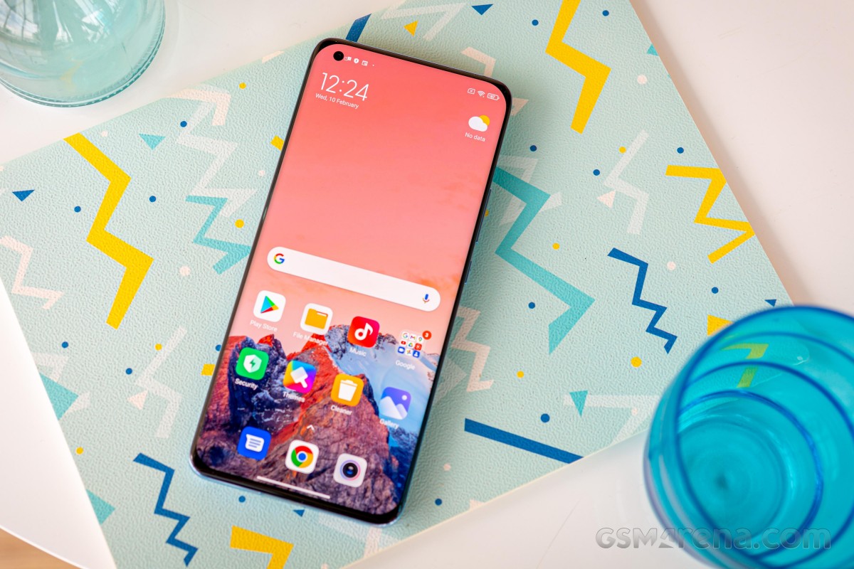
The launcher is a basic affair that nevertheless has support for an app drawer. We're happy this isn't a huge thing to note anymore, and has just become normal. You can have the Google Discover feed show up to the left of your leftmost home screen if you want, or turn that off if you don't like it. The Mi Vault is gone forever from that position, though, there's no way to get it back. We wouldn't call this a big loss or anything close to that, but you may disagree.


Launcher with Google Discover, Recents, Home screen and Recents settings
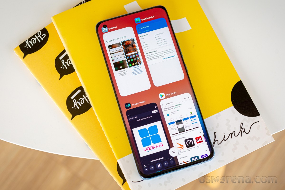
For the Recent apps screen, you can pick between a vertically scrolling view with two apps side by side, or a horizontally scrolling version which is incredibly similar-looking to what every other manufacturer is doing these days. Needless to say, we're very happy for the addition of this choice, as before MIUI was strangely holding on to its own unique and anachronistic way of doing things.

Now, people who agree with that description of the vertically scrolling Recents in MIUI can do what we did and switch to the horizontally scrolling list and restore some sanity in their day to day interactions with their phones, while those of you who love the vertically scrolling thing can stick with that. Everyone's happy.
Standalone Control Center
Another new-ish option in MIUI is the independent Control Center, which looks and feels very iOS-inspired. This can be turned on or off with a toggle, and in previous Xiaomi devices with this option we chose to stick with using Android the way God intended (or Google, in this case), with the hybrid notification pane that also houses a few Quick Settings icons which you can then expand into a larger list by swiping down again.
For this long-term review, however, we decided to try out Xiaomi's Control center and see what we'd think. After a few days of adjustment, we have to say that this arrangement worked for us very well. Not necessarily better than the default of having notifications and Quick Settings toggles in the same place, just... different but equally good, we'd say. It's definitely a matter of personal preference, this, and if you strongly dislike the iOS inspiration for the standalone Control center, then you may choose to ignore it.


New Control Center, no more toggles in Notification pane
Functionally, there are differences between the two ways of handling things, but we'd call it a tie as to which is better or worse. The standalone Control center has quicker access to the list of Bluetooth devices (just tap on the arrow at the bottom right of the Bluetooth field), while the hybrid system can show you both notifications and a few quick settings toggles on the same screen, which could save time sometimes. On the other hand, in the standalone Control Center you can add tiles for smart home devices, such as those controlled through either the Google Home or Mi Home apps. This gives you easy access to turn IoT devices on and off quickly.
Gestures, Dark mode
Xiaomi's gesture navigation system remains among the best ones out there, we've had absolutely no issues with it whatsoever. It works very smoothly (and more so in MIUI 12.5), it's easy to get the hang of, and there isn't any weirdness anywhere with having to retrace your gesture or anything like that. You swipe up for the home screen, swipe up and pause for the Recents menu, swipe from the sides in the lower two-thirds to go back, and swipe from the sides in the upper third to access an app's hamburger slide-out menu, if it has one. That's it.
We're still mourning the loss of the feature that used to allow quick switching to the previously used app by swiping from the side and holding a bit, but you can easily achieve the exact same thing by swiping left and right on the bottom of the screen (though you do have to 'lift' the swipe ever-so-slightly for this to work, and that does take some getting used to, much more than the older gesture did).

There's a Dark mode in MIUI 12.5, naturally, and it looks to us to be identical to the one in MIUI 12, including the fact that it gets forced on for all apps too. This is annoying because you can't turn off the forcing feature in batches, you have to do it for every single app individually. That's bad UI design, and needs to change - we were hoping MIUI 12.5 would fix this, but it hasn't.
Anyway, if you want all of your apps to be darkened by the OS, with no regard for whether they have a dark theme of their own, then you'll enjoy this feature, undoubtedly. Unfortunately, it's not perfect which means that from time to time you will end up seeing black-on-black text in some apps, things like that. This is when you will then need to go to Settings, hunt down the More Dark mode options menu, and toggle off the forcing of Dark mode for that individual app.
Quite an unnecessary hassle in our book, but we do prefer this to having no way of forcing the dark theme onto apps whatsoever - because, incredibly, there still are some that don't have a proper dark mode built-in even today. It probably goes without saying - but we'll say it nevertheless - the Dark mode is schedulable according to your liking.
Settings
The Settings menu doesn't seem to have changed all that much when going from MIUI 12 to 12.5, it's still essentially the same, with a very similar way of sorting its various sub-menus. It's definitely... a lot, we won't lie, and some things may not be where you expect them to, coming from other Android skins. Fun fact: the factory reset option is under About phone, which is also the first item in the menu, and not the last. Why? Who knows.
Then again, just because every other Android device maker under the sun places that option at the end of Settings (or near it), doesn't mean that's the 'proper' placement per se. The point here is that the Settings menu of MIUI 12.5 still thankfully has a search bar at the top, which is very important in getting you to sub-settings that may seem randomly placed throughout.
Overall we wouldn't call MIUI's Settings menu the hardest to navigate out of all Android skins (that dubious honor probably goes to Samsung's), but it's definitely not the easiest to master either, nor the lightest feeling or looking. Then again, the search bar is there, and it's unlikely you'll have to fiddle with Settings a lot after you first customize your phone to your liking.
We will say that we really appreciate the endlessly scrolling list in the Wallpapers section, which integrates that part of the Themes app in a very seamless fashion. You can pick categories of wallpapers to be shown, browse through a million of them (not literally, but that's what it feels like), and applying one you've found to your liking is much faster than in other skins.
While we're talking about wallpapers, no other company has anything that comes even close to Xiaomi's Super wallpapers, and we have to commend it for thinking up this system, where the AOD image, the lock screen image, and the home screen image are all integrated, with very nice animations when transitioning from one state to another. In MIUI 12.5, you can pick between more Super wallpapers than ever before - five categories, some of which have additional choices regarding the exact location shown. They're also finally spotless in the transitions - there are no stutters, no lags, no perceived slowness, none of that anymore.
The Super wallpapers are just one of those small details that Xiaomi thought of in order to make your experience of using the phone every day a little bit nicer. Add to these the redone animations, the gentle vibration 'nudges' here and there in the UI, and while MIUI 12.5 might not be our favorite Android skin when it comes to looks or how heavy it is, it has quickly become our favorite based on how nice it is to interact with.
The caveat here is that we mean this for high-end devices, on cheaper ones the experience isn't exactly as good - cheaper vibrating motors can't deliver the same localized feeling, for example. But on the Mi 11, everything's smooth and seamless and a joy to come into contact with, all day every day.
Reader comments
- MRTL
- 05 Mar 2024
- 8X{
I use hydrogel film, it's great.
- Knytro
- 01 Feb 2024
- PxW
Tempered glass protectors are impossible to fit to the gorgeous screen...does anyone have a solution?
- Anonymous
- 22 Sep 2023
- CbE
Battery life is very very bad


