Xiaomi Mi 10T Pro 5G review
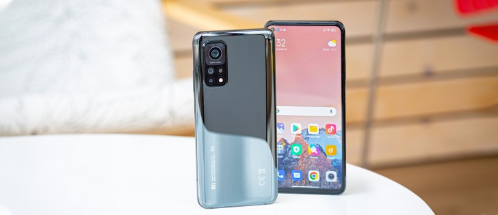
Design and ergonomics
Like the hardware it offers, the Mi 10T Pro's build is nothing short of premium. Sure, it's equipped with Gorilla Glass 5 on the front and back instead of GG6 but let's not forget the price tag. The glass sheets are held together by an aluminum frame, and the color we got is called Cosmic Black but looks more like a gunmetal gray of sorts. It reminds us of the Piano Black paint job of last year's Mi 9. There are no special gradients but the surface does a mirror-like reflection, and fingerprints/smudges are quite visible.
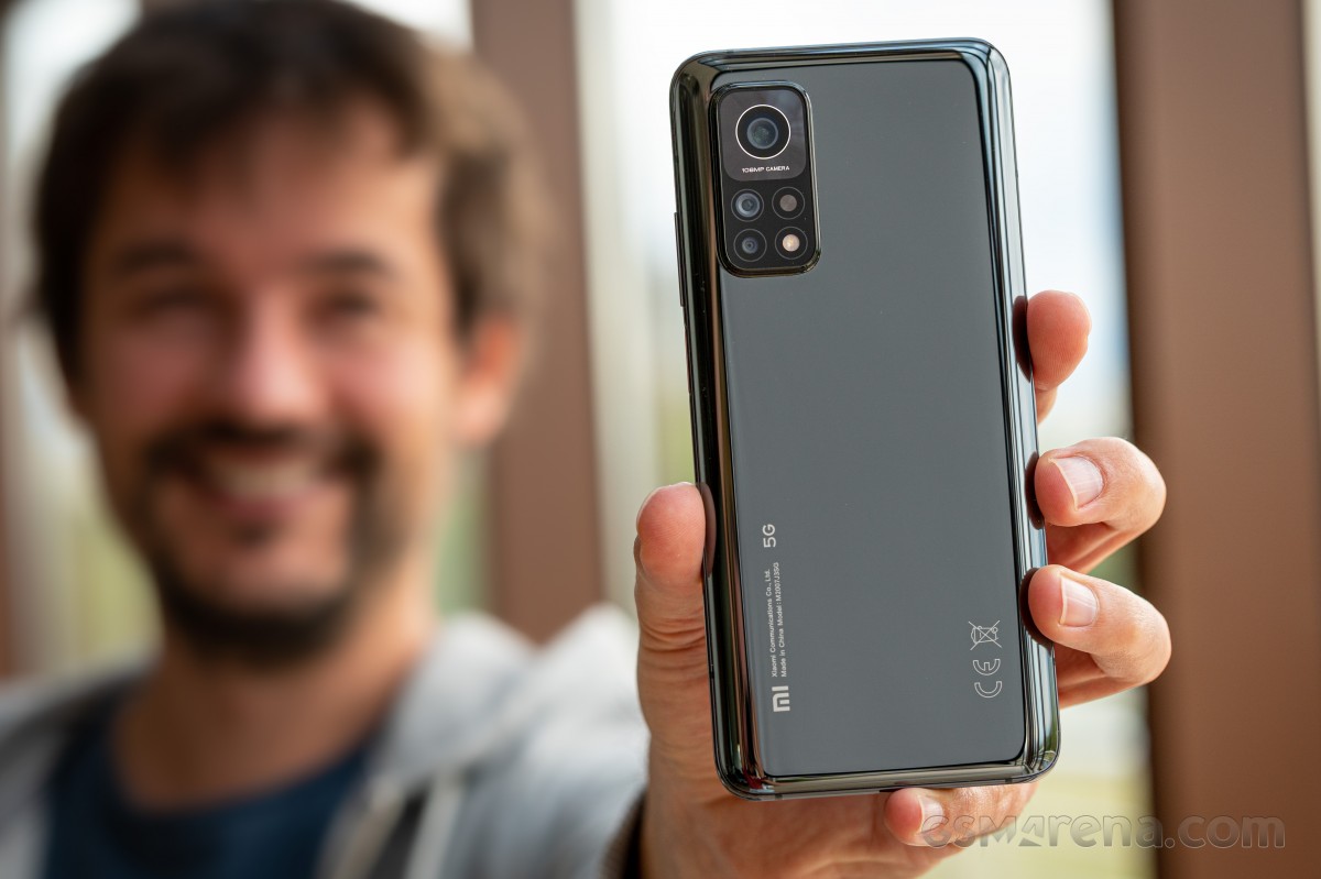
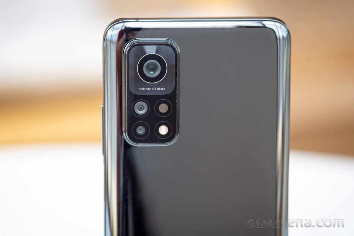
While we are still on the back, we can't miss mentioning the humongous camera bump and a few quirks about it. The first thing you'll notice is how thick it is. It's protruding a lot, and the current design makes the main 108MP sensor look bigger than it actually is. Perhaps with the OIS module, the sensor needs a little bit more space to move around. And under the main cam, we see four more cutouts - one for the ultra-wide, one for the macro, one for the LED flash, and one that's there for aesthetic reasons only. You can say it's the fake exhaust vents of smartphones. Still, the most annoying thing about the camera module is the bump. When placed flat on its back, the phone would wobble heavily.
The back is slightly curved to provide a more comfortable and secure grip while the gap between the frame and the glass sheet is barely noticeable. No matter the curve, it's still a slippery phone, but the good news is that it doesn't feel top-heavy, quite the opposite, which in turn means that it tends to stay in your hand.
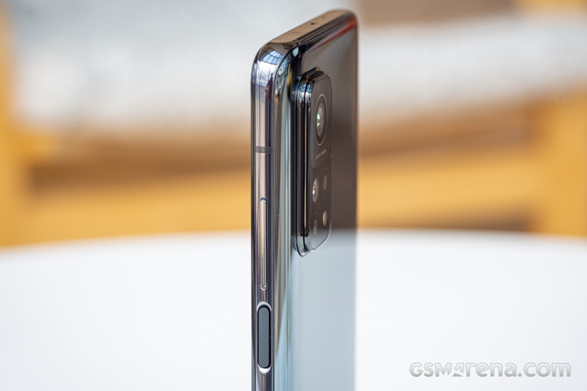
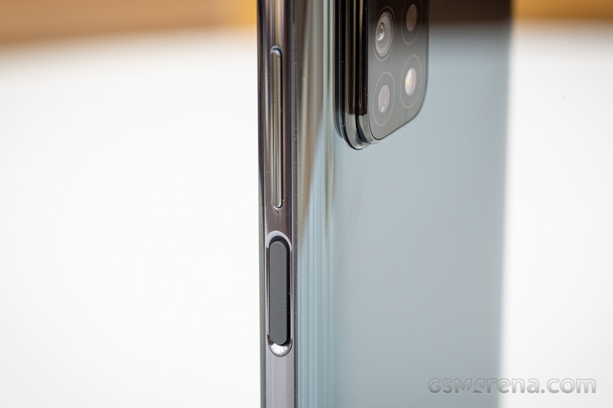
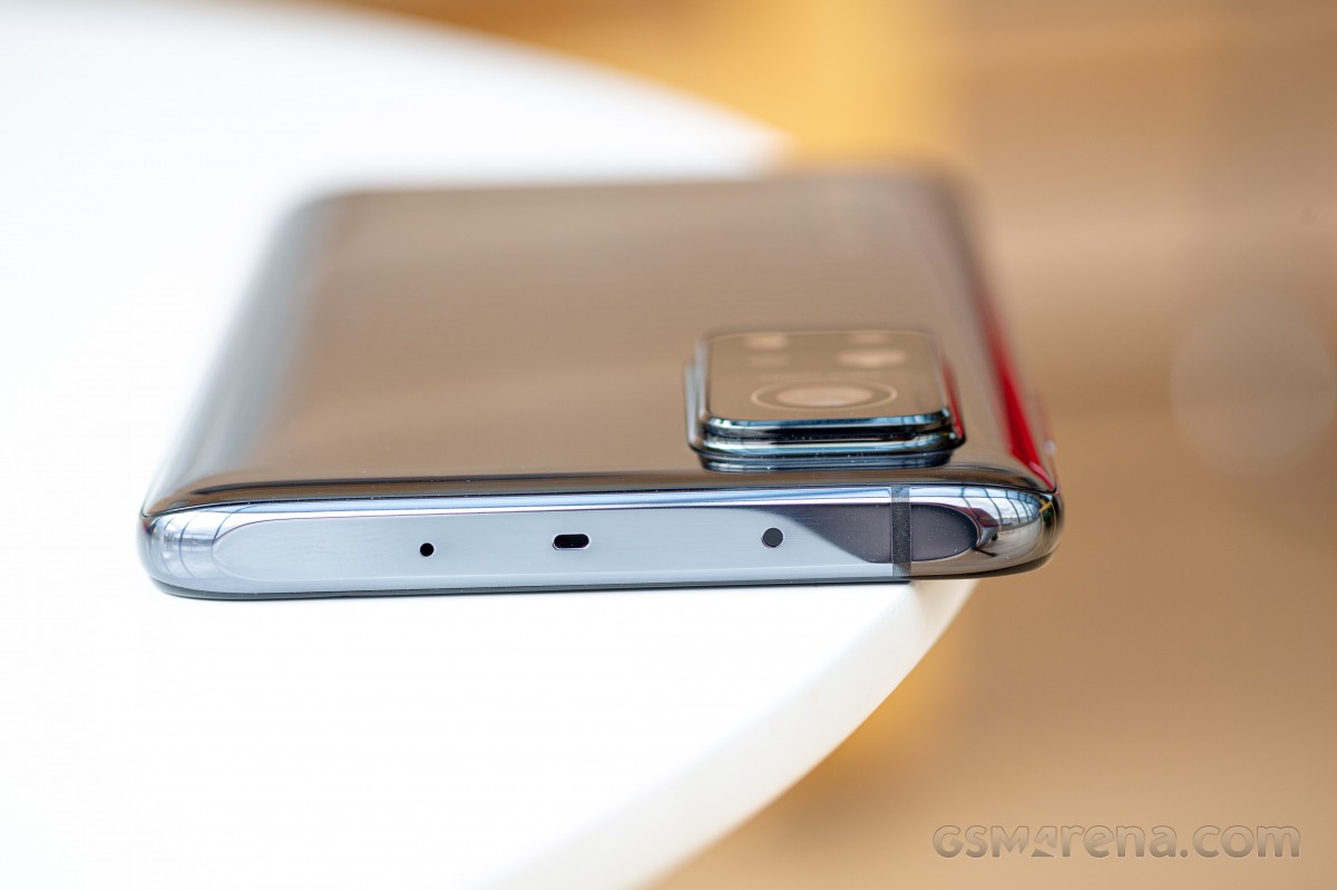
Speaking of the frame, it matches the color of the back glass perfectly. It's rounded to the sides while the top and bottom are flat. The top accommodates the IR blaster, the secondary microphone, and a small hole for the echo chamber. The bottom has the secondary speaker grille, the SIM card tray and the USB-C connector. The volume rocker and the power key, which doubles as a fingerprint reader, are placed on the right side of the frame. The power button sits in a subtle ridge, which is easy to use. We didn't have any issues with the placement. To our surprise, we can say the same for the volume rocker as well. Users with average-sized hands won't have to adjust the grip to reach it.
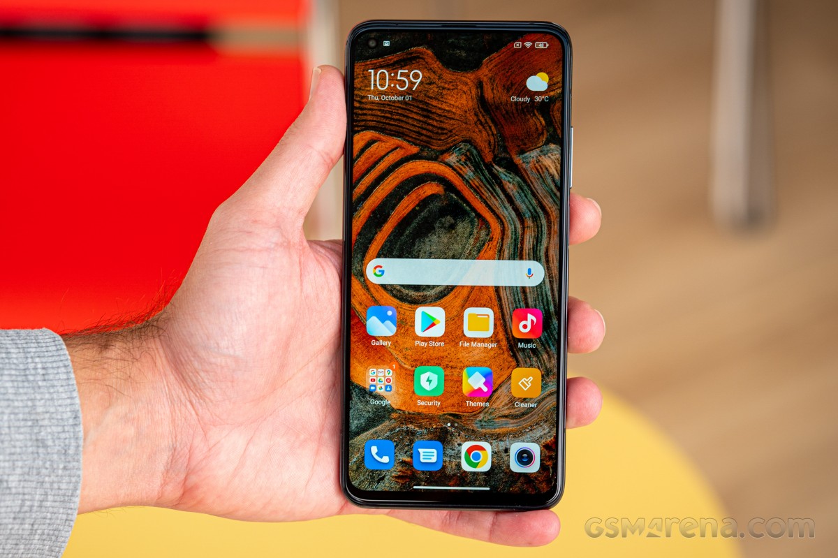
The display is protected by a Gorilla Glass 5 sheet. The bezels aren't the thinnest ones around, especially the chin.
We feel some may be disappointed to see the Mi 9T Pro successor with a punch-hole camera design instead of a hidden pop-up selfie camera. Sure, mechanical components that move come with their durability considerations, but the trade-off is well worth it as you get an unobstructed viewing experience.
To sum things up - the design of the phone is excellent with a good choice of materials (as far as premium feel and looks go) and the only thing that needs a bit of trimming is the camera bump on the back - figuratively and literally speaking.
Reader comments
- Abhishek
- 19 Oct 2024
- rJx
I got this phone in Jan of 2021 and it's still working fine. And the main camera on this thing is really good even in 2024. The only thing I wish it also had is a 3.5mm headphone jack.
- Musty
- 27 Mar 2024
- r3b
Hey guys I'm really enjoying the phone try one.So far so good all i can say is one of best phones produced in the market.
- Mae
- 13 Mar 2022
- gxJ
You can download True Phone Dialer and manage yourself what buttons you want,I left only speaker and dialpad. Even you can set where to place them. I know it was frustrating evreytime the mute button is touched. I had you same idea no Xiaomi...