Xiaomi Mi Pad 7.9 review: Up-and-comer
Up-and-comer
MIUI goes after iOS
The Xiaomi Mi Pad 7.9 runs on a heavily-customized version of Android 4.4.4, called MIUI. Xiaomi mi3 and mi 4 both use MIUI v.5 but the MIUI on board the Mi Pad 7.9 is version v.4.8. Xiaomi recently unveiled MIUI 6 but as that is still in beta so it's not clear whether it will reach the Mi Pad 7.9.
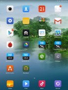
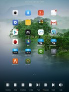
As for the UI of MIUI, If you've ever seen iOS on an iPad you will surely see the similarities with MIUI on the Mi Pad 7.9 from the layout of the homescreen, through the lockscreen to the task switcher interface.
Before we dig in, it's important to note that currently the Mi Pad 7.9 is only available in China and thus doesn't come with Google Services pre-installed. Without those, the Mi Pad 7.9 doesn't have access to Google's Play Store, Maps, Calendar, Drive, YouTube, Gmail or access to any apps outside of Xiaomi's app store. Of course, you can always sideload the Google Services like we did. Most probably the versions of the tablet for other countries outside China will have the Google Services preinstalled.
Here goes a quick glance of MIUI on the Mi Pad 7.9.
The MIUI software on the Mi Pad 7.9 doesn't have too much in common with the OS we saw on the Xiaomi Mi 3 and 4 in its operation and looks. The MIUI icons are the same but there a lot of transparent UI elements and less shadows here.
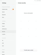
The lockscreen is the simplest one you can find on an Android. It shows you a wallpaper, time and date and a swipe up to unlock command. There's no widgets support on the lockscreen and you can opt for a pattern unlock. Gone is the elaborate four-setting swipe wheel from the MIUI on the MI 3.
Beyond the lockscreen is the Android homescreen with four customizable shortcuts docked at the bottom, but you can dock up to six items. The Mi Pad 7.9 has two types of homescreen - the standard one with app icons and folders and a dedicated one for widgets.
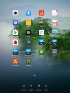
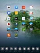
You can add toggles to the standard homescreen and select a number of transition effects for it. You can also add additional standard homescreens but only to the right of the first one, while adding widget homescreens is only to the left of the first one - that way the two homescreen types are arranged right for the apps and left for the widgets.
The leftmost homescreen is dedicated to widgets. You get a swipeable list of widgets with some having subfolders (Google Play Music has two widgets). We've seen this duo homescreen implementation before on Meizu's Flyme OS, where the widget homescreen was a vertically-scrollable grid.
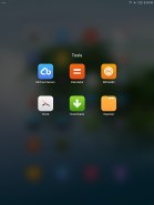
You can create folders by dragging an app icon over another one's. Opening up a folder is done exactly the same as on iOS 7 and 8 - the folder apps float to the center of the screen and the rest gets blurred in the background - a little too uncanny a resemblance here.
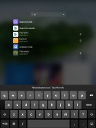
Xiaomi has a universal search function which can be found either through the task switcher menu or through the dedicated widget. If you type a query you'll get the local results (apps, music, videos) and the option to search the web or the play store.
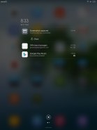
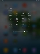
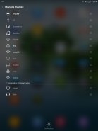
The notification are on the Mi Pad 7.9 is also very close to Apple's implementation - Xiaomi even calls it the same - Notification Center. It shows all of your notifications with the time and date and you get contextual options like on any other KitKat droid - if you get a message you can reply, a saved screenshot gives the option to share and more. A quick swipe to the left unveils the quick toggles page where you get to quickly turn settings on - Bluetooth, Wi-Fi, Rotation lock and you have a brightness slider. You can add those toggles to the bottom of the notification area as well.
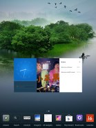
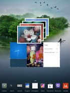
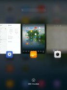
The task switcher menu looks exactly like iOS - you get a thumbnail of the app along with its icon in the bottom. You swipe apps upward to close them and there's an added kill all button. Sadly if you scroll with your finger on the app icons the list doesn't scroll faster like on iOS and you can't drag more than one app at a time like you would on Apple's OS.
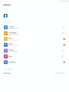
MiCloud is Xiaomi's iCloud. It gives you 5GB of free storage and options to sync contacts, the gallery, notes, Wi-Fi passwords, browser history, music and enable the Find Device function if you ever misplace your Mi Pad 7.9. However, there is no Messaging service included like on the Mi 3 and Mi 4 smartphones.
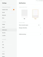
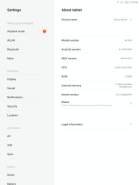
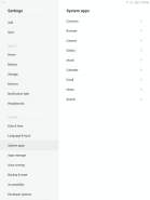
Finally, the settings menu offers a list of the main settings on the left and a sub-settings menu on the right. Note that the settings for the system apps is in the settings menu and not in every individual app.
Xiaomi's MIUI v4.8 on the Mi Pad 7.9 works smoothly and we didn't have any stutter whatsoever. The dual-homescreen implementation will need some getting used to and many won't appreciate the total departure from Android and move into iOS waters from the Xiaomi developer team. Still if need be you can always change the UI with one of the many launchers available on the Google Play store.
Reader comments
- Anonymous
- 11 Oct 2019
- f{H
4000 mah. Right ? 6700 vs 4000 which one is right?
- sid
- 01 Jul 2017
- gML
already wps office is installed by default in mi tablet so it can handle all types of files that a Microsoft office supports
- Anonymous
- 10 Oct 2016
- Hxf
come on!! it costs 100 USD only. I do not need whatsapp on a tab, I do not need contacts on a tab that have no telephone function. Are you sure you are taking about Mi Pad of Xiaomi??

