Xiaomi MIUI 14 (Android 13) walkthrough
Introduction
Xiaomi's proprietary MIUI software matured quite a bit over the years and we can confidently say that the last couple of generations don't have that burdened Chinese feel. And we are not implying that Chinese software is bad. It's just often tailored toward a completely different market and user base.
MIUI 14 doesn't feel like that at all. It brings a ton of customization options to cater to anyone's needs. And at the same time, it feels clean, simple and usable.
However, the latest iteration offers no measurable changes over the last MIUI 13 generation, at least regarding the internationally-available version. The new version is mostly about under-the-hood changes and optimizations. Still, there's a lot to cover in this feature-rich MIUI environment, so continue reading to see if it's down your alley before you grab a Xiaomi smartphone.
Android 13
Xiaomi's MIUI is barely influenced by new Android versions, which is a double-edged sword. On one hand, Xiaomi can distribute its latest Android skin and features to most of its smartphones - including the low-end ones. And by doing so, the company gains a good reputation for keeping its smartphones up to date with the latest features.
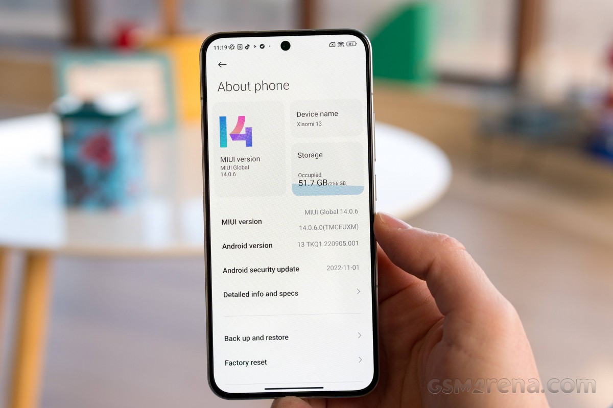
But on the other, some Android-intrinsic features don't make it MIUI. For instance, we are yet to see notification history from Android 12, and even the MIUI 14 + Android 13 combo doesn't prompt you to enable or disable notifications on newly installed apps. And those are just some of the missing features that come to mind. There are many more functionalities that Xiaomi chose to skip in its updates.
We also didn't find any significant difference between Xiaomi smartphones running MIUI 14 + Android 12 and MIUI 14 + Android 13, suggesting that the Android version underneath MIUI doesn't matter all that much. Feature disparity stems mostly from hardware limitations and smartphone tiers within Xiaomi's portfolio.
MIUI 14
What’s new?
Xiaomi says MIUI 14 re-built from the ground up. It uses a new system architecture on the Android Kernel level with CPU, GPU and memory resource scheduling. The firmware size has been decreased along with overall memory usage. The end result is an alleged 60% smoother operation measured on a Xiaomi 12S Ultra.
There's also automatic compression for apps that are rarely used, and you can now uninstall all apps except for eight core system apps. That's a big step towards de-bloating its MIUI software as it ships with quite a bit of pre-installed apps.
When Xiaomi announced MIUI 14 alongside the Xiaomi 13 series, the company outlined a slew of new features (aside from the system optimizations above), but little did we know that many of them won't make it to the international version of the ROM.
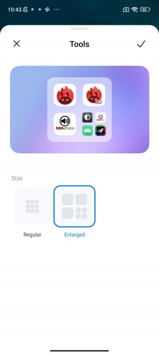
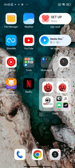
The Large folders feature is among the few user-facing features that has made it to the overseas edition MIUI. And even then, there are differences in the implementations. We've seen MIUI 14 phones that offer both Large and XXL folder variants, while others have only Large folders.
Coincidentally, we had plenty of time to spend with the Xiaomi 12S Ultra but with ported Global version of the official Chinese MIUI 14 + Android 13 ROM. We found many differences as well as features we haven't seen before. One stood out in particular - App management.
Under the Manage apps sub-menu, we found App behavior log. It tracks each app's action in the background and keeps a log in chronological order. It can even tell you if a certain app started another app or when an app tries to launch in the background. We were able to fix some app-related issues thanks to this log and we are disappointed that this feature hasn't made its way to the global version of MIUI.

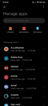
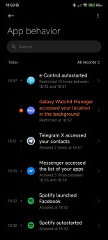
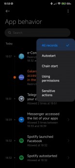
App behavior in the Chinese version of the ROM
In the phones sold outside of China, you also won't see the new widgets with various shapes and sizes, there are no Tamagotchi-inspired flowers and pets that can live on your home screen, and we also didn't find the duplicated file merger.
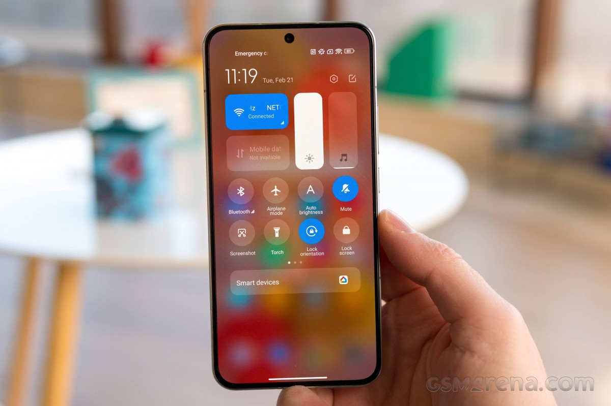
The global version skips of MIUI 14 also skips the new toggle in the Control center that lets you manage Xiaomi accessories and wearables.
Navigation, UI and customization
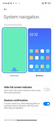
UI navigation is business as usual. You do have the option for software buttons instead of gesture-based navigation, but who's still using that? Still, we found three unique things to MIUI's navigation gestures. First off, you can hide the navigation pill at the bottom, but you can still swipe left and right the bottom edge to quickly switch between apps. That's usually not possible if you hide the pill on other Android skins or even on vanilla Android.
Secondly, the back gesture only works if you swipe from the bottom half of the edges. This is because Xiaomi didn't want to interfere with some pull-out menus in some apps. If you swipe the upper half of the left/right edge, you will pull out the desired menu instead of going back.
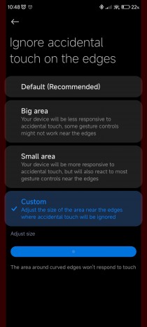
And thirdly, there's granular control over palm rejection. There are two standard presets and one that allows you to adjust the area, which won't react to touches around the edges of the display. It's useful mostly on phones with curved side edges.
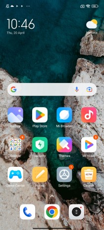
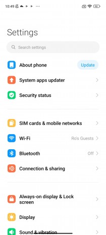
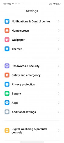
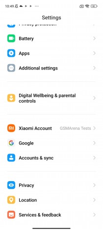
UI-wise, not much has changed coming from MIUI 13. The system uses its own iconography for the main Settings menu and the overall appearance is familiar.
All system menus have a consistent, flat, streamlined and simplistic design, with most of the interactable content moved to the bottom half of the screen for easier reach. It's far from Samsung's One UI one-handed design or even Oppo/OnePlus/Realme's ColorOS/OxygenOS/Realme UI, where you have pretty much everything within your thumb's reach.
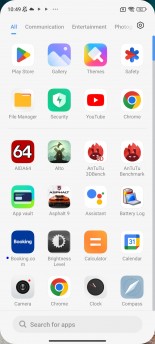
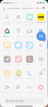
The app drawer is one cool exception. It has the search bar right at the bottom of the display, and the results are neatly organized right above the search bar.
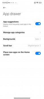
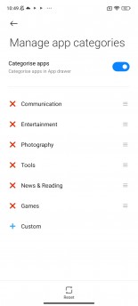
Speaking of the app drawer, you can opt for a simple Home screen layout, but you'd be missing the categories, the easy app search and the customizable scroller. This is by far one of the best and most well-organized app drawers we've used on Android.
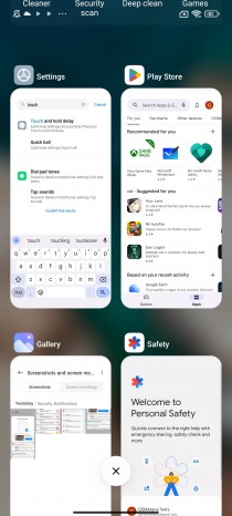
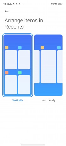
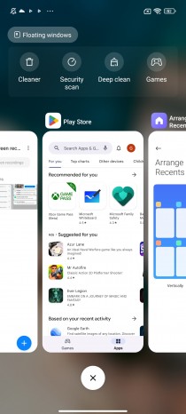
The recent apps menu is another aspect of MIUI that's different from phones from other makes. BIt displays your opened apps in a vertically scrollable list of tiles. You also get the option to change the layout to the more popular horizontal, carousel-style arrangement.
The recent apps menu is also home to a couple of useful shortcuts like Deep clean or Floating windows. The latter allows you to open a few apps in floating windows for easier multitasking. We will talk about that in detail a bit later.
The notification shade also has two versions. MIUI 14 boots with the so-called Control Centre by default, which mimics Apple's iOS Control Center. Swiping down on the right half of the screen opens up the Control Centre with only quick toggles and two sliders for screen brightness and sound. The Wi-Fi and Mobile data toggles are fixed and cannot be changed/replaced. The rest, you can re-arrange to your liking.
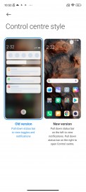
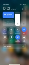
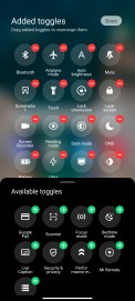
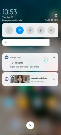
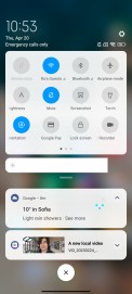
Standard notification shade and Control centre
Swiping down on the left half of the display opens up the notification shade with the familiar card-style notifications.
You can switch between the notification shade and the Control Centre with left/right swipes. That means you can't dismiss notification cards by swiping left, which is the main issue we have with this implementation. Otherwise, we see the potential and why some users would opt for the new Control Centre style. It gives you much larger control toggles. We can't quite understand why the mobile data toggle is the only one that turns green when on while all others are blue in their active state.
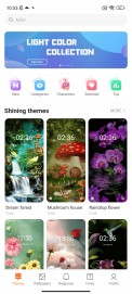
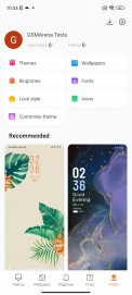
Customization-wise, there is a lot to go through. Xiaomi's Themes ecosystem has been active for many years, so there are a lot of creative community members with hundreds of themes.
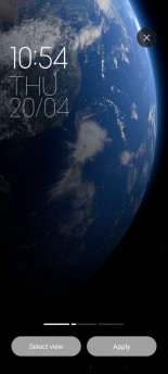
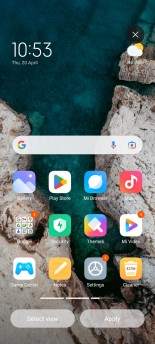
The system Themes app allows you to change not only your wallpaper but also your font, icons, ringtones and AoD style.
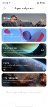
For the more premium Xiaomis, you can opt for the so-called Super wallpapers. They are neat animations of the Earth, Saturn, Mars, geometry shapes and the snowy peaks of Mount Siguniang. They apply to your lock screen, home screen and AoD.
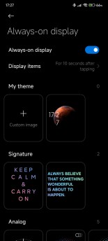
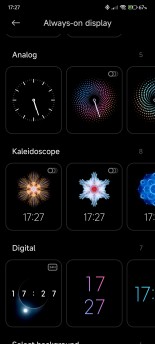
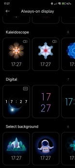
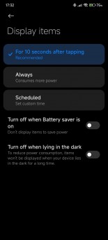
Speaking of the Always-on Display, MIUI has one of the biggest selection of AoD styles and presets. You can even create one from scratch with an image of your choosing. But functionality-wise, it offers the standard options like scheduling or when to turn off automatically.
Notifications
Like most other things, Xiaomi lets you customize your notifications and how they appear. You can choose which apps to appear on the lock screen (you may want to hide apps delivering sensitive information on the lock screen), disable permanent notifications, floating and notification badges on per app basis. You can be pretty flexible with the way apps notify you.
There's even an option to swipe up on a floating notification to snooze upcoming ones in the next minute or until you lock the device. This function is quite useful when a certain messaging app is spamming you with notifications while you are using the phone for other stuff.
The notification cards in the notification shade have two stylings to choose from. There's the MIUI style and the default Android one. The Android ones use simpler icon styles and group notifications from a single app within one card. The MIUI notifications are somewhat more compact and use the original app icons. And once you expand notifications coming from one app, each notification gets its own card.


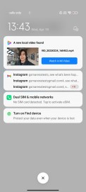

Notifcation cards style: Android default • Android default • MIUI • MIUI
What we would like to see in future MIUI releases is the ability to adjust sounds for calls and notifications separately. This is possible on several other Android overlays but not in MIUI.
Unfortunately, one of the biggest issues we had with MIUI, no matter the version of the software, is the notification reliability. It appears that the system is way too overzealous with keeping background apps in check, and notifications would either arrive late or they won't arrive at all. And there doesn't seem to be a pattern either. Some apps are killed in the background, while others are not.
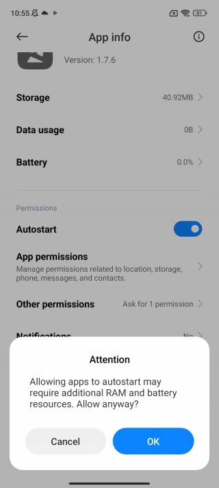
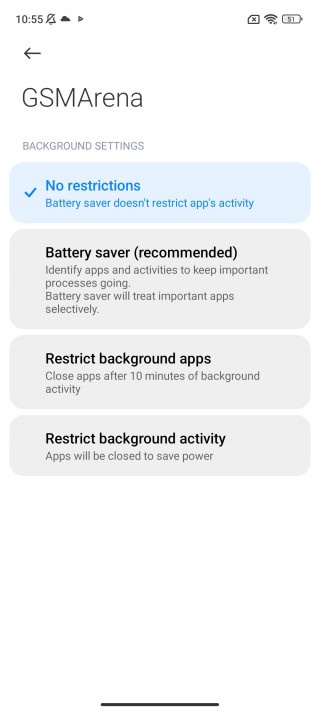
Notification issues workaround
There is a workaround, but it's not perfect. You can whitelist certain apps from MIUI's management and allow them to autostart. This should alleviate some of the notification issues but won't fix them entirely. We've noticed this being a thing on more than one MIUI versions and on more than one phone. So keep that in mind.
Smart and additional features
Although not unique in any way, MIUI offers multi-tasking via the Floating windows function. Either by opening up the recent apps menu and tapping on Floating windows, or by pulling out the so-called Sidebar, you can open certain apps (almost all of them in our experience) in small, interactive windows. You can open up to two apps in Floating windows and a third app in full-screen. You can also dock some of them on the right side of the screen. Performing the home gesture will minimize the apps but won't close them.
Another way to open up an app in a minimized window is to tap and swipe down on a floating notification card. This will open up the app in question in a Floating window mode.
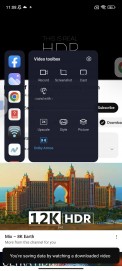
The Sidebar becomes a Video toolbox once the system detects a video player. Of course, the toolbox works in the YouTube app and provides several useful shortcuts. Arguably the most useful feature, however, is the background playback. Any YouTube video will continue playing even if the phone is locked.
Normally, this is a feature available only to YouTube Premium subscribers, so MIUI's Video toolbox is literally saving you money.
Under the Additional settings sub-menu, MIUI holds its gesture shortcuts, which most other Android iterations have. You can set up a three-finger swipe gesture for screenshots and a three-finger tap-and-hold for a partial screenshot.
Certain Xiaomi phones, mostly the premium ones, have an additional tap-on-the-back gesture. You can assign a double-tap or triple-tap function, but no matter the phone, we feel like the tapping gesture on the back is largely unreliable. It rarely activates unless you are very assertive with your taps.
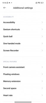
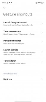
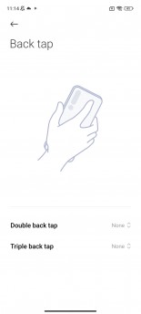
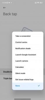
Additional settings and Gesture shortcuts
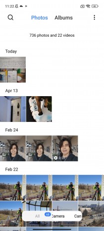
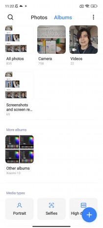
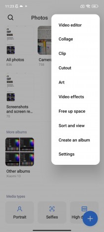
Last but not least, MIUI 14 offers improved text recognition via the default Gallery. You can open up a photo or screenshot, tap on the three-dotted icon and choose Recognize text. It will extract all the text from the photo and dump it on a notepad-like window so you can copy and paste whatever you find useful. This isn't available on certain low-powered Xiaomis, though.
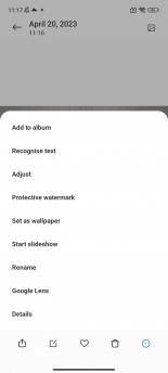
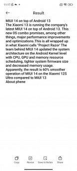
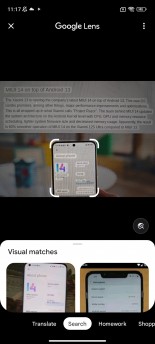
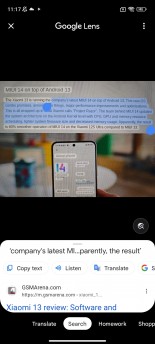
MIUI’s text recognition vs. Google Lens
Alternatively, you can always rely on Google's Lens. The Gallery and the default Camera app provide deep integration with Google Lens, which is considerably more advanced and convenient than the default one from Xiaomi, since it recognizes emails, phone numbers, images etc. and provides more instantly actionable choices.
Privacy and security
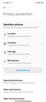
Even though Xiaomi didn't implement many of the Android-intrinsic features from the last couple of releases, it did get around to incorporating privacy-related features such as the Privacy dashboard, per app permissions and the status indicator in the top-left corner of the screen when an app uses your microphone or camera.
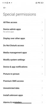
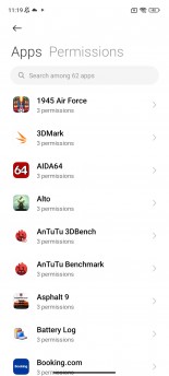
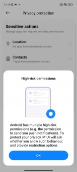
App permissions are neatly organized into three main groups - sensitive permissions, special permissions and other permissions. Once in a while, if the system deems it necessary, it will warn you of a high-risk permission from an app, and it will let you decide what to do with it.
MIUI carries around a Security app that helps you maintain a healthy software status. We remain skeptical of how practical these features are, but you can do a security scan on demand, lock certain apps with a fingerprint or do a deep clean by deleting unused files. You can also kill draining apps in the background with a single tap. The Security app can be a useful tool to delete system-wide cache too.
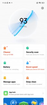
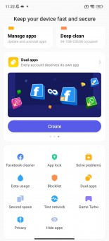
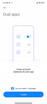
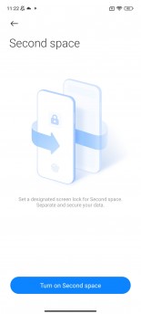
Security app, Dual apps, Second space
Dual apps and Second space, on the other hand, are quite useful features. The first one allows you to sign in with different accounts in one app and keep the user data separate for both user accounts. The Second space does the same but for the entire system. Let's say you have personal and business accounts to manage with different apps and sensitive information. You can do that on a single device with Second space.
Although not necessarily a security feature, Xiaomi phones with under-display fingerprint readers let you launch a QR code scanner or initiate a search as soon as you unlock the phone. You just have to keep your finger on the scanner after unlocking. These types of shortcuts are available on other proprietary Android software, but MIUI doesn't let you customize the shortcuts. The Chinese version of MIUI has more shortcuts but doesn't allow you to customize them either.
System apps
For markets outside of China, Xiaomi tried to streamline the experience by removing some of the system apps. For example, the default Messaging and Phone apps are from Google, whereas the Chinese version adopts its own apps. Still, you will find a Music player, Video player, Calculator, Gallery app, File manager, Recorder, Compass, the Xiaomi Community app and more. Of course, the standard Google apps are also pre-installed along with third-party applications like TikTok, Facebook, etc. It depends on your region.
And in case your phone has an IR blaster, you can use the Mi remote app to set up a connection with your home appliances, including the TV. There's a huge list of supported devices, so you will most likely make use of the Mi remote app.
General performance and day-to-day usability
We have used MIUI 14 as a daily driver for a few months now, and it looks and feels like your average Android OS. And we mean that in a good way. While Xiaomi's take on Android has its own look, it's still consistent with Android. Developers didn't try reinventing the wheel.
The best part is that MIUI just works. Aside from the annoying notification issues with some apps, the OS is quite stable, reliable and fast. Even after installing hundreds of apps and using two different Xiaomi phones, MIUI 14 remained snappy and responsive. You can even go for faster animation, which will speed up things even further. And we suggest you do that because animations in the so-called Relaxed mode feel a bit slow to our taste.
Verdict
At its core, MIUI is a mature Android skin, and it's definitely one of the most consistent and snappy OSs we've used lately. It has come a long way.
However, the aggressive background app management and the hindered notification handling keep us from giving MIUI 14 a perfect score. We hope Xiaomi will work on those in the future and also try to implement at least some of the features it already has in its Chinese ROM. We are completely baffled by the decision to skip even basic features such as the double-tap-to-lock on the home screen to lock.
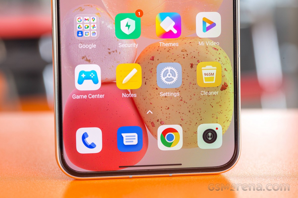
Having said that, MIUI is still one of the most customizable Android overlays out there. You can change and adjust pretty much everything to your liking (okay, maybe without the app notification volume). So it's probably safe to assume that MIUI 14 will cater to almost everyone, making it one of the most versatile UIs out there.
Related
Reader comments
- are
- 06 Sep 2024
- 0mU
are you really asking that question here*
- Pissed of gamer
- 28 Mar 2024
- SqI
Why did you guys remove split screen? I used that function so much but had to get a new phone and now I can't use it.Why!?
- Johnny
- 05 Feb 2024
- 6rd
Hello. I have a Xiaomi 13t with MIUI 14. I can't find the "double video ( or dual Camera)" and "clone video" features.










 Motorola
 Samsung
 OnePlus
 Honor
Honor Samsung

