Poco F2 Pro review

Poco Launcher/MIUI 11, Android 10
The Poco F2 Pro runs on its own Poco launcher based on - MIUI 11 and Android 10. And it runs the software fast too. We didn't notice any hiccups or lags, but we don't expect anything less from a Snapdragon 865-powered handset.

Anyway, if you've used previous iterations of MIUI, then you'll be greeted with familiar feel by this Poco launcher. However, the skin feels more mature in a way. It's way more simplified, streamlined, and borrows some aesthetics from the stock Android, such as the quick toggles in the drop-down menu. In fact, in the Poco launcher, the OS defaults to the app drawer instead of putting everything on the home screen like the stock MIUI does.
Speaking of the general settings menu, we found one odd thing about all the categories. There's too much spacing between each sub-menu, making an unusually long scroll to the bottom. It's something that only a few people would mind.
Another small annoyance we had with our short time with the Poco launcher is the lack of that thin navigation bar at the bottom that some of the ROMs have. It's pretty much an Android 10 default setting. Although Xiaomi was like a pioneer with the Android gestures and was first to introduce the iPhone-like back gesture, some of us still appreciate the pill on the bottom. It makes switching between apps effortless and fast. The current switch between the last two apps is by swiping from the edge of a screen as if you are performing a back gesture and holding for a split second. If you are not fond of that quick switch, you can disable it in the settings menu.
On the other hand, some of you may like the recent apps menu as it displays more apps on the screen with a vertical scroll. There are also quick shortcuts to some tasks at the top end of the screen, which in turn pushes the apps towards the lower half of the screen making manageable to operate with one hand.


Home screen, notification shade
Okay, we got the small misfires we found in the Poco launcher out of the way, let's talk about what we liked and what we found most useful when lurking around the menus for cool functionalities.
The vibration motor is one of the first things that springs to mind as a major improvement over the predecessor. Sure, it's more of a hardware feature but how it's implemented into the software is what matters. Scrolling, typing, and performing gestures will give nice, gentle haptic feedback. But when it needs to, the vibration motor can really hit it. Sometimes a little bit too much, but it's easy to adjust with the slider in the menu. We also found it to be really precise. It's nice to see more and more OEMs paying attention to the vibration mechanics.
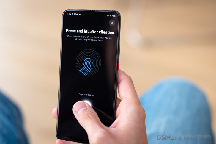
The fingerprint reader is also on par with the competition. We found it to be quite reliable and fast. The unlocking animations are a bit on the slow side, but if you don't keep your finger on the screen long enough, the screen unlocks mid-animation. Interestingly, the placement felt a bit odd at first as it's a bit higher than on most handsets, but after a while, we started to like it. It really does make sense on big-screen devices with tall aspect ratio. Our only complaint would be that the fingerprint area doesn't light up as bright as it should, and it's hard to notice when you are outside under the sun. This one bit needs some more work.

While we are on the lock screen, we can't miss giving some praise to the lock screen designs and the always-on function as a whole. It's highly customizable, gives you a ton of options for the lock screen along with its behavior.
The display settings menu is pretty extensive too. It gives you pretty granular control over the display settings, but one feature stuck out - the Sunlight Mode. Some people still prefer the manual control over the display brightness for one reason or another and the said mode gets rid of one major issue - when it's really bright outside, your last-used brightness level might leave you staring at some weird angles at the screen just to move the slider. Well, Sunlight Mode does that for you when it detects bright ambient light.


Lock sreen, always-on and display options
Notifications are also more customizable than ever, giving you choice even between how notification cards appear in the notification shade. Although not in the same menu, there's a quick reply option for messengers directly from the card. You can find in the Special features sub-menu.
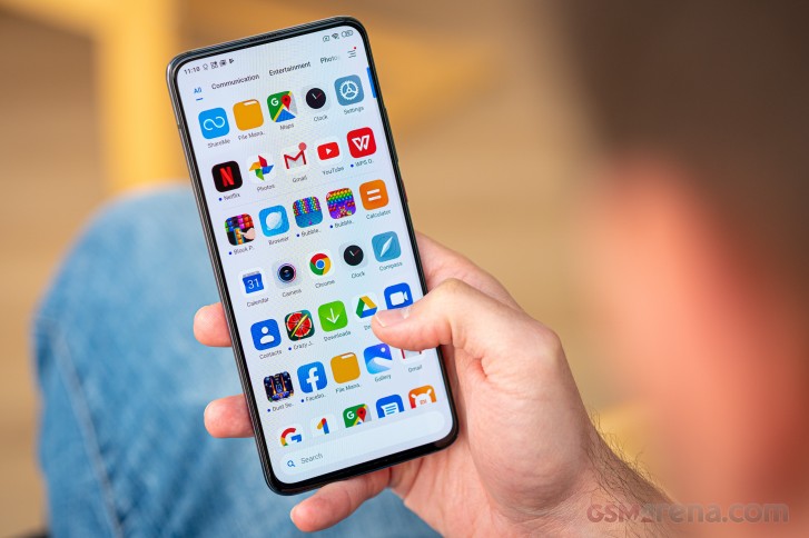
The app drawer is customizable as well. You can arrange your apps by colors, while different categories on the top of the screen help you find your apps faster. It's pretty neat. If you are a "search by typing" type of person, you will find a search bar at the bottom of the app drawer where it's easy to reach with your thumb.
There's also the Game Turbo selection of features if we can call it that. It boosts performance and gives you quite a bit of control over certain game-related things. What blew us away were the individual profiles you can set for each game. You can adjust the touch response (why would you want a slower response, though) and sensitivity to repeated taps. We can see how that one is useful in certain games that require lots of tapping on a single control.
Setting up an area of the screen that doesn't react to touches is also a thing. It prevents accidental touches from users with bigger hands. And visual effects to each game can also be added. The slider increases the contrast and sharpens the picture.
Last, but not least, in the Special features sub-menu, there are a couple of customizations for the LED notification light. And if you are wondering where the hell Xiaomi managed to stick an LED with a full-screen design, it's pretty clever - in the pop-up mechanism. It already has LEDs inside of it, why not just make a small cut so that it can shine through for notifications, incoming calls or when charging. And to our surprise, right next to the periscope, we found an IR blaster, which can be utilized by the numerous apps on Play Store and use your phone as a remote controller. It's a pretty rare feature nowadays.
For those of you with battery anxiety, you'd be pleased to know that the Poco launcher gives you granular control over your battery settings and app behavior. Each app can be tinkered individually, and you can receive notifications when they misbehave in the background. But just to be sure, Xiaomi has a nuke button that clears the cache each time you lock the device. Keep in mind, however, that might kill an important app and you won't receive notifications from it.
Anyway, if you've used previous iterations of MIUI, then you'll be greeted with familiar feel by this Poco launcher. However, the skin feels more mature in a way. It's way more simplified, streamlined, and borrows some aesthetics from the stock Android, such as the quick toggles in the drop-down menu. In fact, in the Poco launcher, the OS defaults to the app drawer instead of putting everything on the home screen like the stock MIUI does.
Overall, we enjoyed using the Poco launcher on the F2 Pro. We also didn't find any visual differences between the stock MIUI 11 and the Poco launcher aside from the fact that the Poco launcher defaults to the app drawer, while on the MIUI 11, you have to switch to it ON in the settings menu.
Performance
The phone is powered by the latest Qualcomm Snapdragon 865 chipset based on the improved 7nm+ EUV manufacturing process. The SoC holds an Adreno 650 GPU for graphically-intensive tasks as well as an octa-core CPU that consists of 1x Kryo 585 core ticking at 2.84GHz, 3x Kryo 585 cores running at 2.42GHz and 4x of the same cores clocked at 1.8GHz.

The chipset is paired with either 6 or 8GB of RAM, but it's important to note that the 6GB version settles for the LPDD4X memory (the unit we have) while the 8GB model gets the new LPDDR5 memory, which is more efficient and faster. Going for the 6GB model gives you 128GB of storage while the 8GB model comes with 256GB of internal storage. In both cases, the storage is not expandable as there is no card slot.
The internal storage has also received an upgrade to UFS 3.1 instead of UFS 3.0. Honestly, though, you wouldn't notice much of a difference when using the phone for your normal daily activities. Both are fast enough, that's what we are saying. The same goes for the LPDDR4X vs. LPDDR5 dilemma.
Of course, we ran our usual synthetic benchmark tests so here's how it fares against the competition and even higher-priced models.
GeekBench 4.4 (multi-core)
Higher is better
-
Xiaomi Poco F2 Pro
13295 -
Honor V30 Pro
12824 -
Realme X50 Pro
12761 -
Galaxy S20 (60Hz, 1440p)
12557 -
OnePlus 7T
11394 -
Samsung Galaxy S10 Lite
11151 -
Xiaomi Pocophone F1
9003
GeekBench 4.4 (single-core)
Higher is better
-
Galaxy S20 (60Hz, 1440p)
4958 -
Realme X50 Pro
4305 -
Xiaomi Poco F2 Pro
4255 -
Honor V30 Pro
3932 -
OnePlus 7T
3644 -
Samsung Galaxy S10 Lite
3524 -
Xiaomi Pocophone F1
2438
GeekBench 5.1 (multi-core)
Higher is better
-
Xiaomi Poco F2 Pro
3332 -
Apple iPhone SE (2020)
3237 -
Honor V30 Pro
3204 -
Realme X50 Pro
3175 -
OnePlus 7T
2858 -
Galaxy S20 (60Hz, 1440p)
2750 -
Samsung Galaxy S10 Lite
2732
GeekBench 5.1 (single-core)
Higher is better
-
Apple iPhone SE (2020)
1334 -
Galaxy S20 (60Hz, 1440p)
931 -
Xiaomi Poco F2 Pro
916 -
Realme X50 Pro
911 -
Honor V30 Pro
778 -
OnePlus 7T
776 -
Samsung Galaxy S10 Lite
738
AnTuTu 8
Higher is better
-
Realme X50 Pro
592447 -
Xiaomi Poco F2 Pro
538221 -
Galaxy S20 (120Hz, 1080p)
525029 -
Galaxy S20 (60Hz, 1440p)
515538 -
Honor V30 Pro
500571 -
OnePlus 7T
485585 -
Apple iPhone SE (2020)
462253 -
Samsung Galaxy S10 Lite
459497
GFX 3.1 Car scene (1080p offscreen)
Higher is better
-
Xiaomi Poco F2 Pro
51 -
Realme X50 Pro
51 -
Galaxy S20 (60Hz, 1440p)
51 -
Galaxy S20 (120Hz, 1080p)
51 -
OnePlus 7T
48 -
Samsung Galaxy S10 Lite
43 -
Honor V30 Pro
42 -
Xiaomi Pocophone F1
35
GFX 3.1 Car scene (onscreen)
Higher is better
-
Realme X50 Pro
45 -
Galaxy S20 (120Hz, 1080p)
44 -
OnePlus 7T
41 -
Xiaomi Poco F2 Pro
40 -
Honor V30 Pro
35 -
Samsung Galaxy S10 Lite
34 -
Xiaomi Pocophone F1
31 -
Galaxy S20 (60Hz, 1440p)
26
3DMark SSE Vulkan 1440p
Higher is better
-
Xiaomi Poco F2 Pro
6660 -
Realme X50 Pro
6472 -
Galaxy S20 (120Hz, 1080p)
6398 -
Galaxy S20 (60Hz, 1440p)
6248 -
Honor V30 Pro
5627 -
OnePlus 7T
5540 -
Samsung Galaxy S10 Lite
4892
As you can see, the Snapdragon 865 chipset performs as expected. Samsung's Exynos 990 takes a beating in the multi-threaded scenarios but offers better single-core performance in return, which is to be expected with the big Mongoose M5 main cores.
The rest of the differences - even in the GPU-only tests - are mostly within the margin of error.
Reader comments
- fr-jason
- 12 Nov 2023
- 6m1
Just install the new Android 14 build for CrDroid ; https://xdaforums.com/t/rom-14-0-beta-official-lmi-crdroid-v10-0-12-11-2023.4640996/#post-89157409
- Nungkham
- 21 Aug 2023
- XZW
Agree 👍, this phone has issue of charging port. This problem is common on the poco f2 pro, which has had to replace both the charging circuit assembly (including type c port) and the cable connecting the charging circuit and main motherboard.
- Cp101
- 15 Jun 2023
- Aky
I've had this phone for 30months now. I still love it, 6gb ram is the only reason I am looking for a new phone. It had to go back once for a internal charging cable issue, and I paid for the battery to be swapped at that point. Has been perfect ...


