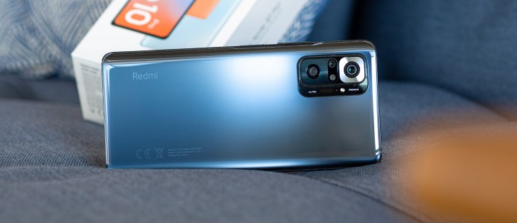
Xiaomi Redmi Note 10 Pro long-term review

Updates
The Redmi Note 10 Pro runs the latest MIUI 12.5 based on Android 11. Our review unit, intended for the European market, got two MIUI 12.5 updates so far, and the first one was definitely not the most stable - so we're happy the second one arrived a few weeks later and fixed most of the issues introduced by its predecessor. Performance now feels on par with what it was under MIUI 12, which was definitely not the case after the first MIUI 12.5 update.
This brings us to our continuing niggles with Xiaomi's update cadence and quality control. The latter seems to vary based on how much a device costs - we've never had an experience where a top of the line Mi handset got much buggier after an update, for example, but that has happened a few times with the 'flagship killers' and a lot with the lower-end devices like this Redmi Note 10 Pro.
In fact, it feels like the least amount of quality control goes into updates for Redmi branded phones (outside of China), with Poco branded devices being treated slightly better, Mi mid-rangers and 'flagship killers' a bit better than that, and then at the top the Mi flagships having QC worthy of their prices.
However, one thing all of Xiaomi's devices have in common is how they only receive updates once every few months, generally, with some exceptions - after a lot of online backlash regarding the first MIUI 12.5 update for the Redmi Note 10 Pro, the company issued the second one less than two months after it, which, believe it or not, is huge progress.

But this is not the usual state of things, and when considering buying a Xiaomi/Redmi/Poco device you still need to keep this in mind. Updates are few and far between, the cheaper the device is the more likely it is that a new update will introduce a whole slew of bugs (or just general slowness, or both), and then you have to wait weeks (if you're lucky) or months (normally) for a new update to fix all of those issues.
This is far from ideal, we'd say, but perhaps inevitable given how most of the company's devices, regardless of brand, undercut the competition in price (and significantly in most cases). Maybe that's the price to pay for getting a cheaper phone? That, and the incessant ads we keep hearing about - that are apparently very prevalent in some markets.
We still can't talk about ads because as usual we have a European retail unit, and on these, ads are constrained to showing inside the built-in Xiaomi apps, most of which we don't use. The most annoying ads for us are those that show up after you install an app, but they can easily be turned off forever by hitting the gear icon in the top right and turning off "Show recommendations".
Because the update cadence isn't great, with a Xiaomi/Redmi/Poco phone you're almost guaranteed to never be on the current security patch level either. Case in point: the Redmi Note 10 Pro is now on the June 2021 security patch level. We're not trying to make a huge deal out of this (especially at this price point), but think you should know very well what to expect.
MIUI 12.5
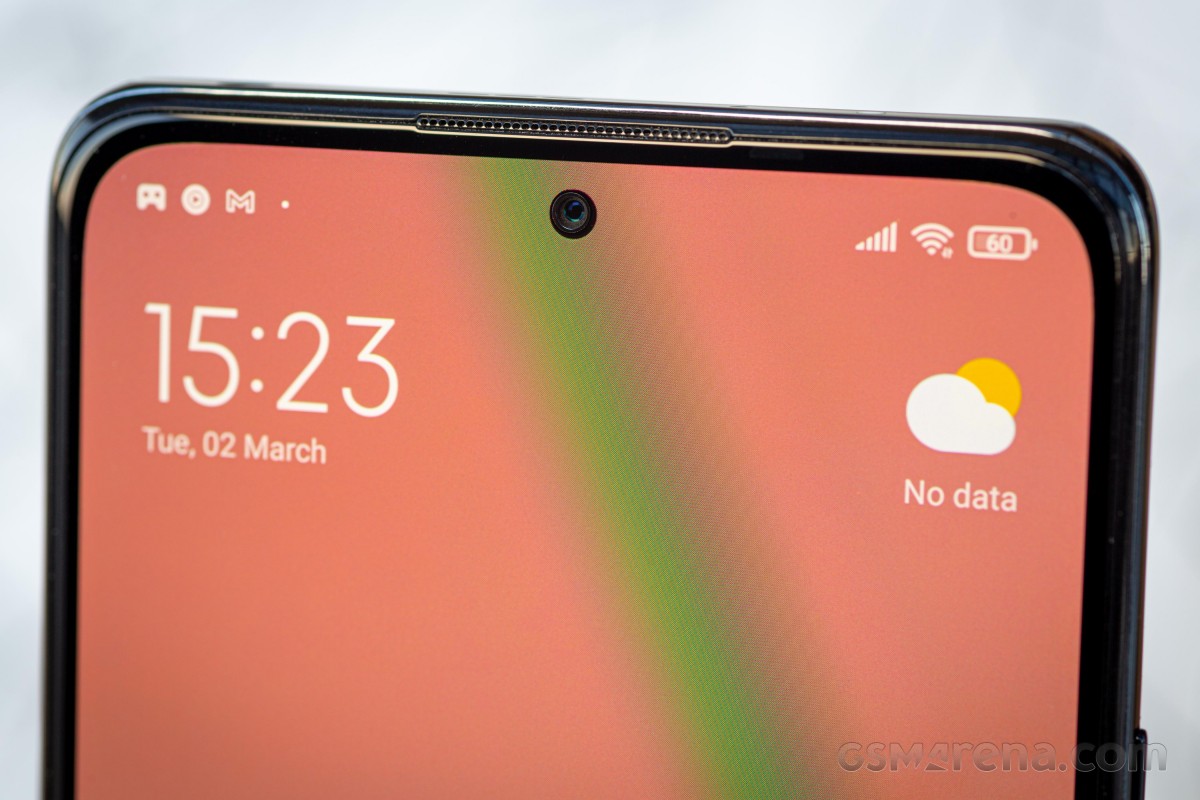
If we could rant just a bit more about MIUI 12.5 as seen on the Redmi Note 10 Pro, we'd also mention the fact that you can only ever see a maximum of three notification icons in the status bar, despite there being room for at least a few more. If you get additional notifications, you'll still have three icons on the status bar and then a three-dot icon to their right, signifying that there's more stuff waiting for you in the notification pane.

We've seen this before, randomly, on some other Xiaomi phones, and this behavior still doesn't make any sense. Fun fact: it all started when notches were a thing, and thus in some cases, there actually wasn't enough space to show more than three icons. It seems like someone in Xiaomi's software development team simply forgot about this, and so we see it in the Redmi Note 10 Pro despite it having only a tiny hole-punch for the camera in the middle.
Last but not least, whenever you make a YouTube video full screen, the brightness of the screen "magically" increases a lot. Only when the video is full screen. And we did look - there's no way to turn this off.
We've seen similar "Video enhancer" features in a lot of skins over the years, but they were all either opt-in or at least opt-out. You simply get no such option here, so you're stuck with this. Truth be told, we didn't particularly mind it, but you might, so we thought you should know what to expect.

Aside from these niggles, we'd still call MIUI 12.5 one of our favorite Android skins at the moment. Far from the favorite, mind you, but on the list nevertheless. Most of that has to do with the reworked animations, the smoothness of the full-screen gestures, and the way vibrations are used throughout the UI to enhance the user experience. Unfortunately, those vibrations are toned down in the Redmi Note 10 Pro, both in literal intensity because the vibration motor isn't great, and it also feels like there are fewer of these gentle 'nudges' than we felt on, say, the Mi 11.
The other two plus points for MIUI 12.5 do still stand, though. Animations feel 'organic', for lack of a better word, and few other skins get close to this feeling - perhaps Google's "stock" Android, but it's still not the same. That said, on a phone with a Snapdragon 7-series chipset these are never fully stutter-free, so the feeling of fluidity doesn't exist to the same extent as on the Mi 11 we've recently long-term reviewed.
Gestures and Recents
Gestures have been reworked under the hood in MIUI 12.5 to be near-instant feeling, and we can confirm that they are. Feature-wise, and also ease-of-use-wise, Xiaomi's gesture navigation system was already among the best out there, for two simple reasons. First, it lets you hide the 'pill' indicator at the bottom of the screen (unlike Google itself), and second - it deals with hamburger slide-out menus in a much more streamlined and easier to understand way than Google.
To go back, you simply swipe from either side in the bottom two-thirds of the screen. To trigger a hamburger slide-out menu for an app that might still have that, do the same swipe in the top third of the screen. See? We told you it was easy. The other gestures are the ones you know already, probably by heart - swipe up to go home, swipe up and hold to enter the Recents menu.
Speaking of Recents, on the Redmi Note 10 Pro (like on most, but strangely enough not all phones running MIUI 12.5), you can pick which way these scroll. You can stick with MIUI's traditional vertically-scrolling two-column view, or go with a horizontally scrolling list of apps, in a similar fashion to what every other Android skin has been doing for a while.
Since we never understood the point of the dual-column vertically-scrolling Recents screen, we're very happy to see the other, saner option introduced here. And no one has to get upset - if you like the other way of doing things, you can keep it.
Launcher
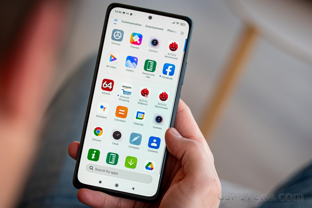
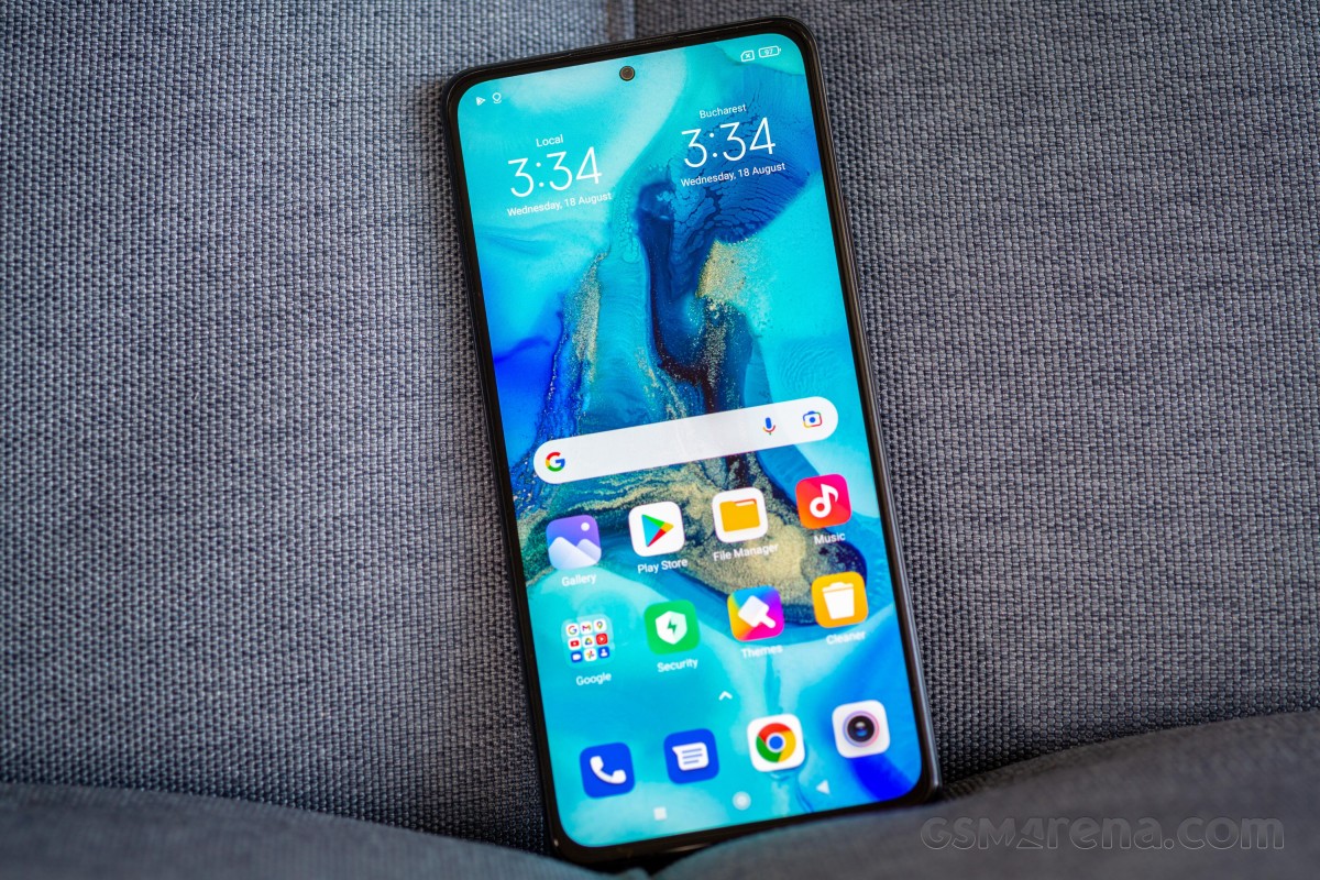
Another thing we're happy to see in MIUI is the Google Discover feed to the left of the leftmost home screen. This you can also opt-out of if you want, but there's no way to bring back Xiaomi's App Vault (which used to occupy the same slot before).
The launcher app seems heavily based on the Poco Launcher, and as such it has the option to use an app drawer, as well as auto-categorize apps in said drawer, and offer app suggestions at the top. You can customize the icon size and grid layout (though you can only pick between 4x6 and 5x6).
The launcher works very well for the most part, although it still has two bugs. The first one we've seen before in other Xiaomi phones, and has to do with the impossibility to add in-app shortcuts to the home screen. So for example on other launchers we can have a shortcut to "My Apps" inside the Play Store app. The way to add that is long press on the Play Store icon, then drag the My Apps icon onto the home screen where you want it to be. The first part of that works on the Redmi Note 10 Pro, whereas the second doesn't.
The other bug we've encountered about once every 2-3 days (and this one we haven't seen on other handsets before) is that the launcher will randomly forget the wallpaper you set and reset to the default one. Hilariously enough, this works both ways - if you simply don't do anything, it will then randomly revert back to the one you set in a few more hours.
Dark mode, Control Center
Dark mode is obviously available, and it's schedulable too. There are no darkness settings (to customize how dark it gets), it's just an on/off switch. You can let the phone dim the wallpaper to fit Dark mode, and adjust text and backgrounds automatically for the same purpose.
Additionally, Dark mode is forced onto all apps by default, regardless of whether they do or do not have a dark theme of their own. While we very much appreciate this option, the fact that it's turned on for every single app by default is really annoying. A lot of times for apps that do have their own dark themes, this results in weird artifacts on the screen, so you'll have to jump back to Settings > Display > Dark mode > More Dark mode options > Individual apps to turn off forcing the theme onto unsuspecting apps.
To make matters worse, there's no way to batch select apps - you'll need to turn this off for each one individually. This feels like one of the areas of MIUI that has been ignored recently, maybe it's time for a touch-up of sorts - having a choice between all on and all off the first time you enter the menu would be nice, for example.
MIUI 12.5 ships with the new iOS-like Control Center that is completely separate from the notification shade, and we're still not entirely convinced by this way of doing things. We think there are upsides and downsides to both approaches, which is why we're happy that the option to go back to the normal way Android does things is still there.
Sticking with Quick Settings toggles above the notifications means you don't have to fiddle with where to swipe down (if you choose the Control Center swiping down from the rightmost two-thirds of the screen will give you that, and you'll only see the notification shade if you swipe down in the leftmost third - even though in theory the halfway point in the middle should be where one turns into the other, in actual use it's not like this).
Then again, if you do pick this way of doing things, you only get five Quick Settings toggles visible on the first swipe, to get to the rest you need to swipe down some more. The new Control Center easily wins in the sheer number of toggles it can show you all at once. Thankfully you can swipe left/right to go from the Control Center to notifications and vice versa, although on the Redmi Note 10 Pro this feels flimsy - for about a second nothing happens, which then might make you think you haven't swiped adequately enough. But if you wait for that second to pass, you'll then jump to the other side in a weird-feeling motion.
Settings
The Settings menu in MIUI 12.5 isn't all that different from the one in MIUI 12, and that means it still has some "unique" features, like the About phone section being the first one up, and the System Apps Updater still existing. Despite what its name may imply, this doesn't actually handle updates for all system apps. Some of them update through the Play Store, and it doesn't feel like there's any logic to which goes where. Nor does the existence of the System Apps Updater make any sense to us, but hey, at least it's not an entire duplicate app store (Hi Samsung!). Also, it's adhering to the Dark Mode now, which it didn't use to do on all phones in MIUI 12. So that's progress right there for you.
Like in MIUI 12, the Settings menu is... comprehensive, for lack of a better word. It is one of the more convoluted out there, but thankfully the search bar is there for you at the top, and has proven to be a great time saver. We still don't think the MIUI Settings menu is the hardest to navigate out of all the Android skins, but it's definitely not even close to the easiest to grapple with. It's also not the lightest feeling, and it looks like there's a lot going on everywhere, all the time - which would actually be right.
We like the fact that the Wallpaper and Theme stores are baked right into Settings, and you get an endlessly scrolling list of wallpapers to choose from without ever having to leave Settings. That's a nice touch, and there are a ton of designs to pick, and the same goes for themes. So if you aren't a fan of the default MIUI looks, that can be taken care of very easily.
Reader comments
- TotoO
- 02 Nov 2024
- peG
I have this device since june 2023, I compared it to the Redmi Note 11, 11 pro 12, 12 pro, 13, 13 pro, nothing to complain about the Note 10 pro, the only thing it can't do is stabilization in 4K. The super macro mode with its 5Mpixel sensor is ...
- Rituraj
- 27 Sep 2024
- Dkt
You are. Right
- Rolly Ghiz
- 22 Aug 2024
- xjH
Looking back at this device in 2024, I realise that it is "premium" as they say. Even to this day, I still prefer this device to any other Xiaomi phone within it's price range. The only deal breaker for me though is that it has reached...


