Xiaomi Redmi Note 4 review: A hidden gem
A hidden gem
User interface
The Xiaomi Redmi Note 4 runs a stable version of the latest MIUI 8, which is built on top of an Android 6.0 core. That's as new as it gets for Xiaomi, which is yet to out a smartphone running Android 7.0 Nougat core. However, Xiaomi tends to backport features to older versions, so the software is often further ahead than its version number indicates.
MIUI 8 doesn't bring a lot of new eye candy to the picture but comes with better text rendering, enhanced Power saving mode, new Notes app and Enhanced video editing tools.
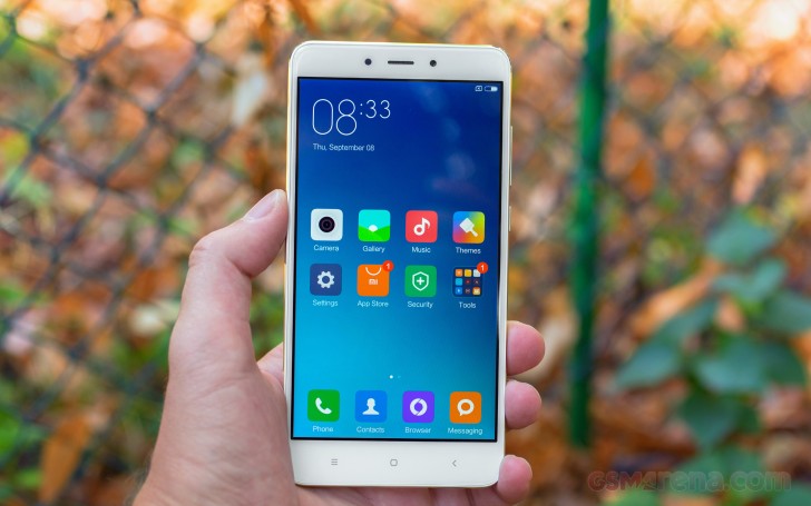
As usual Xiaomi's customizations run very deep and replace everything including all Google services. In fact, the Mi phones sold in China don't have access to Google's services and those need to be sideloaded one way or the other (some resellers may even do that for you). The models sold officially in markets outside of China come with a preloaded Play Store app.
The lockscreen is unchanged from MIUI7 and has a clock in the top left corner - gone are the lockscreen widgets. To unlock the phone, you swipe upwards and if you want a quick access to the camera - just swipe from the right side.
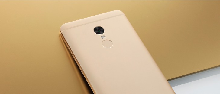
Fingerprint unlock is available, the sensor is below the camera. The sensor is always on, you just need to put your finger on it and it will unlock the phone with some speed. It's very fast for this price range.


MIUI 8 lockscreen • Camera shortcut • Switching wallpapers • PIN fallback for fingerprint reader
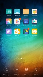
Beyond the lockscreen is the Android homescreen with four customizable shortcuts docked at the bottom by default, but you can dock up to five items. You can have any app there or even folders with multiple items if you will.
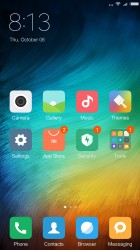
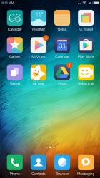
The MIUI homescreens • There is no app drawer
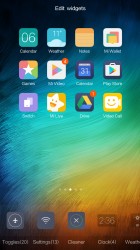
There is no app drawer - anything you install pops up on your homescreen, so it's app icons and widgets fighting for room. There's plenty of it, you can have unlimited panes. Also, folders are an indispensable tool for organizing the homescreen.
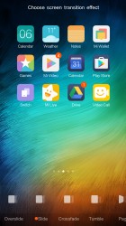
Transition effects and themes are available too. A theme will change your homescreen wallpaper, lockscreen style, system icons, system font and the sound profile (you can disable changing the sound profile from settings).
The notification area was recently revamped. On top, it has a search field similar to Google In Apps (but it's a custom implementation). It searches for apps and settings on the phone (but can't find content from inside apps).
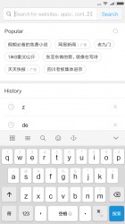
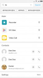
The search field searches locally on your phone
On the right of this search field is a shortcut for the Scanner, which handles QR codes, barcodes and business cards. This app can also translate text and scan documents.
Continuing on, weather info and date are below the field, then a row of toggles (which cannot be expanded to full screen), the brightness slider (without an Auto toggle) and, finally, the notifications themselves. It's a busy notification area but we found it quite functional.
If you prefer, you can go back to the old two-pane notification area - notifications on one side, toggles on the other.
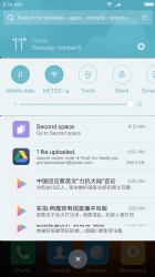
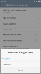
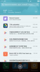
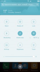
Notifications: Default • Changing the view • Two panes
The App switcher defaults to showing a row of app icons, but you can switch that to the more common thumbnails. A RAM usage reading and a close all apps button are available here.
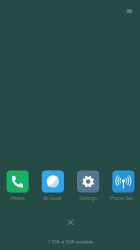
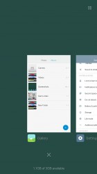
App switcher: Icon view • Thumbnail view
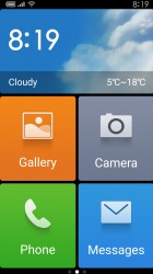
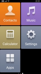
You can switch to a Lite mode, which turns the homescreen into a 2 x 3 grid of huge icons and boosts text size so it can be read from the Moon. Note that this requires a restart, most similar features do not.
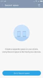
Second space is a BlackBerry-like feature that splits the phone in two. During setup, you'll set up a password for the Second space, import files, photos and apps into. This means you can have a separate set of apps and data that is accessible only with a password. You can even set that notifications don't cross the border between the two spaces.
Reader comments
- StevenNt
- 26 Sep 2020
- 61A
Still use it for almost 4 years. So this is my honest review so far. Design : Looks outdated now. the display standar 16:9 with thick bezel up and down, but the back design i think it is still looks elegant and great. Display : Wit...
- Anonymous
- 12 Nov 2019
- I@H
Can we do anything about the back camera. It is not giving clear picture. from cam is better than back camera.
- ASAN MD
- 24 Dec 2017
- 6ue
What is the difference between global and standard version of the redmi note 4 64 gp
