Xiaomi Redmi Note 8 Pro long-term review

MIUI 11
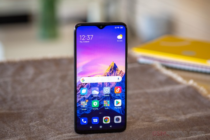
MIUI 11 is based on Android 9 Pie on the Redmi Note 8 Pro, the update to Android 10 hasn't appeared by the time of writing this review. The latest version of Xiaomi's skin is changed compared to its predecessor, but not so much that you wouldn't recognize it.
There's been a lot of polish applied in many places to make it look and feel more modern, with a smarter use of white spaces, and a revamped color set. It's one of the skins that has been toned down a lot in recent years but remains quite heavy, and it does modify pretty much all aspects of the user experience compared to 'stock' Android as Google envisions it.

That's not necessarily a good thing or a bad thing, it's just... different. At this price point you might have a few other options running Android One, which is supposedly a guarantee that you'll get OS updates faster, but the past has proven that's not really a given. And performance-wise, MIUI is really good among the various OEM skins out there. It's fluid and the animations are neat and to the point, although still pretty long for our taste. That thankfully is easy to fix by switching over the three animation duration settings from 1x to .5x in Developer Settings, if you're put off by the default length as we were.

It's a very integrated design language that MIUI 11 touts, you may like it or hate it but we enjoyed the consistency - well, aside from the Digital Wellbeing section which simply doesn't seem to fit in, betraying the fact that it's been lifted wholesale from Google. If you do disagree with the default theme, know that theming should soon become an option again through the built-in Themes app in Europe - after a long wait. We didn't get to try this as it wasn't available for us by the time we finished the long-term review process, but it is apparently coming soon. Xiaomi took down its theme store in the EU following GDPR regulations, and it took this long to make it compliant with those, it seems.
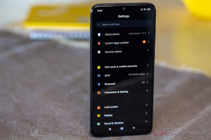
A lot of MIUI's idiosyncrasies are still present too. There's a System app updater in Settings, but this only updates some of the built-in apps, while others use the Play Store. There seems to be no logic to which app updates where, so we're wondering why they can't just all go through the Play Store. Additionally, there's a System app settings entry in the main menu, which will basically take you to in-app settings Apple-style, except in MIUI you can also access the exact same options from inside each app. Redundancy for redundancy's sake? Check.


System app updater, redundant System app settings
You also still have to fight MIUI to let it allow some apps to live in the background, such as those used to sync with smartwatches, for example. Thankfully though, missed notifications from chat apps and the likes are a thing of the past. With the default settings we've had zero encounters of missed or delayed notifications from any app - and keep in mind we have 200+ installed.
The built-in launcher is supposed to support an app drawer soon in Europe but it didn't arrive by the time we finished this review. So we did what we always do when confronted with this issue: installed Xiaomi's Poco Launcher 2.0 from the Play Store. It's made by the same company, it features an app drawer, and it has a bunch of useful settings, but not so many that things get overwhelming.
We like the option to have the alphabet take the place of the scroll bar in the app drawer, for quick access to apps that start with a specific letter, and also the fact that the Poco Launcher has its search bar on the bottom of the app drawer - that makes it much easier to reach on big devices like this one. There are a bunch of transition effects to choose from, and it even supports MIUI's App Vault - which is similar to OnePlus' Shelf, living to the left of your leftmost home screen (if you turn it on) and seemingly showing you important information at a glance. We still can't find a solid use for such things in our daily routine, but maybe you will.
Dark theme, gesture navigation, Recents menu
MIUI 11 has a dark theme too, which is good but we're hoping it gets better when Android 10 becomes the base since third-party apps don't really 'notice' that you have the dark theme on and thus don't automatically switch theirs to match. There's probably a flag for this in the OS that is only available in Android 10. You can schedule the dark theme too, but we didn't end up using it because the Redmi has an LCD screen and thus it would've been pointless for battery life enhancement purposes, not to mention that a dark theme simply looks worse on LCDs because OLEDs can actually display 'pure' blacks. Still, it's there if you need it, and it works well for the most part - with the annoying exception of the Battery sub-menu in Settings which for some reason isn't themed.

Xiaomi's gesture navigation system is among the best out there, and it works as well on the Note 8 Pro as on any other phone from the company and its various sub-brands. You swipe up to go home, swipe up and pause to reach the app switcher, swipe inwards from the left or right (in the bottom 75% of the screen) to go back, do the back swipe but hold for a bit to instantly be transported to the last used app. If you swipe inward from the sides on the top 25% of the screen, you get an app's navigation drawer. Easy to understand and very easy to get used to - with systems as good as this we're wondering why anyone would stick to using a navigation bar with buttons at the bottom, since that eats away at some screen real estate.
The Recent apps menu is still displaying app screenshots in a vertically scrolling list of two columns, and this might seem fine because you can see more apps at a glance than in competitors' solutions, but it actually makes reaching for certain apps one-handed much more difficult. That difficulty grows exponentially when you hold the phone with your right hand and want to use your right thumb to dismiss an app that's in the left column. Or vice-versa. So maybe there's a reason why seemingly every other Android skin (plus stock, plus iOS) settled on using a horizontally scrolling list of apps and showing you just one at a time.


Recent apps, Recent apps settings
Settings
The MIUI Settings menu is filled to the brim with... stuff, most of which we're willing to bet you'll never use. But all of these things are easy to simply ignore, and the important stuff is easy to get to. If you get lost, just use the search bar.
Mi Share is the new way to send stuff to nearby devices, though we didn't have a compatible one around to test with. The Cast function in the Connection sub-menu of Settings really took us for a ride before we realized it doesn't work with Google's Cast protocol, but uses Miracast. Your TV may have the latter, but if you want to share your phone's screen with a Chromecast, this won't do it. Instead, you'll need to go the untested way through the Google Home app, and that's hit and miss. Sometimes it works just fine, other times the casting randomly stops for no good reason.
Anyway, if you do go the Miracast route, there are a bunch of neat options baked in, like minimizing the window that's being cast on your phone so you can do other things on the device while casting, and even casting with the phone's screen turned off.
MIUI 11 takes some getting used to if you're coming from anything resembling 'stock' Android, but we assume most people will adapt just fine. It looks good, it feels fluid, it has nice animations, colors, and fonts, and is overall a joy to use once you've become accustomed to its quirks - of which there aren't many left at this point.
Xiaomi has constantly been cutting down on the number of those, but you still can't swipe a notification away to dismiss it in both directions, for example. Perhaps the point is to leave some of these things for future versions, otherwise, what would the changelogs be filled with? Anyway, although it's heavy, MIUI has never felt heavy or as heavy as other skins out there, and that's something to be praised. And that heaviness does come with a bucket load more options than you'd ever get in 'stock' Android, so if you're a fan of those you'll love this.


Notification pane and Quick Settings
Just to give you a taste of the amount of customizability on offer, you can independently set which apps are allowed to show you notifications on the lock screen, which get to throw floating notifications at you while you're using the phone, and which are allowed to display notification badges on top of their icons - and you can set a preference for these badges to just be dots or show the number of notifications per app too.
Updates
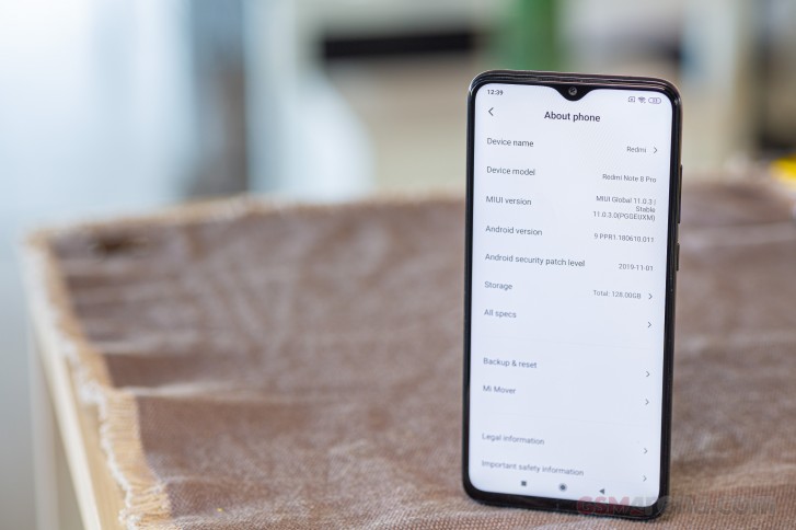
Our review unit is still running MIUI 11.0.3.0 based on Android 9 Pie, although an update to Android 10 should be arriving... at some point. Since this is a mid-ranger, we might forgive how long it took to get the ball rolling on that, but what's less forgivable is the security update situation. As you can see, our Note 8 Pro is stuck on the November 2019 security patch level, and that's just unacceptable. This handset might be cheap, but a lot of people are buying it, and monthly security updates should be just that - monthly.


Current software version at the time of writing
Whether this phone will ever get Android 11 is a different thing entirely. Based on Xiaomi's history, it's pretty much guaranteed to get MIUI 12, but Android version jumps have historically happened less often for the company's cheaper handsets, so take that into account.
Reader comments
- Dawhat
- 25 Mar 2025
- nda
I have been using RN8P for 5 years and its better than a lot of flagships so idk what the hell are u talking about
- Anonymous
- 04 Feb 2025
- rKK
Yes, it is very nice phone I am also using it since 2019 and is working very well.
- Anonymous
- 16 Nov 2024
- U{w
One of the best phone I have used it since 2019 it's still one of the best phone for me.


