Xiaomi Redmi Note 9 Pro (Max) long-term review

MIUI 12 finally arrives
We finally received the update to MIUI 12 very recently, after many months since its initial launch. We can't possibly ascertain why it took this long for Xiaomi to update the Redmi Note 9 Pro, which is definitely among its best selling phones of 2020, to the latest iteration of its software skin. But, alas, it's here now, so the wait is over.
Note that our review unit is on European software, and other versions of the Redmi Note 9 Pro may well have received the update to MIUI 12 sooner than it did. That said, it still baffles us that the Redmi Note 8 Pro, this phone's predecessor, got to taste MIUI 12 before it, but this often happens with Xiaomi phones.
On the topic of updates, in general, this sort of gives you an idea of what to expect. Updates do happen, but erratically and not on any logical schedule we can think of. So we are assuming that the Redmi Note 9 Pro will eventually get Android 11, but we can't possibly venture a guess as to when. And the same goes for MIUI 13, which could get unveiled pretty soon, based on recent rumors.
When it comes to security updates, Xiaomi is among the worst at keeping these in check, and that applies to its expensive flagships as much as its affordable mid-rangers. We currently have the October 2020 security patch level on our unit, which came with the MIUI 12 update in mid-November.


Current software and security patch
Perhaps seeing the monthly security updates be monthly is too much to ask for a mid-ranger like this one, although other companies seem to be pulling off a much better job. Then again, the Poco F2 Pro we long-term reviewed earlier this year had it even worse in that regard, so we're just left very confused by these shenanigans.
We've already talked about MIUI 12 extensively in our long-term reviews of the Mi 10 Pro and Poco F2 Pro. We will try to keep this section lighter since the software is identical between the three, with the only differences being the bugs we encountered. So let's uncharacteristically start with those.
Bugs, gestures, animations, Recent apps, DND
First, we want to say that we're disappointed with how badly the gesture navigation system works in MIUI 12. It used to work much better in MIUI 11, whereas in the latest version, you sometimes need to swipe multiple times from the bottom to 'convince' the phone to go home. Likewise, entering the multitasking view by swiping up and pausing can often be a tricky affair.
It's all a big shame, this, for Xiaomi's gesture navigation system is normally great, uncomplicated, and very easy to get used to. You swipe up to go to the home screen, swipe up and pause to reach the Recents menu, and slide in from the left or right sides in the lower two-thirds of the screen to go back. And if you want to trigger an app's hamburger menu, just swipe from the side in the top third of the screen.
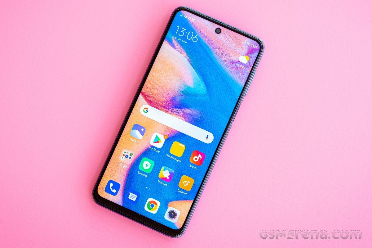
For now, in MIUI 12 on our review unit, the gesture implementation is so bad that we're wondering whether the update we got might be a "beta stable" release and not a "stable" one. Oh, and in case you were wondering, there's no way to tell which type of update you received. "Beta stable" builds usually go out at random to a small number of units before "stable" ones get a wider rollout. This makes sense because it can catch show-stopping bugs before they affect many users, but the fact that you can't tell what you have is quite frustrating.
If you get a European Redmi Note 9 Pro and are offered the update to MIUI 12.0.1.0, and you love using gestures to get around, perhaps hold off until a subsequent release hopefully fixes all these issues. It's hard to describe how frustrating the phone has been to use ever since this update brought along this bug, and another one with it - the power button doesn't always respond upon the first press when the screen is on, say when you'd want to turn it off and lock the phone.
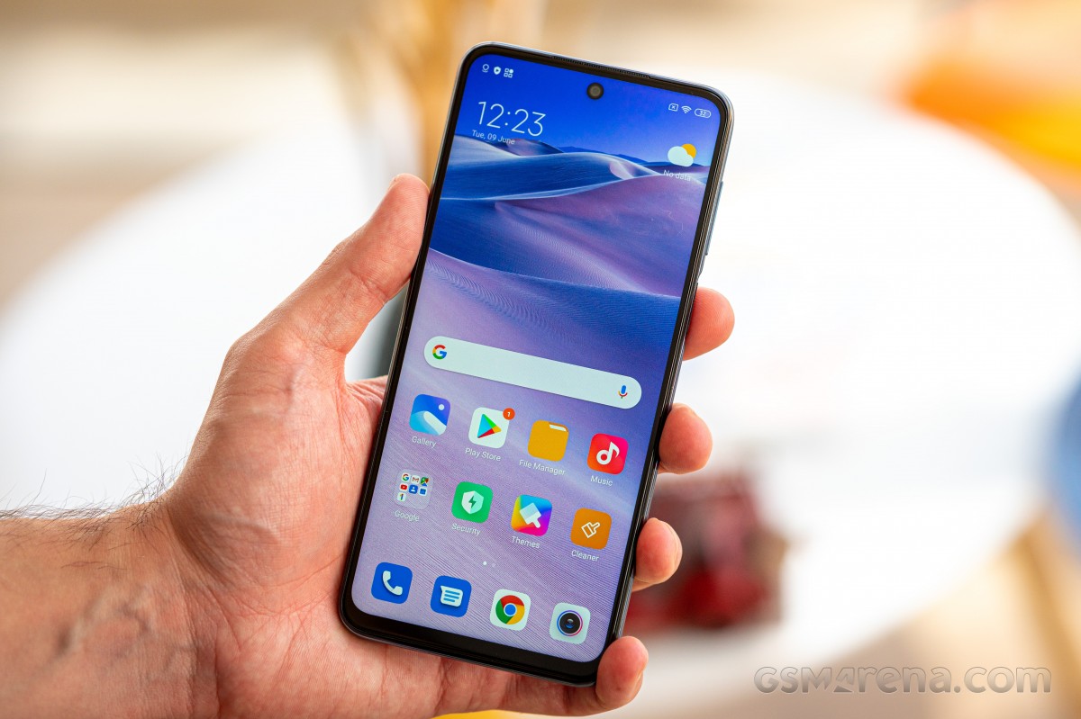
Additionally, the animations are all way too long, and the usual trick to make them shorter through Developer Settings doesn't work anymore. It's still there, but some animations don't get shortened at all. This means that every time you unlock the device, there's about two seconds before you can actually use the phone while the animation does its thing.
A similar amount of time is wasted every time you go into Recent apps when the windows needlessly jump around while they are populated. To add insult to injury, the quick way of switching to the previous app found in MIUI 11 is gone (we mean swiping from the sides as if to go back but then holding the swipe for a second or so). So now, because of that and the pointlessly elongated animation for bringing up the multitasking view, there literally is no way to quickly switch between apps.
Speaking of the Recents menu, it's typical Xiaomi fare with two apps side-by-side in a vertically scrolling list, with a few options up top. That could be counted as unique, and it is. Still, we can't really figure out why Xiaomi thinks this setup is superior to what everyone else is doing: a horizontally scrolling list. We've used a lot of Xiaomi phones recently, so we're used to this idiosyncrasy, but if you're switching from any other brand, you may be in for an adjustment period.
Next up, something that has been with MIUI for a long time and still hasn't been fixed. It's a pretty complicated thing to explain, so bear with us here.
If you have a scheduled Do Not Disturb mode (say, for when you're sleeping), and it's set to allow phone calls to 'break through' and actually alert you, and outside of DND, the phone is set to vibrate - if all of these conditions are met - when you get a call inside the DND hours, nothing happens. You are not alerted to it in any way. Not through vibration (and yes, Vibrate when Silent is set to On), not through a ringtone, nothing. We've missed many calls because of this 'particularity' of MIUI and aren't happy at all with what we can only assume is a bug.
Launcher, dark theme
MIUI 12 is an improvement upon MIUI 11 in many ways, the design included, but it's not such a huge departure that you won't recognize it.
The launcher that ships with our European Redmi Note 9 Pro has an app drawer, and the app seems mostly modeled after the Poco Launcher that's available in the Play Store to install on any device you want. It has some customization settings, which we'd call the bare minimum, but nothing too fancy. That's perfectly fine in our book because apps such as Nova Launcher with their billion possible options in their Settings can feel daunting to normal users.
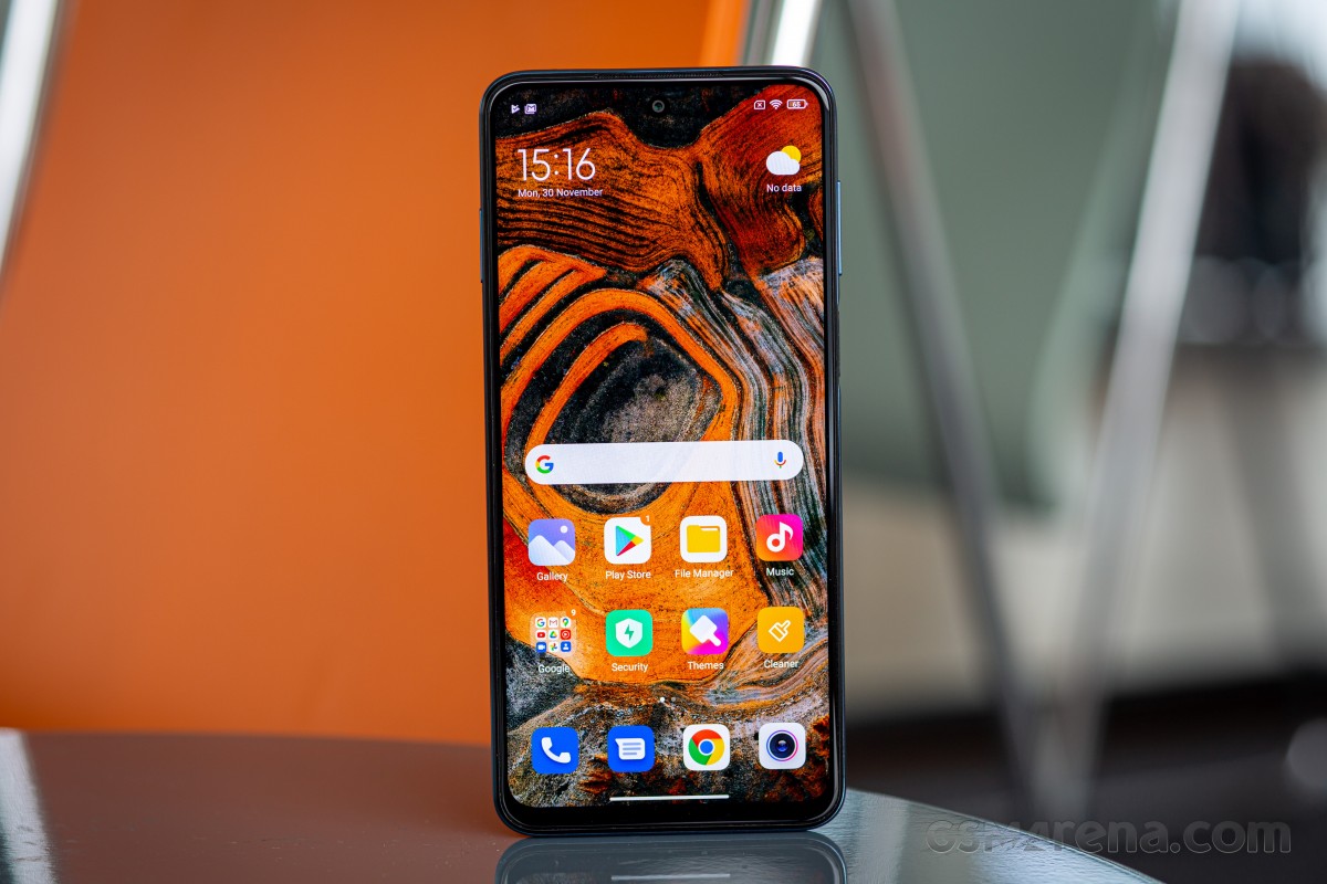
However, we have found that the launcher itself is less polished than we expected based on our previous experiences with Xiaomi phones. There's a weird issue with placing in-app shortcuts on the home screen - that just doesn't work. For those of you who don't know what these are, they show up as options when you long-press any app's icon. For example, in the Play Store case, you can normally get a direct shortcut to the My Apps section on your home screen this way. The My Apps shortcut does show up as an option when you long-press the Play Store icon, but it can't be dragged to the home screen as it should be.


Launcher: Home screen, app drawer, Google Feed
Also, you can choose to have the Google Feed to the left of your leftmost homescreen, which is a welcome addition in our book, but you do lose the possibility of having Xiaomi's App Vault reside there. It's Google or bust. Speaking of, both the Phone and Messages apps built-in are Google's, as Xiaomi has given up on developing its own apps for these purposes in some regions, the EU included. That's a welcome debloating in our book, and it makes for more seamless switching between some phones - if you happen to come from an Android One device, for example, you'll feel right at home when it comes to these two essential apps.
The dark theme is perfectly adequate and does the job nicely. That said, you should keep in mind that this is an LCD screen, so the battery life improvements you'd see from running Dark Mode on an OLED won't be present here. Then again, we have always had Dark Mode on, and you can see what amazing longevity we've gotten even so if you peek at the Battery life section of this review.
You can schedule the dark theme if you so wish, dim your wallpaper when it's on, and a nice touch in MIUI 12 is that you can force enable Dark Mode for apps that don't have native support for it yet. This is opt-in, and obviously, things may look funny from time to time, but for the most part, it works wonders if you enjoy the darker look and have to use apps that still didn't get the dark theme memo (we're looking at you, Facebook).
Settings, notifications, ads
The Settings menu is big and convoluted, but navigating it shouldn't be an issue for most. There's obviously a useful Search field, too, helping you get where you want to go faster. We wouldn't call this the cleanest Settings iteration out there, not by a long stretch, but it's not the worst either, especially when it comes to the inner logic of how things are sorted and what section goes where.
The notification pane is typical Xiaomi, design, and icons-wise. While we appreciate easy access to the manual auto-brightness adjustment slider, you still can't just tap on it where you want it to be - you need to slide your finger across it for any change to register. This hasn't been fixed in MIUI 12, unfortunately.


Notification area, Quick Settings
Speaking of notifications, to get those to work for wearable devices, you'll have to jump through the usual (for Xiaomi devices) hoops in Settings, stopping the automatic "battery optimization" and allowing the companion app to auto-start. Otherwise, you will miss out on receiving notifications on your smartwatch or smart band. We don't have a Xiaomi smart band or smartwatch around to test, but would have been interested to see if those get a pass and don't require such complications as we had to employ for both a Garmin and a Wear OS smartwatch.
One of the novelties in MIUI 12 is a new Control Center, which is thankfully opt-in. If you enable this, you'll have a different notification shade and Control Center, with no more Quick Settings tiles above your notifications. You reach the notifications by swiping down on the left side of the screen, and the Control Center if you do the same on the right side. Once you see the Control Center, you will instantly recognize how the similar function in iOS was used as its inspiration. Make of that what you wish, we chose to stick with the normal Android way of dealing with notifications and Quick Settings in the same view, but the new Control Center could definitely be of more use to some of you. It's there and works well if you want it - and can get over the iOS similarities.
As usual for long-term reviews of Xiaomi or Redmi devices, we have to note that our European model only has ads inside some of the built-in apps. We have never seen ads in the notification area or on the lock screen - nothing intrusive.
The most annoying bit is the ad that shows up during the post-installation security scan of an app, but there's a gear icon in the top right corner that you can tap to disable this scan, which also means you'll never see such ads again when you install new apps. If you stick to the Play Store and don't install obviously scammy looking things, there's no need for any sort of security scan. Your phone isn't a Windows computer; you don't need an antivirus unless you keep installing sketchy things off third-party websites. In which case, maybe constantly seeing that ad isn't such a bad compromise after all.
Aside from this one ad instance that we promptly turned off, we can live with the ads inside the built-in apps, first of all, because a lot of third party apps have ads too, and second because, truth be told, we don't usually use a manufacturer's own duplicate apps all that much.
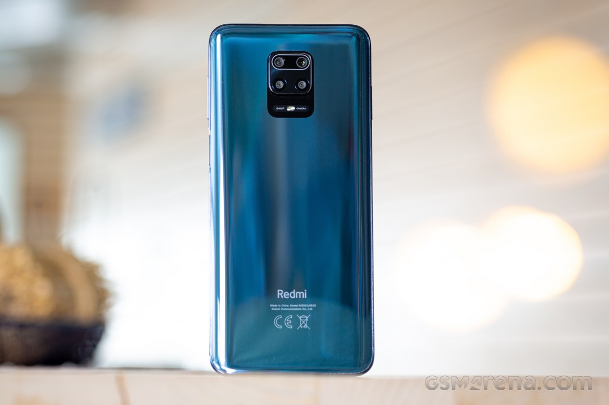
We prefer Google's options because they usually work better, but also for simplicity's sake, given how often we switch devices in a year.
All this said, we are aware that ads are much more prevalent in MIUI in other regions, which could very well be a huge downside for some people. We simply haven't had that specific user experience, but we understand that may be one of the cons of Xiaomi devices in these particular markets.
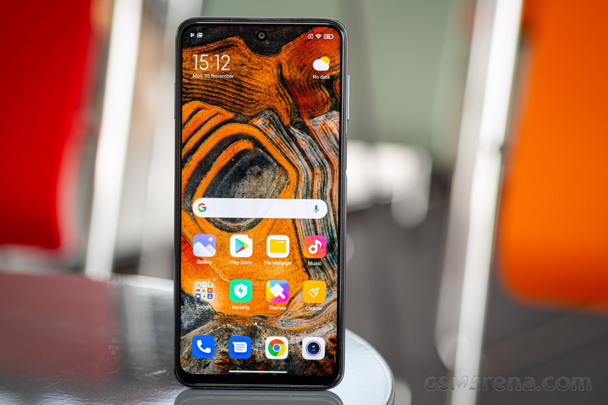
Overall, MIUI 12 is definitely an improvement compared to MIUI 11. Its design feels fresher and more modern, the animations are much improved (although too slow at the moment on this phone), but the changes aren't big enough that you'd feel there's a learning curve involved in updating from MIUI 11. Everything is still familiar, but with many small improvements here and there, which add up to a better user experience in MIUI 12 compared to its predecessor.
Because the Redmi Note 9 Pro's vibration motor is cheap and not very good (perhaps understandably at this price point), the subtle 'nudges' that are there in a lot of places in MIUI 12 on the Mi 10 Pro and even the Poco F2 Pro are simply not to be found in this variation of the software. The sole exception is the gentle vibration when you reach the beginning or end of a list. We can't say we disagree with what Xiaomi has done, as having those 'nudges' everywhere like on the Mi 10 Pro would have felt bad given the quality of the vibration motor here.
Reader comments
- Michelle
- 01 Dec 2024
- IVy
The Redmi Note 9 Pro is an amazing phone. It has worked smoothly and flawlessly for me since I bought it in 2020 until now, end 2024. NO lags, no bad battery drains, camera's still excellent, as good as brand new. Only have to change to anew pho...
- Anonymous
- 28 Jun 2024
- pHH
UPDATE: I managed to update the RN8 Pro to the latest supported MIUI version (12.5.15.0 (EU)), and performance is smoother and at least as fast with almost no hiccups or freezes and feeling faster than the RN9 Pro, also running its latest MIUI 14 ver...
- Anonymous
- 17 May 2024
- phj
I have note 9 for 4 years. There is some problems i have with it. The android MIUI has the worst bloatware i have ever experienced. It was unstable, my phone randomly restarted and i had to disable all of bloatware to make it stable again. In few mon...


