Redmi Pad SE review
Design and ergonomics
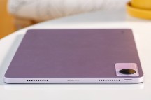
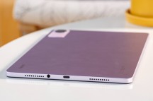
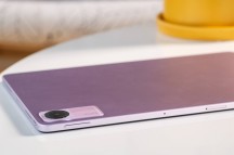
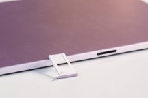
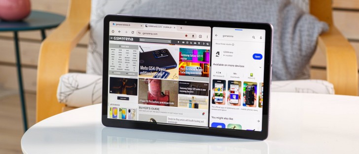
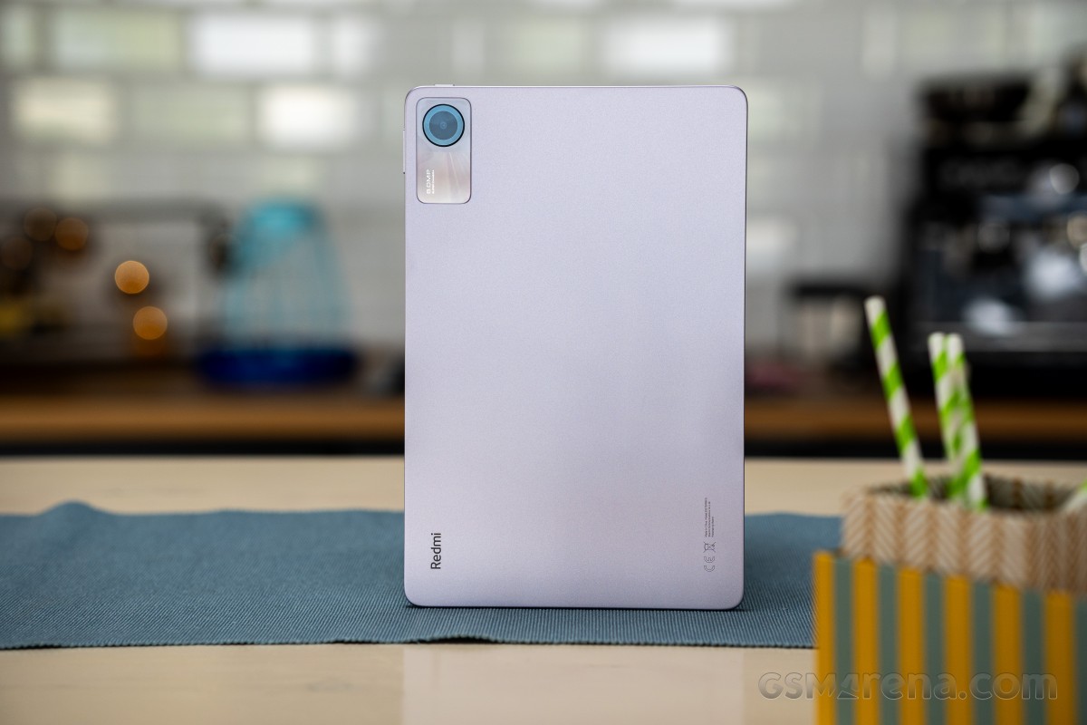
The Redmi Pad SE has an impressive, sleek design for a budget tablet. It's a slab of metal, but it's a well-molded aluminum. There are no inconsistencies, sharp edges, or protrusion - just anodized aluminum unibody. It looks and feels nice in hand. Weight-wise - it's what you'd expect from an 11-inch tablet.
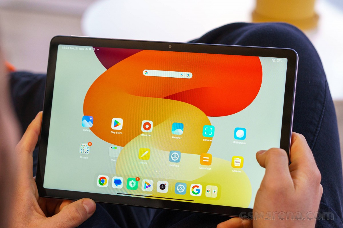
The panel on the front is, of course, glass and forms a small ridge with the side frame. The bezels are somewhat thin and maybe just the right amount of thick to ensure a secure grip without touching the touch-sensitive area when using it. We like it.
The bottom of the tablet (or the right side if you are holding it horizontally) houses the USB-C port, the 3.5mm audio jack, and two openings for the loudspeakers. The top has another set of grilles for the speakers and the power button in the corner. On the right side of the frame, you will find the volume rocker in close proximity to the power button.
We don't really have any issue with the button placements, but the power key seems to be way too easy to press. Throughout our usage, we accidentally locked the screen almost every time we picked up the tablet. It can be annoying. And in case you are wondering - no, there's no fingerprint reader. PIN or pattern lock are your only secure enough options.
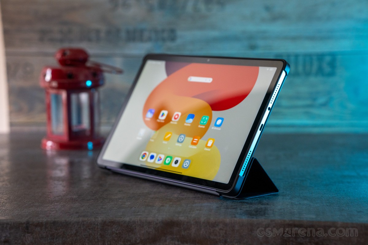
The flip case we got gets an easy recommendation from us. It's pretty nice to the touch, quite grippy, and although it's not real leather, it gets close to the real thing. The magnetic cover doubles as a stand, depending on how you fold it.
Reader comments
- Anonymous
- 10 Mar 2025
- Nwg
is this device good for video editing
- Anonymous
- 09 Feb 2025
- sw{
samsung is TFT, Redmi is IPS. in this case Redmi is better
- Anonymous
- 03 Feb 2025
- Nwp
The regular Xiaomi Stylus Pen seems to be working on this tablet according to Youtube vids.
