Nubia Z11 review: Work hard, play hard
Work hard, play hard

Unboxing the Nubia Z11
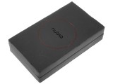
Nubia has never been one to skip on a fancy entrance. Just like the Z9 before it, the Z11 arrives in style. Surprisingly enough, even though the handset itself has definitely shed most of the company's traditional bold black and red styling, the box hasn't. The phone comes in a spacious and lavish two piece cardboard box, in the signature black and red colors. It is not as premium as the Z9's with its hard cover, but clearly not your average phone package either.
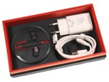
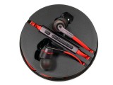
The contents are set on two levels. The phone itself is on top and underneath are the accessories. Just like the Nubia Z9, the Z11 comes with a premium pair of headphones. These have volume controls and they come in a practical rubber circle that neatly holds the headset itself. The headset has flashy red cables and definitely looks more premium than the regular in-box headsets we're used to.
Besides the headset, the box also has a surprisingly compact Quick Charge 3.0 charger and a USB Type-C cable. Both come in white, which serves as even more proof that Nubia is trying to find the right balance between its former flashy design and the new cleaner and toned-down approach for the Z11. Another cool little addition is a tiny micro USB to Type-C adapter. Last, but not least, there is a nifty SIM ejector pin as well.
Nubia Z11 360-degree spin
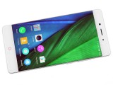
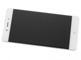
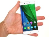
It is hard to pinpoint exactly where Nubia gets its influences for the Z11 design. The Z9 influences are definitely present, but not prevalent. Sure, you get the curved front glass, complete with Nubia's clever optical tricks to simulate an edge-to-edge panel. You also get the small red accents on both the front and back.
Beyond that, however, the Z11 doesn't make a point of following in its predecessor's footsteps. Although the back and front have a familiar elevated profile, the strong chamfering and edges have given way to smoother and rounder lines.
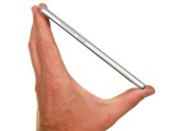
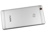
The back is now all metal, instead of glass, giving the Z11 a whole different feel. Overall, the Z11 brings some elegance and mature sophistication to the Nubia lineup, which we definitely appreciate.
Hardware overview
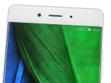
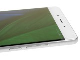
A curvy front panel is an attention-grabber in 2016. Unlike Samsung or Vivo, Nubia hasn't gone the extra mile to actually curve a panel. Instead, the Chinese OEM has a simpler and far less expensive approach. Just like the Z9 before it, the Z11 uses some clever optics to sort of stretch out the edges of the picture onto the curved part of the glass. It is a cool solution but certainly has its drawbacks, like image distortion along the edges. But we will talk more about that in the Display section.
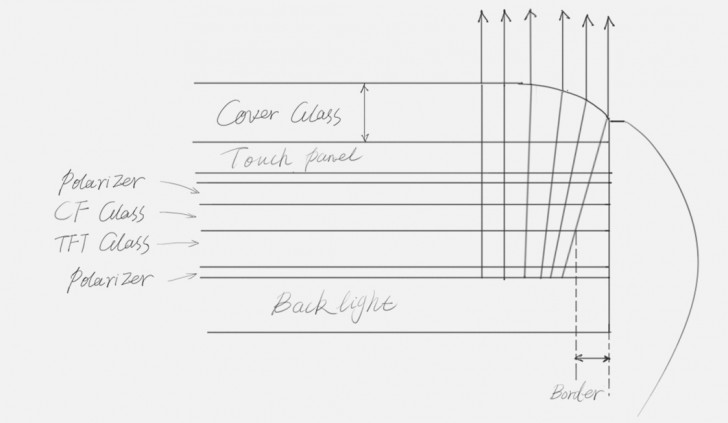
Material-wise, you get Corning Gorilla Glass 3 on the front, which can potentially go a long way in protecting the screen. Also, to further ease the minds of potential buyers, Nubia claims its aRC 2.0 design not only looks good but also provides some additional shatter protection, thanks to a buffering layer between the screen's glass and the metal frame.
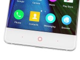
Aside from the obvious center of attention, the front of the Z11 is surprisingly clean. Nubia has kept its signature red circular home button design, though. It looks particularly good when lit-up, but admittedly the backlight red is an acquired taste. Still, if it's up your alley, you can also enable the "breathing" function.
There are two more capacitive controls beneath the display as well. These are only marked by small red backlights and can be reassigned the menu and back function to your liking - neat!
On top of the panel, we have a usual affair - a front-facing camera, speakerphone and proximity sensor.
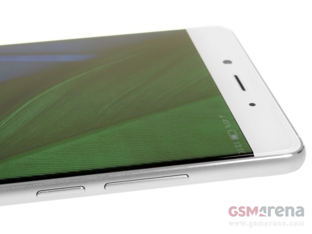
As already mentioned, Nubia has ditched the glass and opted for an all-aluminum body instead. The material is a Series 6000 aluminum alloy, to be exact, which Nubia claims to be drop-tested and quite sturdy. We can't attest for any of the drop-resistance, but we can confirm the brushed finish looks and feels premium.
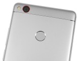
The back of the Z11 offers an almost uninterrupted metal surface. You do get plastic segments at the top and bottom, but they look and feel pretty close regarding finish. Plus, the subtle silver accents work well in unifying the different surfaces. Other notable features on the back include the red color accent camera ring and the relatively small flash. However, the latter is still dual-tone and does a pretty good job.
The fingerprint reader is also conveniently mounted here. It is accurate and quite snappy, although we have seen better.
Hardware keys are only present on the right side of the phone. Starting from top to bottom there's the volume rocker and then the power key. The dedicated camera shutter button from the Z9 is sadly no longer present.
On the opposite side is the card tray, which takes an eject tool to open. It holds two nanoSIM cards, or you could substitute one of them for a microSD. We would have loved a dedicated memory slot, but this seems to be a common problem these days.
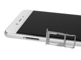
The other side is where you put up to two nanoSIM cards
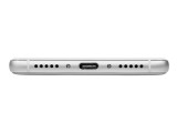
At the bottom are two grilles, either side of the microUSB port. Only the right grille hides a speaker, while the left one covers the mouthpiece.
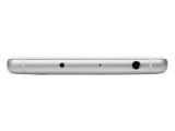
The top side holds the secondary microphone and a 3.5mm audio jack. The latter should deliver great quality thanks to the AKM4376 audio chipset. The top also houses what appears to be an IR blaster, however, unlike the Z9, this time around there is no remote control app bundled on the phone and none of the third-party apps we tried managed to utilize it.
Reader comments
- AnonD-137518
- 02 Mar 2017
- Swq
What are the features missing in international rom? does it has French language as it is not sold in France? thank you.
- Rico m
- 27 Feb 2017
- iBI
A great good looking and with good performance however white a poor international rom in comparison with the Chinese rom. If zte will put an effort in bringing to the international rom theme features like in Chinese rom it would make it an awesome...
- Sombir verma
- 12 Feb 2017
- gMA
I want this phone
