Nubia Z11 review: Work hard, play hard
Work hard, play hard

Nubia UI 4.0 - beautiful and clean
Like many other manufacturers, primarily aimed at the Chinese market, Nubia was no stranger to flashy, bloated and over the top custom version of Android. We definitely can't blame the OEM for going that route with the Z9 last year, but we definitely applaud its newfound philosophy with Nubia UI 4.0.
The strive towards a more mature and refined persona has luckily stretched beyond the Z11's exterior. There are still notable hints and traces of Nubia's signature bold aesthetic here and there, but overall, the OS is now among the cleanest and most subtle we have seen out of China.
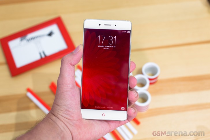
It also helps that unlike the Z9 unit which we reviewed a year ago, this time around we appear to have a more international version. That means a full set of Google services and apps pre-installed. Sadly, like we already mentioned, for some inexplicable reason, we seem to be missing the Nubia store, new NeoPower 2.0 battery manager, Game app and IR blaster app, to name a few. And Nubia advertises all of them on its product page. Our best guess is that these are either going to be added via a future software update or their availability will be regional.
Still, despite these minor setbacks, the Android 6.01-based Nubia UI 4.0 still managed to impress. It has an almost Vanilla feel to it that is surely a lot more universally appealing than a heavy skin job. However, this slimming down has led to some notable functionality omissions as well.
For one, themes are no longer a thing. This might be, at least in part, tied to some Android Marshmallow development overhead, but the end result is that the excessive customizability of the Z9 is a thing of the past. Now you only get the basics - wallpapers, some icon grid and rearrangement control and that's about it.
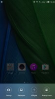
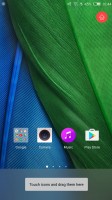
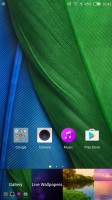
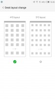
UI customization is basic at best
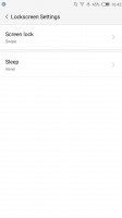
But, let's take a step back. The lock screen is a pretty standard affair. You swipe to unlock by default and only get a single camera quick shortcut (the Z9 had some customizability here as well).
One thing that Nubia has kept from its Android pedigree is the lack of an app drawer. Everything is laid out on home panels instead. However, as yet another testament to the dialed-back approach, the custom neoShare (a feature of the Weibo social network) panel is gone as well.
That's the launcher style popular in China, no app drawer, instead drop everything into the homescreen (think iOS, but with widgets here and there). Folders help organize the madness if you have too many apps and you can dock the 4 most used apps at the bottom row.

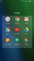
Standard launcher and folders to keep everything organized
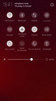
The notification area combines notifications and quick toggles, plus a brightness slider. Only the top four quick toggles are visible at first, the rest are revealed with a second swipe. You can rearrange them so you can make the toggles you use most visible by default.
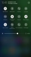
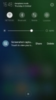
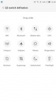
Pretty standard notification shade
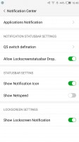
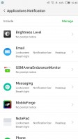
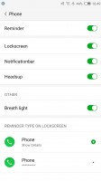
One thing that Nubia luckily kept intact is the powerful Notification Center. It gives you granular control over which apps are allowed to show notifications. You can even define the types of notifications each application can generate - pretty thorough indeed. Bear in mind that most apps tend to install without access to any notification privileges by default. So, if you need something in particular, you have to go in and enable it specifically rather than the other way round.
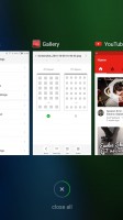
The app switcher is launched by holding the right capacitive button by default. The interface itself has also undergone some simplification and now consists solely of preview windows, which you can swipe away. There's also an X that will "Accelerate" your phone by closing running apps and freeing some ram. This, however, wont typically touch any background services.
Another truly great feature Nubia has carried over to the Z11 and the new Android is the SplitScreen mode. It is actually one of the better implementations out there, minus a few slightly irritating issues. For one, you can view the homescreen twice, dock and all, which just looks weird. Also, not all apps resize to fit their allotted portion of the screen, most remain a downscaled 16:9 version of themselves, which is often too tiny to use properly. The good news is that even third-party apps seem to work in this mode and some of them are smarter about resizing than the Nubia's native apps.
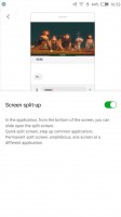
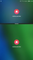
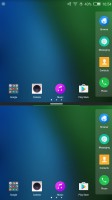
Split screen works pretty well
Speaking of powerful multitasking, we cant fail to mention another great little trick the Nubia Z11 can pull off. It is called Dual instance and just like the name suggests, it allows you to have two separate versions of an app installed. Combined with the App lock feature, this comes pretty close in terms of usability to Samsung's coveted KNOX private folder. Although the latter is undeniably better in terms of security.
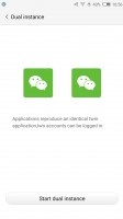

Dual instance and App lock for multitasking
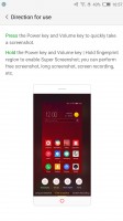
Super screenshot deserves a mention as well. You don't really realize how much easier and more powerful screencapping can be before trying such a tool. Not only can you capture things taller than your viewport, but recording a quick video is just as easy and only a click away.
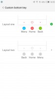
The ability to swap your back and menu buttons is definitely a nice little touch and can ease your transition to the Nubia from most other Android devices. For the moment these are the only two options available for customizing the capacitive navigation buttons, but the interface suggests that perhaps more will be added later. Further customization would be cool.
Edge gestures
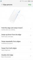
While Nubia's approach to a curvy front panel might not be the most cutting-edge or technologically advanced one, the OEM has managed to make great use of its bezel-less design with a plethora of custom gestures.
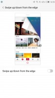
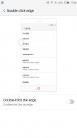
Swipe up or down on one side of the screen - that can switch back and forth between apps or launch a couple of apps (one for up, one for down). Oddly, the left and right edges can no longer be individually set to either mode, which was a thing on the Z9.
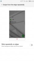
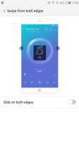
Swiping on both edges simultaneously can be set to adjust the screen brightness. Again, the Z9 used to have the option to replace that with a volume control. An up-down-up-down gesture on one edge can only be set to accelerate the phone, i.e. close running apps, complete with a cool animation.
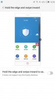
Holding an edge and swiping inward allows you to quickly get to any of your home panels. And that is about it in terms of custom gestures. If we get back to the Z9 comparison again, the reduction in advanced functionality is noticeable. The Z11 doesn't appear to recognize squeezes at all, there are no gestures tied to horizontal orientation and overall, options seem to be fewer. Not that we complain.
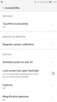
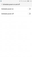
Beyond the edge-specific things, the Nubia Z11 has a few other interesting accessibility features as well. For instance, you can you can quickly turn on the flashlight by holding the home button on the lock screen. Then there is scheduled power on and off and a scheduled volume and alert mute.
Reader comments
- AnonD-137518
- 02 Mar 2017
- Swq
What are the features missing in international rom? does it has French language as it is not sold in France? thank you.
- Rico m
- 27 Feb 2017
- iBI
A great good looking and with good performance however white a poor international rom in comparison with the Chinese rom. If zte will put an effort in bringing to the international rom theme features like in Chinese rom it would make it an awesome...
- Sombir verma
- 12 Feb 2017
- gMA
I want this phone

