ZTE Nubia Z17 review: Driven by ambition
Driven by ambition
Unboxing
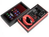
A Nubia handset will never miss an opportunity to make a fancy entrance. Just like the Z11 and the Z9 before it, the Z17 arrives in style. The packaging is somewhat simpler, but that's probably a good thing; nobody really needs an expensive box driving the price up.
The company's traditionally bold black and red accents are still intact, though. The phone comes in a two piece cardboard box. The contents are set on two levels, the accessories packaged underneath the handset itself. Both the Nubia Z9 and Z11 came with a premium set of headphones in the box. Our Z17 review unit had none. It might be a market-specific thing, or maybe the headset fell victim to cost-cutting this time around. Either way, a quality set could've probably helped users get over the missing audio jack.
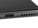
That's right, Nubia made the switch to a single Type-C port, getting rid of the 3.5mm audio jack. Of course, this means you need to embrace #donglelife and carry around the little passive adapter. Also, you can't really charge your phone while listening to music- not without an extra adapter, that is.
Sourcing the latter might be a challenge, especially if you want to keep using the DAC inside the Z17, and not one embedded in a dongle or the headphones themselves. Nubia opted for the Type-C standard, but left a DAC inside the phone that carries its analog audio via the pair of Sideband Unit (SBU) pins on the Type-C port.
What that means is that the provided dongle doesn't do any conversion, but simply connects your audio jack to the said pins. There are certain benefits to this approach, one of which being that you don't have to rely on external DACs in third-party accessories. That, however, is only valid if the internal DAC performs well - we'll test that in detail in the audio chapter. Of course, you can still pick up any pair of active Type-C headphones or an active adapter to use with the Nubia Z17.
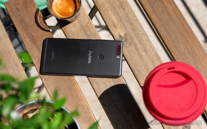
On to charging then. As mentioned earlier, Nubia boasts Quick Charge 4+ compatibility on the Z17, an industry first. In all fairness, the QC 4/4+ situation is currently a bit murky, but the promo materials did mention up to 15% faster charging on mobile devices and we are pretty certain that must require up to 28W of power output. However, the charger provided with the Nubia Z17 is only rated at 12V@1.5A, 9V@2A and 5V@3A. This is exactly what the older QC 3 is rated at. Plus, the Z11 charger was clearly labelled QC3, while the Z17's unit has absolutely no mention of Qualcomm or its charging tech.
As we researched this even further, it turned out that at the time of writing there is not even a formal procedure in place for certifying Qualcomm QC4+ chargers. We're sure these will come to the market, but just not yet.
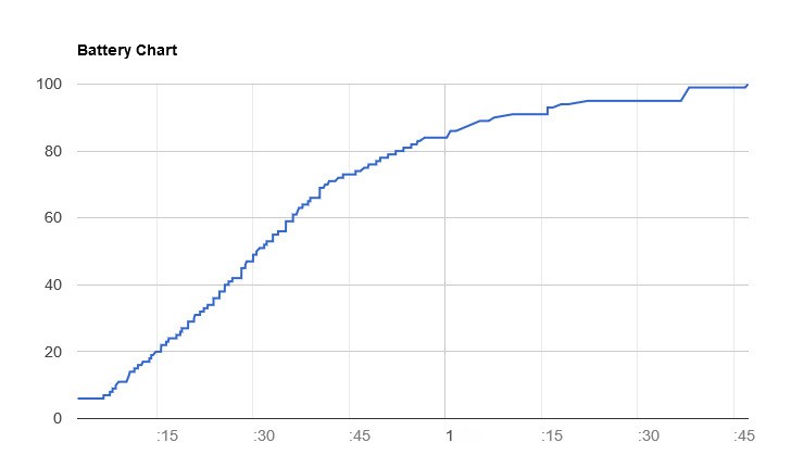 Nubia Z17 charging time
So even if the Nubia Z17 is compatible with the new standard, the bundled charger isn't. Now, that might be an issue of supply and availability that will be remedied in units shipped at a later point. But, with the package we got for testing, it is really not fair to claim Quick Charge 4 or 4+ technology. The charging times we got in our battery tests prove our point.
Nubia Z17 360-degree spin
If there is one thing we can definitively say about Nubia's flagship line these last few years, it's that ever since the Z9, every device has had a unique appearance. The signature red contrasting accents got carried over to the Z11 and now to the new Z17 as well. It's an acquired taste for sure, but we still admire Nubia for sticking with those little yet prominent accents.
As for the construction, there is an obvious consistency to be observed as well - you get the curved front glass, complete with Nubia's clever optical tricks to simulate an edge-to-edge panel. There is also the exquisite brushed metal frame.
Beyond that, the Z17 is an interesting mix of its two predecessors. It features the metal back of the Z11, as well as a rounded frame. However, the chamfers look a lot similar to those on the Z9, with strong and well defined edges.
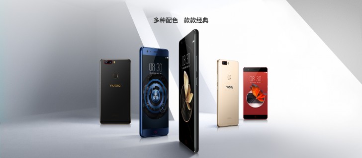 Nubia Z17 color options
In fact, the Z17 seems to be trying to rekindle the really bold look of the Z9. Some of the color options take the red theme to the extreme. Flame Red is a particularly strong spin on the traditional Nubia black and red scheme, only reversed. Then there is Aurora Blue, which reminds us of the equally eye-catching similar shade on the recent Huawei P10.
It is worth noting, however, that neither the soft finish on the back, nor the side chamfers really provide a secure grip. The Z17 is a very slippery handset. The curvy front panel doesn't help in this respect either.
Hardware overview
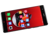
An edge-to-edge display is always an attention-grabber. The same goes for a curvy front panel. By those standards, the Z17 looks very trendy, but to be fair it can't really be part of the curved display elite. Unlike Samsung or Vivo, Nubia still hasn't gone the extra mile to actually curve a panel. Instead, the Chinese OEM has a simpler and far less expensive approach. Just like the Z11 and Z9 before it, the Z17 uses some clever optics to sort of stretch out the edges of the picture onto the curved part of the glass. It is a cool solution but certainly has its drawbacks, like image distortion along the edges.
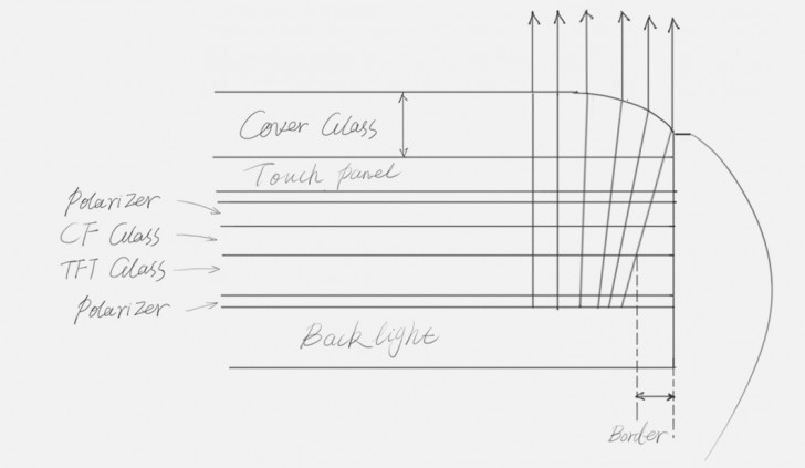 Nubia Z17 curved display technology (aRC)
Material-wise, you get an undisclosed variant of Corning Gorilla Glass on the front. Also, to further ease the minds of potential buyers, Nubia claims its aRC 2.0 design not only looks good, but also provides some additional shatter protection. This is thanks to a cushion layer between the screen glass and the metal frame. Then again, this isn't anything new - the Z11 was built the same way.
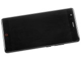
Aside from the glowing red circle on the home button, the front of the device is surprisingly clean. Even though the color is admittedly a bit out-there, we got used to it pretty quickly- and we have to say it looks particularly good in the dark. If it's up your alley, you can also enable the breathing light function.
There are two more capacitive controls beneath the display as well. These are only marked by small red backlit dots, and can be remapped to Menu and Back the way you like.
At the top you have the 16MP selfie camera, an earpiece and proximity and light sensors. The latter two are pretty well-concealed on models with a black frame.
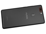
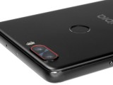
Around the rear, the Z17 offers an almost uninterrupted and surprisingly smooth metal surface. Gone are the plastic top and bottom bits from the Nubia Z11. Instead, Nubia has managed to get away with only one well-concealed antenna line near the bottom of the back panel. The fingerprint reader almost looks like a naturally recessed point in the metal plate, while still retaining a distinct chamfered edge for finger guidance.
The dual-camera setup is compact and fits snug in the top left corner, along with its dual-tone LED flash. It features a very slight camera hump, which shouldn't really be a problem as far as lens protection goes, especially if you opt for a case. The red accent really ties in well with the button LEDs on the front, but we just can't shake the feeling that something is wrong - either the red line or the entire camera module are somehow misaligned relative to the phone's body.
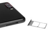
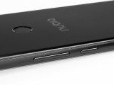
The sides of the unit are both very clean. You only get a SIM card tray on the left that can take one or two SIMs. Sadly, there's no microSD expansion option. It sits very flush, and has the exact same color as the frame itself.
The same goes for the volume rockers and power button on the right. There are no accents or textures here, which we appreciate overall, but it also seems like a missed opportunity for some extra signature accents.
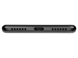
The bottom of the Nubia Z17 has the USB Type-C port, flanked by two symmetrical grilles. Only one is an actual speaker though. The other one houses the main microphone.
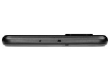
There is a second mic on the top of the unit for noise suppression, along with an IR blaster - an increasingly rare feature. What is missing, though, is a 3.5mm audio jack. You just have to live with either analog or digital audio via USB.
One very interesting thing to note here is the fact that an almost invisible plastic inlay runs down the middle on the top bezel and extends slightly down the sides on the phone. This is actually an extremely well-hidden second antenna line. We are really impressed with Nubia's approach here.
Reader comments
- 10basetom
- 20 Apr 2018
- qSQ
FYI the Z17 6GB/64GB model can be had for $390 on importer sites now.
- Anonymous
- 19 Sep 2017
- Y7J
Why don't they make camera comparisons with this phone? The samples are really nice. Nicer than the G6, S8, iPhone 7, etc.
- Ivo001
- 29 Jul 2017
- 3YV
Apple wasn't first. I think that was the LeEco Le Max 2
