ZTE Nubia Z17 review: Driven by ambition
Driven by ambition
Nubia UI 5.0 - feature heavy
Like many other manufacturers that are primarily aimed at the Chinese market, Nubia is no stranger to flashy, bloated and over-the-top custom versions of Android. Nubia UI 5 is no exception. The OS is custom end-to-end and is filled to the brim with added features, little tweaks, and options everywhere you look.
Our review unit is particularly stuffed with "stuff" since it is running a Chinese Android 7.1.1 Nougat ROM. Besides the multitude of odd local apps, this also means a total absence of Google Play services and the Google App package, and no apparent way to sideload any of them. Not without rooting the device, at least. Of course, we did our best to work around this and not to judge the OS too harshly based on its localized features. What we did find a little hard to swallow, however, was the overwhelming number of bad and confusing English text translations found all throughout the UI.
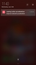
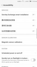
Bad English translations and Chinese text are a common occurrence
A few quick online searches, however, did lead us to stores claiming to offer the Nubia Z17 with an international ROM, which hopefully has no such issues and is a lot more streamlined. Not to mention, the presence of Google Play Services. You should look for such a unit if you decide on importing the Z17 from China.
Last year, we praised the Z11 unit we got for review for the clean and almost vanilla feel of its International Android 6 - Nubia UI 4.0 ROM. This time around, however, we find this version of Nubia UI 5 adopting the polar opposite ideology of "more is better." We realize that added functionality can be a major draw for many prospective buyers, but there still has to be a cutoff point somewhere. And Nubia UI 5 plays fast and loose with this abstract boundary.
Before we go on criticizing the bloated nature of the OS, we feel it is worth giving credit to Nubia for including a powerful Themes engine this time around. This was a sore point we had with the older version of the ROM. Again, it might be a regional thing, since the Z9 also had a Theme store. All we know is our review unit has a rich online selection of skins, along with a choice between a 4 or 5 column interface.
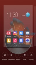
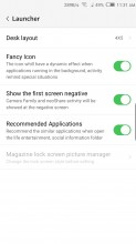
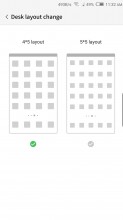
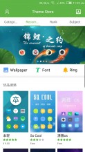
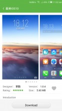
Launcher customization options are back
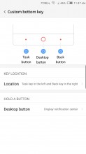
To truly make the Z17 yours, you can also rearrange the capacitive home buttons. By default, the back key is on the right, old-school style. You can even bind a long press on the home button to one of a few pre-defined system actions. Not so with the other two buttons, though.
The lockscreen also lends itself to some visual tweaking. By default, you only get a simple static image, with a clock widget, and a quick camera shortcut. However, there are also a few other unlock options to choose from and a dynamic GalleryLockScreen setting. It comes complete with its own online repository of images, divided into categories you can subscribe to. Of course, you can add your own photos to the mix as well.
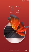
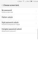
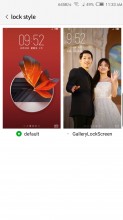
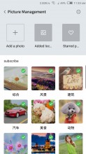

Basic lockscreen • Unlock options • GalleryLockScreen
Nubia has opted out of an app drawer once again. With the launcher style popular in China, you are supposed to have all apps on the homescreen (think iOS, but with widgets here and there).
Folders help to organize the madness if you have too many apps, and you can dock the 4 or 5 most used apps in the bottom row. Some of the folders also come with an optional app suggestion feature that tries to bring up relevant apps based on your usage history.
By default, the leftmost panel on the home screen is dedicated to shortcuts to Nubia's numerous special camera modes. It also houses the neoShare activity widget, which is another local Chinese-only feature. Luckily, the launcher does give you an option to disable this page altogether.
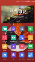
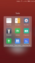
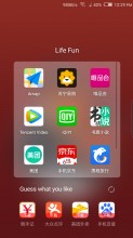
Dedicated camera and neoShare home panel • Folders • App suggestions
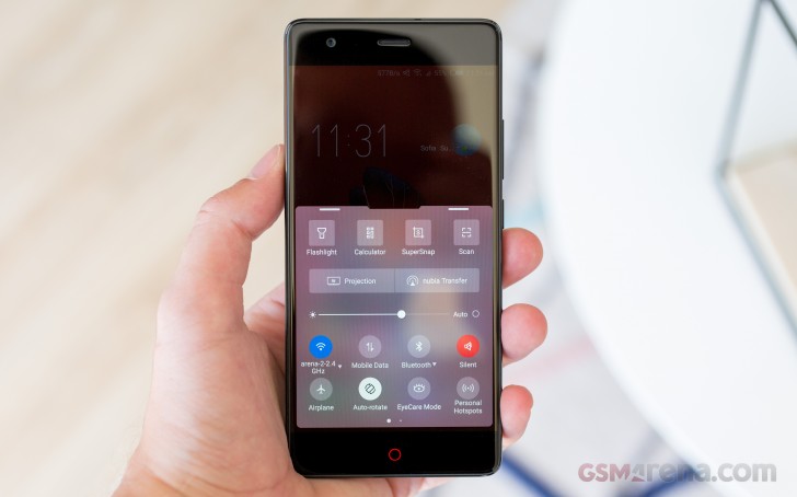
One area that has received a major redesign in Nubia UI 5 is the notification and quick toggle shade, or should we say shades. This time around, Nubia decided to separate the two things out in a vaguely iOS fashion. Swiping from the top of the interface opens a dedicated notification area - one of several the OS recognizes as distinct places for notifications.
The quick toggles and brightness slider are moved to their own shade, that, unfortunately, doesn't seem to offer customization. It can be pulled up from the bottom of the UI.
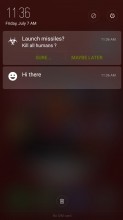
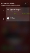
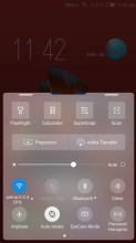
Dedicated notification shade • Separate quick toggle shade
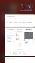
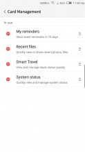
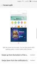
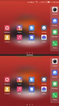
Just be sure to swipe up a little to the left or right of the home button. Doing a central swipe is a different gesture, which by default, triggers the Split screen UI. The gesture situation gets even more confusing if you opt to trigger the slip screen feature with a downward swipe as well. Oh, and there is also a side panel to the right. It acts as somewhat of a Google Now interface, with a few available widgets. These can show you reminders, a quick summary of the system status, recent files or quick contextual travel directions.
Boy, that's a confusing mess of gestures and interfaces, if we ever saw one. And it's just the tip of the iceberg. Just wait until we get to the rest of the edge and touch gestures the Z17 has to offer.
The Split Screen feature is actually one of the better implementations out there, minus a few slightly irritating issues. For one, you can view the homescreen twice, dock and all, which just looks weird. Also, not all apps resize to fit their allotted portion of the screen; most remain a downscaled 16:9 version of themselves, which is often too tiny to use properly. The good news is that even third-party apps seem to work in this mode and some of them are smarter about resizing than the Nubia's native apps.
Speaking of powerful multitasking, we can't fail to mention another great little trick the Nubia Z17 can pull off. It is called Dual instance and just like the name suggests, it allows you to have two separate versions of an app installed.
But before we get into all the extra usability features, and there are a lot of them to cover, let's finish off with the basic navigation and notifications. The app switcher employs a horizontal layout, with a swipe away gesture for recent apps. There's also an X that will "Accelerate" your phone by closing running apps and freeing some ram.
You actually get a say in what background activities get axed by this optimizer. This is achieved on a per-app basis within the Power settings menu. Unless you specifically tell the OS not to touch a certain app, it will get the boot. It is perhaps worth noting that Nubia has made the feature more aggressive, since the logic used to be the other way around in Nubia UI 4.
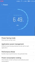
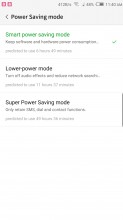
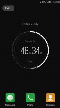
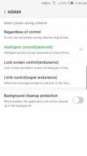
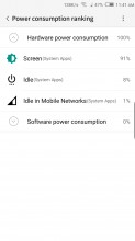
Power manager • Power Saving modes • Super Power Saving • Per app power saving schemes
And if you think that's the only battery-saving measure Nubia UI 5 has to offer, you are wrong. Besides the per-app control, you also get four distinct power saving schemes. And that's not even counting the three power savings modes, including a super saver one, which limits the phone to basic functionality only. You can get some pretty detailed battery usage statistics for both hardware and apps as well.
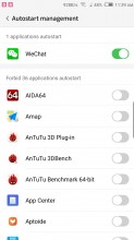
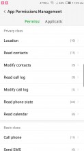
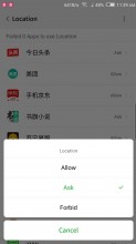
You also get to decide exactly which apps can autostart with the system, potentially saving even more power. That is actually part of a bigger interface for managing permissions on a per-app level. As you can imagine, this includes controlling their access to hardware components, like the camera or GPS as well. Handy, for sure, if you have the time to get your hands dirty and manage every single app, without potentially crippling or breaking it.
And there is more potential still for granular control and hardware optimization, all bundled up in the NeoSafe app. You can access most of the features we just described from various points in the settings menu as well, but NeoSafe is the convenient central managing hub for them all. We already discussed the Permissions and Power options, and the Cleaner and Antivirus are pretty self-explanatory.
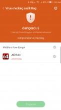
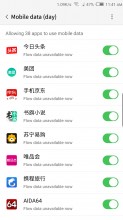
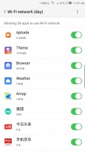
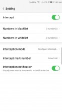
Antivirus • Data manager • Data manager • Intercept
Flow is an extension of the permission manager, which lets you restrict certain apps from using Wi-Fi or network data. We assume it is somehow tied in with Nubia's own roaming data package market, which is one of the numerous apps, pre-installed on the Z17. Intercept lets you whitelist or block numbers for calls and notifications - pretty nifty.
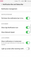
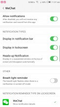
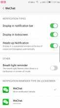
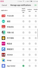
Speaking of notifications, we mentioned that Nubia UI 5 recognizes a few distinct types of them and areas to display them in. It also offers a phenomenal level of per-app granular control. Bear in mind that most apps tend to install without granted access to any notification privileges by default. So, if you need something in particular, you have to go in and enable it specifically rather than the other way round.
Gestures
While Nubia's approach to a curvy front panel might not be the most cutting-edge or technologically advanced one, the OEM has managed to make great use of its bezel-less design with a plethora of custom gestures.
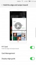
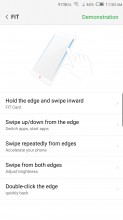
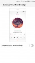
First up on the list of gestures is the inward swipe that brings up the FIT Card interface, we mentioned earlier. Swipe up or down on one side of the screen - that can switch back and forth between apps or launch a couple of apps (one for up, one for down). Oddly, the left and right edges can no longer be individually set to either mode, which was a thing on the Z9.
The Z9 used to recognize squeeze, much like HTC's U U11, but the feature was removed from the Z11 and it is absent from the Z17 as well. Frankly, it's not really that big of a loss, since the control scheme is already incredibly confusing even with one less available gesture.
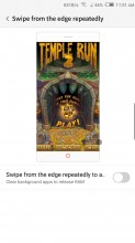
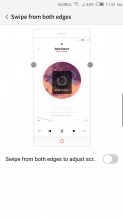
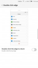
Swiping on both edges simultaneously can be set to adjust the screen brightness. Again, the Z9 allowed you to use the gesture alternatively as a volume control. An up-down-up-down gesture on one edge can only be set to accelerate the phone, i.e. close running apps, complete with a cool animation. Double clicking the edge can double as a back button.
OK, that's it, right? No more gestures, smart features or anything of the sorts to make using the Z17 more like a rocket ship. Well, no. Actually, there are a few other gestures that don't pertain to the edges of the phone and this were deemed unworthy to be placed under the "FIT" moniker. Let's pretend that made any sense to begin with...
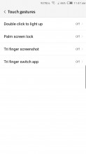
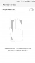
Anyway, you can double tap the display to wake the Z17. Also cover the screen to lock it. Realistically, we probably see ourselves remembering these two and using them at least a few times more than the convoluted edge-based finger-twisters. There are also a pair of three finger gestures, which we almost didn't even have the energy to research at this point.
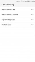
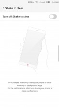
What's that you say? You think the Nubia Z17 is pretty nice, but it could use some extra control gestures? Don't worry, there's more! Try "Smart sensing" on for size. You can pick up the phone to dial or answer and flip to mute or pause playback. Also, shaking the phone can be used to "conveniently" invoke the "Accelerate" feature. By the way, shaking the phone will also align you icons while you are in a very specific part of the Launcher settings menu. Does that qualify as another gesture? It might as well do. We wouldn't want anyone to think the Nubia Z17 doesn't have enough control gestures.
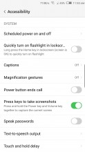
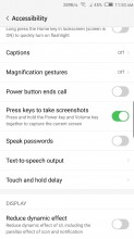
Oh, oh, we almost forgot, there is a magnification gesture hidden away in the Accessibility menu as well. Also, something called "One-key Exchange smart installation", which may or may not be a gesture and a trio of other options, which we can only assume are only useful in China, since Nubia's translation team didn't even bother to translate them in English.
There is also a quick toggle for the flashlight here, scheduled power off and on and even a toggle to disable the standard Android button combination for grabbing a screen capture. Nubia does provide the option to use a press on the fingerprint reader for that instead, so we guess it sort of makes sense.
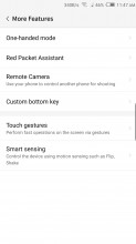
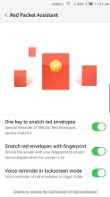
Speaking of confusing China-centric options, there is a WeChat Red Packet Assistant. There is also a Remote Camera feature that allows you to control another Nubia's camera remotely. It is an interesting concept, but it is rather baffling why Nubia decided to put a shortcut to it in the "More Features" settings menu.
Reader comments
- 10basetom
- 20 Apr 2018
- qSQ
FYI the Z17 6GB/64GB model can be had for $390 on importer sites now.
- Anonymous
- 19 Sep 2017
- Y7J
Why don't they make camera comparisons with this phone? The samples are really nice. Nicer than the G6, S8, iPhone 7, etc.
- Ivo001
- 29 Jul 2017
- 3YV
Apple wasn't first. I think that was the LeEco Le Max 2
