Android 11 review
Privacy
Android 11 introduces two new privacy-focused features. The first is expanded Google Play update modules that include double the number of updatable modules, including 12 new ones. With this, Google will be able to push more security and privacy-related features to you through Google Play Store and can be updated and installed the same way you update your apps.
This is significantly better than bundling security updates in the monthly patches. As we know, most OEMs don't actually release those updates monthly as they should and just bundle them all at once every 2-3 months in the best-case scenario. Decoupling the security updates from the OS patches and releasing them as Play Store updates means users can get them much faster.
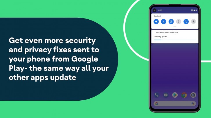
Even for Pixel owners, this is a good thing as you won't have to wait for a critical patch at the beginning of the next month if it's something Google can just push through the Play Store today.
Speaking of updates, Google is also making seamless updates mandatory for devices launching with Android 11. This feature was introduced in Android 7.0 but wasn't included by some brands like Samsung. With seamless updates, your device will download an update in the background and install it on a separate partition. The next time you restart your device, it boots into the other partition, which makes the experience of updating the device feel seamless to the user as there was no downtime specifically for installing the update.
The other privacy-focused change applies exclusively to enterprise users. With this change, you can now have a work profile on your company-owned device, which will allow the IT personnel to manage your device but not have access to any of your personal profile data or activity on the phone.
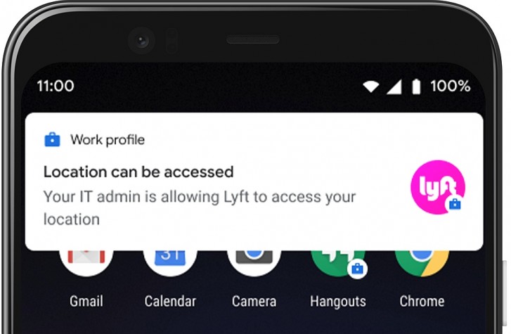
Separate work and personal profiles have been in Android since version 5.0. Before Android 11, however, this feature was only available on devices owned by the employee in an enterprise environment. With Android 11, Google is now making this feature available even on company-owned devices, so employees get the same separate work and personal profiles as they would if they owned the device themselves.
Pixel-exclusive features
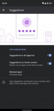
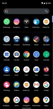
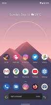
For Pixel device owners, Android 11 has a few extra features. One of them is app suggestions. App suggestions will appear on your app drawer and your home screen. The first one is pretty standard, and something we have seen in the past; the phone learns from your usage and shows a row of apps at the top of the app drawer that it thinks you use most often. These tend to be a bit weird at times as apps you don't open all that often could end up here while apps you are constantly using get ignored. You can disable this feature if you want.
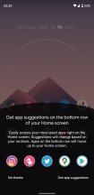
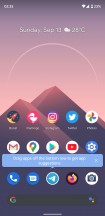
The other one is a bit more interesting. Google now uses the bottom row of the home screen to show suggestions. Most of us generally keep apps there so we wouldn't notice anything. But if you were to remove one of the apps from there or if you keep your bottom row partially or completely empty, then Google will place a suggested app there. This happens pretty much instantly; just remove an app if you have a full bottom row and instantly a suggested app will appear in its place. This app icon has a different colored ring around it to identify it as a suggested icon and the icon itself isn't actually there so you can treat it as a blank space when moving icons around or adding your own icon in that space.
As you can see above, the suggestions aren't particularly intelligent. When I removed Telegram, it replaced it with Instagram, even though Instagram is already pinned elsewhere on the homescreen. The suggestions don't seem to take into consideration what else is happening on the homescreen.
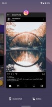
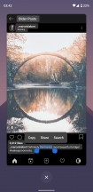
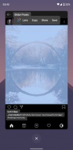
Google has also overhauled the multitasking overview screen. If you use the gesture-based navigation UI, you swipe up and hold as usual to access the overview screen. Here you will notice that the phone no longer shows suggested app icons at the bottom as it used to, nor can you swipe up again to enter the app drawer. Instead, you will see the same familiar card-style UI but with two new options at the bottom. One of them will take a screenshot of the app currently highlighted. The other makes you enter a text selection mode that instantly highlights all the text on the screen in that app. You can then just use the editing tools to copy the text and paste it elsewhere. You can also share that text or search it online. This also works for any visible images on the page.
There's also a cool new animation for the wallpaper when you swipe down on the notifications or swipe up for the app drawer, where the wallpaper zooms in and out to create a sense of depth and motion.
One thing we would have liked Google to change is to let users adjust the color of the search bar at the bottom of the screen. You can choose a custom color for the Google Search widget, but the search bar on Pixel phones is always white or gray depending upon your day/night settings.
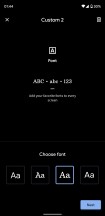
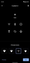
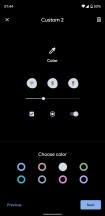
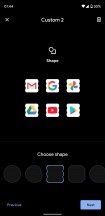
Launcher customization options are largely unchanged
All things considered, the Pixel launcher is still fairly basic. There is no folder support in the app drawer, no ability to hide app icons, and no custom icon support. All you get is basic color, font, and icon customizability from a small list of available options and the only thing Android 11 added is a handful of extremely odd icon shapes. For anything else, you are looking at installing a custom launcher.
Android 11 (Go edition)
Alongside the standard release, Google also announced the Go edition of Android 11. Limited to just... well, Go edition devices, this version brings some of the new features of the standard release, including Conversations, and also introduces things like gesture navigation, and Safe Folder in the Files app to password protect files.
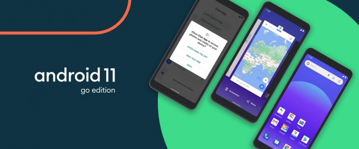
Google also claims this version improves app launch up to 20% over the previous update, although you will need a device with 2GB memory, which is now also being supported with this update. We didn't have a Go edition device with us to test these changes.
Reader comments
- Anonymous
- 08 Oct 2021
- Nue
You can d that in the developers option
- Anonymous
- 20 Sep 2021
- uwV
Don't upgrade 10 to 11. It is not good compare to 10.
- Syfur
- 17 Sep 2021
- XVT
Android 11 is the worst android ever!! Trying to improve some features, they have downgraded them. From my perspective, conversation bubble is a straight downgrade. on messenger, chat heads were far better that this new bubbles! The look uglier, bugg...
