Apple iOS 7 review: Eye of the beholder
Eye of the beholder
iOS 7 user interface: new aesthetics
Well, six years of user interface revisions and incremental improvements were obviously enough, especially after the uninspiring iOS 6. The UI that launched on the original iPhone way back in June 2007 has finally been put to rest. About time, considering the competition hasn't been sitting around either.
The iOS 7 is not quite the game changer that the iPhone OS 2 and the App Store were, but the amount of effort that went into it shows. There're some key new features and cool system apps, to go with the complete user interface redesign and tweaks under the hood.
Under the personal supervision of John Ive, the iOS made the transition from skeuomorphic to flat design. And the great news is the UI changes didn't come at the cost of new features. We got connectivity toggles, file sharing, automatic app updates, improved multitasking with cooler interface, live wallpapers, among others.
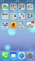
iOS 7 looks a lot different to its predecessor, but its logic of operation is mostly the same. All of your apps are on the homescreen, folders are available and there is the familiar dock that can take up to four shortcuts.
All system icons are different though, the clock now has an animated icon showing the current time, the system fonts have been altered, there are lots of semi-transparent elements and new gestures.
Let's start from the beginning - the lockscreen. It's totally different and yet it works in a very similar way. The slide to unlock bar is now gone and you can swipe anywhere on the screen to unlock your iDevice. The text is somewhat illogically placed right above the tiny arrow for the control center which points up, but you actually still need to slide to the right to access the homescreen. The swipe could've worked both ways, left too, but that's not the case.
The lockscreen also has the camera shortcut at the bottom, you can swipe up from there for quick access to the camera app. A double press of the Home key will bring the multimedia controls as usual. Lockscreen notifications are available as well.
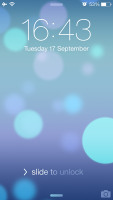
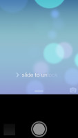

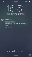
The lockscreen works as before
You can notice two transparent arrows at the top and the bottom of the lockscreen. Swiping from the top will display Notifications, while swiping from the bottom will bring up the new Control Center.
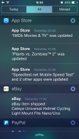
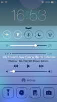
Notifications and Control Centers are available on the lockscreen
Swiping the lockscreen out of the way reveals the revamped homescreen. The Spotlight pane is now gone - but not lost. It's just triggered by a new pull-down gesture anywhere on the homescreen.
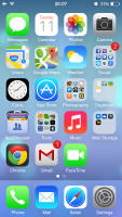
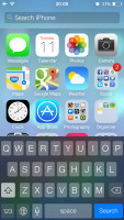
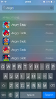
The Spotlight is now hidden but has a dedicated gesture
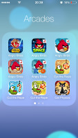
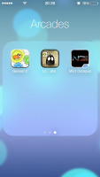
Folders are available as usual, but there is no limit any more on how many apps you can put inside them. Pages are available in the folders, each page can pack up to nine apps and there is no limit on the page count. And you can finally put the Newsstand app away in a folder! Hallelujah!
The opening and closing of folders is now accompanied by a cool animation. Those do take a bit too long, though, and might become irritating once you are past their wow phase. We are hoping Apple shortens the animation a bit in the final version or at least give us the option to switch it off. A cool bit is the folder icons and the folders themselves are semi-transparent and their backgrounds adapt to the background's prevailing color.
You should have already noticed the semi-transparent dock, folders, keyboard and Control Center in the screenshots. The Notification and Control Center colors are also adaptive, just like the folders, and they'll change depending on the background. So they might be blue-ish on the homescreen, but light gray in the web browser, or dark gray in the settings, or green in the gallery, etc.
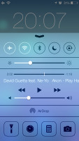
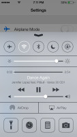
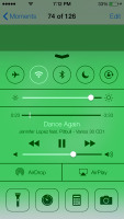
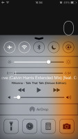
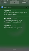


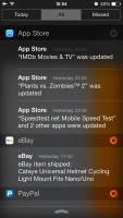
The semi-transparent Control Center and Notification Center in different colors
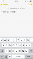
The keyboard is less transparent and has only two themes - very light gray and very dark gray. Of course, they also change depending on whether your keyboard has popped up on top of a light or a dark background. Beside the new theme and font, the iOS keyboard is unchanged, which is not a bad thing as it's certainly one of the most comfortable around.
Dictation is also available courtesy of Siri. Just hit the dictation button on the left of the space bar and fire away. Keep in mind that the performance may suffer in noisy environments.
The changes don't end with those transparent and adaptive visuals. Opening an app involves a zoom in animation over the app icon, which is pretty cool.
The parallax effect is observable throughout iOS 7. Apple designed the new iOS on independent layers - background, homescreen icons, icon badges, app pop-ups. The iPhone then uses its accelerometer and gyroscope to move layers independently and create an illusion of depth. The movement is very subtle. In fact, you might not even notice it if you are not looking for it, but it's there and it looks awesome once you start moving your device.
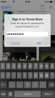
The parallax effect is not only available on the homescreen. You can see it in folders and in the pop ups that ask you for passwords or display notifications. Those pop ups by the way are also translucent and adapt their background color.
Apple iOS 7 brings live wallpapers. You can find them in the relevant section of the Wallpaper Settings. Currently there are seven live wallpapers, but we hope more to become available in the AppStore as soon as iOS 7 becomes widely available.
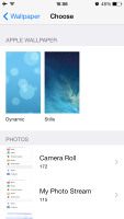
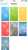

Wallpaper settings • Dynamic wallpapers • Still wallpapers
You might have noticed in all those shots that Apple has ditched the cellular coverage bars and replaced them with five dots. The battery also got a new icon.

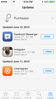

Three out of five dots for signal strength and the new battery icon
Reader comments
- AnonD-214520
- 12 Dec 2013
- mkr
Apart from that, I really do not understand how can a company force its customers to change a product so much from the state it was originally purchased without giving to the possibility to restore it to the configuration it was at the date of purcha...
- AnonD-214520
- 12 Dec 2013
- mkr
Well, I have two identical iphones and I upgraded iOS 7 only on one: after several months use my conclusions are the followings: 1- iOS 7 drains 35% more battery than iOS 6; 2- iOS 6 is 30% faster than iOS 7; 3- iOS 6 is by far clearer than iOS...
- AnonD-202636
- 03 Nov 2013
- XuW
I want to buy iPhone 4S or 5. But i want to know should i buy with iOS6 or iOS7 as i heard there are issues currently with iOS7. Please help & advise
