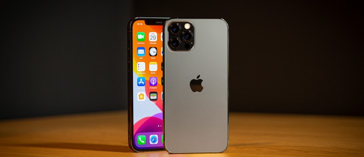
Apple iPhone 12 Pro review

Apple iOS 14.1 on the iPhone 12 Pro
All new iPhones come with the latest iOS 14.1 pre-installed. It's a minor update over the iOS 14 containing mostly bug fixes and newly added support for 10-bit HDR video playback on iPhones 8 and up.
Let's take a closer look at the iPhone 12 Pro's iOS 14 now. Its focus falls on the new widgets and App Library, which will improve your experience should you decide to use them. It's nice to see Apple has decided to make new features as optional as possible, instead of forcing them on you right away.
The rest of iOS remains mostly unchanged since iOS 13 with some minor UI improvements across different system apps. Some new apps and features are available, too.

The lockscreen on iOS 14 remains intact - it's one with the Notification Center and houses your notifications (privacy options are available), plus shortcuts for the torch and the camera. You can get past it via Face ID or PIN if you've opted for secure unlock.
Your apps usually populate the homescreen(s) and widgets - the leftmost Today page. Now there is also a rightmost page - the App Library.
A new option allows you to hide specific homescreens - you may have a page that's full of games and hide when at work or hide the two pages of work apps when on vacation. You can't opt-out of Today and App Library, though.


Lockscreen • Homescreen • Homescreen • Today • App Library • Hide homescreens
You can continue to use iOS 14 the old way if you like and completely ignore the App Library. There is no option to disable the App Library entirely, though.
The new Widgets can be placed on any of the homescreens and the Today page, and they can coexist with app icons. There are three widget sizes supported by iOS 14 - 2x2, 4x2, and 4x4.
You can stack widgets of the same size on top of one another. Once you have a stack, you can either have the OS automatically choose which is the most relevant widget to surface to the top of the stack automatically. You can also flip through the stack manually by swiping up or down until you find the widget you need. We love this idea of stacked widgets - it's a real space saver - especially if you combine a frequently used widget at the top with less frequently used ones in the stack below it.


Widgets • Widgets • Widgets • Stacked Widgets • Settings
The App Library is an app drawer, which is always your rightmost homescreen pane. Apps are added automatically to the App Library upon installation. The sorting is also an automatic process, and you can't edit the categories or move apps in different categories. The app sorting depends on the App Store tags the developer has used upon uploading the apps.
The App Library has three settings only - Add new apps to Homescreen and App Library, Add to App Library only, and Show Notification Badges in App Library. That's it.
The App Library is where you are going to ditch your least used apps to die. It's inevitable.
We bet the Today page will slowly go away, but for now, it is only for widgets. You put the same widgets and stacks you can on your homescreen(s). Here you can also use the old third-party widgets that haven't been optimized yet for iOS 14. The old widgets come right after the new one, should you choose to use some new ones.
In time, we guess all developers will update their widgets to support iOS 14, and that will be the death of Today as we know it.
The Notification Center is summoned with a swipe from the left horn or the notch. The pane was unified with the lockscreen in iOS 11, and that's why you can have different wallpapers on your homescreen and notification center.
The Control Center, which has customizable and (some) expandable toggles, is called with a swipe from the right horn. You can use haptic touch to access additional controls. And the battery percentage is also here.


Today • Today settings • Notification Center • Control Center
The navigation gestures stay the same as they were on the iPhone X. Swipe upwards from the bottom line to close an app, swipe and stop midway for task switcher, swipe from the side of the screen for back and forward. You can also swipe on the line left or right to switch to your recently used apps instantaneously.
The Back Tap is a new accessibility shortcut. It recognizes double and triple tap on the back of the phone, and you can assign whatever you like. We chose 'Take a screenshot' and 'Control Center,' but it is really up to you. Overall, it has to be one of our favorite features in iOS14.


Gestures • Task Switcher • Moving between apps • Back • Closing an app • Back Tap
There is a system-wide Dark Mode. You can enable it manually or schedule it from within Display Settings, and it switches to dark all-white backgrounds across iOS. The Dark Mode affects all system apps, but also apps that rely on system backgrounds. You can also check the option to darken the homescreen wallpaper when in Dark Mode.
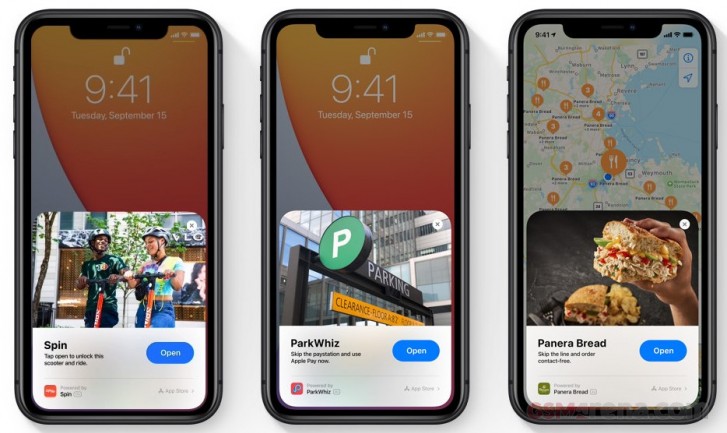
The App Clips service is a major part of iOS 14 even though it is yet to become widespread. An App Clip is a pop-up window where you can use a small part of an app that you don't have installed on your phone without going to the App Store and downloading it. Basically, iOS 14 downloads this "clip" for you in real-time, you use the function, and then it goes away.
For example - you browse burgers in your browser, you see a place with nice burgers, you tap on a burger you want to order. A small pop-up window appears of, say, Foodpanda's app where you can order the said burger without installing their app and making a proper registration. The same goes for taxis, bike, or scooter rentals, among others.

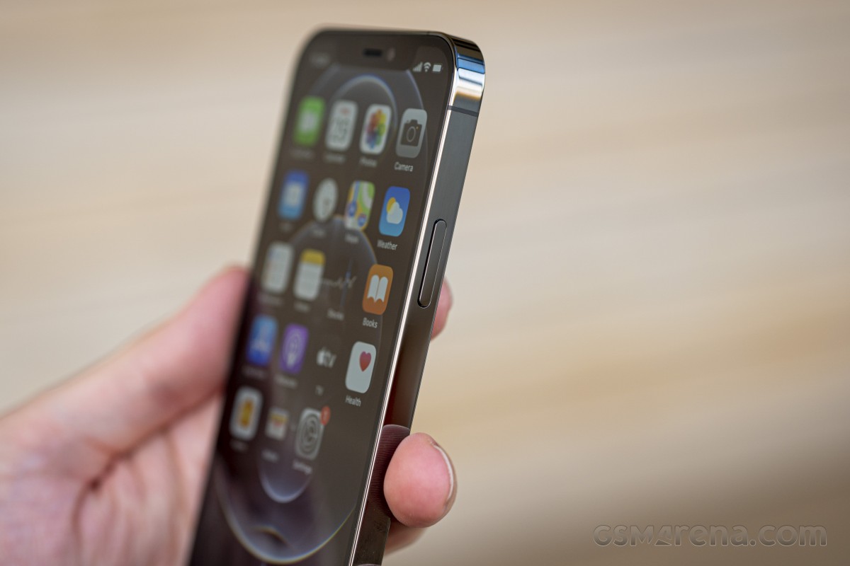
Siri - Apple's digital assistant - is used by 400+ million people monthly. You summon it by holding the 'side' key (the Power key). You can do all sorts of things with Siri - from questions and translations through setting up reminders and sending replies to asking for reservations or tickets, directions, and whatnot.
Siri Shortcuts are available within a standalone app. You can assign a shortcut to so many things that it will take many pages to describe them. You can script almost anything available within iOS itself, a lot of stuff from within the system apps, and some advanced actions from any well-known apps such as YouTube or Facebook.
Another new feature in iOS 14 is the more compact Siri interface. Upon summoning Siri, you will see a small ball around the bottom, and your answer will be provided in a small pop-up window. This way, you can still see what's happening in your active app.
Speaking about compact interfaces, Siri isn't the only app getting such refresh. The Phone app is still the same, but receiving a call while your phone is unlocked has become a much more unintrusive thing with the new compact UI. Instead of pausing everything you were doing and throwing you the black call screen, now you get a small pop-up with Green and Red receivers and the caller ID.
PiP or Picture-in-Picture mode is a very welcome and long-overdue feature in iOS. It does precisely what the name suggests - minimizes your currently playing video within a hovering pop-up over the iOS UI or other apps.
PiP is supported in Apple TV, Podcasts, Safari, FaceTime, iTunes, Home, YouTube, and any other third-party app that chooses to add support for it.
Now, can we get PiP for Maps next, Apple? Pretty please?


The new Siri UI • Compact Siri answer • Compact phone call • Picture in Picture • PiP
The multimedia is handled by Apple's default apps - Photos, Music, TV - and they are mostly unchanged since their iOS 13 versions.
The Photos tab has four different views - Years, Months, Days, and All Photos. Days, Months, and Years tabs use what the AI considers as best pictures at a glance, and this way, all the clutter gets filtered - you won't see screenshots, notes, or even duplicates. When you scroll through your images in these three categories, all live photos and videos will play automatically (muted). Also, your best photos or videos will show in bigger thumbnails.
AI-powered search option and powerful photo and video edit modes are available, as usual.
The Apple TV app is part of iOS 14, and it is your default video player for locally stored movies and shows you've added via iTunes. This is also the digital store for movies and TV shows, but it is also the place where you find the Apple TV+ streaming service.
Music has a new homescreen icon. It is the default player, and it relies heavily on Apple Music. But even if you decide not to use the streaming service, it can still do an excellent job if you have a few minutes to add your songs via iTunes. Realistically, adding music tracks via iTunes requires as few clicks as it would take to copy them via Windows Explorer, so there is no overhead. The requirement to download and install iTunes in the first place, however, can be off-putting to Windows PC users.
Books are here for your documents, PDFS, and eBooks. Stocks and News are onboard. Safari is your default web browser, and it has a Download manager and some enhanced privacy options we will talk about in a minute.
Apple Maps will be bringing its new, enhanced mapping solution to the UK, Ireland, and Canada "later this year." It adds cycling directions, complete with elevation info, and a new "avoid stairs" option for New York, LA, San Francisco, Beijing, and Shanghai.
The new EV routing will factor in necessary charging stops along the way.
Guides let you discover restaurants, popular attractions and explore recommendations from "respected brands."
The maps also show known speed cameras and red-light cameras.
Some of the new Privacy features include options to change default browser and mail client, Safari's Privacy report about website trackers, the option to report approximate instead of precise location, and also the green and orange indicators for camera or microphone in use.


Default browser • Privacy report • Approximate location • Mic indicator • Camera indicator
Finally, Apple Pay is on board, of course, and Sign-in with Apple is pushed everywhere. You can use this to quickly sign into apps with your Apple account, authenticating with FaceID and with two-factor authentication included. Apple will send the app a unique random ID. If an app demands your email address, you can choose to give it your actual email or a random one automatically created by Apple for you with built-in forwarding.
Reader comments
- Adeeb
- 22 Apr 2025
- 6p}
Iphone 12 pro ios update
- Tamim
- 17 Jan 2025
- 2Wx
12 pro
- WhytDehvull
- 15 Feb 2022
- 0ar
I completely disagree, but for me it’s just relative. I upgraded to a 12 Pro from an SE 2020. I’ve seen sitcom episodes that lasted longer than the battery in the SE, anemic would be a gratuitous compliment. So for me, the 12 Pro is a full season of...


