Asus Zenfone 9 review

Design, build quality, handling
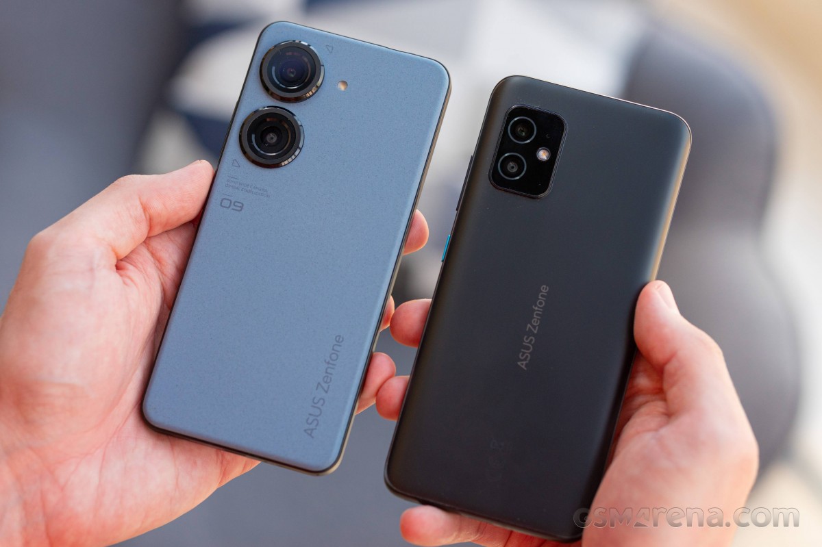
Similar, yet totally different, the Zenfone 9 is roughly the same size as last year's model, but the look and feel is entirely its own. Gone is the rear glass panel and nondescript camera island, replaced by two prominent separate camera rings against a matte plastic cover.
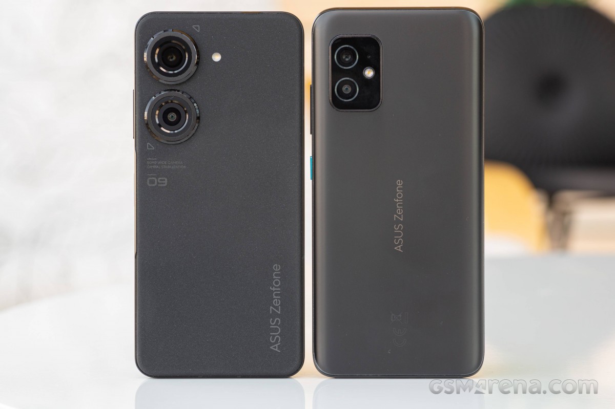
You could say that the switch from glass to polymer might make the new phone feel less premium, and at least one person at the office did call it a cheap feeling. That was more of a dissenting opinion, though, with most folks appreciating the unusually soft and grippy plastic. The new panel is also instrumental in keeping weight down - it's 36% lighter than the glass one on the 8.
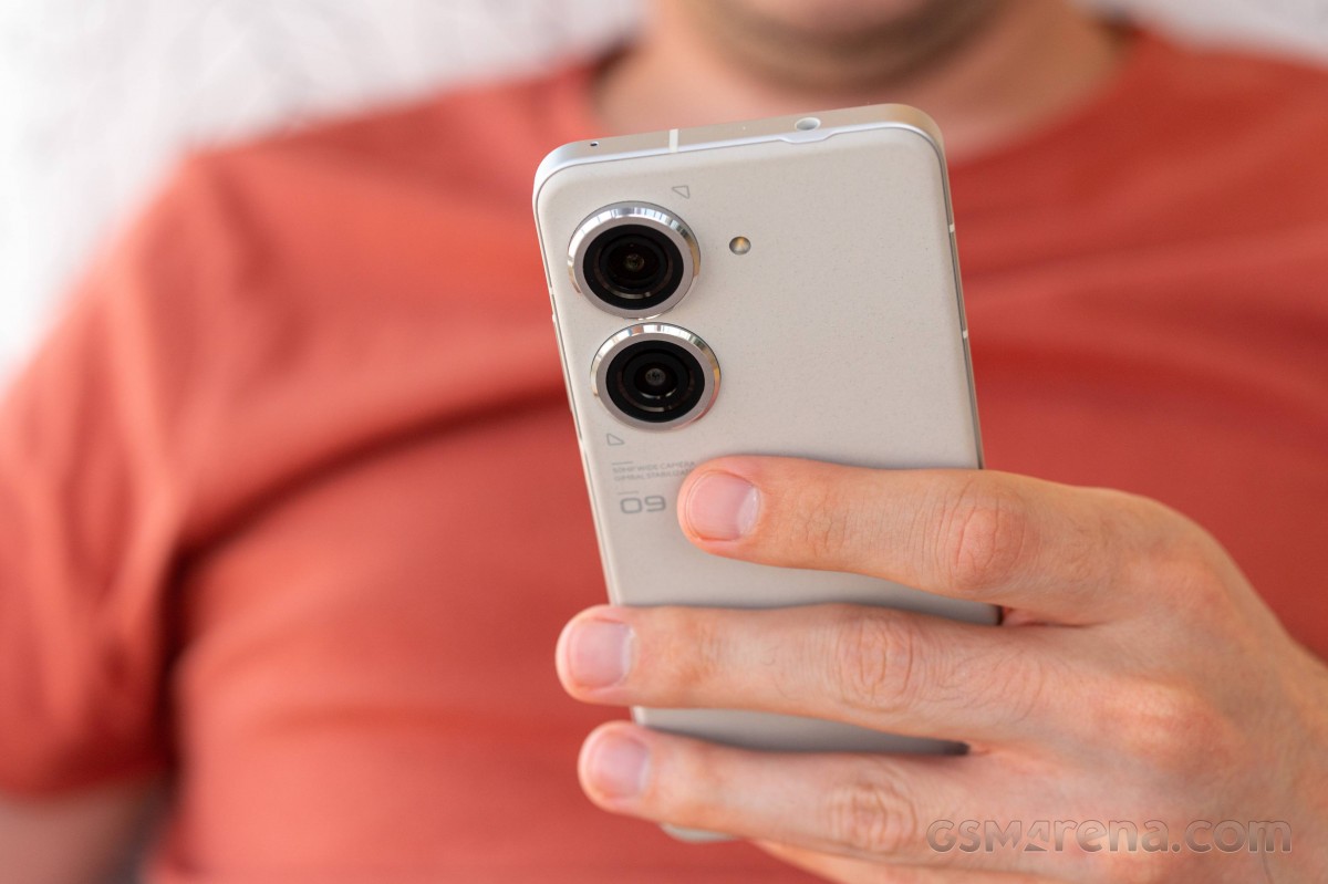
The Midnight Black colorway did tend to show fingerprints, while the other versions didn't advertise them quite as much. You can't just wipe it clean with a cloth either, though a wet tissue does restore its original cleanliness. And no worries about that water - the Zenfone 9 is IP68-rated for dust and water protection.
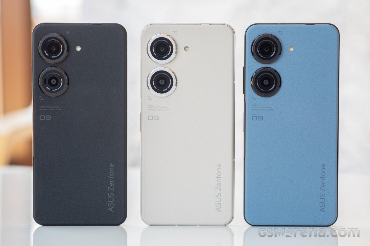
We're typically no fans of excessive writing on a phone's back, and the Zenfone 9 almost has us irked. Okay, most models tend to outline key camera features, and this one is no different, but why is the '09' separated from the rest of the model name and what's with the two triangles at the opposite corners of the imaginary camera island? We'll file these under 'petty complaints' and move on.
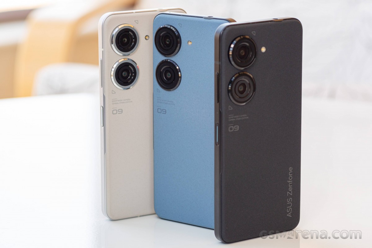
The cameras themselves look a little odd at first glance, in part because of their sheer size, in part due to the different levels of protrusion - the main one on top does stick out a good deal more than the ultrawide. We quickly warmed up to the styling, though, and appreciated their extra presence compared to the Zenfone 8's basic entry-level-looking setup.
The two-level approach also ensures that the phone doesn't wobble too much when placed on a flat surface - if the ultrawide stuck out as much as the main camera, it would have been a different story. As it is, the phone does rest on the bottom end of the main camera's ring, but the glass remains safe.
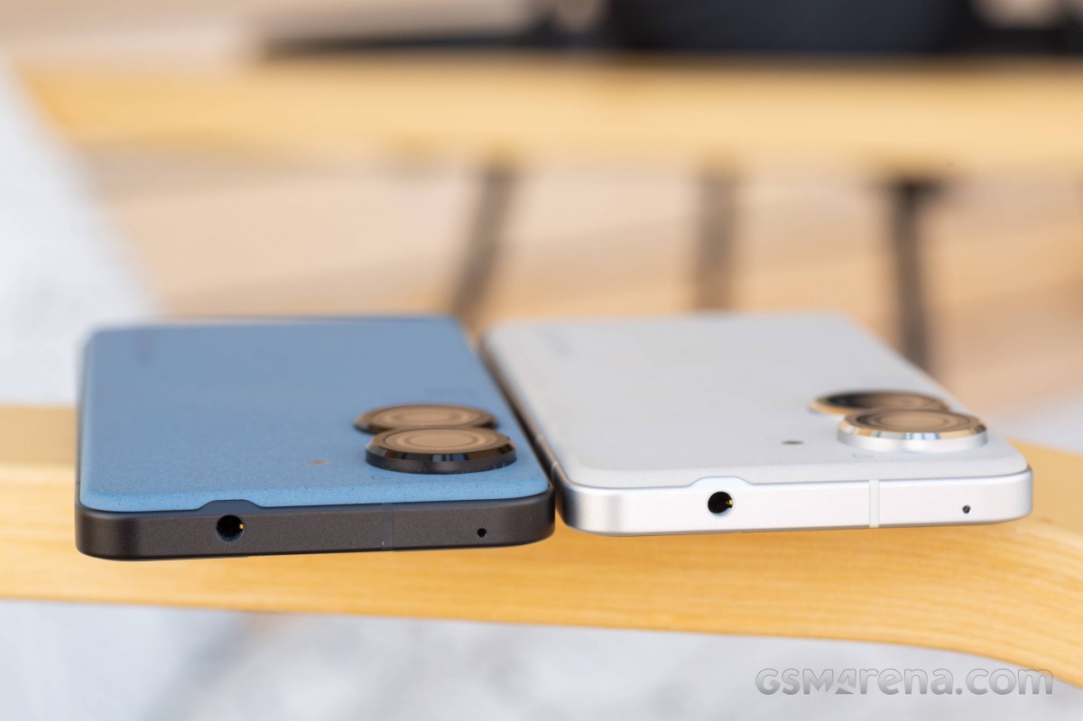
Speaking of the camera rings, they are colored to complement the midframe - so they're silver on the Moonlight White colorway and black on the other three versions, with a shiny polished chamfer on all. The aluminum frame itself has more of a satin finish, and in a departure from last year's design, it's now flat. Asus says it improves grip, and we'll concur.
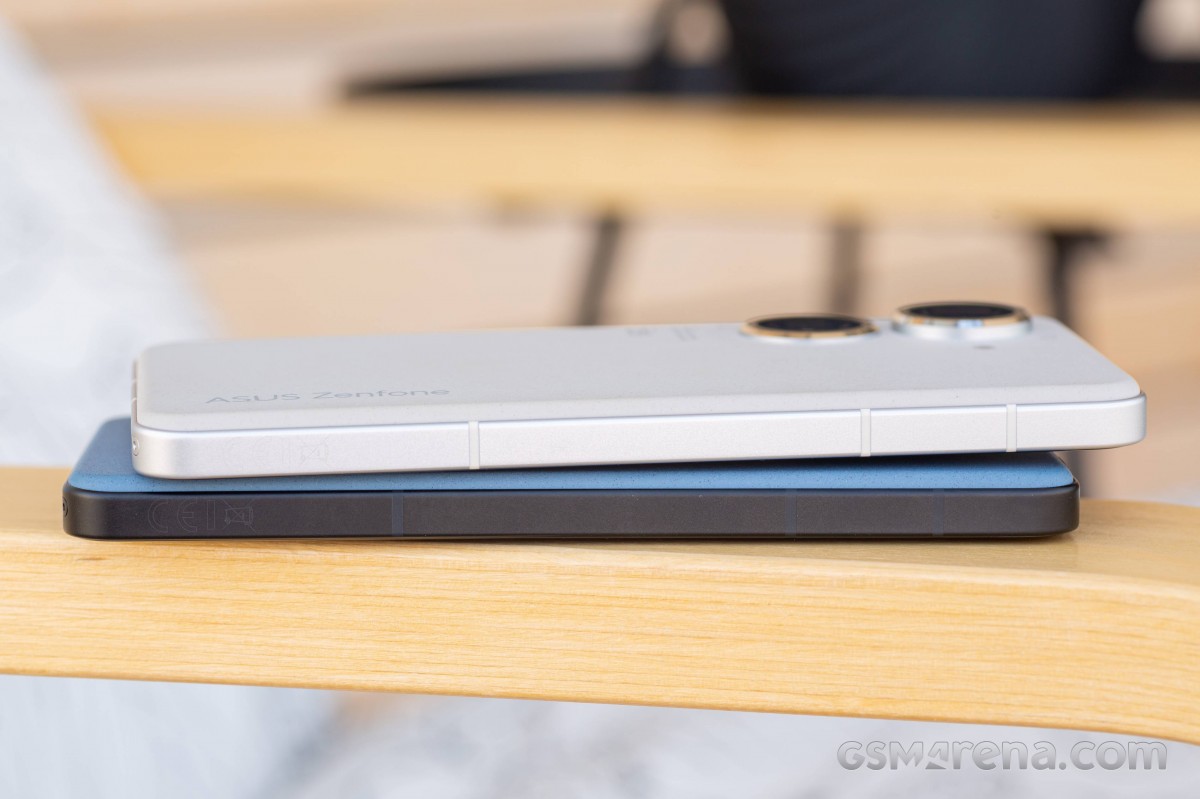
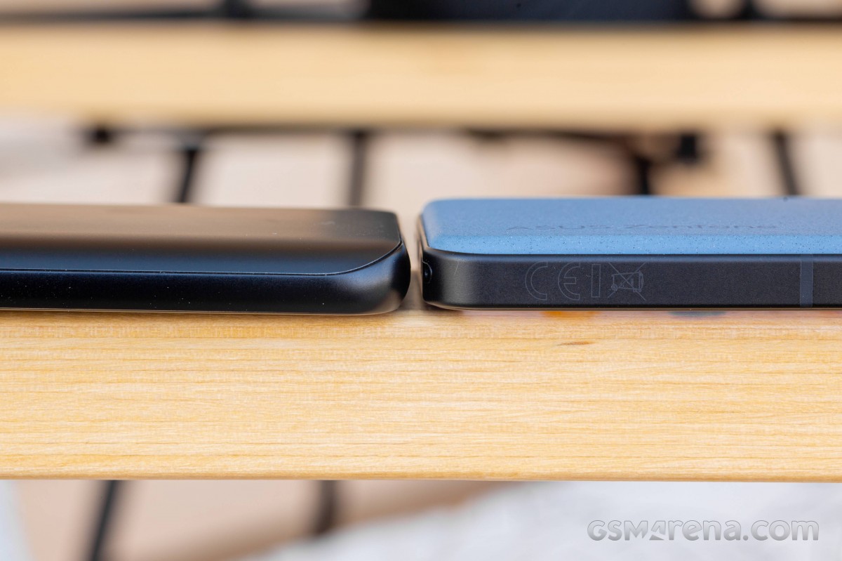
The flat sides and back have also helped with component placement on the inside, we're being told. The 8's curving back edges were deemed too wasteful when cubic mms are at a premium as is the case here, so they had to go.
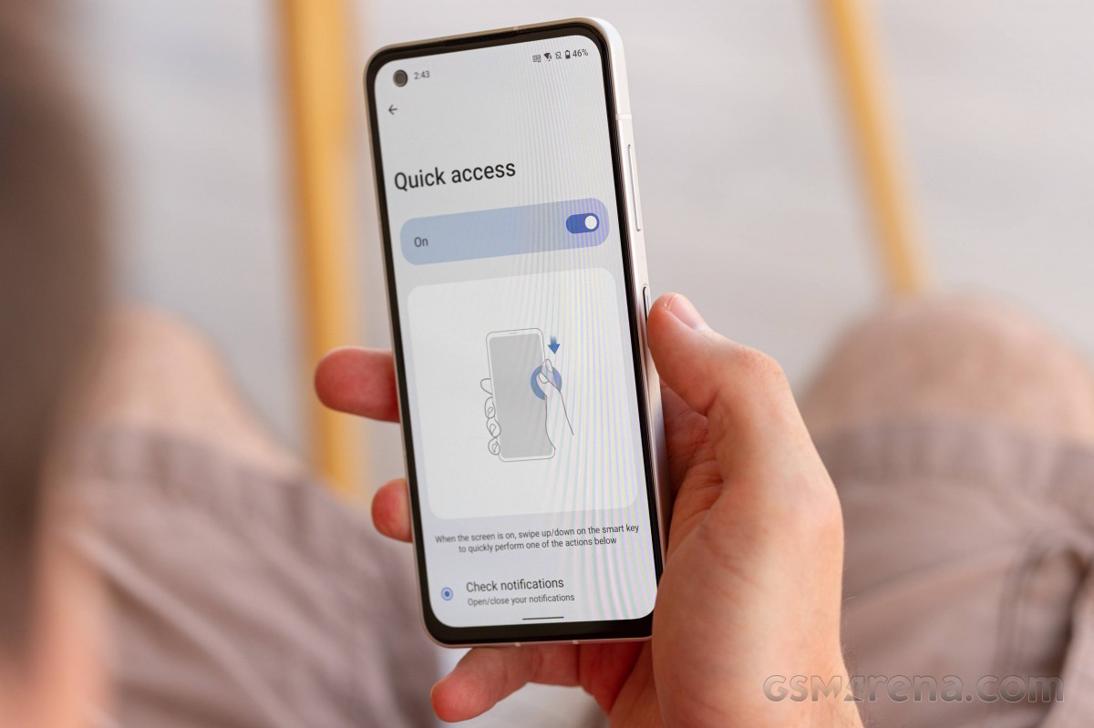
Also new is the Smart key - Asus's name for what we generically call the power button. While there were options to assign actions to the old one, the Zenfone 9 adds further customizability, which includes swiping on it. That's enabled by, you guessed it, the embedded fingerprint reader.
Side-mounted fingerprint sensors have their pros and cons, but a move from the under-display solution of the old model to this feels a little backward. On the other hand, the extra functionality you get out of the new Smart key can't be overlooked.
We're just not quite sure about the placement of the button. It's at the very midpoint, while the natural resting position for the right-hand thumb ends up above the midpoint on relatively tiny phones like this one. All too often, we had ourselves tapping or pressing the area between the volume rocker and the Smart key, a tendency magnified by our conditioning to expect to find such buttons in a recessed part of the frame - with the volume rocker and the Smart key sticking out, the in-between area feels just like that.
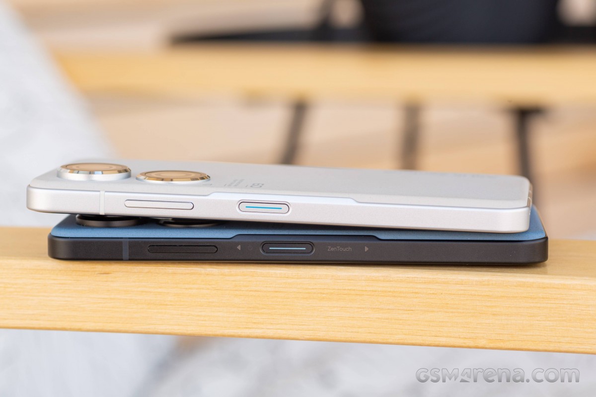
That said, once habit kicks in, there are no issues with using the button right-handed. And if you happen to be a leftie in your smartphone use, the lower position does make the button (and, by extension, the fingerprint reader) very easily accessible with a left index finger.
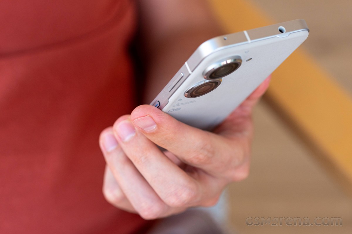
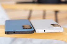
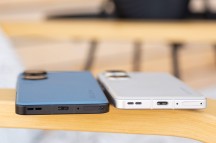
The layout of the other bits around the perimeter is essentially the same as on the Zenfone 8. There's a headphone jack up top for those who are still into that, joined by a mic.
Down at the bottom, there's another mic pinhole, the USB-C port and the bottom loudspeaker. Also, here is the card slot, its eject pinhole almost in the curved section of the bottom left corner. It's a dual nano SIM tray that pops out. There is no option for microSD storage expansion.
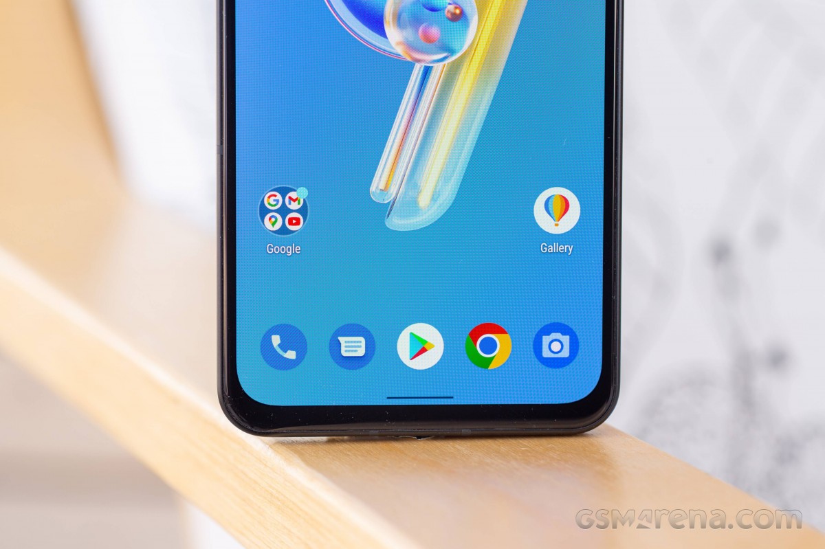
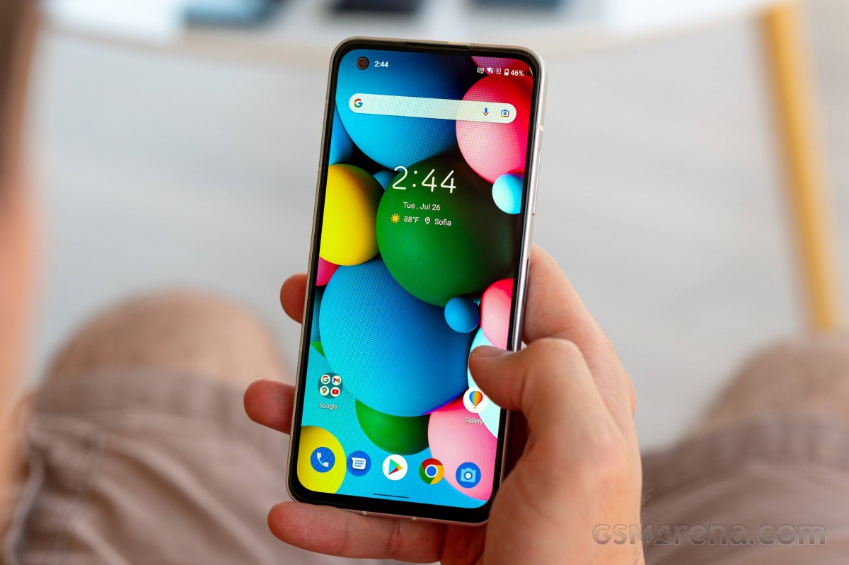
Finally, making our way to the display side, we see the 5.9-inch OLED display surrounded by a black border that's a bit too thick for the phone's flagship aspirations. Well, that is, it's noticeably thicker than the one on the Galaxy S22 or the Xiaomi 12, though the iPhone 13 might just have even more bezel on the sides (plus there's always the notch).
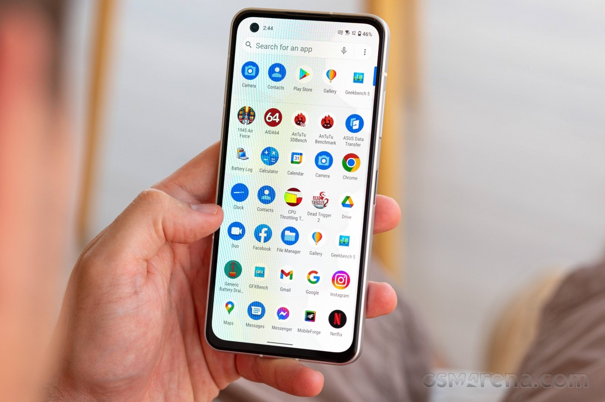
The more observant will also note that the top bezel is just a tiny bit thicker than the side ones, though only specifically troubled souls will make a big deal out of that. The chin is thicker still but not midranger-grade thick.
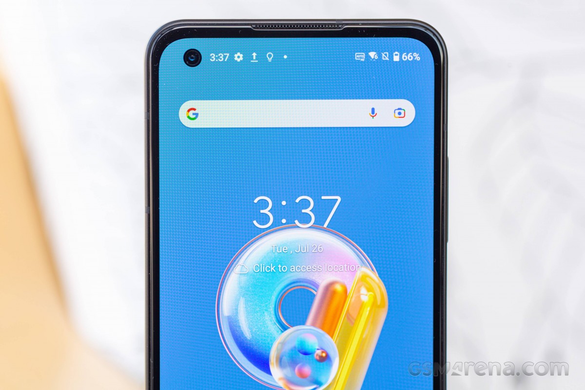
Perhaps the one true eyesore is the semi-shiny ring around the punch hole for the selfie camera. It draws unnecessary attention to what would otherwise be dismissed by our fully developed punch-hole blindness. It's the same as on the Zenfone 8, too - perhaps we should have complained more vocally back then.
Chiseled out of the top edge of the Gorilla Glass Victus sheet is the space for the top speaker grille, also an earpiece if you are so inclined.
Finishing off the way we started, let's talk about the Zenfone 9's size. Measuring 146.5x68.1x9.1mm, it's 1.5mm shorter and 0.4mm narrower than the 2021 model, albeit a whopping 0.2mm thicker. Weight has remained unchanged on paper, at 169g, though at least one set of scales (non-certified and uncalibrated as it may be) showed 172g for the 9 and 170g for 8.
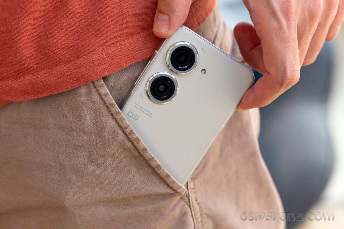
In any case, the Zenfone is about as little of a burden on your pocket as you can get in 2022, with flagship-level internals, no less. Then again, it's not more pocketable than a Galaxy S22 or an iPhone 13, with both having essentially the same footprint and weight, while also being tangibly thinner at 7.6-7.7mm. Admittedly, the Zenfone has the larger battery going for it.
The Xiaomi 12 (or 12S) is some 10g heavier and has a couple of hundred mAh larger battery than the Zenfone, plus a larger display, in just slightly less volume than the Zenfone, for what that's worth.
Reader comments
- Sam N8 808 owner
- 01 Aug 2024
- up6
Nice... Thanks a lot. 4K120 is a lot of frames and a lot of resolution at the same time. Try making some good use of it when you can! All the best. My LG G8x does 4K60 or 1080p240 at best.
- Anonymous
- 26 Jul 2024
- wiy
Yes, I just checked on mine and 4k@120fps is an option under "slo-mo"
